1,913 Images and Illustration Examples That Teach Things
Drawings and illustrations and photography can transmit more information from human-to-human than text can. This board is perfect for designers and marketers seeking visual inspiration.
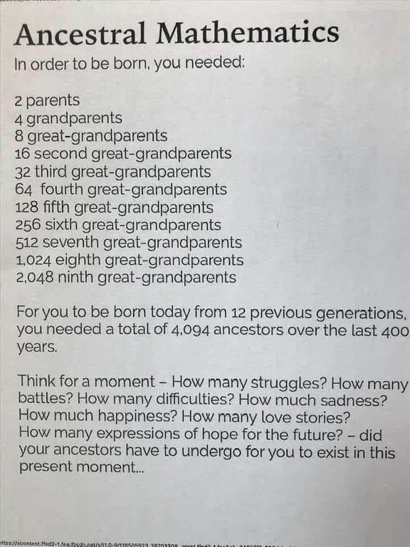
How many ancestors does it take to make YOU?
This “Ancestral Mathematics” image nails one thing perfectly: scale and emotional storytelling. It takes something abstract (your family tree) and...
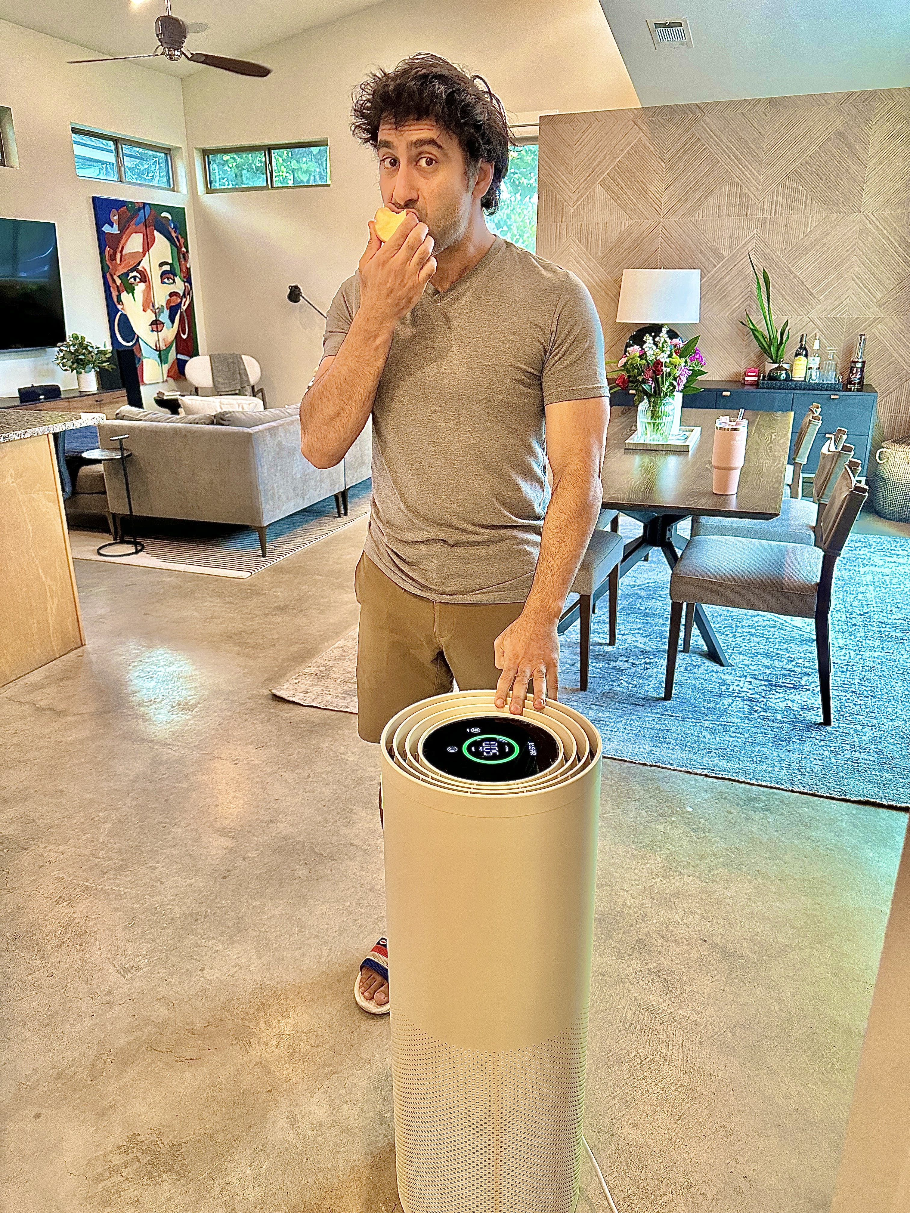
Jaspr which makes high end air purifier
When wildfires blanketed cities in orange haze, Jaspr didn’t just wait it out—they launched early. Smart move. They had a...

Support your favorite business for free
This image nails visual marketing. It turns a boring idea—“support small businesses”—into a fun fake receipt. The outcome? It instantly...
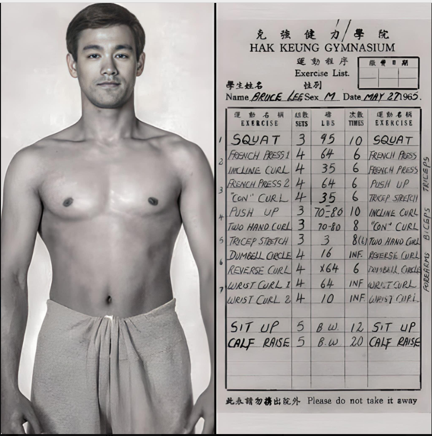
Bruce Lee Workout
This image nails it: Bruce Lee’s physique on the left, his exact workout routine on the right. First, it shows...
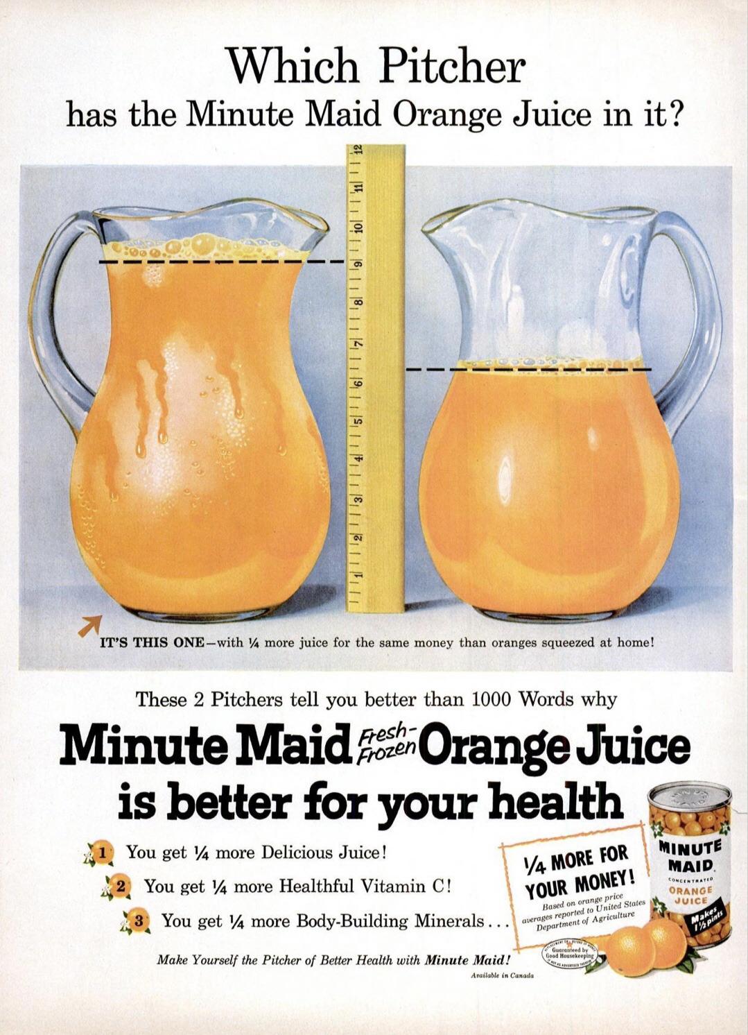
Clever OJ ad makes you look closer at it
This classic Minute Maid ad shows a pitch-perfect way to make value visual. Two pitchers. One ruler. One clear winner....
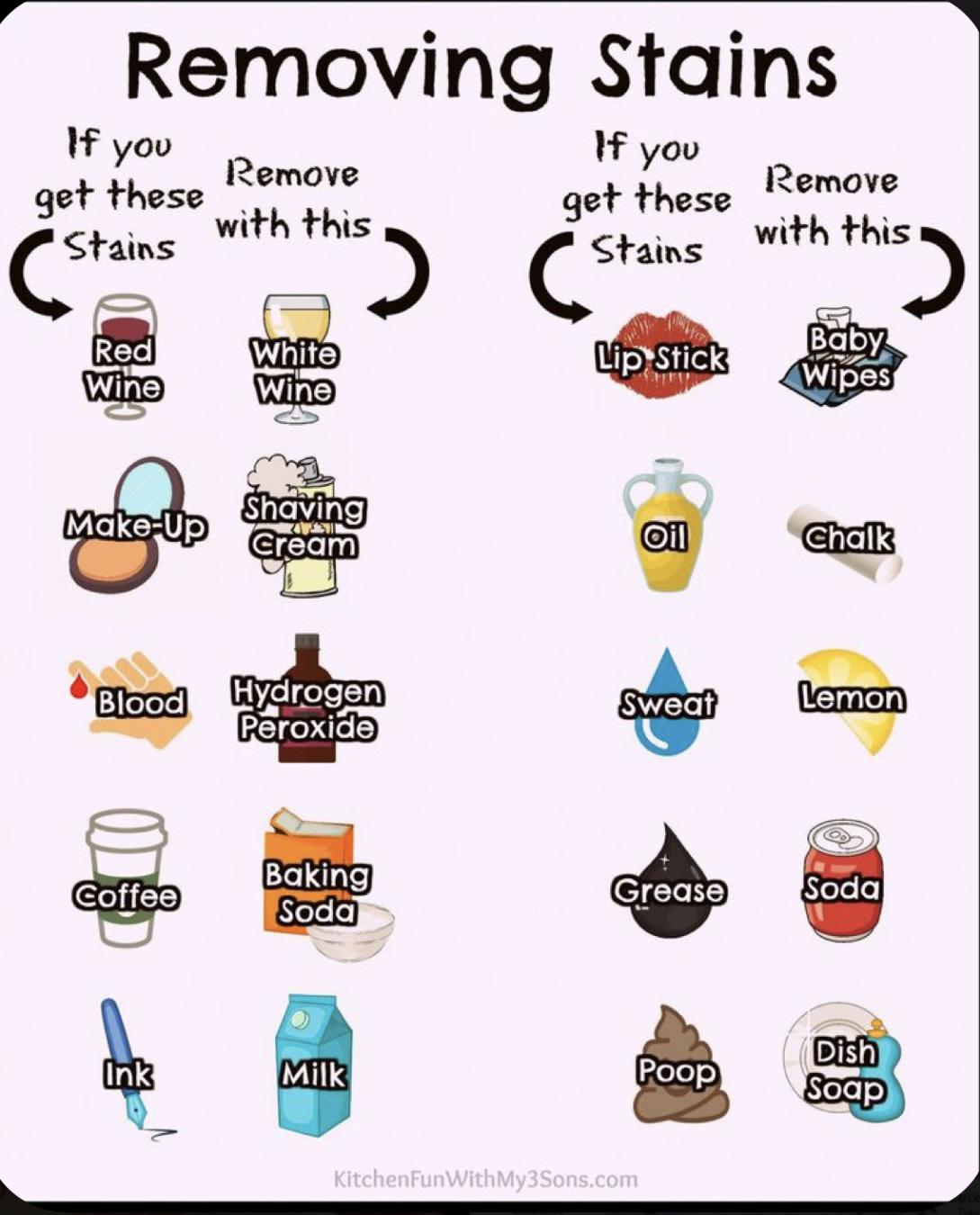
Removing Stains Simple Guide
Ever seen a chart so useful you instantly want to save or share it? This “Removing Stains” graphic nails it....

Apple’s Revenue Chart VS Tech Companies
This chart hits you right in the wow-factor glands. Apple’s 2022 revenue was $394.3B — equal to Adobe, Nvidia, Netflix,...

1978 Ford Pinto Ad
No headline. No copy. Just a shiny green Ford parked in golden sand. And it totally works. This ad doesn’t...

Survive a Dog Attack Guide
This “How to Survive a Dog Attack” comic packs a whole mini survival class into six frames. It’s visual, fast,...
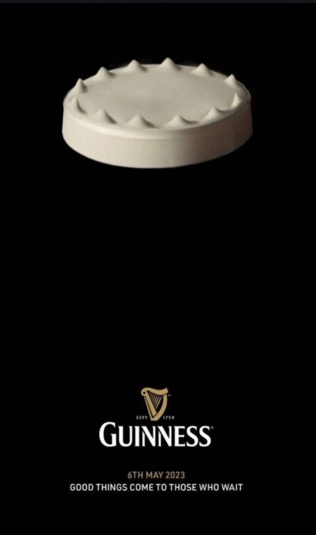
King’s Coronation Guinness Beer Ad
This Guinness ad is a masterclass in minimalism and timing. It shows what looks like an upside-down bottle cap, but...

United States Empire
A single image, a bookshelf, and a punchline: “You are here.” That’s it. Yet this meme grabbed 743K views and...
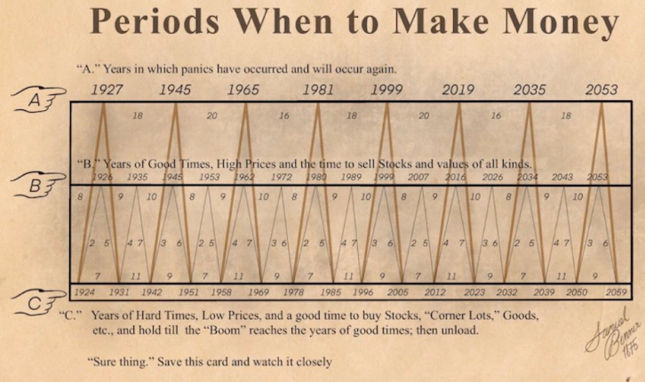
Periods when to make money chart
This old-school chart nails a timeless truth: markets rise and fall like clockwork. It’s a visual reminder that cycles happen,...
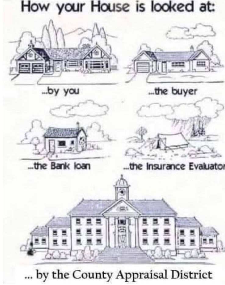
How your house is looked at meme
This meme nails a universal truth: perception changes depending on who’s looking. Your house is the same building, but every...
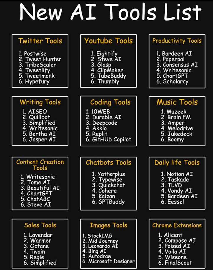
AI Tools Listicle Chart
This image nails a simple yet brilliant marketing structure: clear categories, short lists, easy scanning. It’s basically visual candy for...

McDonald’s Banana Puns Ad 1976
Old-school McDonald’s nailed this one. The ad screams fun with bright colors, bold fonts, and those groan-worthy puns: “Go Bananas”...

Sunglasses Product Images + Features + Price
This ad for Nick Sunglasses nails minimalism. Clean background, crisp photo, and just three simple facts: polarized, UV protection, and...

Video editing burnout ad
Simple. Visual. Clear. That’s the vibe of this BeCreatives ad. Two pieces of toast—one burnt, one perfect—and a punchy line:...

Funny neck pain image
This meme hits because every single person with a smartphone has lived it. The “why do I hurt?” paired with...

Hilariously good lawyer billboard 😂
Driving past lawyer billboards usually feels like déjà vu. Same suits, same serious faces, same “We Win Big” promises. But...
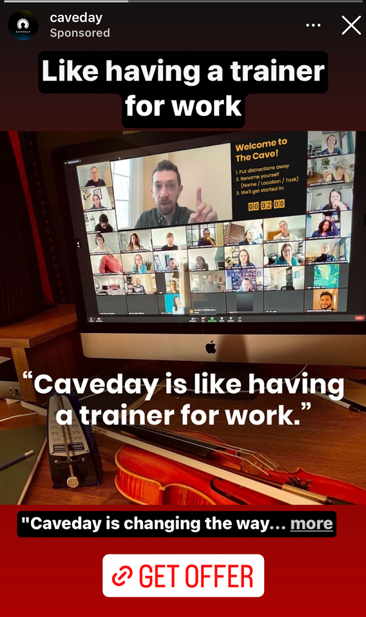
“Life having a trainer for work”
Caveday nailed their ad with one line: “Like having a trainer for work.” It instantly explains what the service does...

Copywriting is the marketing that feeds your core business
This simple doodle nails a huge truth: copywriting isn’t just for ads—it powers every part of your business. Words are...
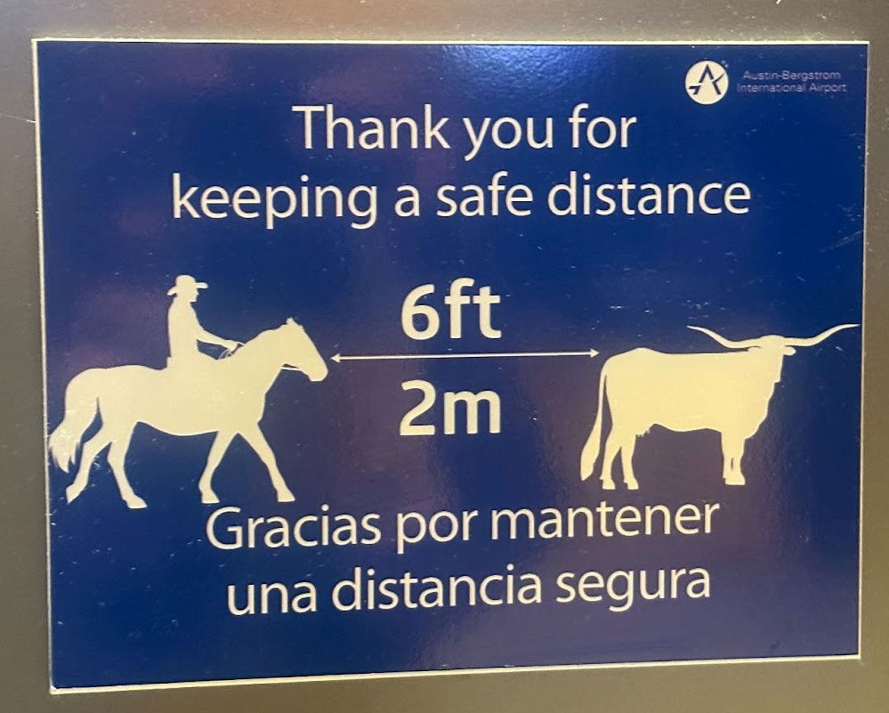
Funny sign at Austin Airport
This sign at Austin-Bergstrom International Airport nails local branding while giving a basic safety message. Instead of a standard “keep...

1935 DKW Car Strength Demonstration
This photo says everything a headline could: strength, reliability, confidence. A DKW car holding up more than 30 men on...

Why pay for dating apps?? 😂
A guy put up a flyer saying he’s “Looking for Girlfriend!”—with a photo, short bio, and a phone number. It’s...