2,046 Images and Illustration Examples That Teach Things
Drawings and illustrations and photography can transmit more information from human-to-human than text can. This board is perfect for designers and marketers seeking visual inspiration.

This isn’t a Vogue cover. It’s “DOGUE.” And yet… it feels totally real. That’s the magic of good design and...

Amazon’s first landing page looked like a college homework project: plain, gray, and full of text. Today’s version looks like...

Most people try to “fix everything” in their business at once. Big mistake. This image shows a saner path: improve...

Wendy’s nailed transparency before it was trendy. This 1979 “Hot ’n Juicy Explained” ad broke down exactly what made their...

When your product is the visual, let the picture speak. This old Miller Rodeo Shirts ad nails it — no...

 Neville Medhora
A/B tests tell the truth. This one showed that a mock Zoom screenshot outperformed a clean photo wrapped in an...

This ad nails the curiosity hook. It doesn’t say “buy wine,” it says “2 MIT grads built an algorithm to...

Nike’s ad nails the balance between sleek design and clear communication. Every arrow and label tells you exactly why this...
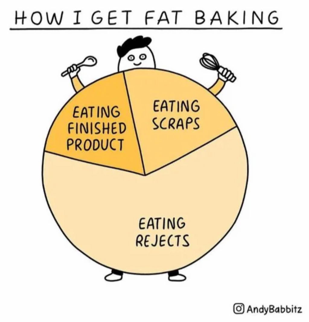
This cartoon “pie” chart nails a universal truth with humor: we eat way more “testing” our baking than actually eating...


IKEA turned an everyday product—pillows—into something people instantly crave: better sleep. The ad shows a pill bottle labeled “Sleep,” but...

This vintage Ford ad nails one concept perfectly: visual proof beats lengthy explanations. Instead of listing specs about cubic feet...

This chart tells a big story fast. Slack built a product people loved. Microsoft built a distribution machine. The result?...

Look at this side-by-side. On the left, text testimonials. On the right, video testimonials. You can practically feel the difference....

This table from Tacklebox shows how a single visual can explain complex offerings in seconds. It compares two products—their 7-week...

The HelloFresh sales page is a masterclass in simplicity and persuasion. It grabs attention with a big, juicy offer —...

This Cheez Whiz ad from 1965 nailed one big idea: versatility. Just one jar could upgrade any bread into a...

We’ve all been there. Lying in bed at 2AM, thinking we just cracked the marketing code of the century. Everything...

Austin Shoe Hospital nailed it with this email. Instead of paragraphs explaining their services, they simply showed shoes before and...