Homepage vs Product Page With Callouts
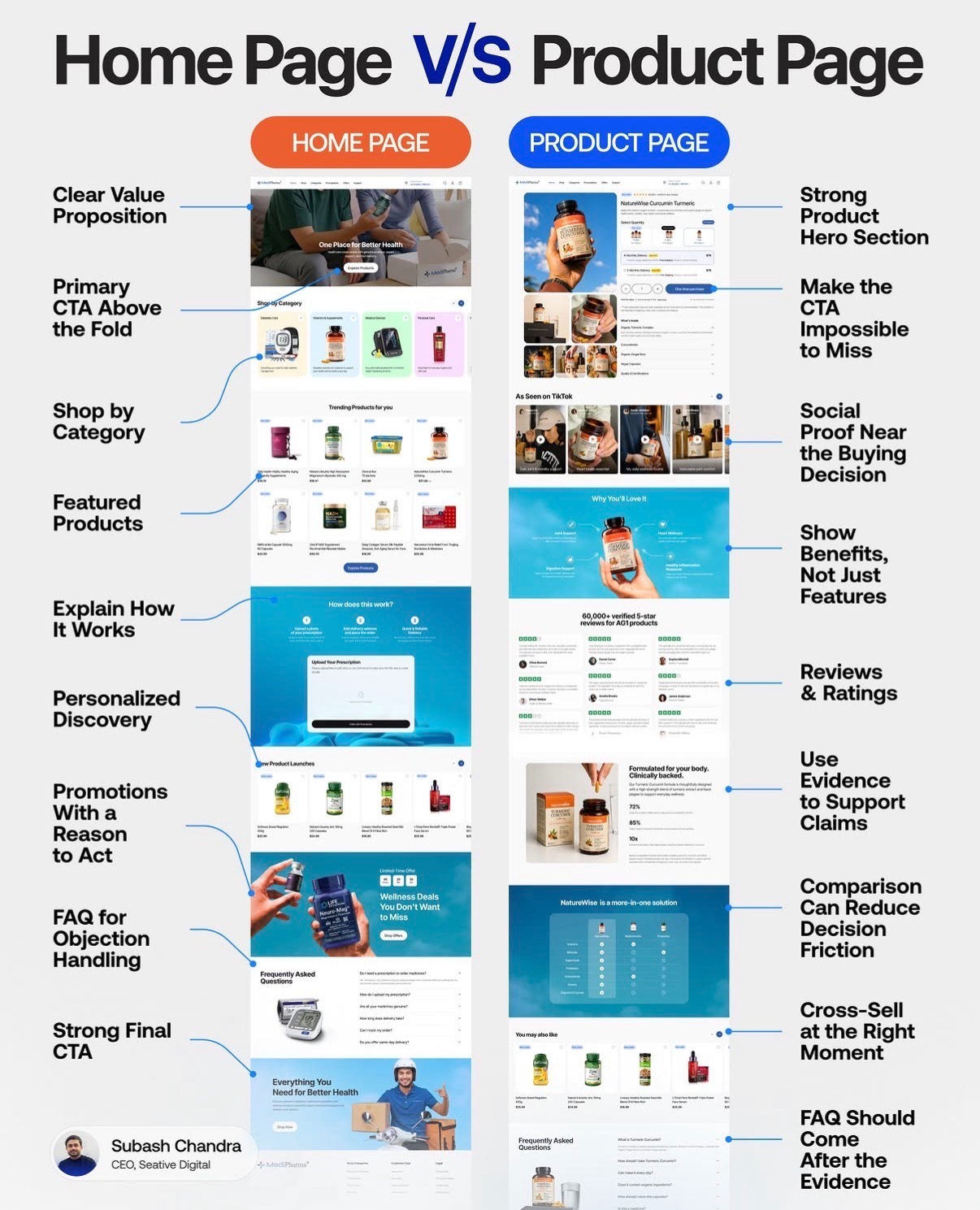
Most homepages and product pages look like cousins who barely talk to each other. This visual from Subash Chandra shows they should actually work like a relay team: the homepage grabs attention, then the product page sprints to the sale. Use this breakdown to tune each page for the exact job it needs to do so you convert visitors at every stage instead of losing them in the handoff.
The Psychology Behind It
The homepage answers, “Am I in the right place?” so it stays broad, benefit-driven, and exploratory. The product page answers, “Should I buy this now?” so it piles on clarity, proof, and urgency. When you design both with these different questions in mind, visitors never feel lost, rushed, or under-informed—they simply move one confident step closer to checkout.
Homepage: The Helpful Tour Guide
- Lead with a clear value proposition and one primary CTA above the fold.
- Let people shop by category and showcase a few best-selling or featured products.
- Explain how it works and offer personalized discovery tools or quizzes.
- Stack in promos with an actual reason to act, then handle objections with an FAQ and a strong final CTA.
Product Page: The Closer
- Open with a strong product hero section and a CTA that’s impossible to miss.
- Show benefits instead of just specs, backed by reviews, ratings, and proof.
- Use comparisons and evidence to reduce decision friction right before the buy box.
- Cross-sell relevant items, then finish with an FAQ after all the proof is presented.
Creative Variations
Analyzed by Swipebot
Loading analysis...