Nick Kolenda’s sales page for his “School of Mind” course is a masterclass in applied psychology. Every visual, headline, and...
Copywriting/Advice/Sales Pages
Dec 9, 2019
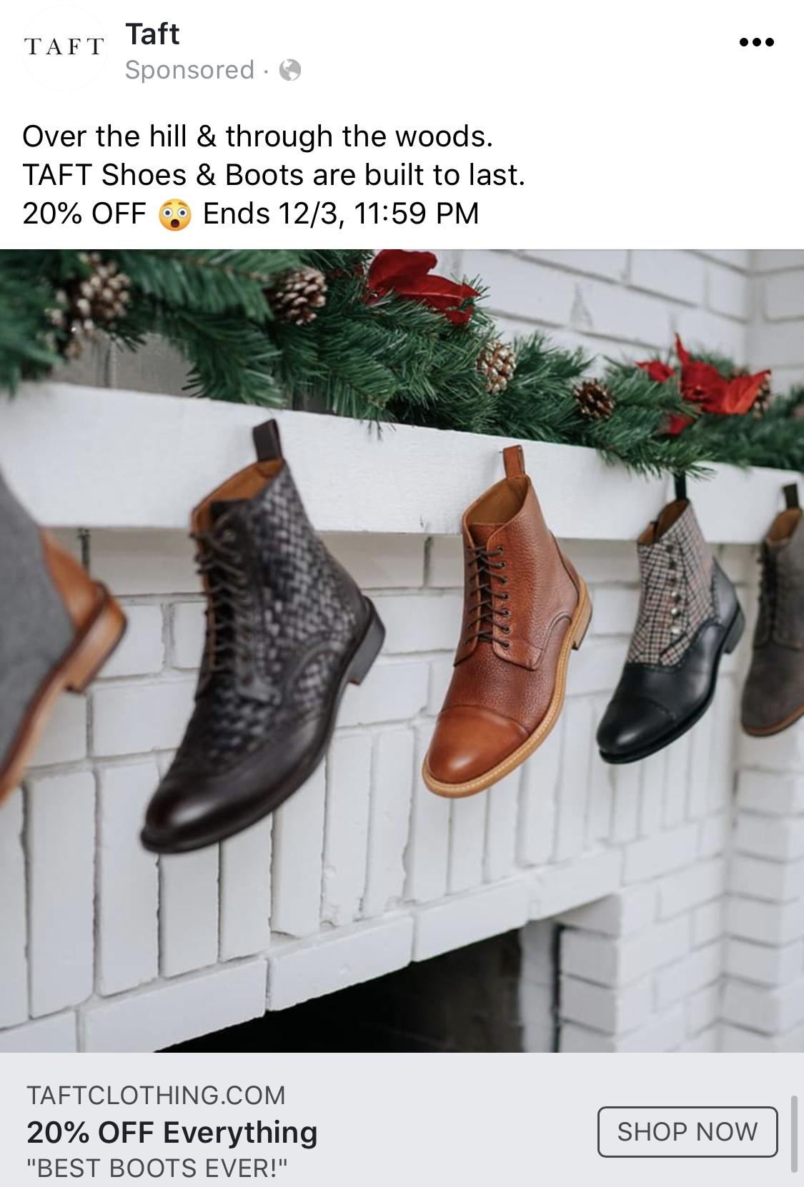
Taft Boot Facebook Holiday Ad
Taft nailed this Facebook ad. Instead of just showing boots, they turned them into holiday décor — boots hung by...
Ads/Copywriting/Images
Nov 27, 2019
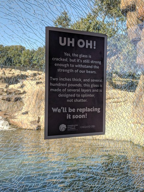
Shattered Glass Bears 😳
Ever seen cracked glass at an animal exhibit? Normally, that’s a panic moment. But the Oakland Zoo turned it into...
Ads/Copywriting/Outdoor Advertising
Nov 27, 2019
Huckberry Memorial Day Sale Email
This Huckberry Memorial Day email is a masterclass in seasonal selling. It’s clean, easy to scan, and screams “limited-time deal”...
Copywriting/Emails/Images
Oct 18, 2019
Huckberrry Labor Day Email
Huckberry nailed the art of making a long email feel effortless. This Labor Day sale email looks fresh, flows perfectly,...
Copywriting/Emails/Advice
Oct 18, 2019
Huckberry Black Friday Email
This Black Friday email nails every element of seasonal e-commerce marketing. It’s clean, bold, and built entirely around one clear...
Copywriting/Emails/Advice
Oct 18, 2019
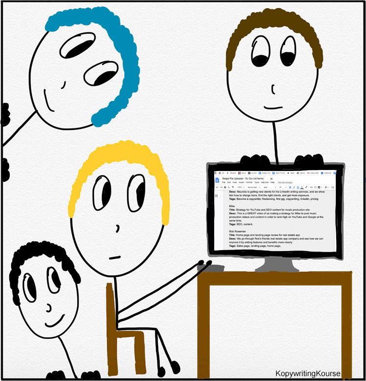
Getting 3 Copywriters To Write For You
Ever wish you had a few extra brains when writing copy? This cartoon nails that feeling. One writer types, while...
Ads/Copywriting/Images
Oct 16, 2019
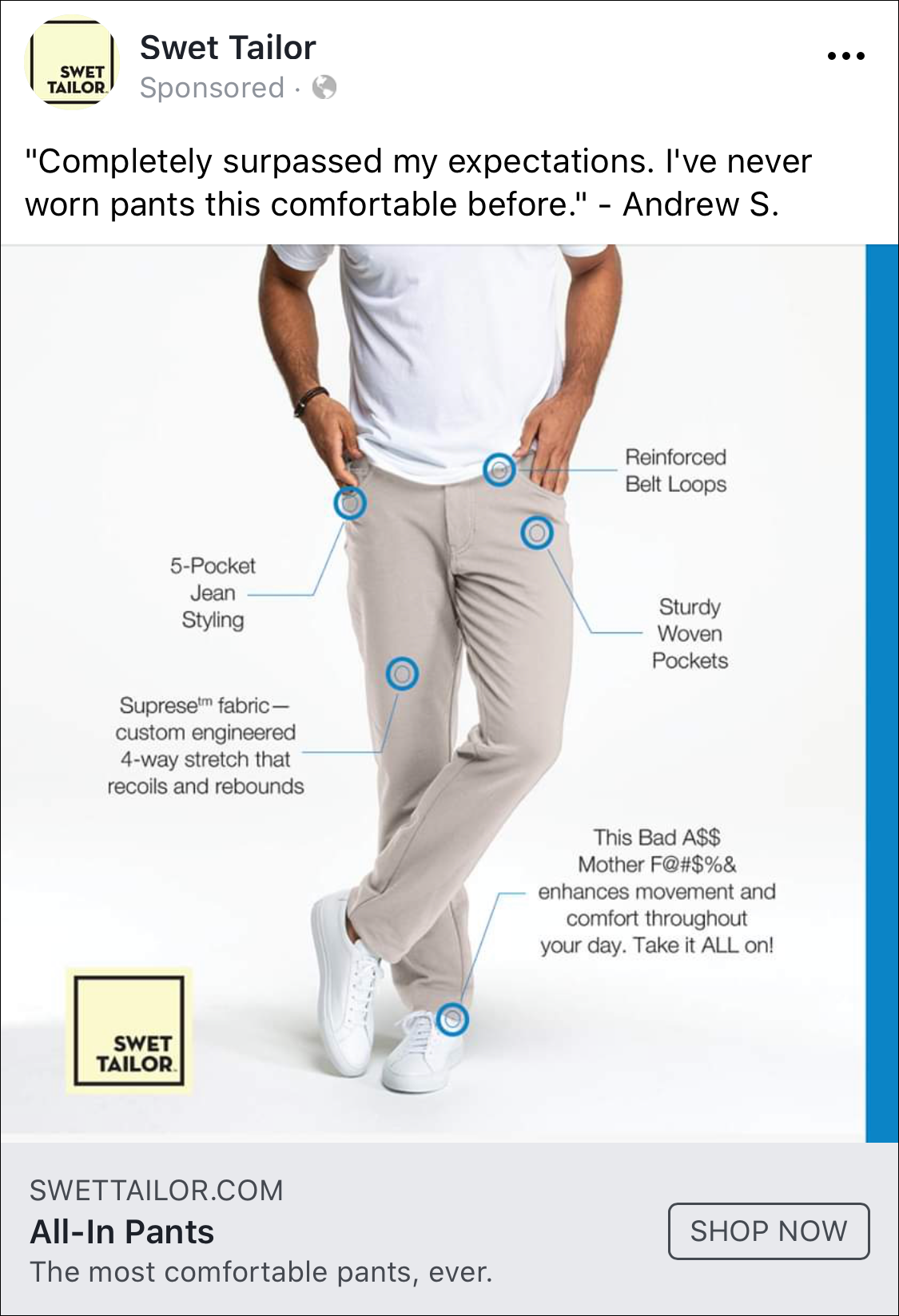
Swet Tailor Facebook Ad
This Swet Tailor ad nails clarity and personality. It uses simple visuals, clean lines, and customer trust to turn pants...
Ads/Copywriting/Images
Oct 16, 2019
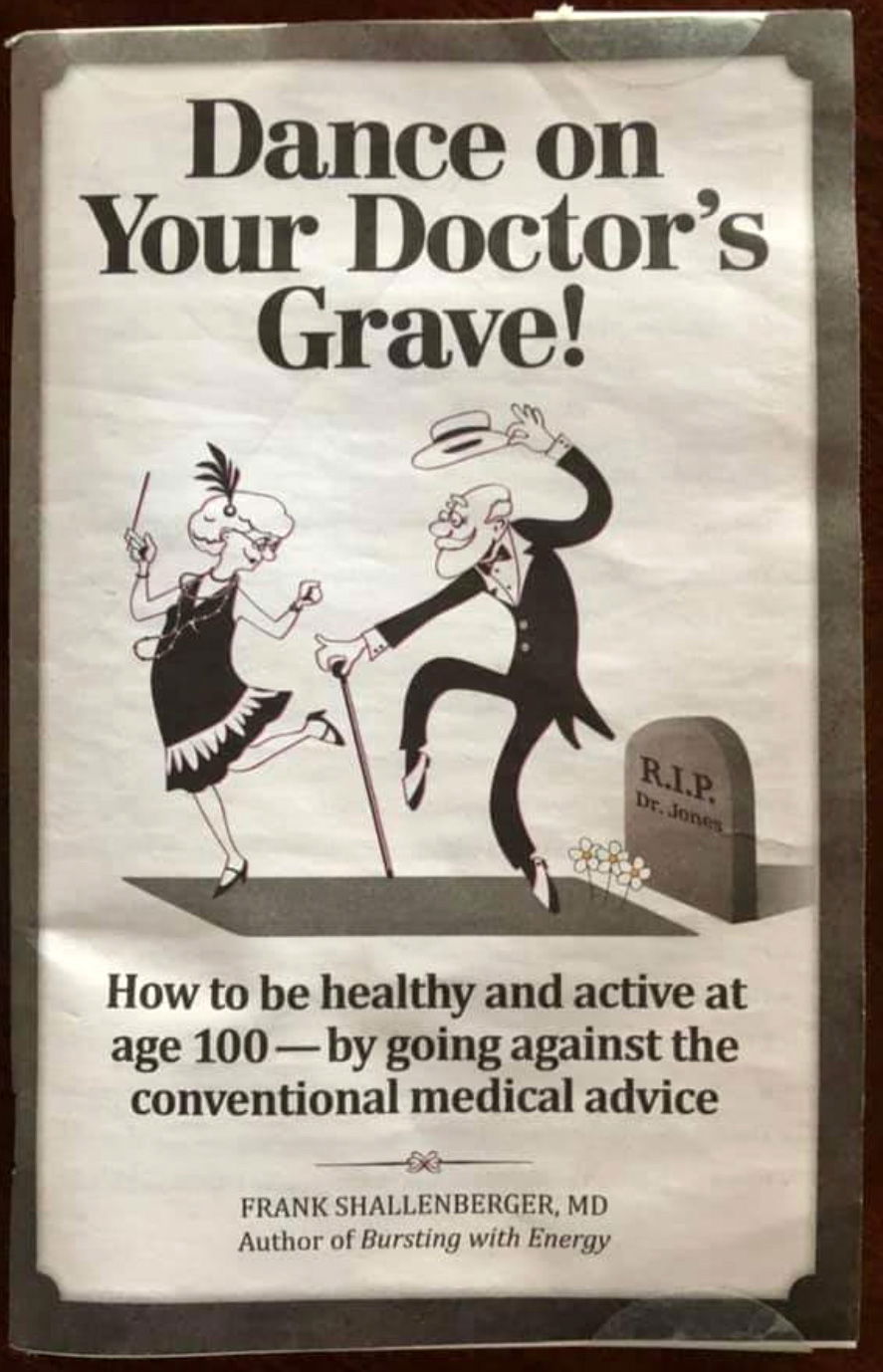
Dance On Your Doctors Grave Pamphlet
This pamphlet cover is wild. It’s got an old couple literally dancing on their doctor’s grave. Shocking? Yep. Memorable? Extremely....
Ads/Print Ads/Copywriting
Oct 16, 2019
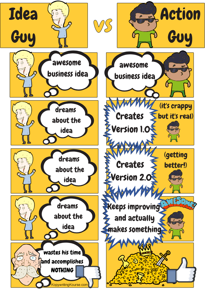
Ideas Vs Action
We all know an “Idea Guy.” Turns out, what really matters is being the “Action Guy.” This image nails the...
Copywriting/Videos/Images
Oct 16, 2019
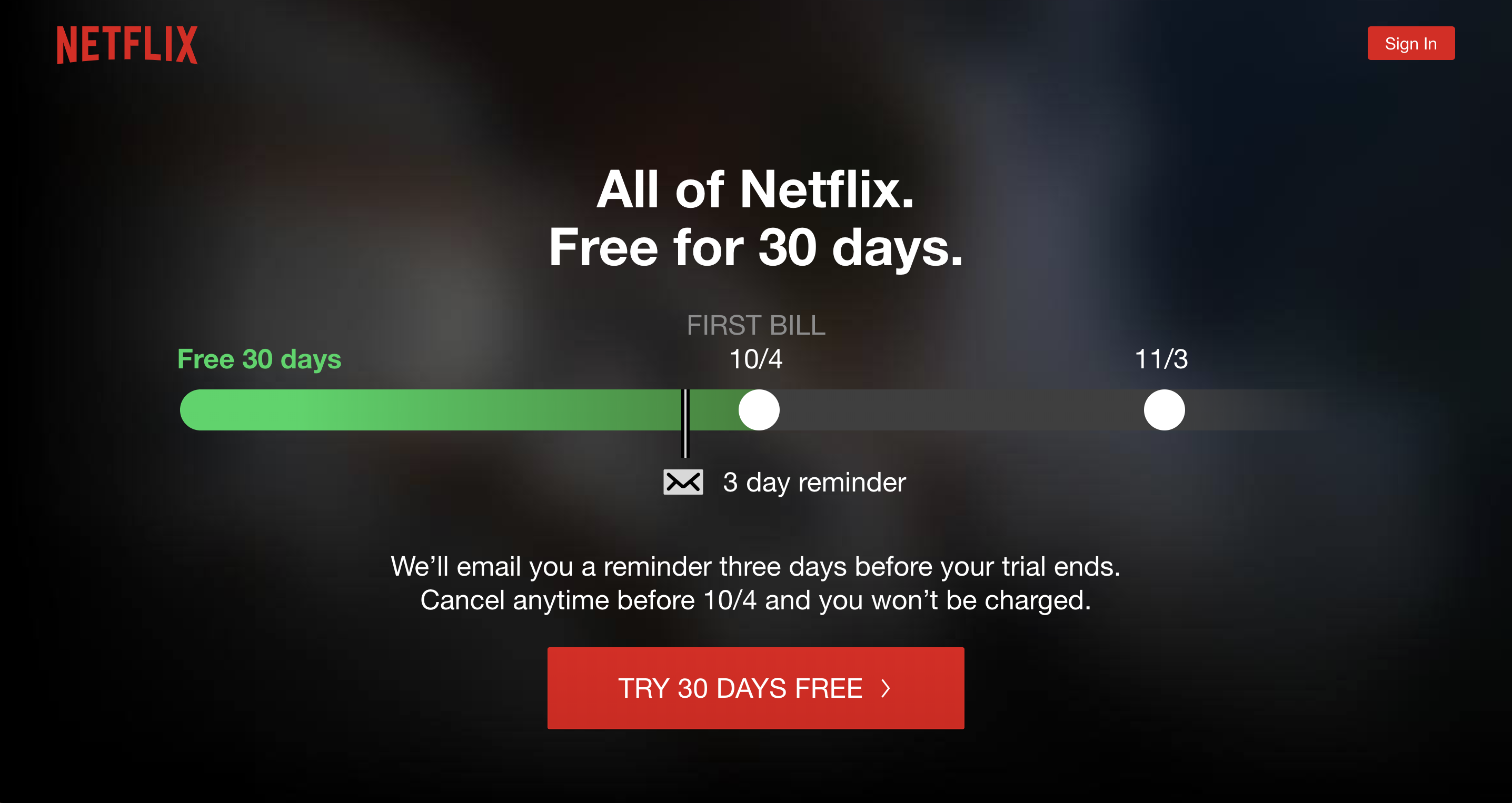
Netflix Free Trial Pricing
Netflix nails the art of the “no-brainer” trial. Their landing page doesn’t just say “Try it free” — it shows...
Signup Forms/Copywriting/Pricing
Sep 20, 2019
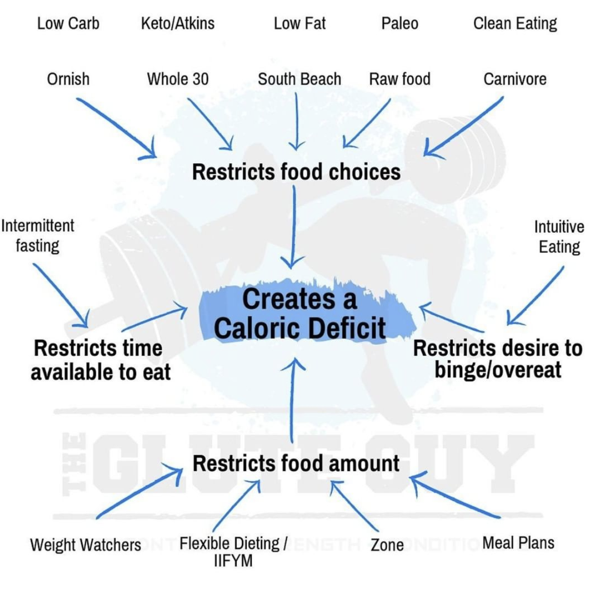
Simplified Dieting Image Chart
This image nails what most diet books take 200 pages to say: every diet works because it cuts calories. One...
Ads/Copywriting/Videos
Sep 20, 2019
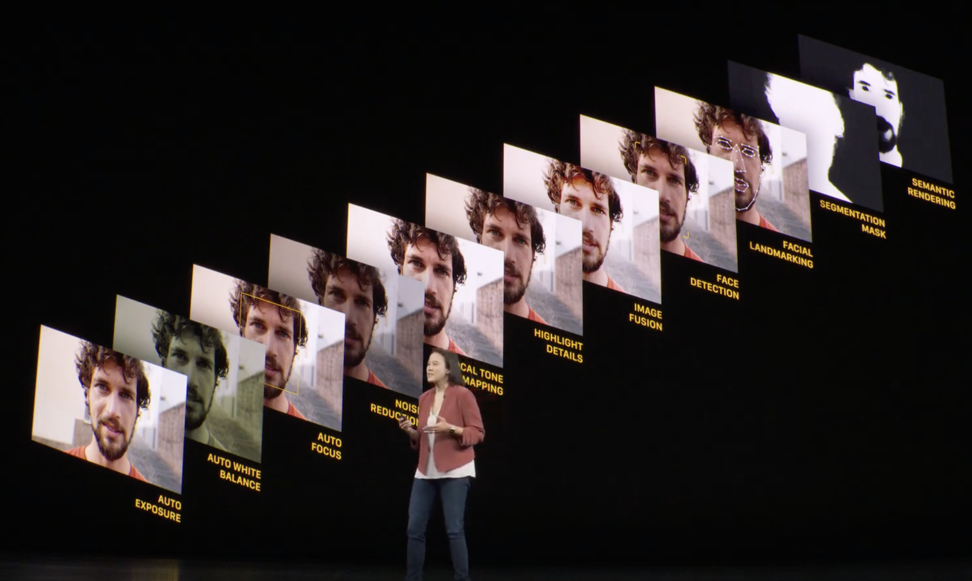
Apple using clever images to show all layers of a photo
Apple could’ve used 10 slides to explain how their iPhone camera processes a photo. Instead, they showed it in one...
Copywriting/Videos/Images
Sep 20, 2019
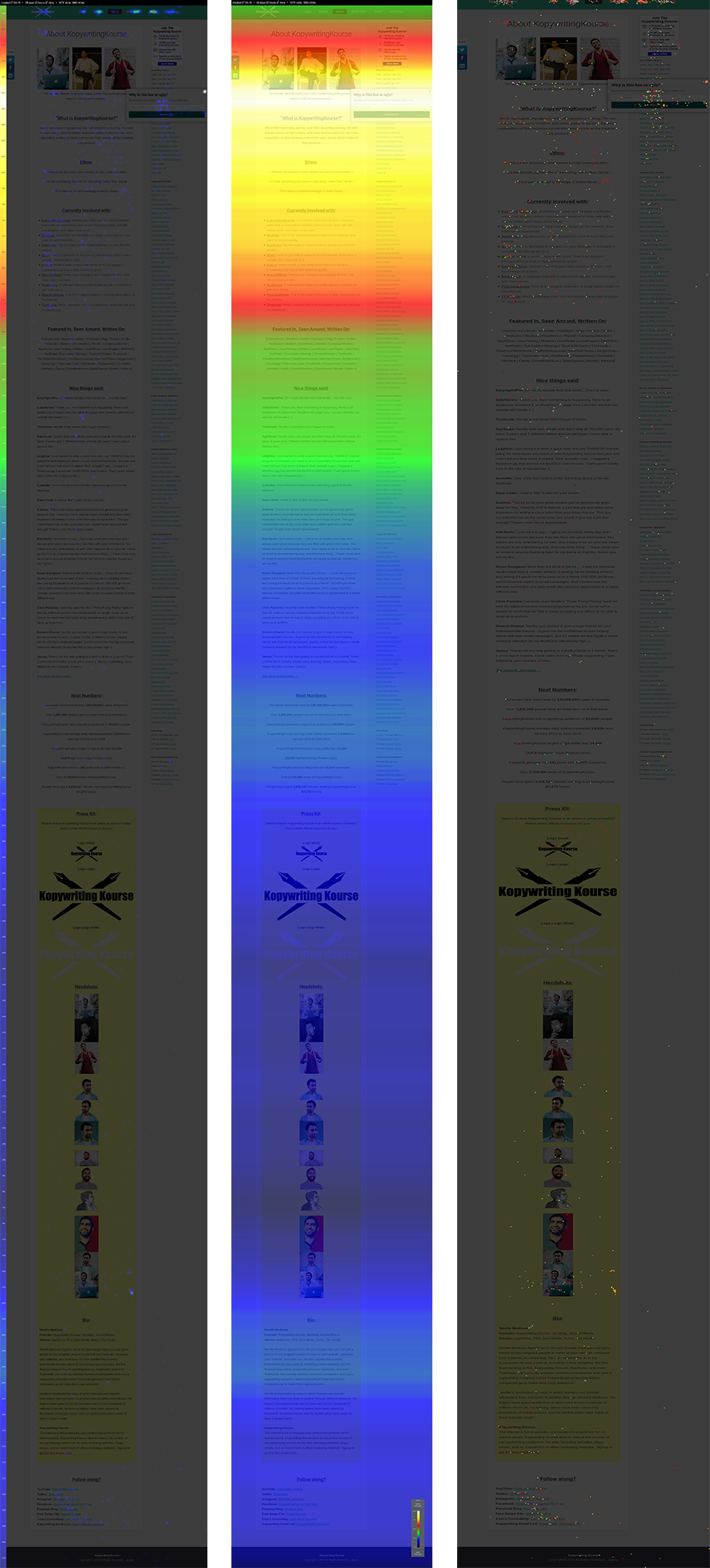
Kopywriting Kourse Sales Page
These heat maps from Kopywriting Kourse show exactly where users click, scroll, and stop paying attention. Instead of guessing what...
Copywriting/Data/Sales Pages
Aug 28, 2019
Kopywriting Kourse About Page
Most people treat their About Page like a resume. But these heat maps from Kopywriting Kourse show where visitors actually...
Copywriting/About Pages/Data
Aug 28, 2019
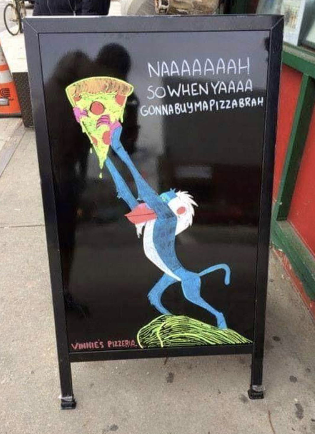
Funny Lion King Pizza Restaurant Sign
Vinnie’s Pizzeria nailed timing with this sidewalk sign. They riffed on The Lion King remake hype, turning a famous movie...
Ads/Copywriting/Restaurant Signs
Jul 30, 2019
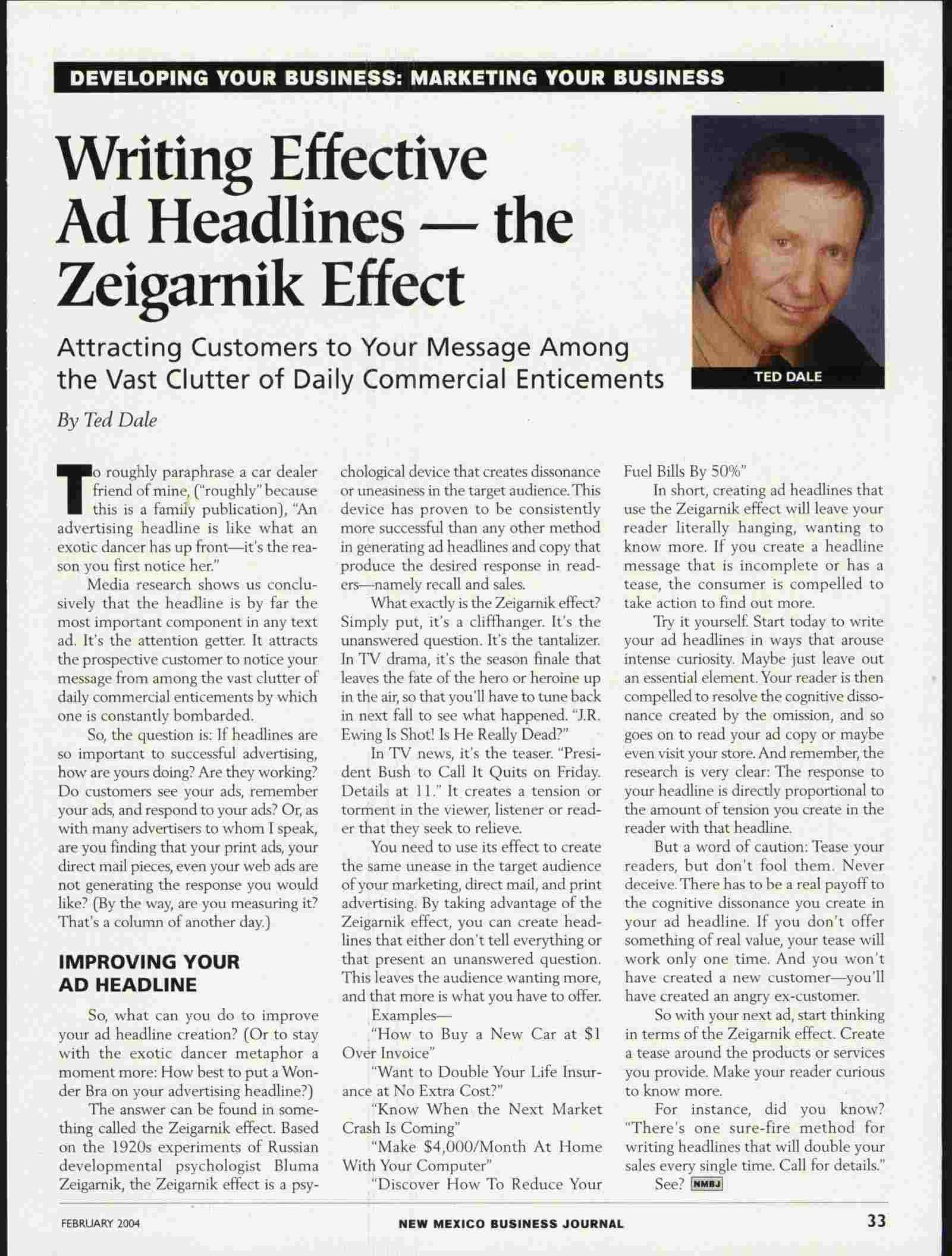
Writing Effective Ad Headlines - The Zeigarnik Effect
Ever stop reading a headline halfway and feel you have to know the rest? That’s the Zeigarnik Effect at work....
Ads/Copywriting/Headlines
Jul 22, 2019
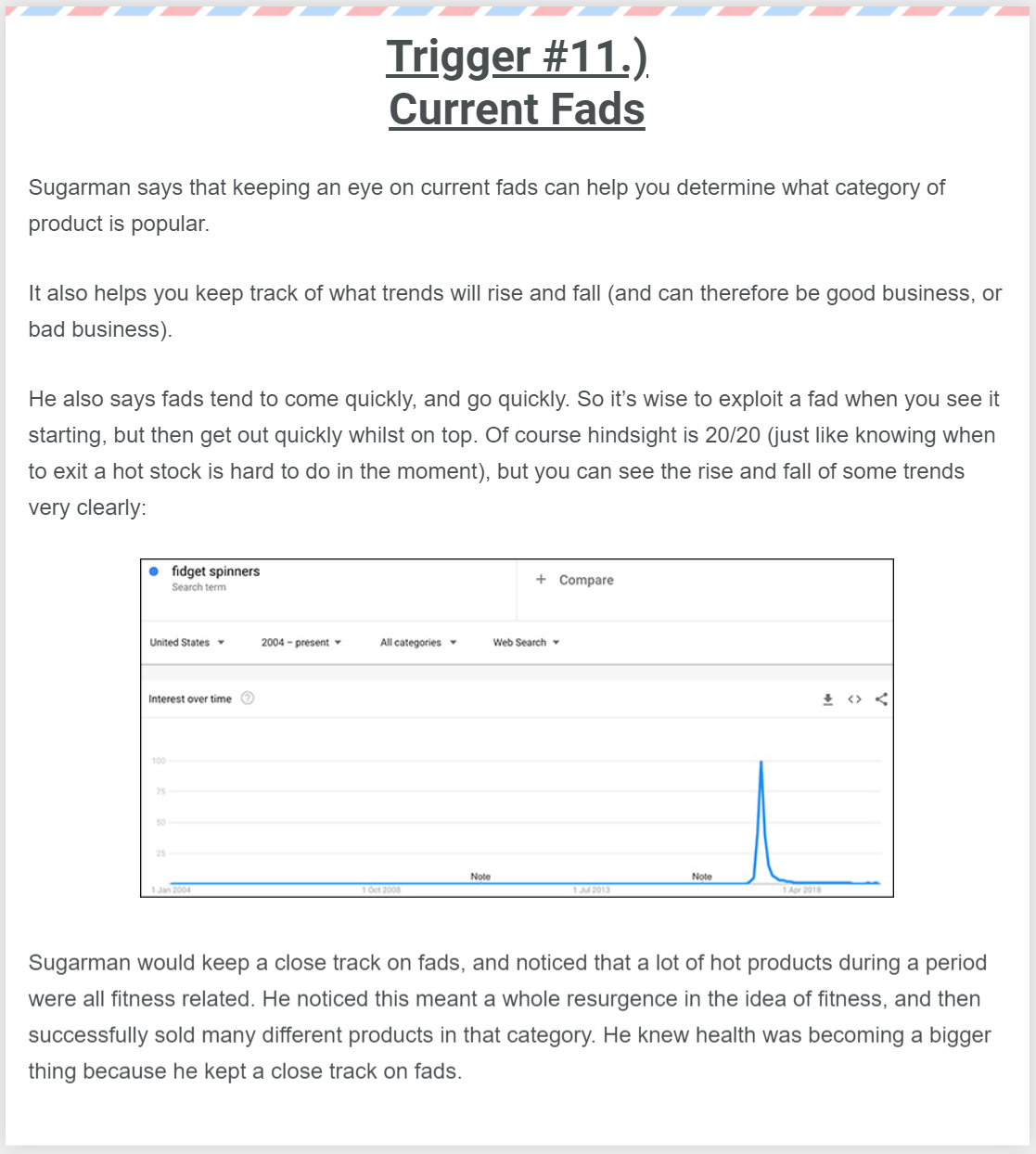
Sugarman Trigger #11 - Current Fads
Remember fidget spinners? They shot up like fireworks… then disappeared just as fast. This Google Trends graph says it all:...
Formulas/Copywriting/Data
Jun 19, 2019
Scotts Bass Lessons Sales Page
This page for Scott’s Bass Lessons nails how to make an online membership look irresistible. It’s not just “bass lessons”—it’s...
Signup Forms/Copywriting/Data
May 30, 2019
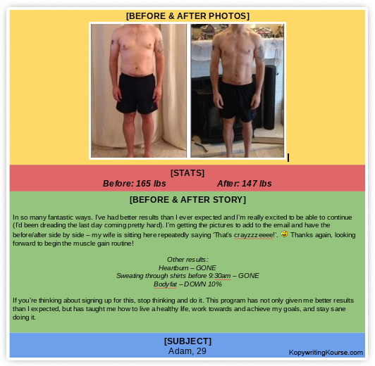
Before & After Template With Explanations
This Before & After example from Copywriting Kourse shows exactly how to structure a high-converting testimonial. You’re not just showing...
Copywriting/Before & After/Data
May 29, 2019
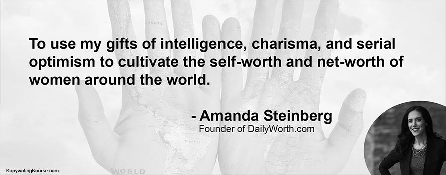
Amanda Steinberg Mission Statement
Amanda Steinberg’s personal mission sounds like a purpose... but it’s actually a power-packed marketing statement. It’s clear, confident, and audience-focused....
Copywriting/Motivation/Quotes
May 11, 2019
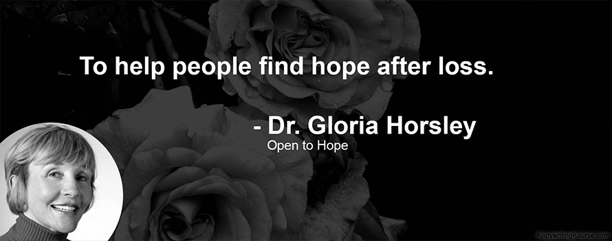
Dr. Gloria Horsley's Mission Statement
A single sentence can carry a whole brand. “To help people find hope after loss.” That’s not flashy or complex....
Copywriting/Quotes/Advice
May 11, 2019
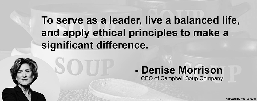
Mission Statement Quote From Denise Morrison
Denise Morrison nails it: real leadership isn’t about loud slogans or fancy titles. It’s about balance, ethics, and impact. This...
Copywriting/Quotes/Advice
May 11, 2019
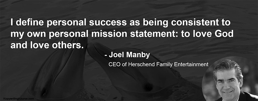
Mission Statement Quote From Joel Manby
Joel Manby’s quote nails something most people (and brands) overlook — success isn’t about doing everything, it’s about staying true...