Search for a command to run...
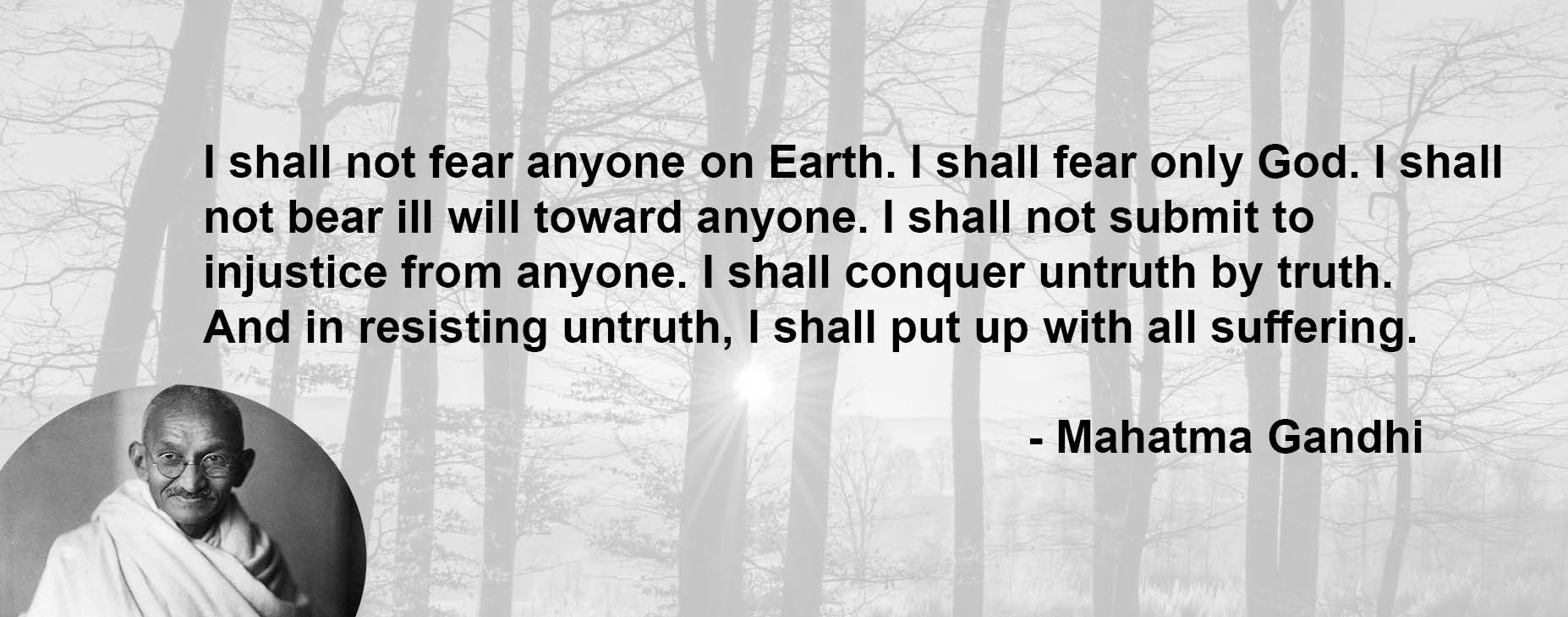
This image of Gandhi isn’t just spiritual—it’s a masterclass in branding. It’s his personal mission statement, short enough to remember...
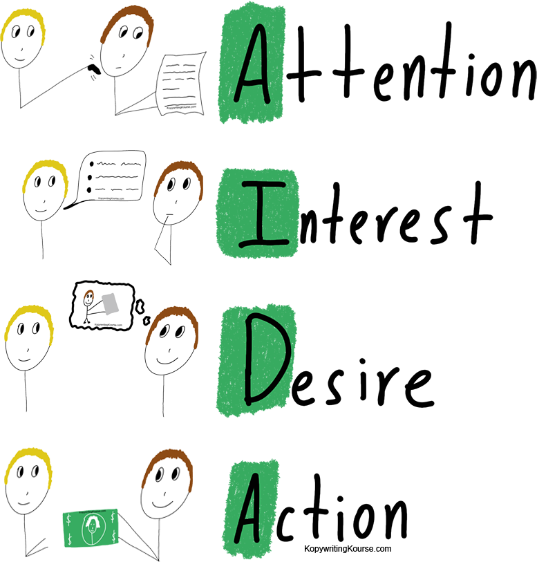
Every good ad, landing page, or email follows the same 4-step formula: AIDA. Attention, Interest, Desire, Action. This simple framework...
Ever wonder why some ads grab your attention and make you click, buy, or sign up? That’s the AIDA formula...
Learning copywriting alone is like trying to learn guitar from a textbook. Sure, you’ll get some notes right—but it’s way...
This direct mail piece from Lydian Dental nails it. It’s simple, warm, and makes booking a cleaning feel like grabbing...
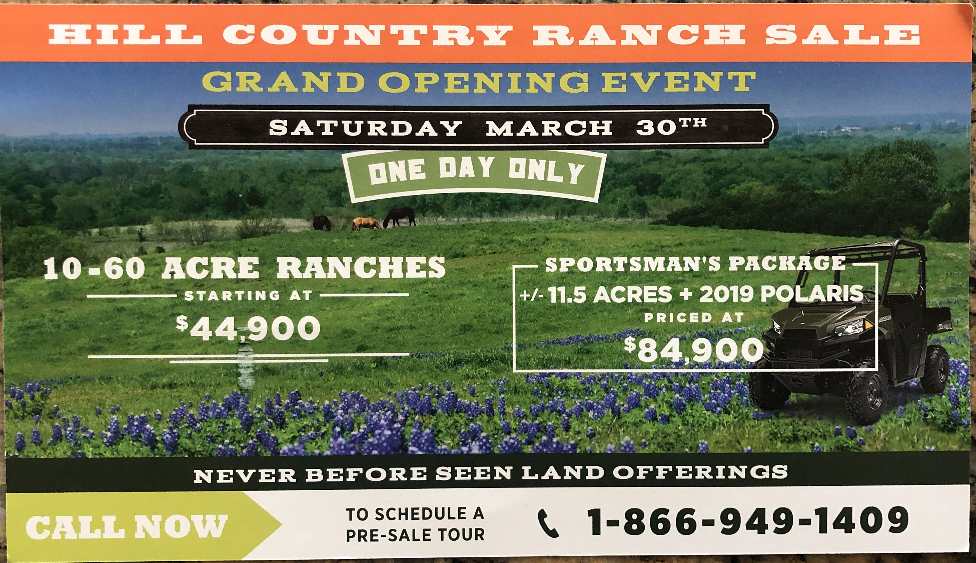
This ranch flyer packs every classic direct-response trick into a single postcard. It doesn’t just list land for sale—it makes...
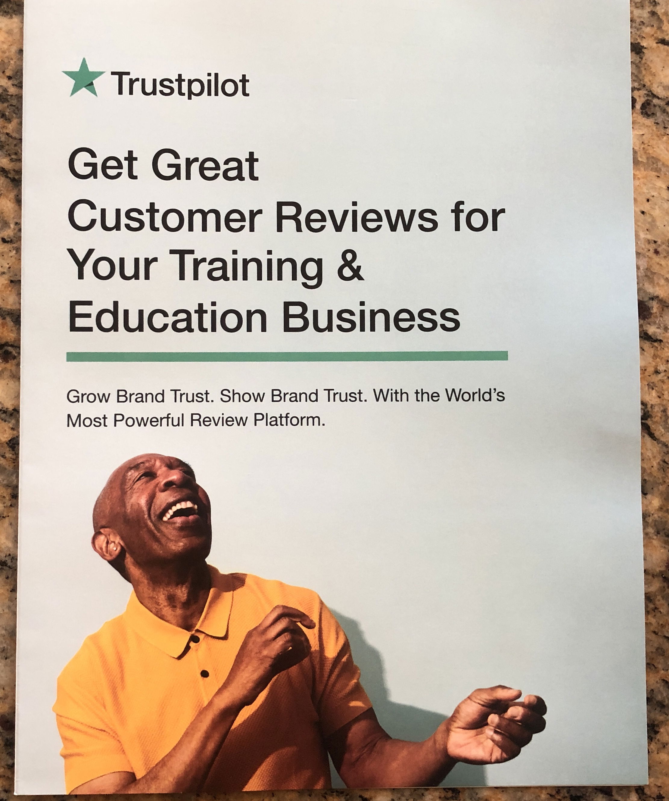
TrustPilot nailed it with this physical flyer that looks and reads like a digital sales page. It’s direct mail designed...
Everyone thinks creativity is a lightning bolt. It’s not. This video shows how you can manufacture creative ideas, even on...
Pedro Cortes’ website is a masterclass in selling the invisible — SaaS conversion copywriting. The design doesn’t just look good;...
A good “One Pager” turns a wall of info into a sales machine on a single sheet. This video breaks...
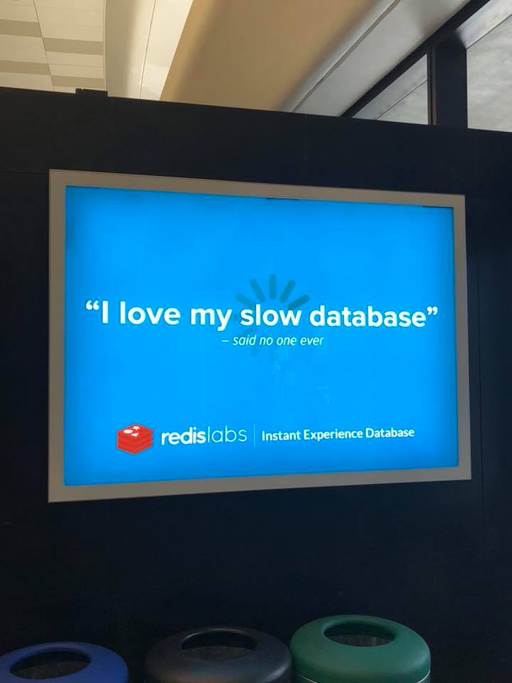
Ever notice how some ads grab your attention instantly? This Redis Labs billboard does exactly that by saying the opposite...
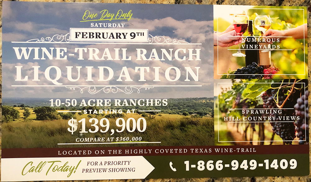
This “Wine-Trail Ranch Liquidation” flyer is a masterclass in manufactured urgency. It drops just days before the sale. There’s no...
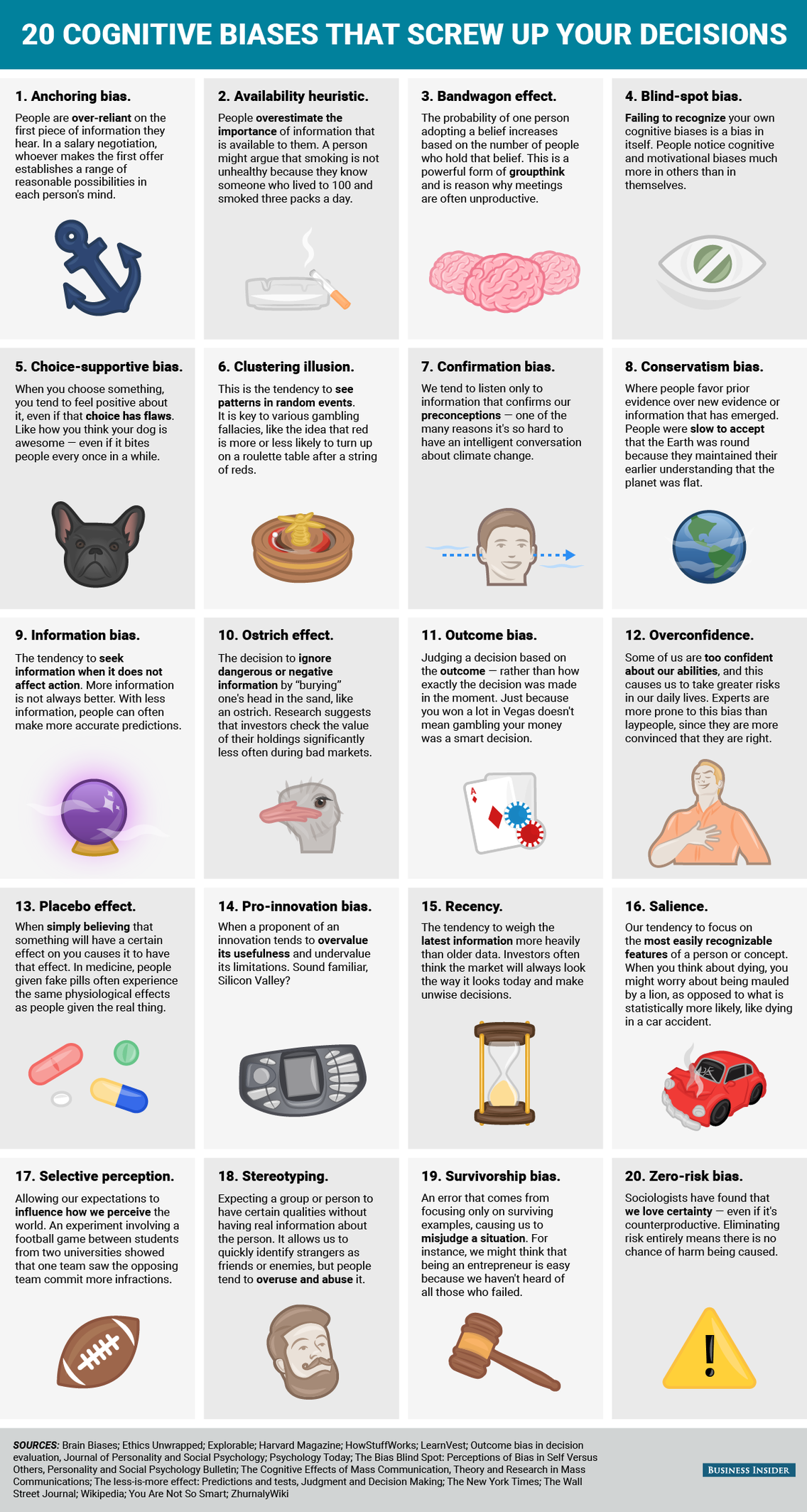
Ever wonder why people ignore data and stick to their gut? Cognitive biases are the sneaky shortcuts our brains take—and...
These pasta boxes use design so clever it practically smiles at you. Each pasta shape becomes part of a face...
Ever notice how good pricing pages make you pick the middle option? That’s not by accident. It’s a sneaky-smart technique...
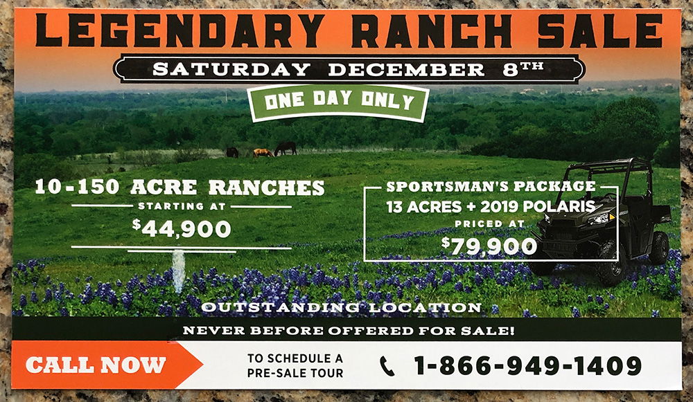
This flyer is a masterclass in urgency. Big, bold fonts. A clear “ONE DAY ONLY” headline. And irresistible price tags...
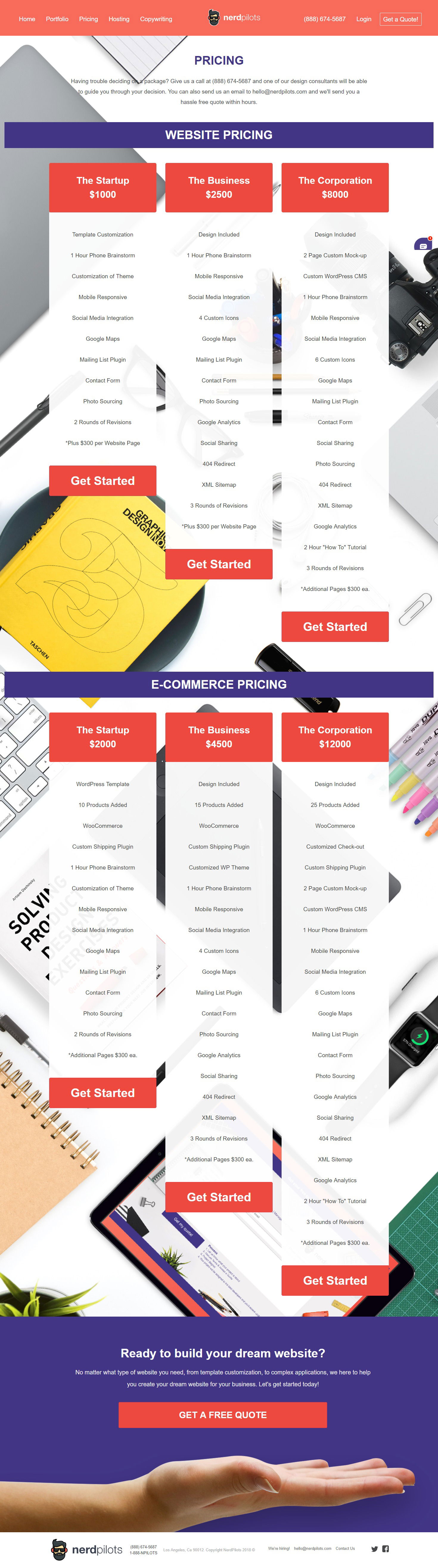
This pricing page by NerdPilots nails the classic 3-tier setup. It’s clean, clear, and makes choosing a plan feel easy....
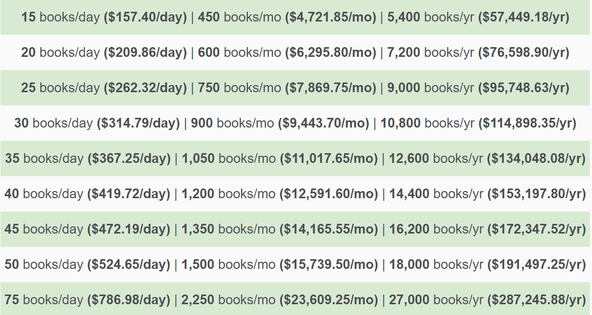
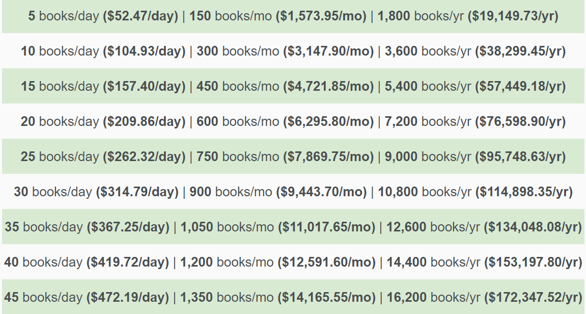
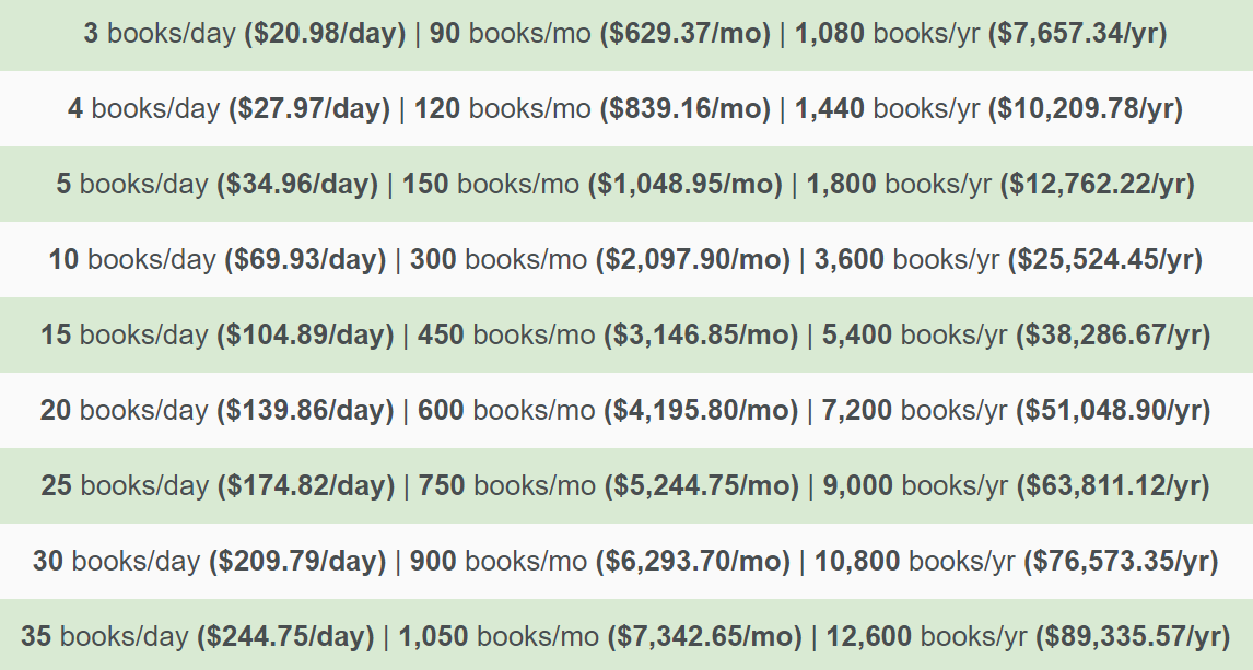
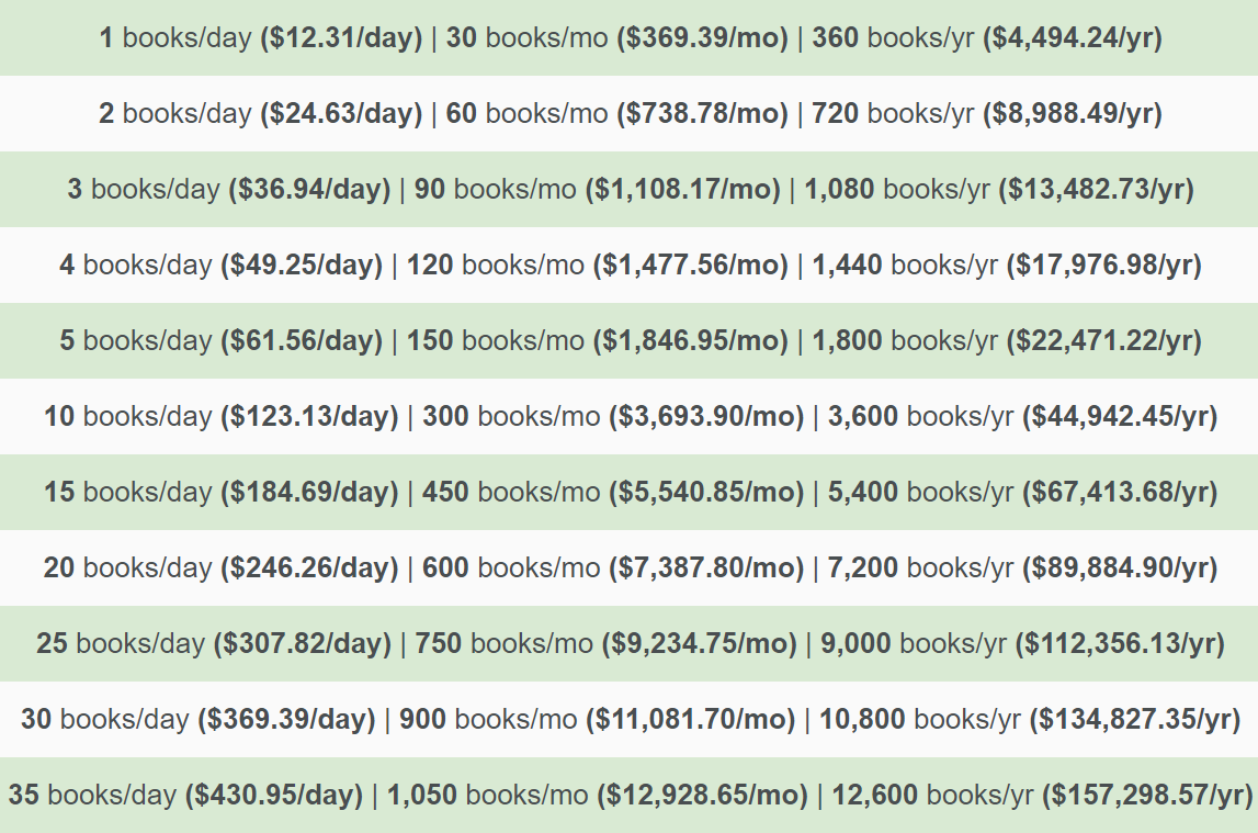
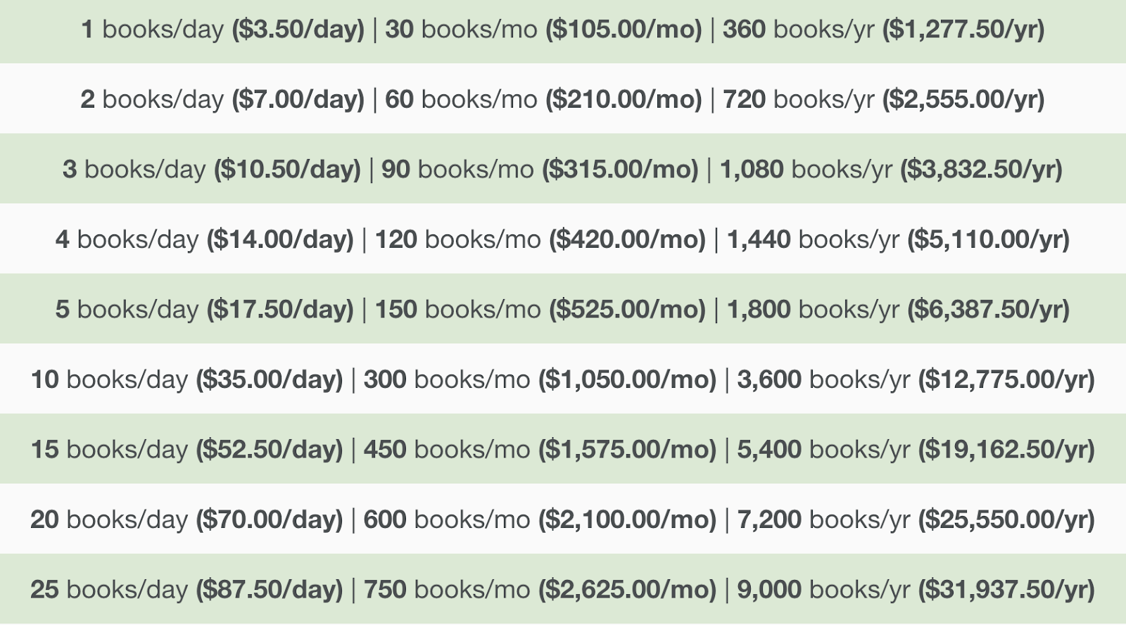
Ever dream of quitting your job to “just sell a few books online”? This chart makes that fantasy look surprisingly...
That little chart looks simple, but it’s a powerful sales mindset: it breaks down big, scary revenue goals into bite-size...
This simple chart makes book profits feel real. It breaks down how much you actually earn depending on how many...
Ever wonder how many books you need to sell to make a living? This chart nails it. It shows daily...
Most people think you need huge numbers to make real money. But this chart breaks it down: sell one $5...
This boat walkthrough hits that sweet spot between showing off features and keeping viewers hooked. It’s technical without being boring...
Ever seen a walkthrough video that makes you want to buy something right now? This wakesurf boat video nails it....