Ship Integrations in Minutes with Raven
Published on
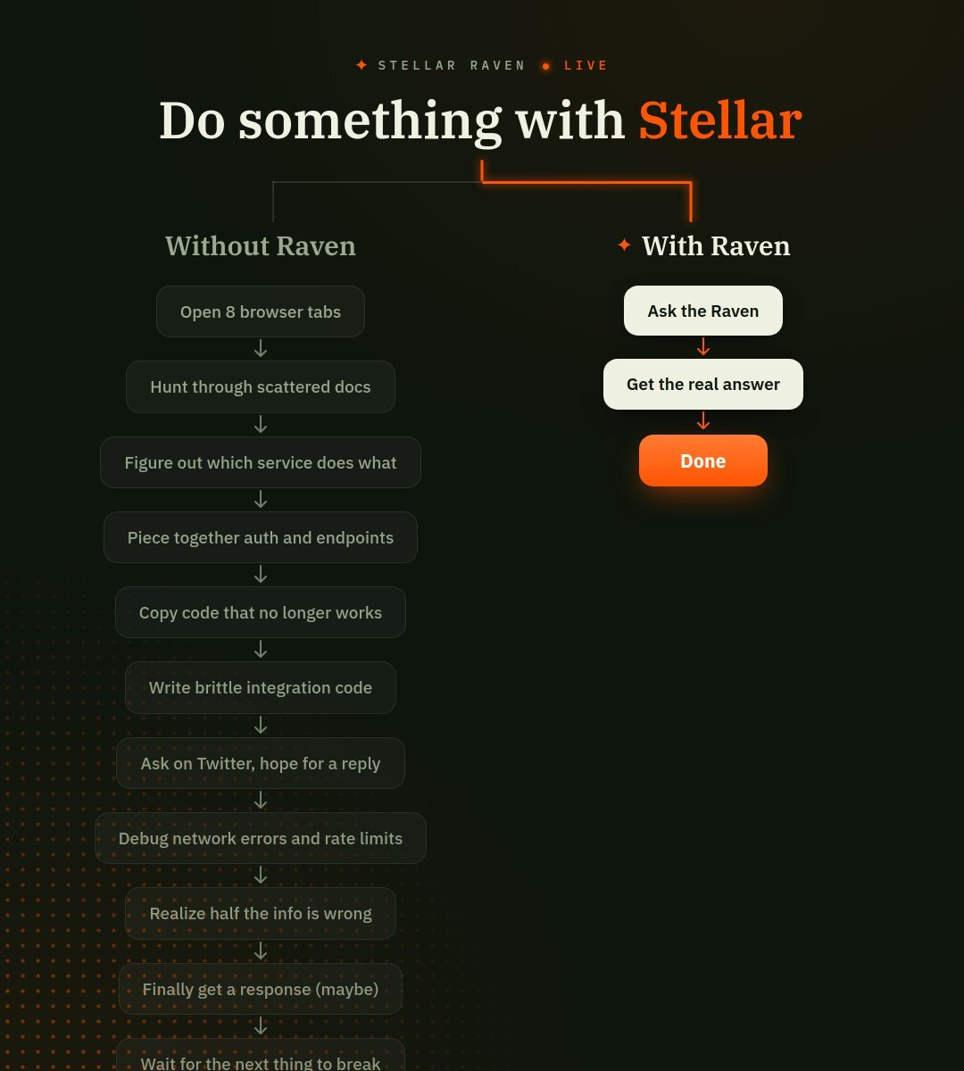
Integrations usually feel like death by a thousand browser tabs. The Raven team nailed this pain in one brutal graphic: a left side packed with tiny, annoying steps… and a right side that’s basically three buttons and a mic drop. This post breaks down that visual so you can steal the positioning, not the headache. If you ship integrations for a living, this is the story your landing page should be telling in one glance.
Ship integrations in minutes, not marathons
The Raven graphic doesn’t talk about models, embeddings, or any tech buzzwords. It just compares your current integration slog to the fantasy every engineer wants: type a question, get the right answer, ship. That contrast is the whole pitch. If your product makes a painful workflow vanish, map out the ugly, real-world steps like Raven does, then ruthlessly compress the “with us” side into the shortest possible path to Done.
The before-and-after Raven is selling
- Left column dramatizes the old way: research, guesswork, brittle code, and endless debugging.
- Each dark pill-shaped step stacks frustration until you feel tired just reading it.
- Right column is comically short: Ask the Raven → Get the real answer → Done.
- High-contrast orange buttons and the word “Done” make speed and certainty feel tangible.
- Headline “Do something with Stellar” keeps the focus on outcomes, not features.
Creative Variations
Analyzed by Swipebot
Loading analysis...