Us vs Them Comparison Ad Template
Published on
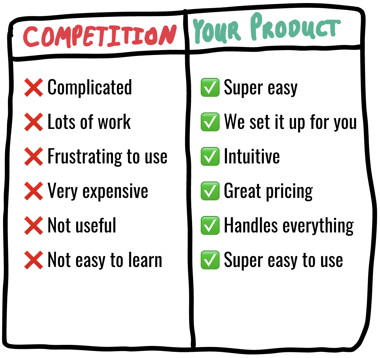
Us vs Them ads work because they let your prospect make a snap decision. One glance at the side‑by‑side comparison in this image and the brain screams, “Why would I ever pick the left side?” This is comparison shopping boiled down to a doodle. No paragraphs, no features list, just a visual punch in the gut.
How This Simple Chart Sells Fast
The left column screams pain: complicated, lots of work, frustrating, very expensive, not useful, not easy to learn. Red X’s everywhere. The right column is pure relief: super easy, done‑for‑you setup, intuitive, great pricing, handles everything, super easy to use. Green checkmarks everywhere. By exaggerating the contrast, the ad forces a yes/no choice instead of a long evaluation. The prospect doesn’t need to understand every feature; they just need to know which column feels like their future.
Why This Us vs Them Layout Converts
- Transforms vague benefits into a clear before/after snapshot.
- Uses colors (red X vs green check) to trigger fast emotional judgment.
- Stacks multiple pains on the competition and stacks multiple wins on you.
- Makes your product feel like the obvious, low‑friction option.
- Works in any format: image ad, landing page section, sales deck slide.
Real-World Ways To Use This

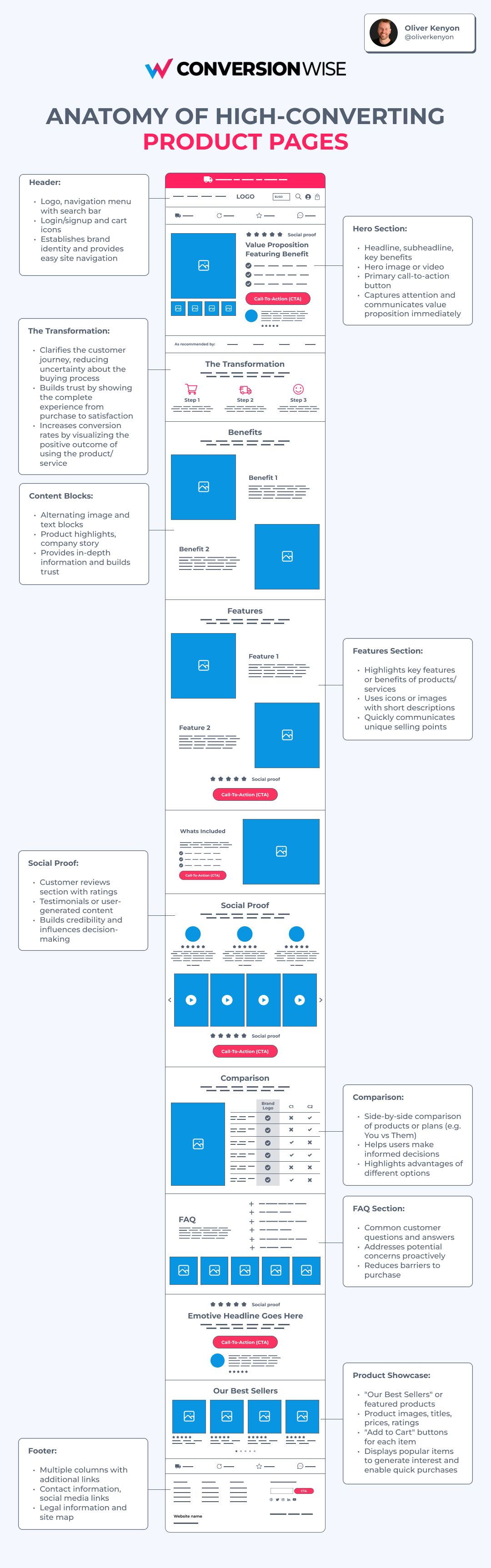
Shopify uses comparison tables in landing pages to show how selling on their platform is faster, simpler, and less technical than cobbling together plugins on competing systems.
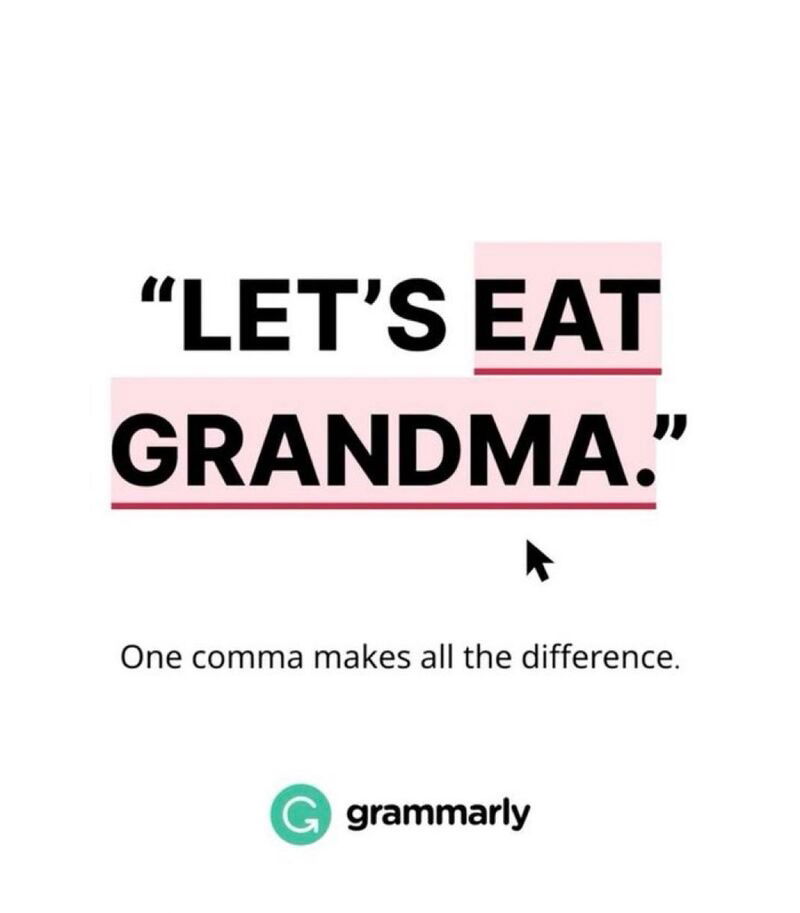
Grammarly uses side‑by‑side examples of unedited vs Grammarly‑edited text to visually demonstrate the contrast between confusion and clarity.
Creative Variations
Analyzed by Swipebot
Loading analysis...