1,913 Images and Illustration Examples That Teach Things
Drawings and illustrations and photography can transmit more information from human-to-human than text can. This board is perfect for designers and marketers seeking visual inspiration.
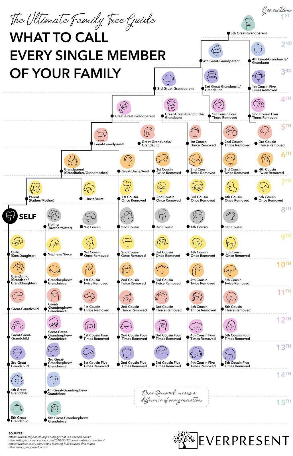
What to call every single member of your family chart
This Everpresent “Family Tree Guide” is a masterclass in making complicated info feel fun and understandable. Family connections across 15...

Pod 5 new upgrade ad for Eight Sleep
Eight Sleep nails the “upgrade offer” with this clean, visual email comparing the Pod 3 to the new Pod 5...
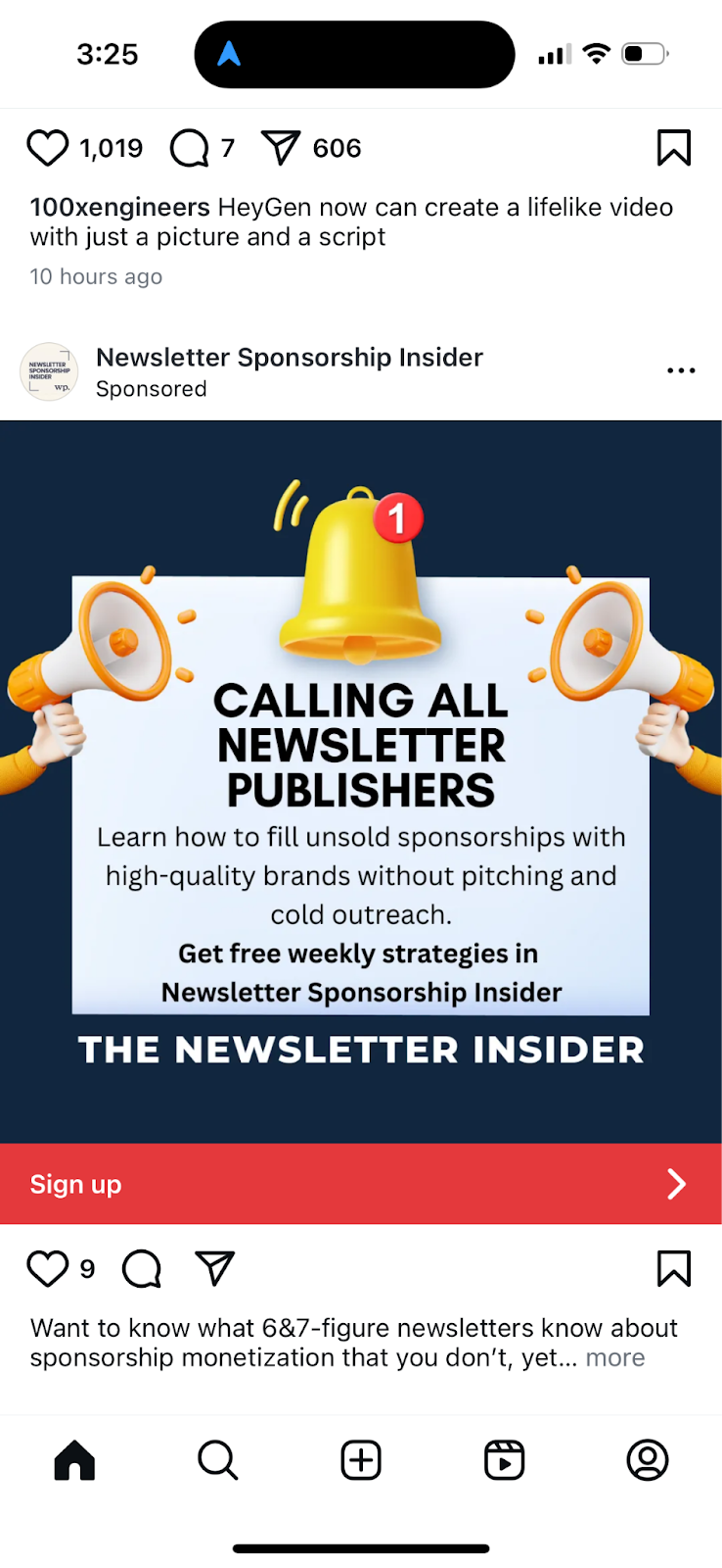
Straight to the point newsletter ad
This ad isn’t flashy, but it hits its mark hard. It’s laser-focused on one audience: newsletter publishers who need to...
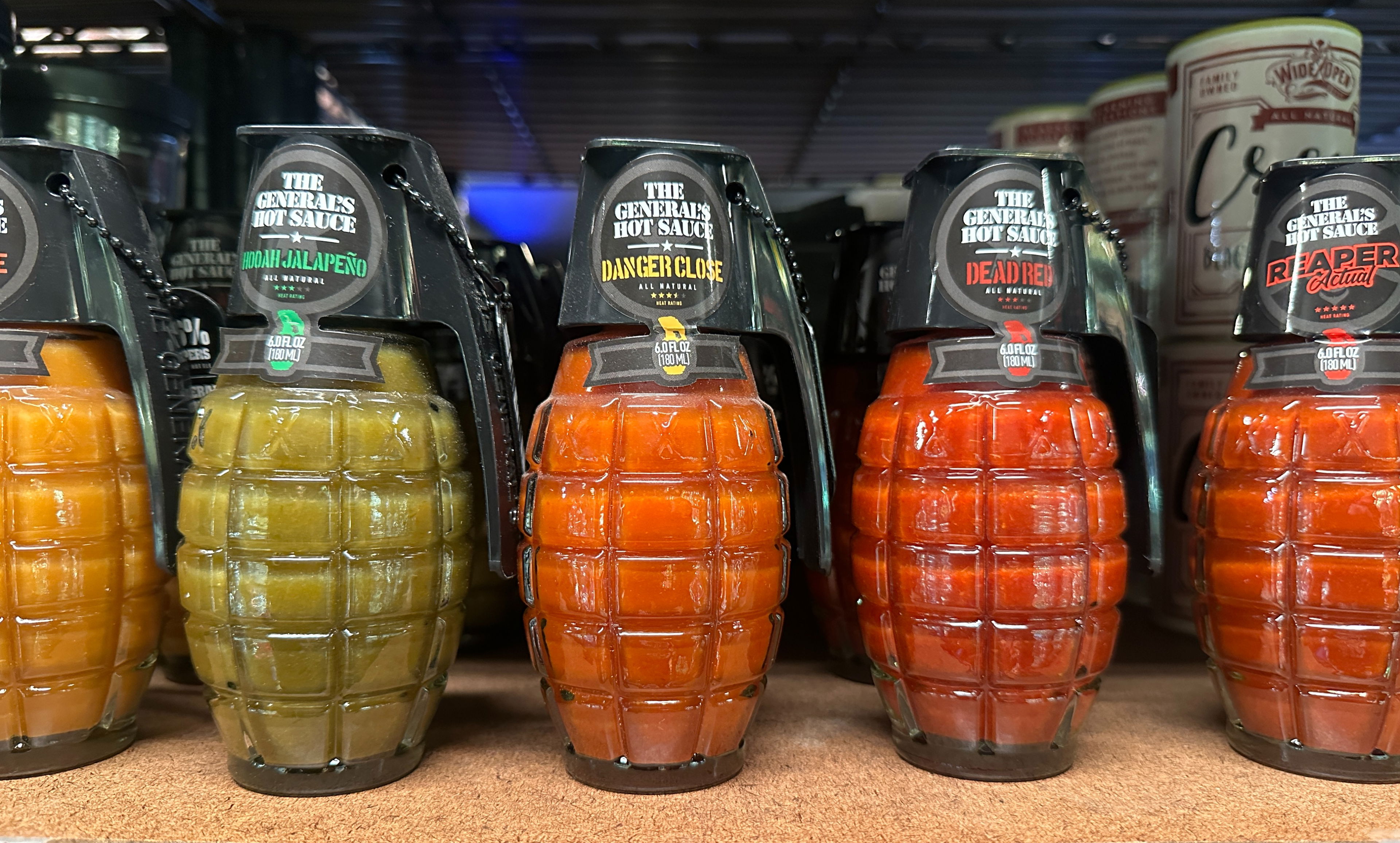
Grenade hot sauce packaging
Walk into any store’s hot sauce section and your eyes glaze over. But this grenade‑shaped bottle? Boom. Instant attention grabber....

Optimal eating for no brain fog
Look at this meal board: steak, eggs, avocado, salmon, watermelon, cheese. Clean, intentional, and visually satisfying. That’s not just a...
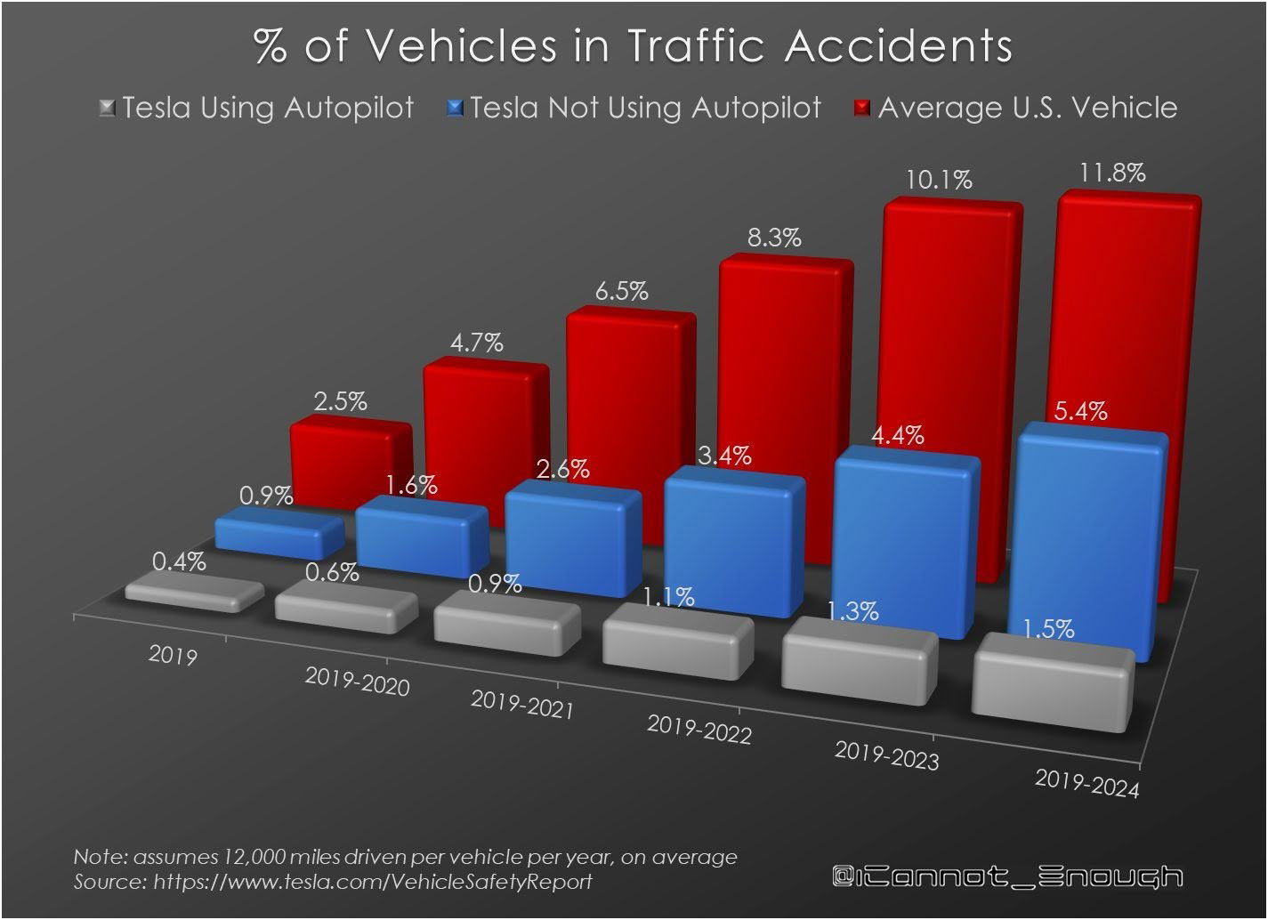
Percentage of vehicles in accidents
This Tesla chart shows something wild: accidents drop the more the car drives itself. Humans cause more chaos than code....
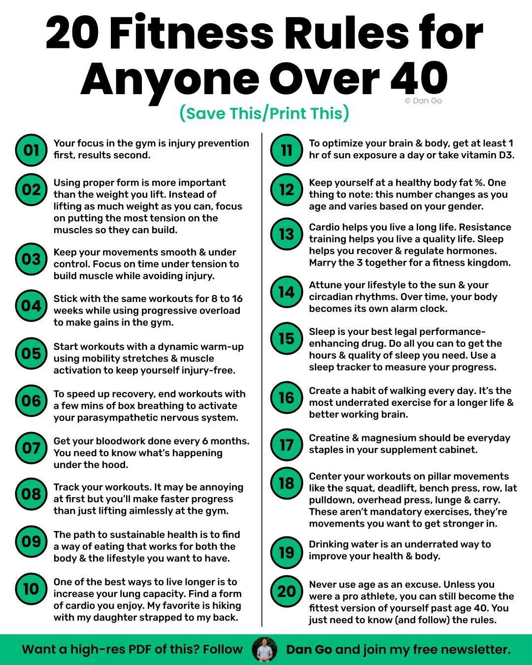
20 Fitness Rules for Anyone Over 40
This one-pager from Dan Go is a marketing workout plan. It’s visually simple, full of value, and laser-focused on a...
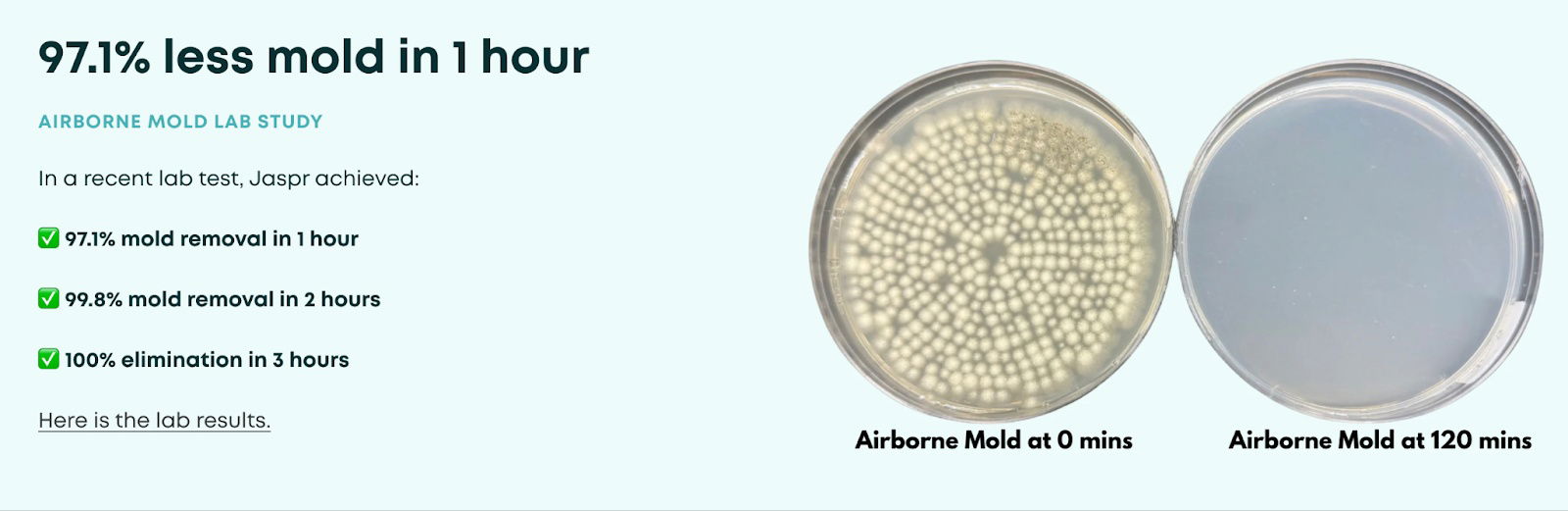
Jaspr Air before/after
Look at that: “97.1% less mold in 1 hour.” That’s ultra-specific. Not “kills mold fast” or “almost all mold gone.”...

Cool Tesla visual lineup
This single image tells the whole Tesla story — from the blocky Cybertruck to the sleek futuristic concept car. No...

Lex Fridman's Podcast Setup
Lex Fridman runs one of the world’s biggest podcasts… out of a single room in Austin, TX. The kicker? His...
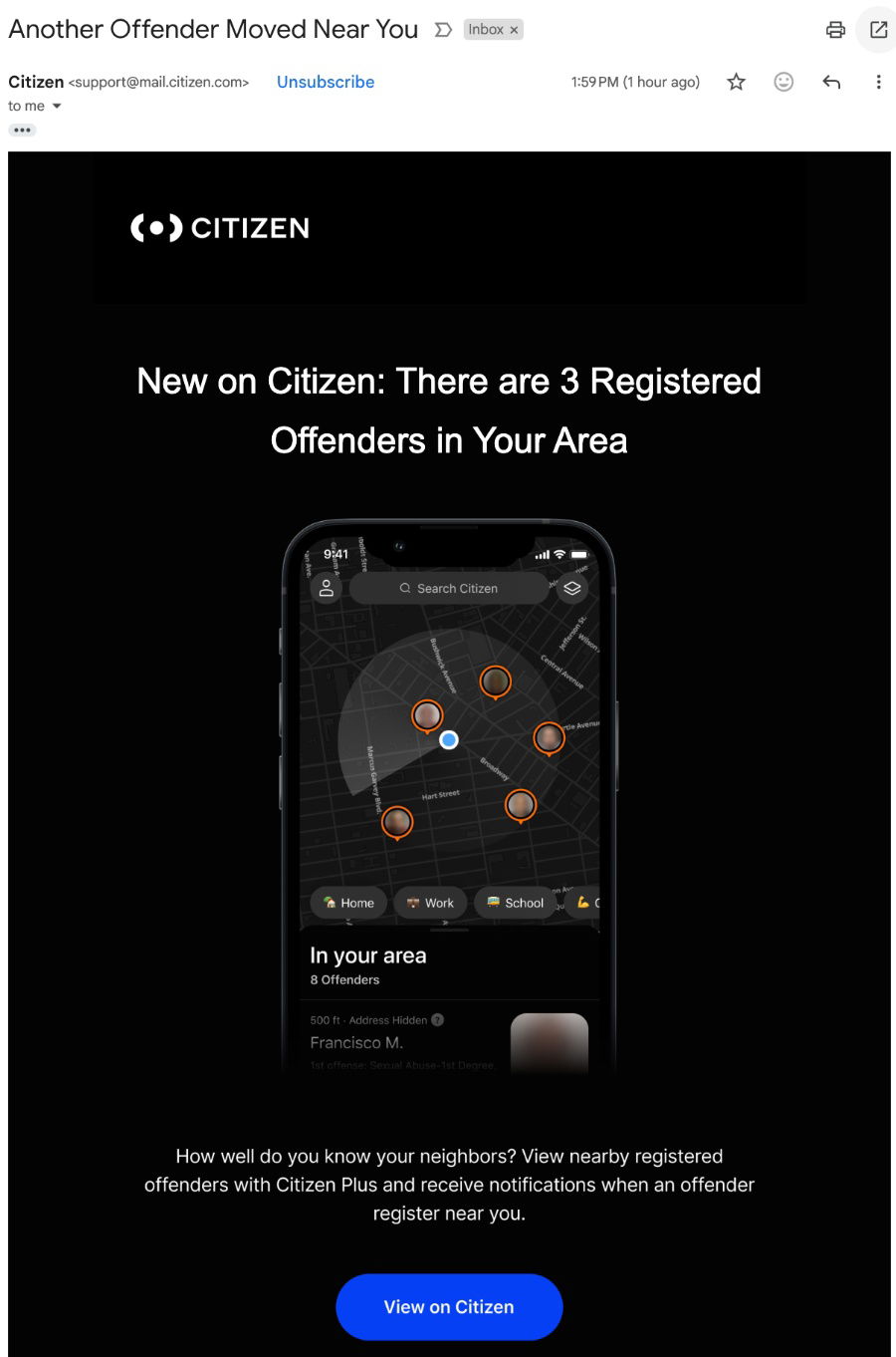
Fear-based (yet effective) email subject headline
This Citizen app email nailed one thing: immediacy. The subject line “Another Offender Moved Near You” triggers an instant emotional...
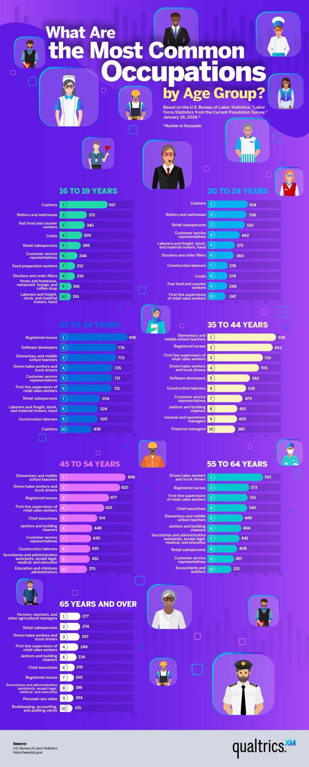
The most common jobs by age group graphic
This infographic from Qualtrics shows the most common jobs by age group. From teen cashiers to elderly farmers — it...
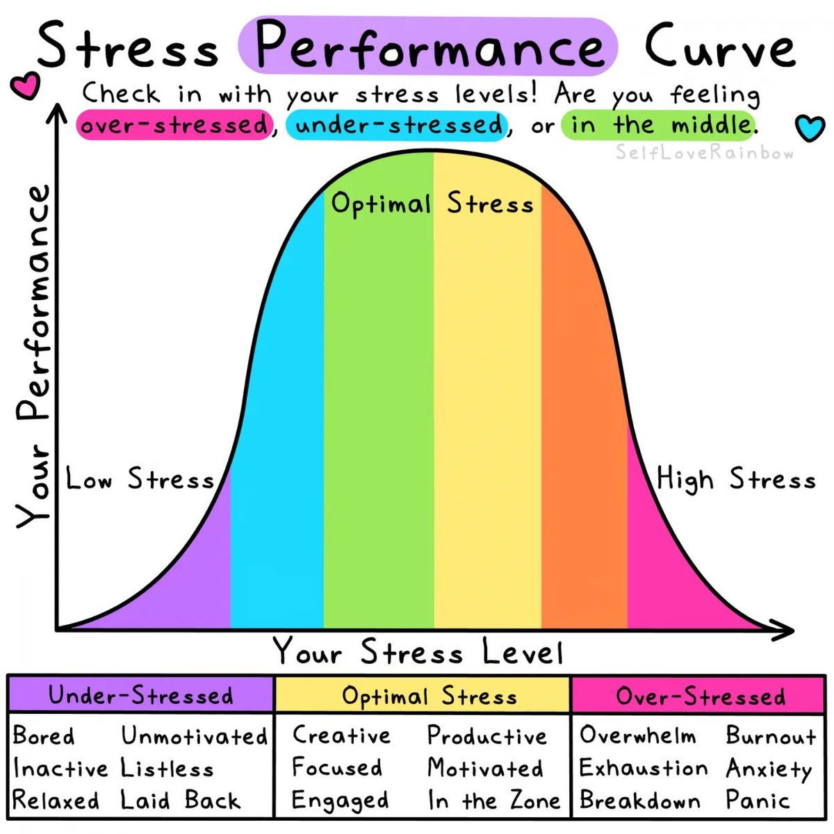
Stress Levels and Performance Curve
This chart nails something every marketer feels: stress can make or break performance. Too little, and you’re bored. Too much,...
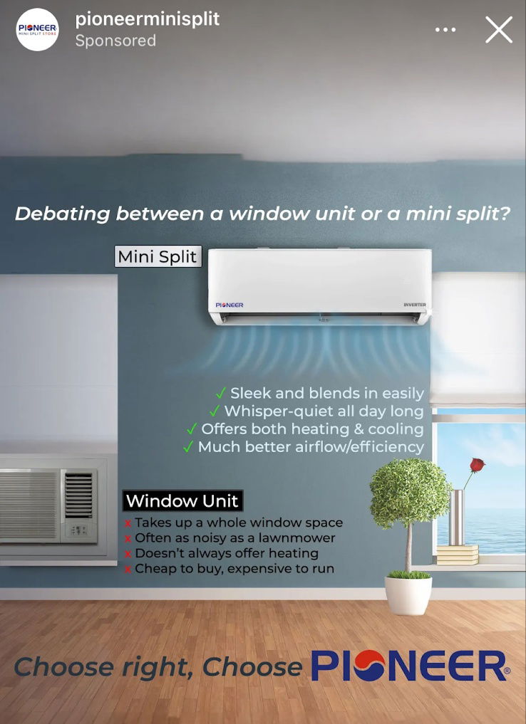
Mini-Split Air Conditioner ads from Pioneer.
Pioneer nailed this comparison ad. It’s simple, visual, and instantly communicates value without paragraphs of text. Marketing Analysis The image...

Good mosquito repellent solution ads.
This ad from Tougher Than Tom shows how to stop the itch both literally and figuratively. Simple product, clear problem,...
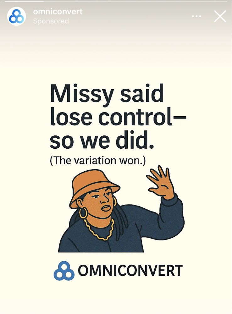
Hilarious lose control ad
Omniconvert nailed attention with this ad. It uses a clever play on words about “losing control” — a phrase from...
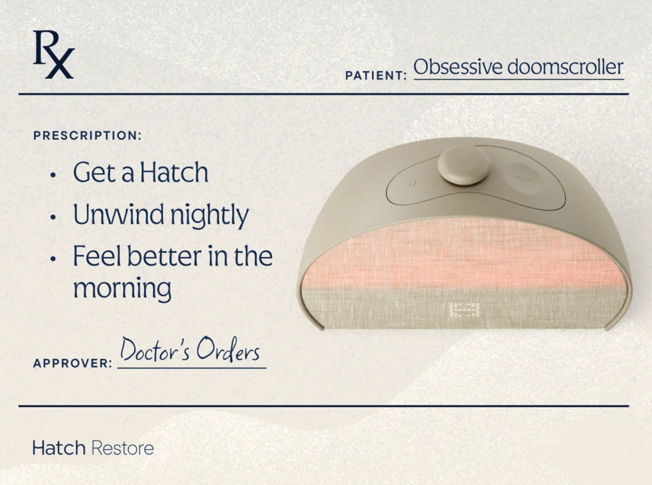
Hatch Restore Alarm Clock "Prescription" Ad
Hatch nailed this ad by packaging its sleep device like a doctor’s prescription. It’s playful, relatable, and instantly positions the...

Proper Hotel Mother's Day Gift Email
This Mother’s Day email from Proper Hotels nails emotional appeal and visual storytelling. It’s not just selling hotel stays—it’s selling...

Waymo vs Tesla Sensor Suite
This side-by-side image of Tesla and Waymo tells a clear story: one bets on fewer sensors and smarter software, the...

The Proof Economy - Hiring Builders not Bachelors
Look at that image. Tombstones for GPA, Dean’s List, SAT scores—all buried. Front and center? A sign that reads, “Now...
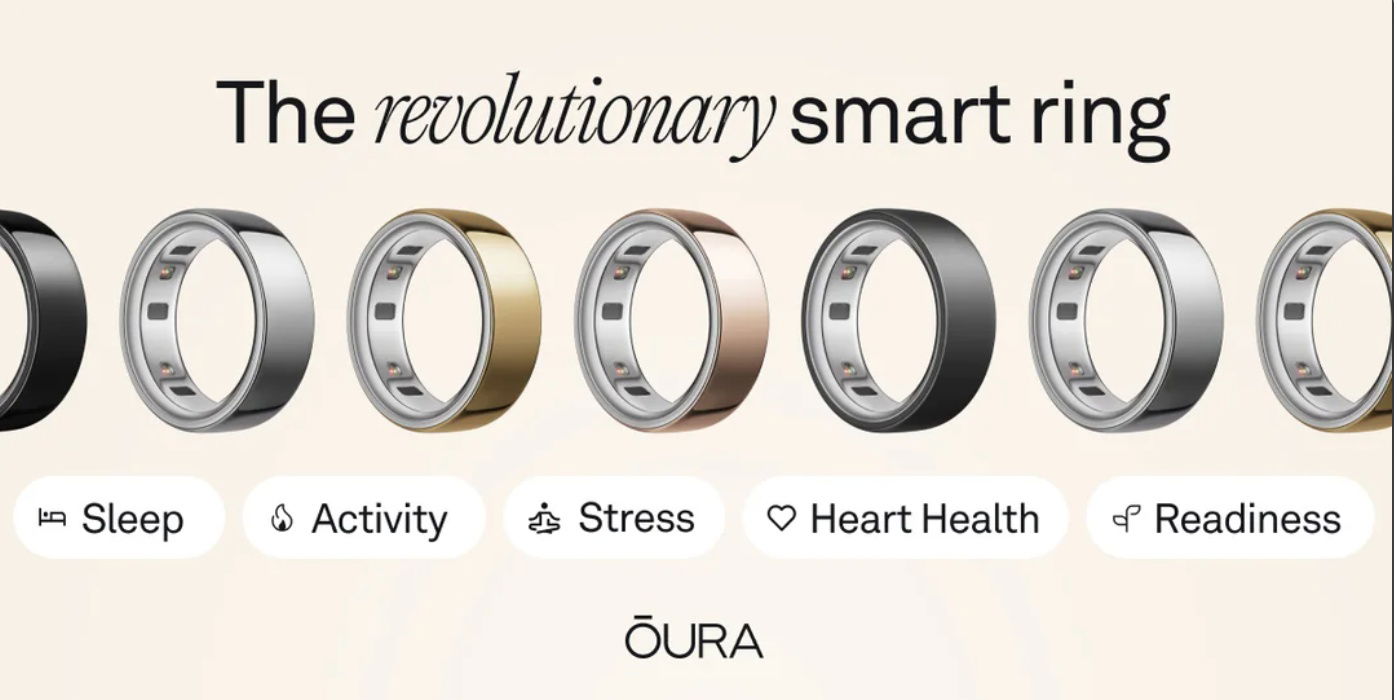
Oura Ring featured metrics ad
This Oura Ring ad is clean, classy, and laser-focused. It doesn’t scream features or technical specs. Instead, it taps straight...
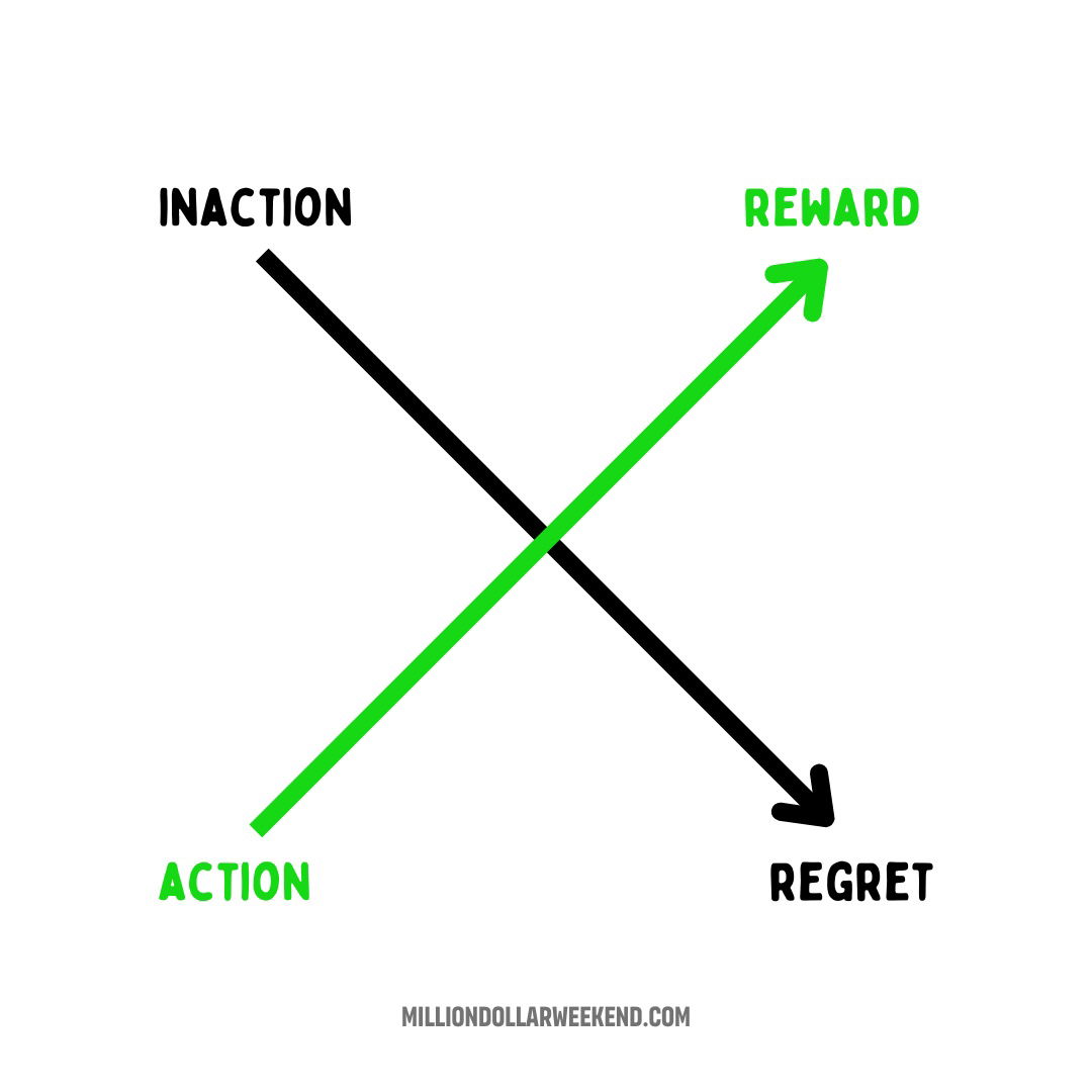
Action Gets Reward, Inaction Gets Regret
The chart nails it: Action leads up to rewards. Inaction spirals down to regret. Simple, visual, sticky. Marketing Analysis This...
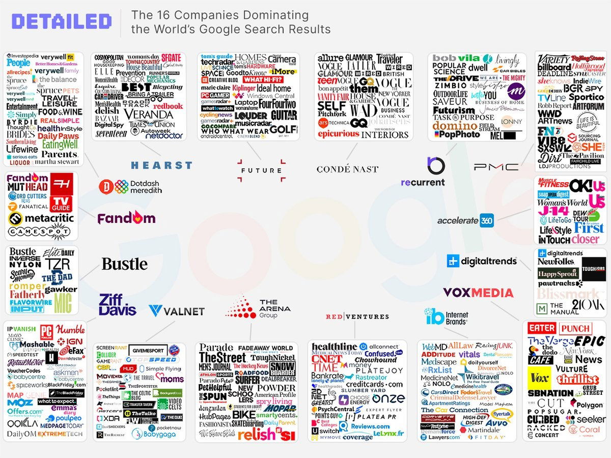
16 Companies That Dominate Google Search Results.
Take a look at this image. Sixteen giant media companies basically own your Google search results. What looks like hundreds...
AI will grow industries
Garry Tan’s tweet nails it: every time tech “kills” an industry, it actually supercharges it. The spreadsheet didn’t destroy accounting—it...