1,913 Images and Illustration Examples That Teach Things
Drawings and illustrations and photography can transmit more information from human-to-human than text can. This board is perfect for designers and marketers seeking visual inspiration.
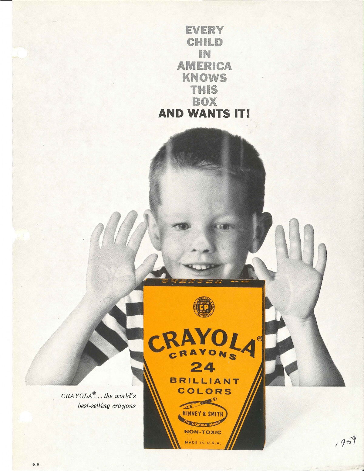
1959 Crayola Print Ad with Great Headline
This 1959 Crayola ad nails emotional marketing in one simple image: a kid pressed against a store window, eyes wide,...
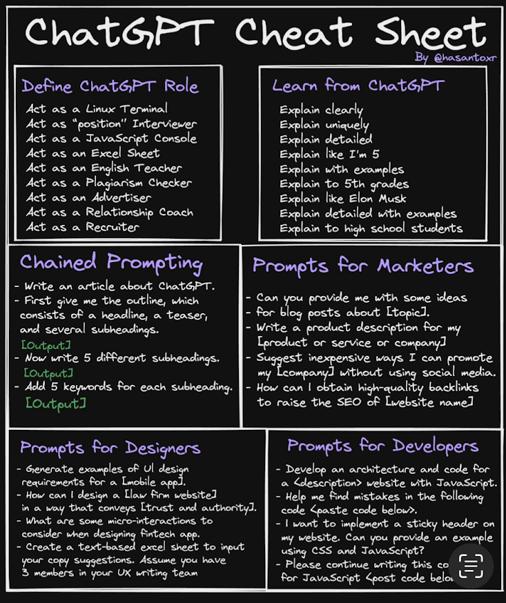
ChatGPT Cheat Sheet One-Pager
There’s a special kind of magic when you fit tons of value on a single page. The ChatGPT Cheat Sheet...

Cool graphic showing “Cheaper is not better”
Ever tried convincing someone that “cheap” can actually be expensive? This graphic nails it with running shoes. Two pairs side...

Visually showing procrastination
This ad nails it. It shows what you planned to do (green block: “Project A”) versus what actually happened (red...
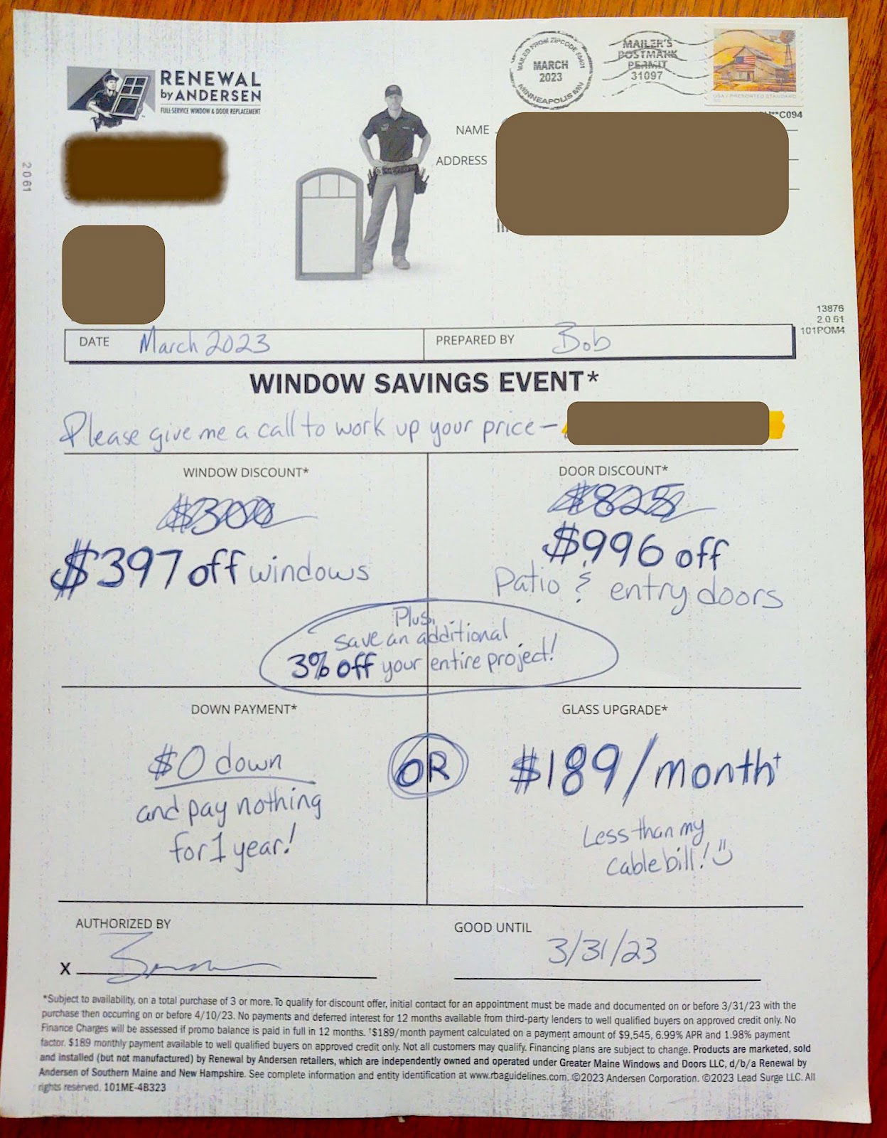
Attention-grabbing Handwritten Window promotion by Andersen
Most printed ads get ignored. But this one looks like a handwritten estimate—complete with scribbles, underlines, and even a little...

Qualifying a prospect in just 3 words
Ever seen a van that makes you want to stop and call immediately? This one nails it. Thornton & Grooms...

Before and After Transformation Photos
Before-and-after photos are marketing crack. They instantly stop the scroll, tell a full story, and make people imagine the transformation...

Daily to-do list
This image says it all: a plain yellow notepad, no distractions, no notifications. Just space to think. That’s the same...

Grabbing retirement asset chart
This “Rule of 25” retirement chart nails what every marketer dreams of: instant clarity. One glance, and you know exactly...

Show your work, not your tools
This graphic nails a simple truth: people don’t care how fancy your tools are—they care about what you create. The...
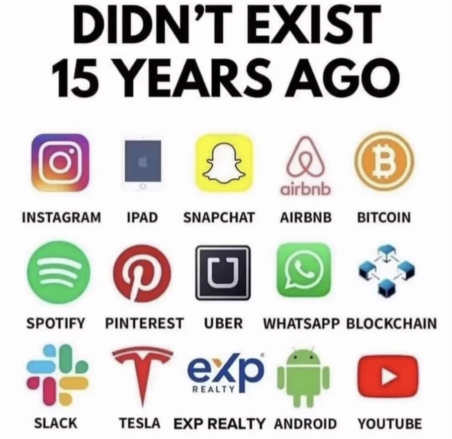
New technologies emerge quick
Crazy thought: none of these brands existed 15 years ago—and now they rule the world. This image is a masterclass...

Eight Sleep mattress simple graphic
This Eight Sleep image nails the “show, don’t tell” rule. In one glance, you instantly get it: one person likes...
White paint on brick trend before/after
This ad nails one of the oldest marketing tricks: show a dramatic “before and after.” The product? White paint. The...

17 equations that changed the world
This post showing 17 Equations that Changed the World racks up over 9k likes because it hits a sweet spot:...

Fun visual of most visited countries
This chart shows the most visited countries, but instead of plain bars, it stacks suitcases. Genius move. It turns dull...

1961 Ford Econoline “Price Advantage” Ad
The 1961 Ford Econoline ad doesn’t waste time. Big headline. Clear promise: “America’s lowest priced pickup.” Everything else just backs...

SXSW party and panel
At Noah Kagan’s SXSW content creation panel, the crowd was packed, the energy was high, and one attendee stole attention...

1912 mail order house plans
In 1912, this ad screamed: “$759 BUYS THE MATERIAL FOR THIS HOUSE.” For readers of Popular Mechanics, that sounded like...

Call to action based pizza ad:
In 1979, Jeno’s Pizza Rolls pulled off one clever marketing trick. They ran an ad asking people to write a...

Sphere of Influence
This image nails how modern marketing really works. It’s not just one post or one ad that drives sales anymore....

Lots of medical tourism data in simple chart
This simple chart comparing surgery costs across countries does something powerful: it shocks you. A $170,000 heart valve replacement in...

1951 “Instructional” Orange Juice Ad
This vintage orange juice ad doesn’t just sell juice. It sells quantity. Instead of saying “Drink orange juice,” it says...

Simple chart shows how much data NetFlix and YouTube take up
Netflix eats up 14.9% of all global internet traffic. YouTube grabs another 11.6%. Together, that’s one-quarter of all internet use....

Testimonial + Pic for the ultimate social proof
Parachute nails it with this ad. One quote, one elegant photo, and boom—you instantly believe the product’s good. No clutter,...