Jacques Spitzer: Make Your Product Design Sell Itself
Published on

7.0K
87
jacquesspitzer The #1 rule to selling anything is you can’t communicate with someone unless they are paying...
If your product blends into the shelf, your ads have to work overtime. But when your product design grabs attention on its own, people stop scrolling, stop walking, and actually look. That’s what turns packaging into a tiny billboard you don’t pay rent for. Let’s break down how to make your design do the selling before your copy ever shows up.
The Boxer Shorts Lesson
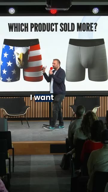
In the reel, Jacques is on stage with a giant slide behind him: on the left, loud American-flag boxer briefs with a huge eagle face; on the right, plain gray boxer briefs. Same category, same function. But only one of these can win in a social feed or on a retail shelf: the one that earns attention from across the room. That visual contrast is the entire sales pitch, no words needed.
How To Make Your Product Design Sell Itself
- Design for the camera first: ask, “Would this pop as a tiny square on Instagram?”
- Build in contrast: bold colors, clear shapes, or a single memorable icon like the eagle.
- Make it readable at a glance: from 10 feet away or in a 1-second scroll, the product story should click.
- Let the design embody the vibe: fun, premium, patriotic, minimal—pick one and exaggerate it.
- Assume no caption: if someone muted the sound and hid the text, your product should still be the ad.
Brands Letting Design Do the Heavy Lifting
Coca-Cola uses its red can and classic script so powerfully that a split-second glimpse of the package instantly signals the brand and the feeling.
Glossier leans on minimal, pastel packaging that photographs beautifully, turning every customer’s bathroom shelf into free social content.
Liquid Death designs tallboy cans that look like hardcore beer so the packaging sparks curiosity, photos, and shares for a simple can of water.
Analyzed by Swipebot
Loading analysis...