Search for a command to run...
Copy.ai didn’t just launch an AI tool. It launched at the perfect time—right as GPT-3 started blowing minds across the...
Clean. Simple. Visual. This homepage nails the golden SaaS rule: just show the product. Testimonial.to doesn’t waste time with fancy...
Look at this side-by-side. On the left, text testimonials. On the right, video testimonials. You can practically feel the difference....
Gagan Biyani helped create Udemy, a $3B online learning giant. Now he’s building the next evolution of online learning: cohort-based...
Mailshake’s pricing page is a masterclass in reducing friction. It doesn’t just show prices, it builds confidence with proof, protection,...
This 1970s Palmolive ad didn’t just sell dish soap—it sold hand care disguised as cleaning. “You’re soaking in it!” became...
The Tacklebox homepage is a masterclass in clarity and persuasion. It speaks directly to would-be founders who still have a...
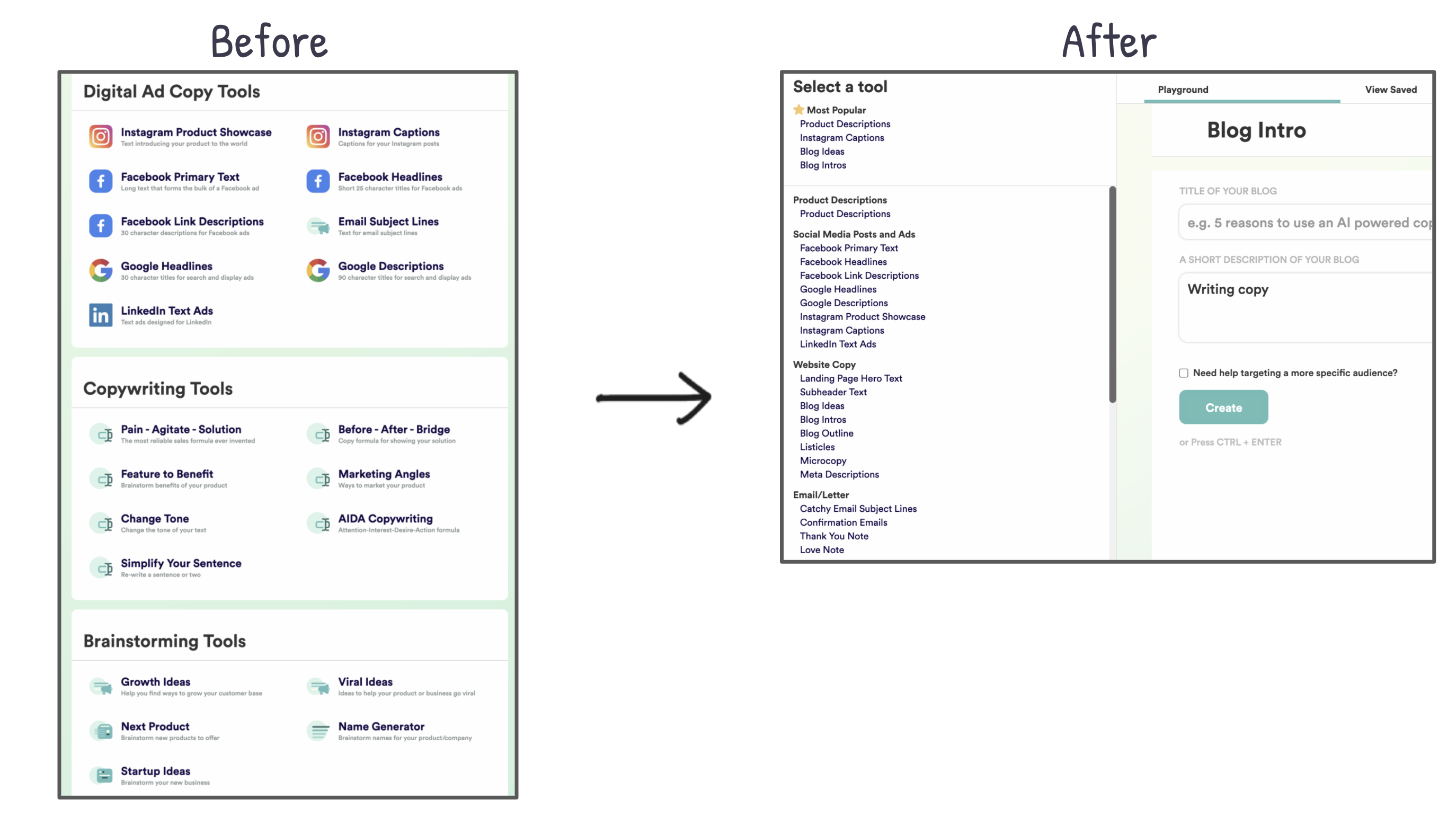
Small UI change, massive impact. Copy.ai replaced a cluttered layout with a scrollable sidebar menu—and turned a 6-screen hunt into...
This table from Tacklebox shows how a single visual can explain complex offerings in seconds. It compares two products—their 7-week...
Sujan Patel’s life looks like controlled chaos: runs 5+ companies, invests in 10+, has 3 kids, a wife, supercars, motorcycles......
Nike’s ad nails the balance between sleek design and clear communication. Every arrow and label tells you exactly why this...
In 2011, KopywritingKourse.com looked like the inside of a copywriter’s notebook—quirky, handwritten, and full of personality. By 2021, the site...
Atoms pulls a clever move here. Instead of dodging the “$129 is pricey” complaint, they own it. The copy calmly...
Doctors have one of the toughest “sales jobs” on the planet. They have to convince people to take actions they...
Noah Kagan just crossed 100k subscribers on YouTube—and he’s not stopping. In a quick interview, he rapid-fires his lessons on...
Amazon’s first landing page looked like a college homework project: plain, gray, and full of text. Today’s version looks like...
The HelloFresh sales page is a masterclass in simplicity and persuasion. It grabs attention with a big, juicy offer —...
This ad nails it. Instead of screaming “download now,” it gives you an actual mini fitness plan right in the...
This pricing chart nails the classic 3-tier structure: Starter, Growth, and Business. Notice how each plan gets a little better,...
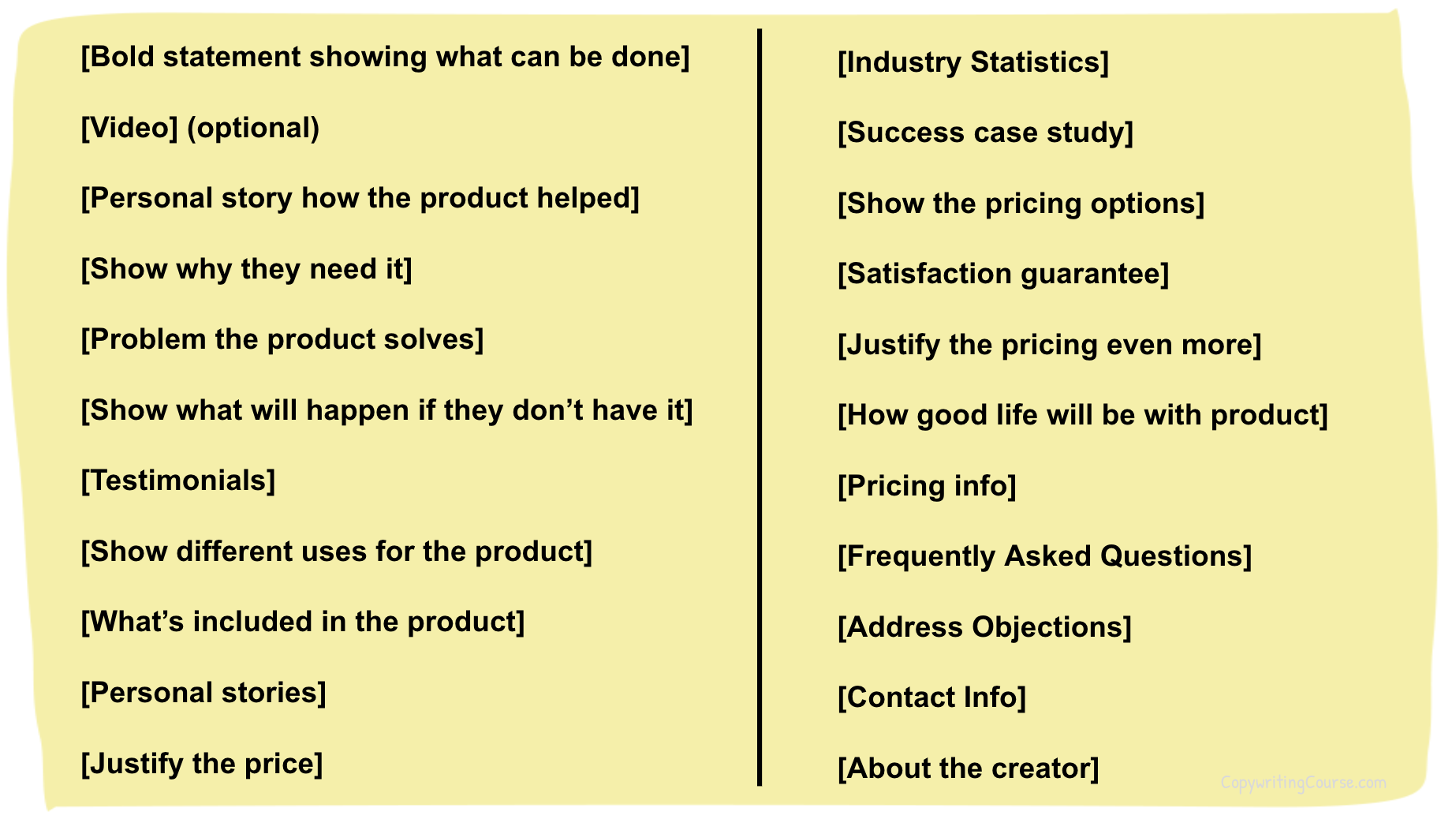
This outline is pure gold for anyone building a sales page. It’s basically a plug-and-play checklist showing what to include...
In 1994, AT&T released the very first banner ad in internet history. The line: “Have you ever clicked your mouse...
This 1978 Sears ad for a “printing calculator” nails clarity with one simple trick: text formatting. It bolds, italicizes, and...
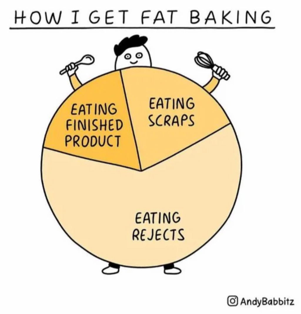
This cartoon “pie” chart nails a universal truth with humor: we eat way more “testing” our baking than actually eating...
This 1966 Wonder Horse ad looks like it's about a fun toy for kids. But it’s really selling peace of...