Search for a command to run...
Writers used to disappear for years, then resurface with a finished masterpiece. Now the playbook’s flipped. You can share dozens...
Glowforge did something clever. Instead of a boring form asking for your “name” and “email,” they turned it into a...
These vintage Silly Putty ads nailed the formula for irresistible advertising. They didn’t just tell kids what the toy did—they...
This vintage ad nails what most modern marketers forget: clear, simple benefits. In just a few lines, it sells a...
Basecamp nailed their testimonial page by showing what life looks like before and after using their product. It’s not just...
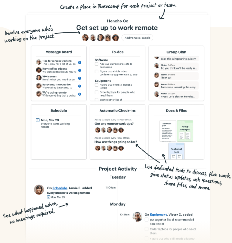
Basecamp nails clarity with this annotated screenshot. Each callout explains what a section does, why it’s useful, and how it...
Most people already have a “mini business” inside their daily routine. The trick is spotting it and packaging it up....
After 20 years of selling consulting, physical stuff, and digital products, one thing stands out: digital wins. Selling bits instead...
This old-school ad nails it: you can feel the warmth. The steam, the copper kettle, the cozy lighting. It’s not...
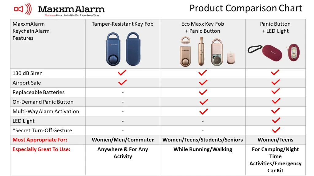
Ever tried explaining product differences in words… and watched eyes glaze over? This chart from MaxxmAlarm shows exactly why pictures...
Ryan Moran from Capitalism.com drops insight on choosing the best platform to sell your products. Spoiler: it’s not about the...
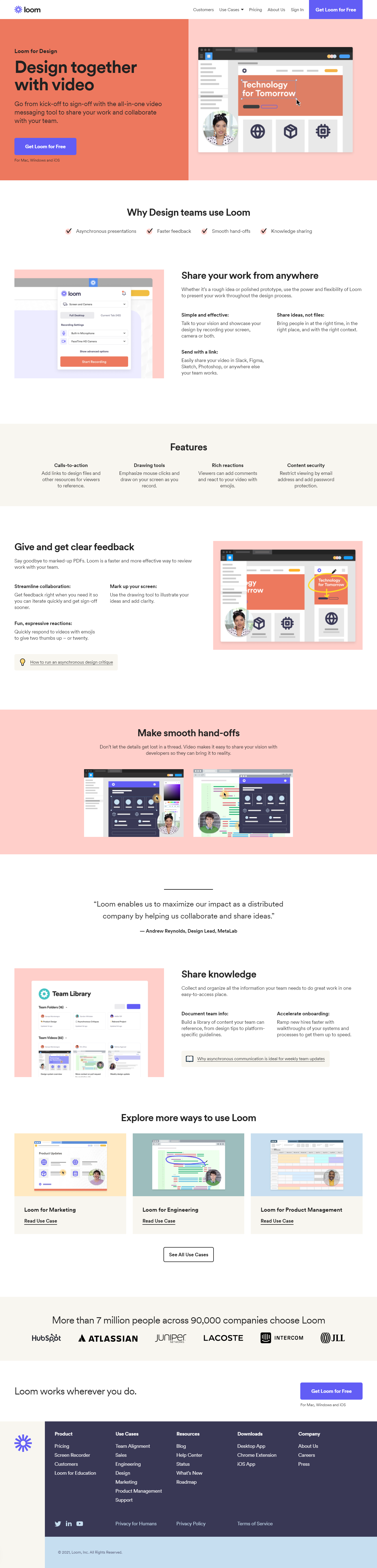
Loom nailed a smart marketing move: instead of one generic landing page, they built different ones for each team —...
Loom nailed this landing page. It shows exactly how design teams can use Loom, using real visuals, short copy, and...
One cold email wins deals. The other gets ghosted. The difference? The first one leads with value, while the second...
Thirty years ago, nobody thought “YouTube strategist” or “Notion template seller” would be real jobs. Now they’re everywhere. The internet...
This fight poster for Ali vs. Foreman proves you don’t need fancy graphics to grab attention. A yellow background, two...
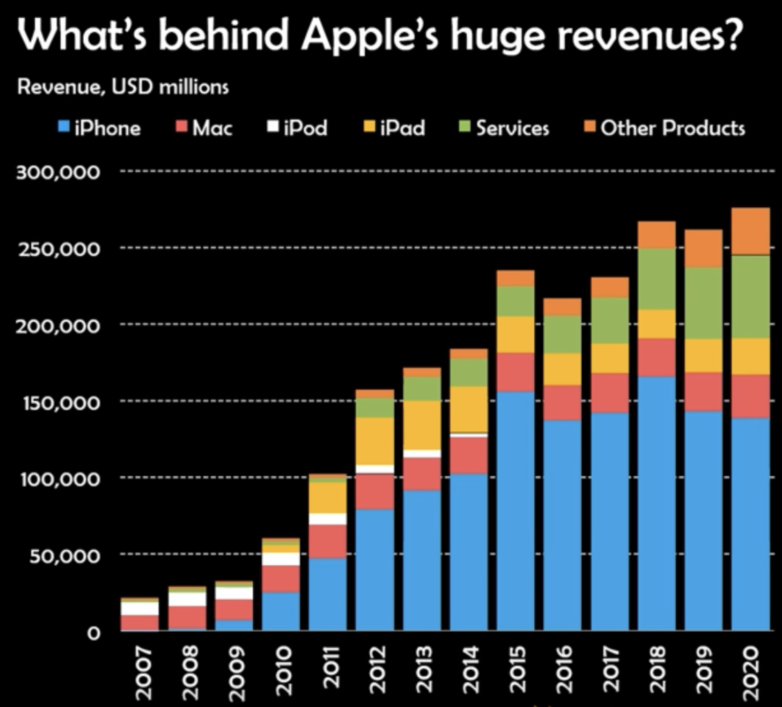
Ever stared at financial reports and felt your brain melt? This Apple revenue chart is the cure. With clean colors...
This map shows dog and cat ownership by state using just color gradients. No big tables. No long explanations. Yet...
This isn’t a Vogue cover. It’s “DOGUE.” And yet… it feels totally real. That’s the magic of good design and...
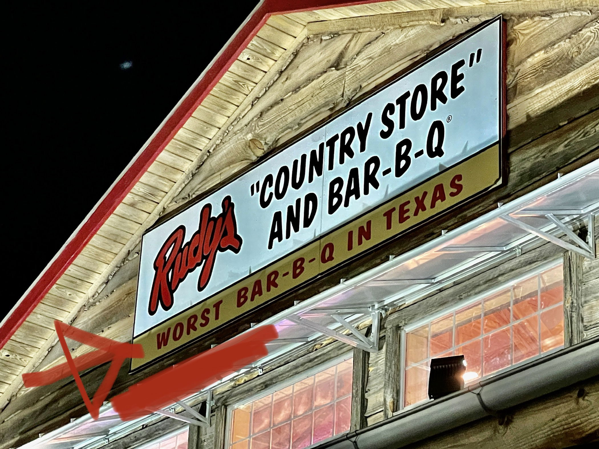
Rudy’s BBQ in Austin calls itself the “Worst BBQ in Texas”. That’s the whole sign. And that’s genius. Why this...
This ad nails the curiosity hook. It doesn’t say “buy wine,” it says “2 MIT grads built an algorithm to...
This signup page from The Generalist nails the “trust me, I’m worth it” vibe perfectly. It doesn’t just ask for...
This pricing table nails clarity, psychology, and conversion all at once. Three tiers: Free, Premium, and Believer. Each feels intentional...
This newsletter from Aaron Allen & Associates is a great example of how to keep a B2B audience hooked with...