Search for a command to run...
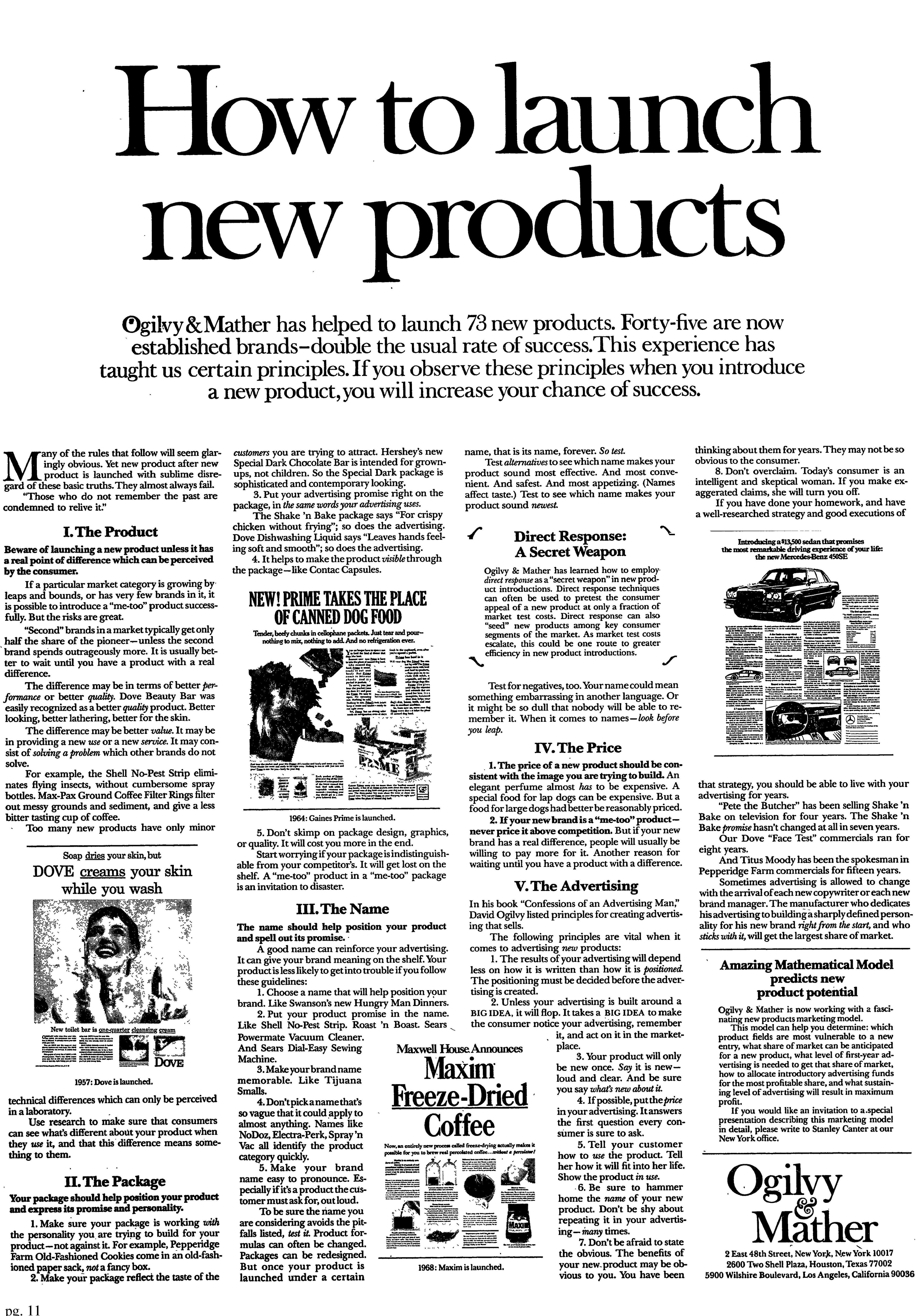
This Ogilvy & Mather ad doesn’t just talk about launching—it shows how to do it with style. Using heat maps,...
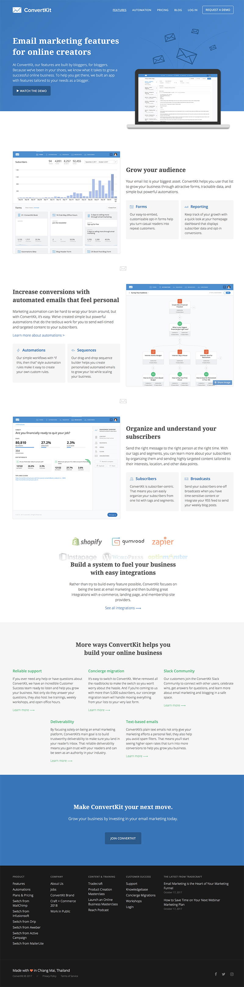
ConvertKit nailed their feature page by keeping words light and visuals heavy. Instead of explaining what their tool can do,...
MemberMouse’s homepage skips the fluffy copy and jumps straight into action. Each section has a short demo video showing the...
Basecamp’s “How It Works” page doesn’t feel like marketing. It feels like someone friendly saying, “Here, let me show you.”...
The Hustle’s homepage does one thing really well: it gets your email. No extra buttons, links, or fluff. Just a...
Brian Dean’s homepage is like a Jedi masterclass in lead generation. Every scroll gives visitors another reason to drop their...
MailShake keeps it super simple. Their homepage video isn’t flashy—it’s just a screen recording showing the software actually solving a...
This Tyndall Condos flyer nails the “luxury lifestyle” vibe with one simple move: it leads with a photo of the...
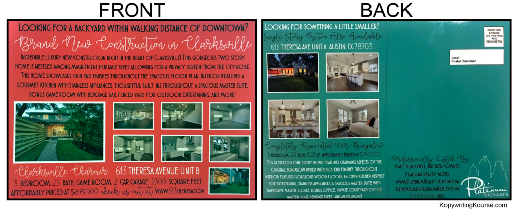
Ever seen a postcard stuffed with info that somehow still looks clean and grabs your attention? This real estate flyer...
This Austin real estate flyer doesn’t sell condos—it sells sunsets over the skyline. That full-width photo of downtown glowing at...
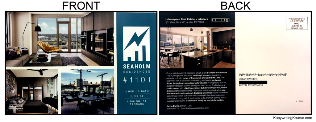
This Seaholm Residences flyer doesn’t just look nice—it’s a visual funnel for your eyeballs. Every design choice has a purpose:...
This condo flyer doesn’t shove sales copy in your face. It whispers luxury. The sleek pool shot does nearly all...
This apartment flyer grabs your eyeballs before you even read a word. It’s wide, glossy, and bursting with visuals that...
This real estate flyer for The LAAN Residences is a masterclass in eye control. It looks simple, but the heatmap...
This apartment flyer from The Millennium grabs you by the eyeballs. The headline “Up to 2 MONTHS FREE RENT” glows...
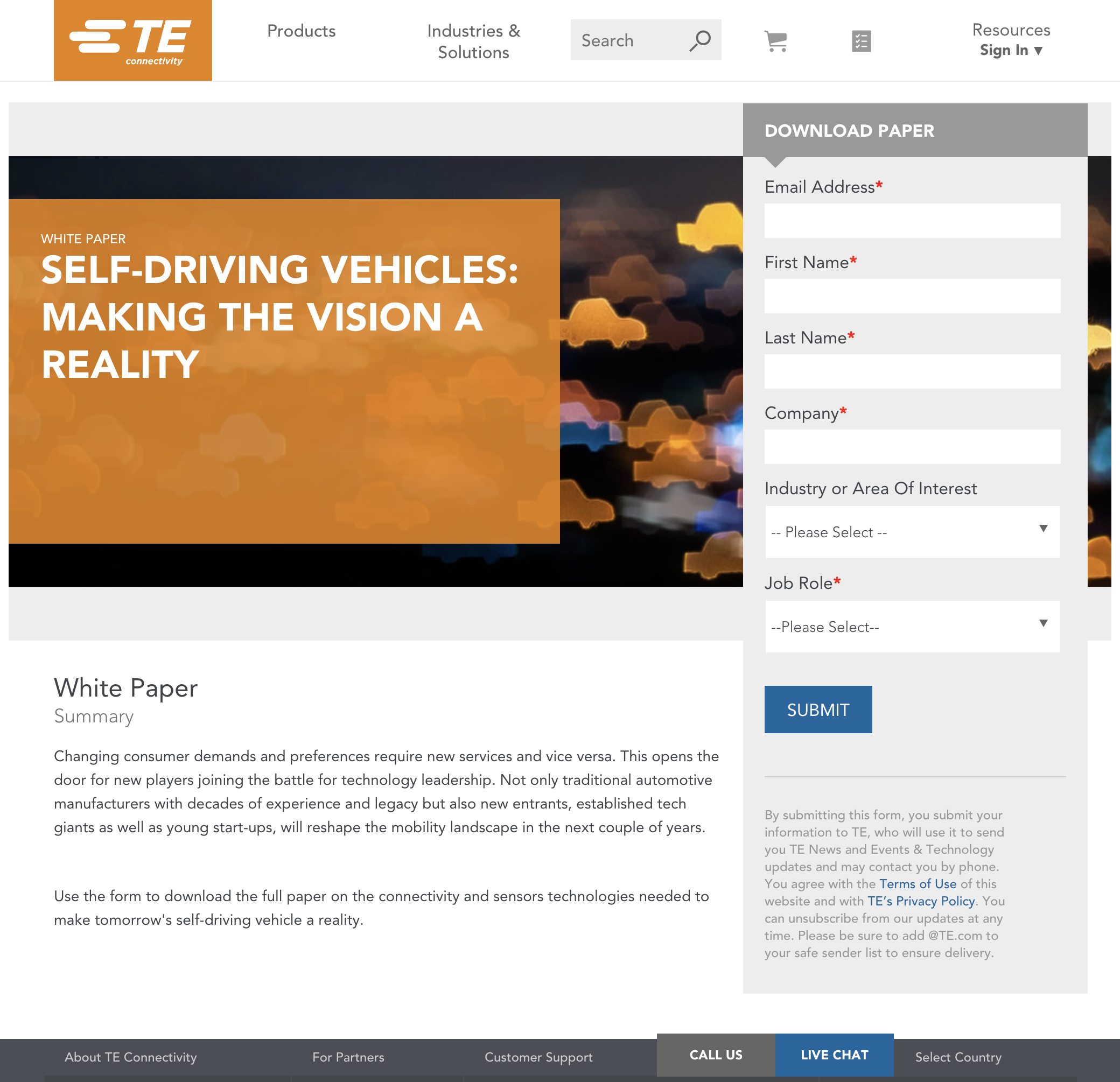
This white paper signup form from TE Connectivity isn’t pretty, but it works hard. It’s got one job: get people...
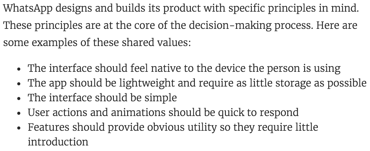
WhatsApp isn’t just a chatting app. It’s a masterclass in design discipline. Every pixel and feature screams “lightweight, fast, and...
Ever notice how Wix makes building a website look ridiculously easy? Their short videos don’t pitch. They teach. In under...
Ever record a killer video, then lose steam fumbling with uploads, links, and embeds? Wistia spotted that momentum-killer moment and...
Trello’s intro video does something clever: it makes task management feel simple, visual, and even exciting. In just two minutes,...
Sometimes the simplest tools tell the best stories. The iTrac explainer video uses just a marker, a whiteboard, and a...
Paul McCartney’s quote nails it: try too hard and you might ruin the magic. This applies to writing too. When...
Slack skipped the studio and handed the mic to an actual user, Adam. No script. No lighting. No buzzwords. Just...
Sam Parr didn’t just write another email newsletter. He built a daily habit called The Hustle that millions subscribed to...