1,913 Images and Illustration Examples That Teach Things
Drawings and illustrations and photography can transmit more information from human-to-human than text can. This board is perfect for designers and marketers seeking visual inspiration.
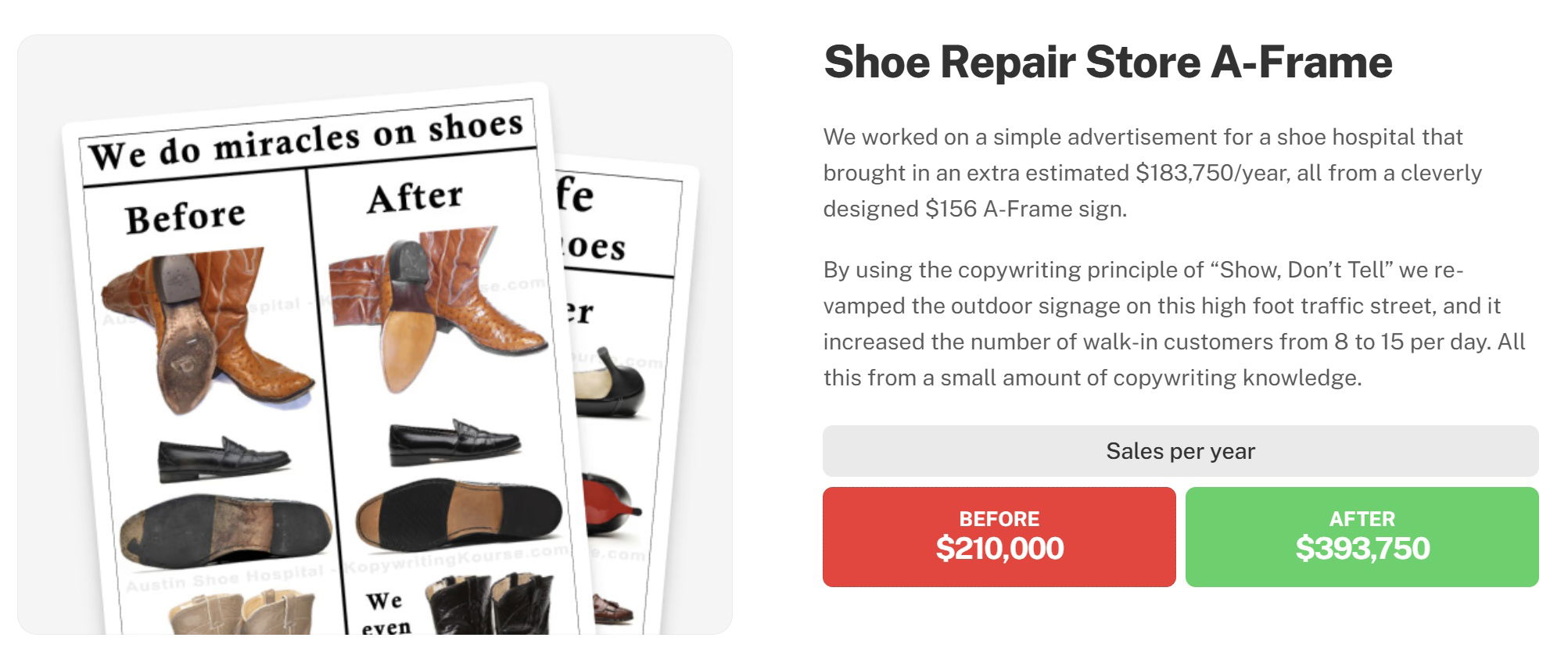
Before and After style results testimonial for a shoe repair store
A single A-frame sign made a shoe repair shop an extra $183,750 per year. All it did was show “before...
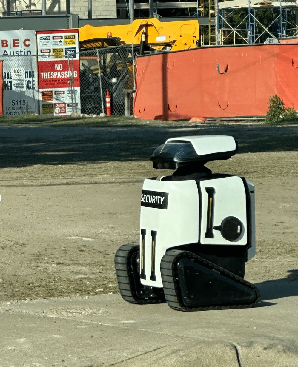
DaxaBot Security Robot
Spotted this tiny “security bot” patrolling a construction site. It doesn’t talk, chase thieves, or call the cops. But it...
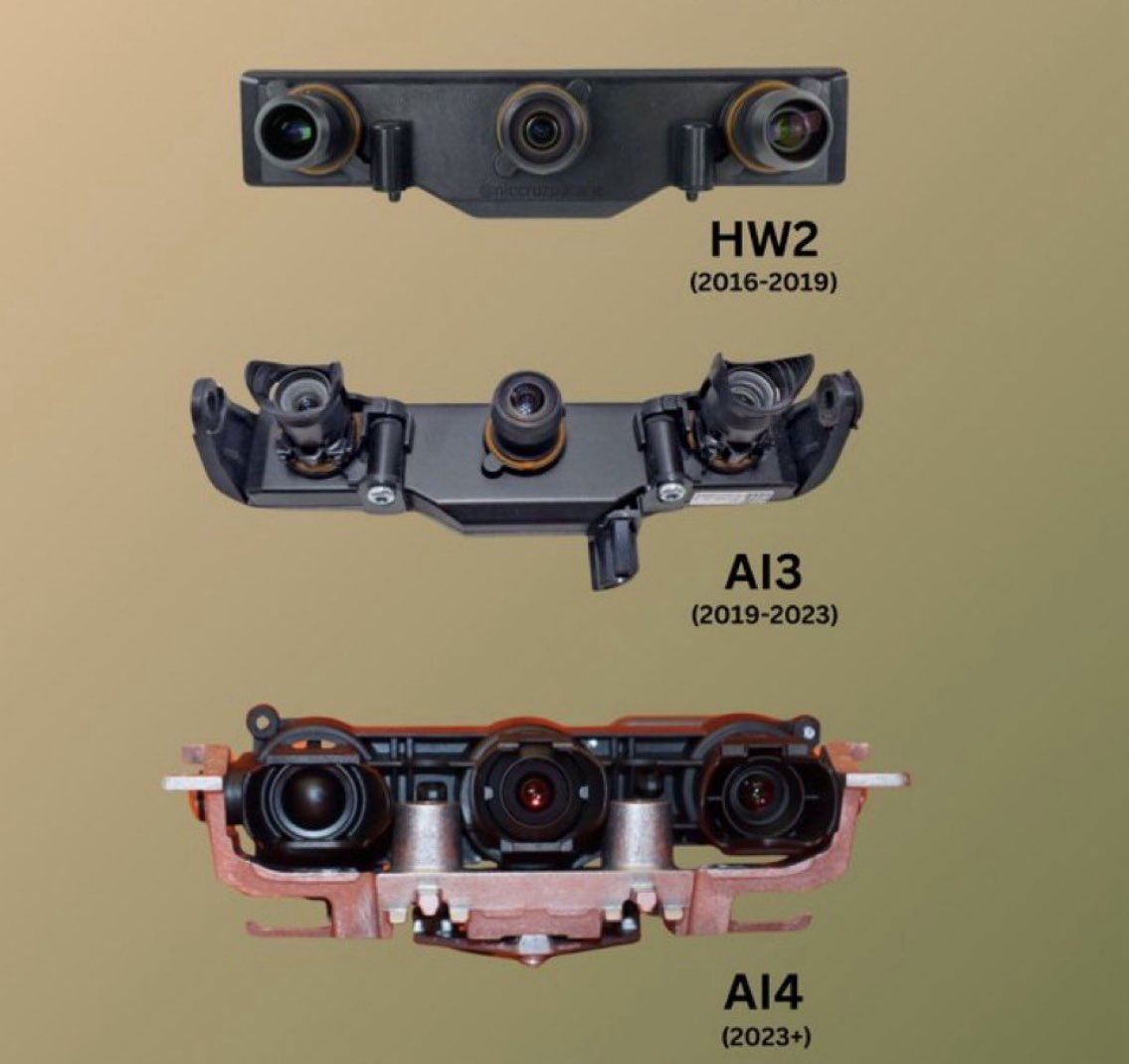
Tesla AI hardware upgrades
Tesla’s camera upgrades tell a bigger story than tech specs — they show customers visible progress. Each version gets chunkier,...
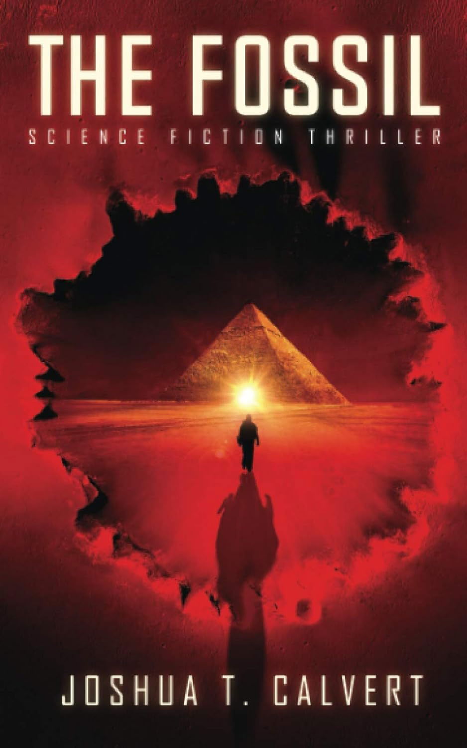
Great fiction book: The Fossil
This book cover for The Fossil is a perfect lesson in visual marketing. One glance and you already know what...
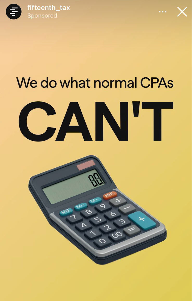
Fifteenth Tax great headline and storytelling ad
Most CPA ads are snoozefests. But Fifteenth Tax grabs attention fast with: “We do what normal CPAs CAN’T.” Then, they...
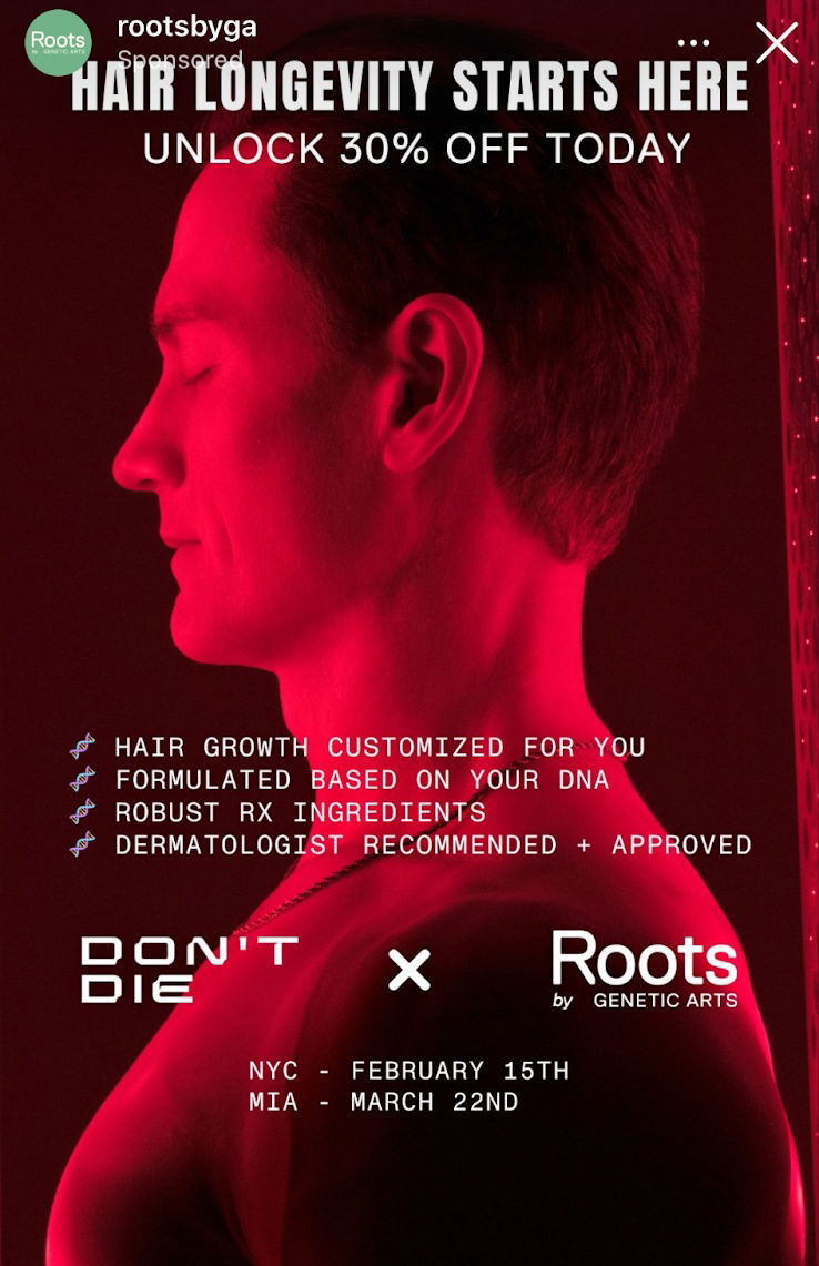
Bryan Johnson collaboration hair restoration ad
This Roots ad is a great example of how visual contrast grabs attention fast. The deep red glow on Bryan...
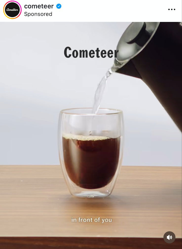
Minimalistic Cometeer Coffee ad
This Cometeer Instagram ad nails visual storytelling. You see boiling water hit a frozen coffee puck—and boom—it instantly becomes a...
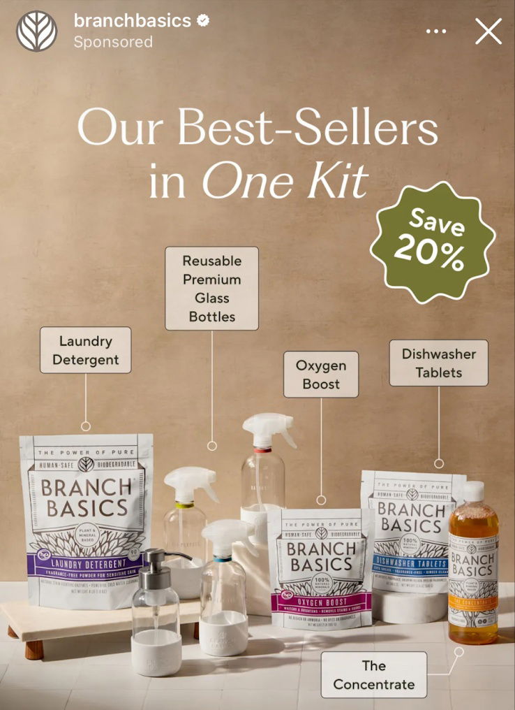
Showcasing best-sellers ad with text mockups
Branch Basics nails it with this ad. No fancy lifestyle shots. No overcomplicated text. Just their top products, clearly labeled,...
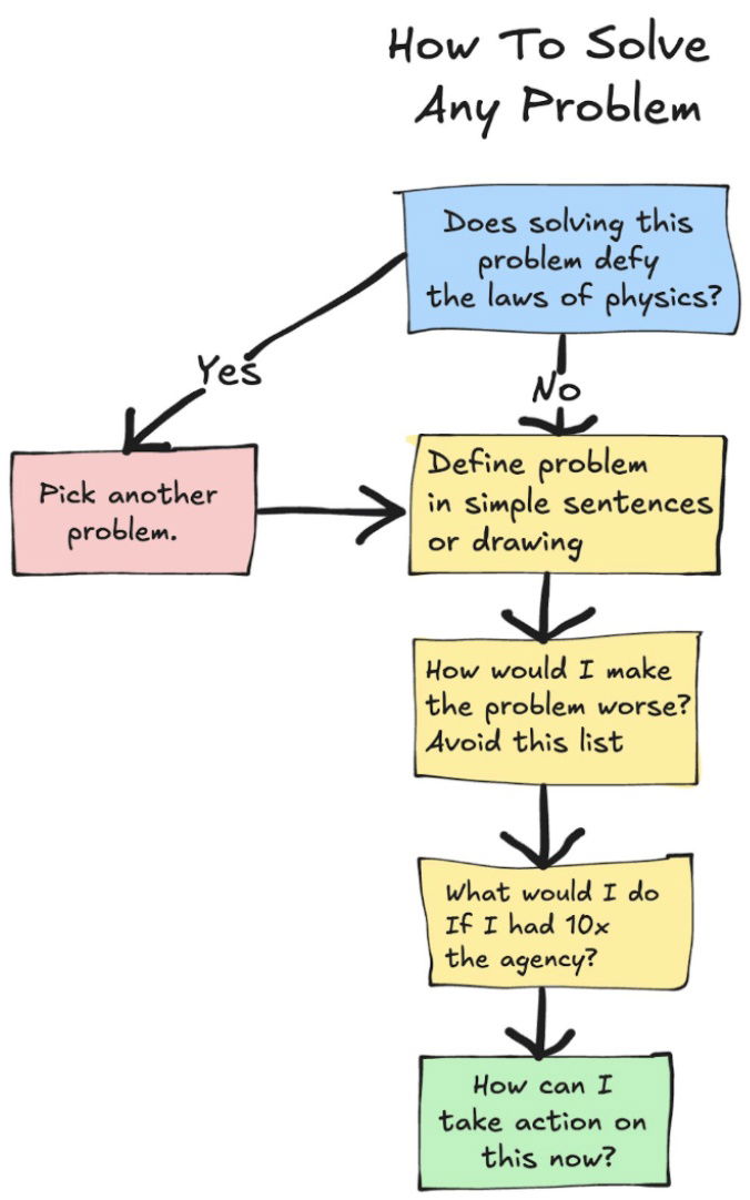
How to solve any problem with first principles
Ever get stuck on a marketing problem that feels impossible? This flowchart nails how to think like a first-principles problem...
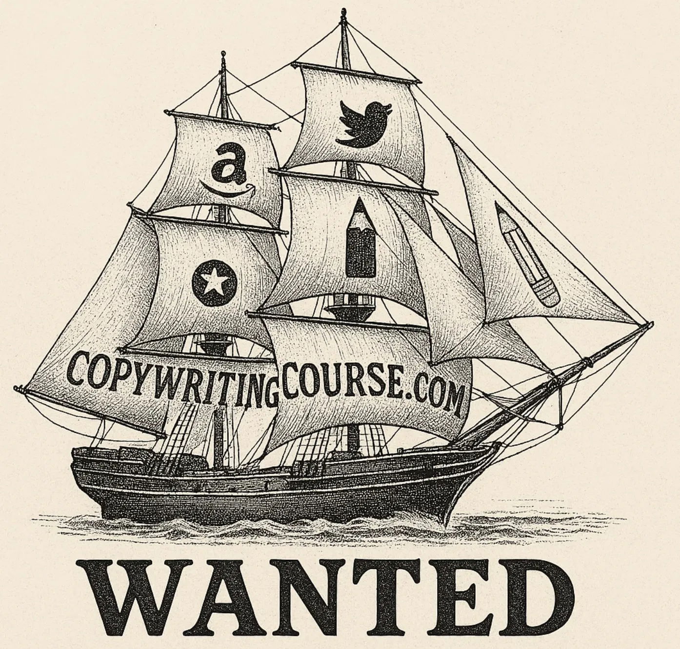
Vibe Marketing an ad with ChatGPT
This remake of Ernest Shackleton’s “Men Wanted” ad shows how quickly AI can turn a concept into a fully formed...
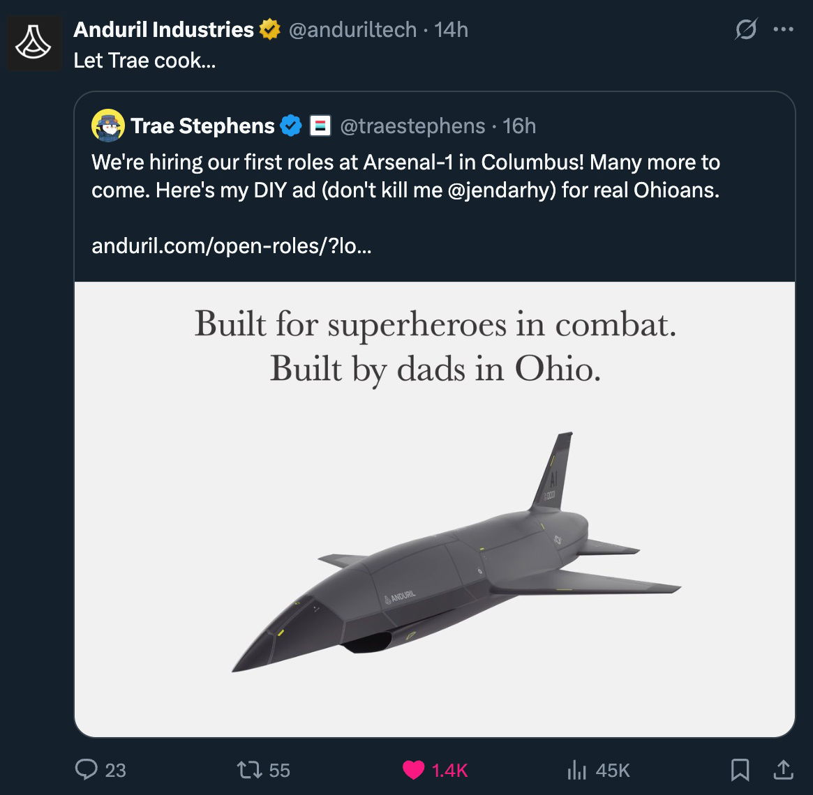
Cool Anduril autonomous warplane hiring ad
Anduril Industries dropped a gem of a hiring ad: “Built for superheroes in combat. Built by dads in Ohio.” It’s...
Speed of light visualized
Explaining that light travels "300,000 miles per second" sounds cool… until your audience’s eyes glaze over. But show a short...

What could this possibly be?
You don’t have to know what’s inside this massive green-wrapped mystery delivery to stop scrolling. You just have to know...

Cool image showing Tesla headlight progression.
This graphic shows Tesla’s headlights from 2012 to 2025. What started as basic, gappy beams evolved into sleek, seamless bands...

Crappy drawing grabs attention on a truck
This truck from Two Men and a Truck nails something most companies miss: personality. The hand-drawn logo looks like a...

Cool photo with Albert Einstein and his son and grandson in 1933
This photo of Albert Einstein just hanging out with family hits different. No chalkboard. No formulas. Just a guy with...

The High Cost of Overpaying vs. the Power of Fair Pay
This graphic nails a simple but painful truth: pay execs too much, and your business bleeds. Get it right, and...

Hemingwrite smart typewriter
The Hemingwrite isn’t just a gadget. It’s a brilliant case study in selling focus as a luxury. It looks vintage,...

1956 Ogilvy "The man from Schweppes is here" print ad
David Ogilvy did something wild in 1956: he turned Schweppes’ real-life CEO, Commander Edward Whitehead, into an icon. The ad...

Exit Strategies for SaaS Company Founders
Hampton’s 2024 State of SaaS report gives us a peek inside founder brains. Turns out, they’re not just chasing unicorn...

Big Goals Focus on Small Steps
Ever stare at a big goal and feel stuck? This simple graphic nails the solution: stop obsessing over the whole...

Peak Car Design Simplicity
Remember these? Three knobs. One job each. No screens, no menus. Just pure, brain-dead-simple usability. The Marketing Principle Here This...

60,000x improvement in capability in 24 years
Apple’s billboards show how to make tech marketing insanely simple. In 2001: “1,000 songs. In your pocket.” In 2025: “60...

Ikea Severance Ad
Ikea took a scene from Apple TV’s Severance and rebuilt it entirely with their own products. Same eerie cubicles. Same...