453 Sales Page Examples
Unlock the secrets of effective sales pages with Swipefile's curated examples. From compelling copy to strategic design, learn how top marketers structure pages that convert. Whether you're selling a product, service, or course, our sales page gallery offers inspiration and strategies to boost your conversion rates.

This music festival homepage has everything you need to sell tickets
Boston Calling nails its homepage layout. Before you even scroll, you get the headliners, prices, and a ticking countdown. Boom...

Email newsletter homepage displays social proof with blurbs from popular journalists
Most sites beg you to sign up. NextDraft just shows you who already did. Their homepage lists quotes and blurbs...

Pricing compared to industry standard pricing model
Playbook nails the art of price comparison. Their pricing page doesn’t just tell you they’re cheaper—it shows you in a...

Great "Product Explainer" Homepage from Span.io
SPAN.io turned a dull household necessity into a must-have smart-home upgrade. Their homepage starts with the powerful line: “SPAN reinvented...

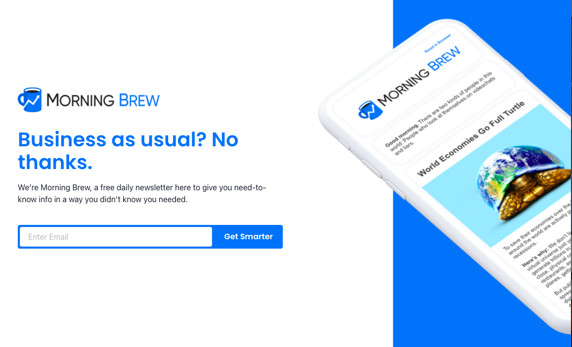
Email newsletter landing page limits viewer to one action
Morning Brew’s landing page does one thing really, really well: it forces a single action. There’s no scrolling, no menu,...

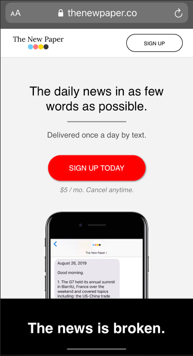
Great above the fold copy for mobile landing page
This landing page from The New Paper is a masterclass in clarity. In less than five seconds, you know exactly...

Homepage page giving great expectations
The Hustle’s sign-up page is pure marketing gold. In just a glance, it nails what most landing pages miss —...

Awesome BlackMagic.so Homepage
This homepage nails the SaaS formula. Within seconds, you know what it does, who it’s for, and why it’s worth...

Retro GumRoad.com Homepage
Gumroad went full 80s with its homepage. Neon colors, hand-drawn illustrations, and playful copy make it feel like a comic...

IdeaToStore Instagram Contest Landing Page
Shopify and .Store Domains ran a slick contest that turned business dreams into a viral marketing campaign. The hook: share...

Utopia 2 Tier Pricing
This pricing section nails the basics. Two tiers. Clear contrast. Strong call to action. No fluff. It makes the buying...

Utopia Sales Page
This Utopia sales page nails clarity, design, and persuasion all at once. It’s sleek, benefits-first, and makes joining feel like...

Exploding Topics newsletter landing page
This Exploding Topics newsletter page nails the basics: it’s clean, clear, and makes you want to sign up fast. It...

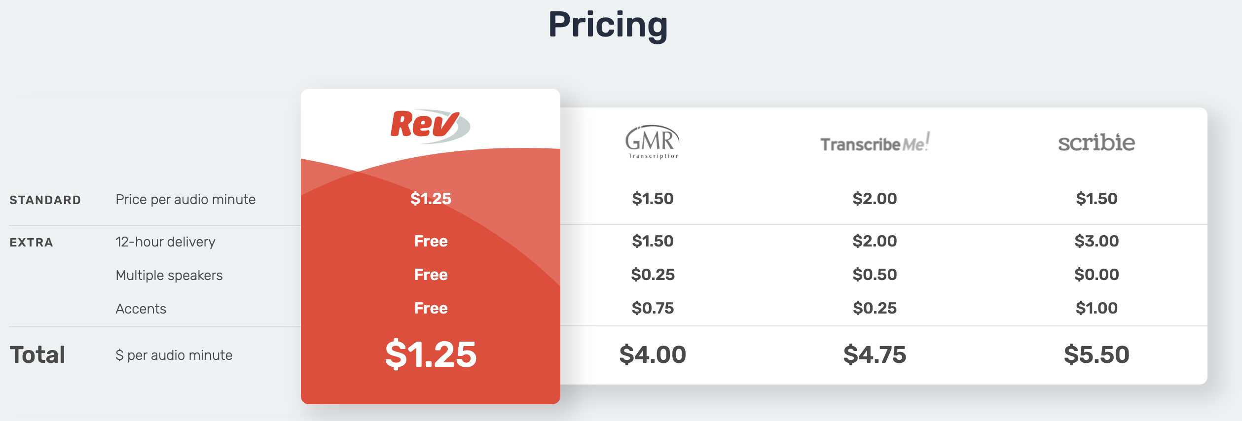
Rev Pricing Chart
Rev nails it with this pricing chart. No fluff. No confusion. Just a clean, side-by-side comparison that screams “We’re the...

Why Marketers Use Loom Sales Page
Loom nailed a smart marketing move: instead of one generic landing page, they built different ones for each team —...

Why Designers Use Loom Sales Page
Loom nailed this landing page. It shows exactly how design teams can use Loom, using real visuals, short copy, and...

Great Email Newsletter Homepage by The Generalist
This signup page from The Generalist nails the “trust me, I’m worth it” vibe perfectly. It doesn’t just ask for...

Nice 3-tiered pricing with email signup
This pricing table nails clarity, psychology, and conversion all at once. Three tiers: Free, Premium, and Believer. Each feels intentional...

Mailshake Pricing Page
Mailshake’s pricing page is a masterclass in reducing friction. It doesn’t just show prices, it builds confidence with proof, protection,...

Get TackleBox Home Page
The Tacklebox homepage is a masterclass in clarity and persuasion. It speaks directly to would-be founders who still have a...

Copywriting Course Before and After
In 2011, KopywritingKourse.com looked like the inside of a copywriter’s notebook—quirky, handwritten, and full of personality. By 2021, the site...

Amazon's first landing page to now.
Amazon’s first landing page looked like a college homework project: plain, gray, and full of text. Today’s version looks like...

HelloFresh sales page
The HelloFresh sales page is a masterclass in simplicity and persuasion. It grabs attention with a big, juicy offer —...

CrewFire 3-tiered pricing structure
This pricing chart nails the classic 3-tier structure: Starter, Growth, and Business. Notice how each plan gets a little better,...