457 Sales Page Examples
Unlock the secrets of effective sales pages with Swipefile's curated examples. From compelling copy to strategic design, learn how top marketers structure pages that convert. Whether you're selling a product, service, or course, our sales page gallery offers inspiration and strategies to boost your conversion rates.

Copywriting Course Before and After
In 2011, KopywritingKourse.com looked like the inside of a copywriter’s notebook—quirky, handwritten, and full of personality. By 2021, the site...

Amazon's first landing page to now.
Amazon’s first landing page looked like a college homework project: plain, gray, and full of text. Today’s version looks like...

HelloFresh sales page
The HelloFresh sales page is a masterclass in simplicity and persuasion. It grabs attention with a big, juicy offer —...

CrewFire 3-tiered pricing structure
This pricing chart nails the classic 3-tier structure: Starter, Growth, and Business. Notice how each plan gets a little better,...
All the stuff to put on a sales page
This outline is pure gold for anyone building a sales page. It’s basically a plug-and-play checklist showing what to include...
Great image and text for a watch on Amazon
This Amazon product image turns a confusing gadget into an easy choice. Instead of a cluttered description, it shows exactly...
IPMonitor SaaS Homepage
Ipmonitor’s homepage nails the fundamentals: clear headline, instant value prop, easy features, and no-wait pricing. It’s a masterclass in helping...

3-Tiered Pricing Example from IPMonitor
Look at this pricing layout. Clean. Simple. Obvious. The visitor instantly knows which plan is the “main” one to buy....

Tiny Capital Homepage
Tiny’s homepage nails what most brands miss: clarity, empathy, and proof. The whole page reads like a calm conversation, not...
YouTube Marketing, best marketing channels, and life planning with Noah Kagan of OkDork and AppSumo
Noah Kagan’s AppSumo does something simple but brilliant: it takes the “deal” format and turns it into a movement for...

MyMind "How It Works" Beautiful Page
The MyMind “how it works” page is a masterclass in keeping things light, clear, and magnetic. No jargon. No clutter....

Design Mentorship Sales Page
This service page nails a huge marketing insight: words shape perception. Instead of selling “consulting,” it sells “mentorship.” Same offering,...

Paul Minors Tiered Pricing Chart
This pricing chart by Paul Minors shows how clean design + smart psychology = better conversions. No clutter, no confusion,...
Re-doing the Ideation Bootcamp Sales Page (w/ CEO of TheHustle Sam Parr)
Sometimes a landing page is good, but not great. That’s what happened when Copywriting Course teamed up with Sam Parr...

Great Gym Landing Page From Hale Fitness
This Hale Fitness landing page is a masterclass in turning clicks into clients. It’s not fancy. It’s not bloated. It...
ChainFuel 4-Tiered Pricing
Chainfuel nails the 4-tier pricing layout. It takes you from free to premium without confusion and makes upgrading feel natural....

Ghost Org Complex Vs Simple Pricing
This Ghost.org pricing graphic is a masterclass in contrast selling. It takes the messy, expensive “old way” of launching a...
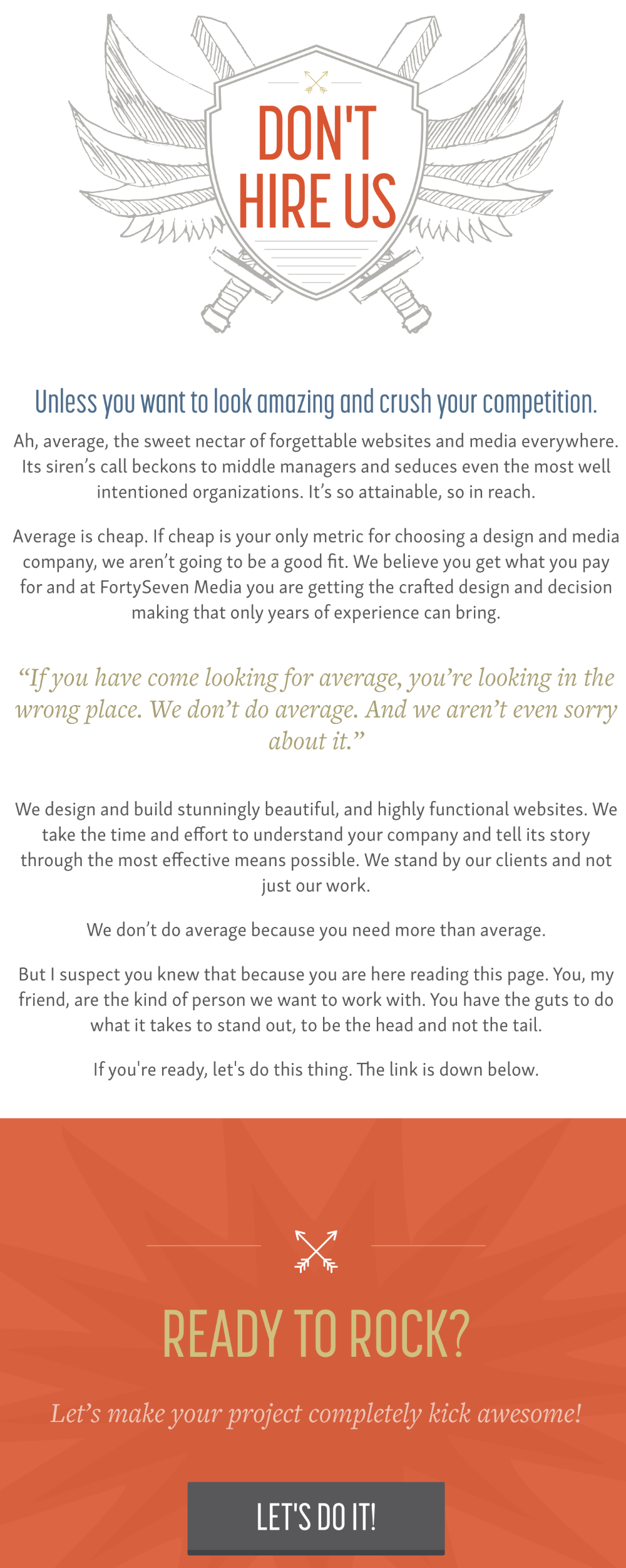
The "Don't Hire Us" Page
This web design agency flipped the script. Instead of a “Hire Us” page, they made a “DON’T Hire Us” one....
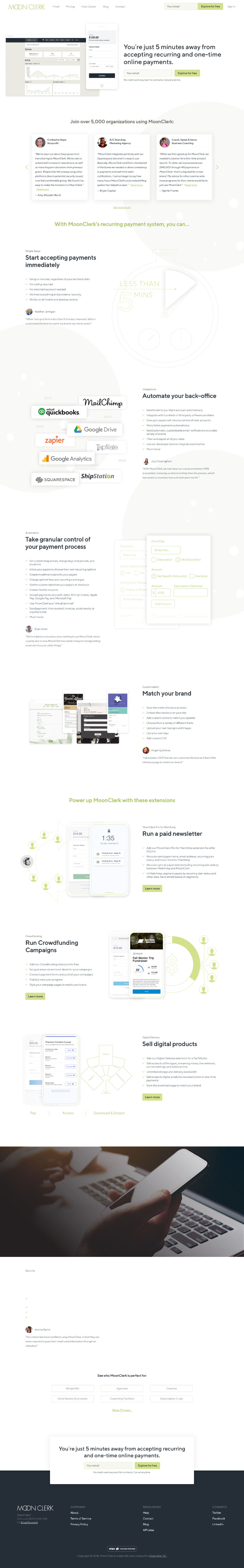
MoonClerk home page
MoonClerk’s homepage is a masterclass in clarity. In just a few scrolls, it explains what it does, who it’s for,...
Hello Sign's Hero Section
HelloSign nails the landing page formula: a short headline, one clear CTA, and a looping GIF that shows exactly what...
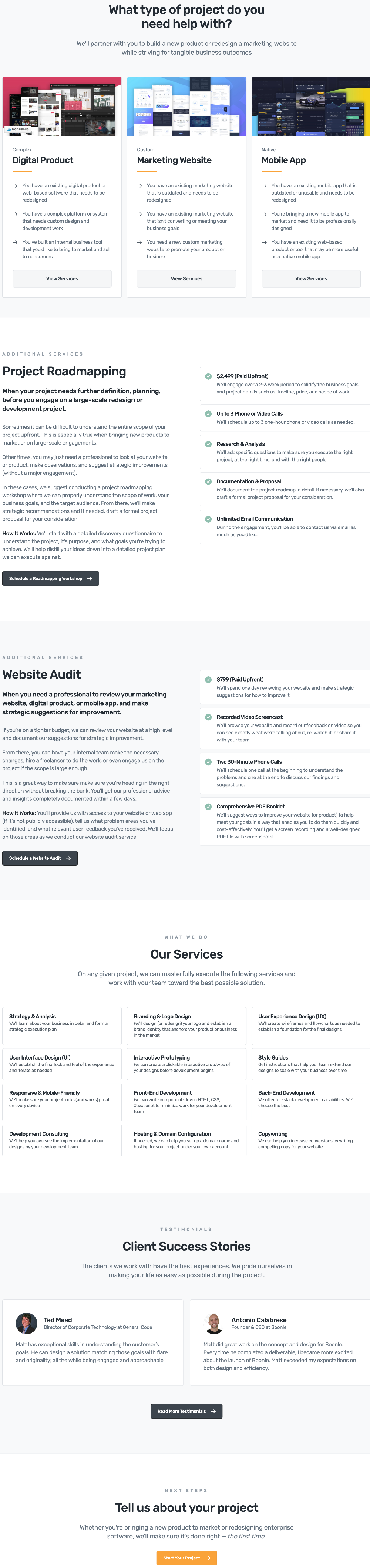
Made By Matthews Software Design Services Page
Ever land on a service page and feel totally lost? This design fixes that. It takes a long list of...
Sarah Marie Anderson Copywriting Services Page
This services page is a masterclass in clarity. It shows two main offers front and center, then gives visitors a...
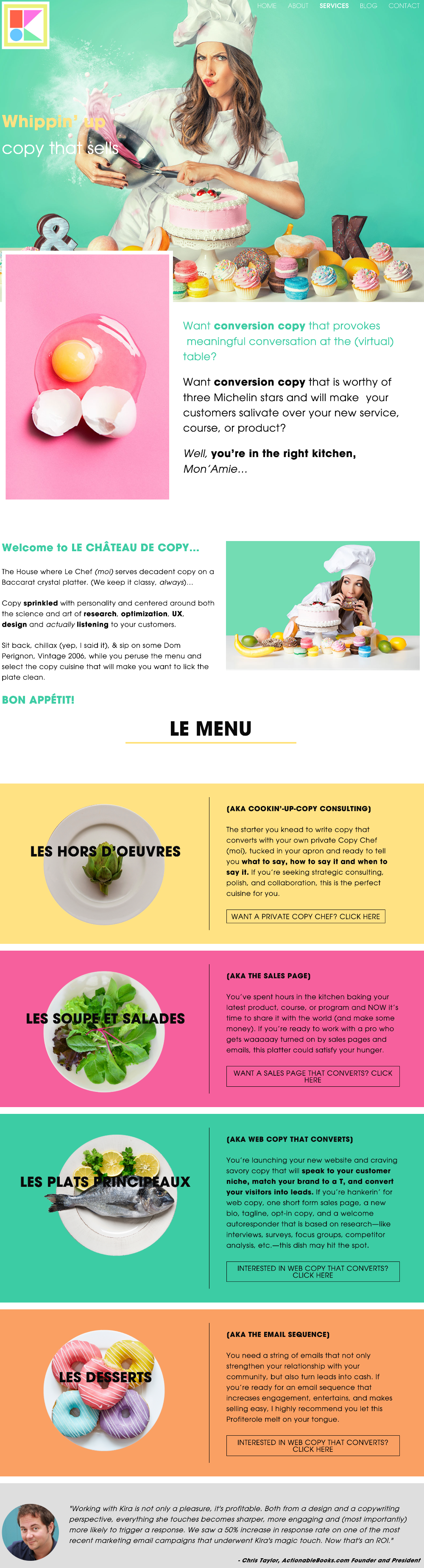
Kira Hug Copywriting Services Page
Most service pages are boring. Kira’s isn’t. She turned hers into a full-on French restaurant experience—complete with “Le Menu,” “Les...
Talking Shrimp Work With Me Page
Talking Shrimp’s “Work With Me” page is a masterclass in how to make people want to hire you — not...