No clients? No samples? No problem. The smart move isn’t waiting for permission—it’s hitting publish and learning as you go....
Copywriting/Motivation/Advice
Feb 6, 2018
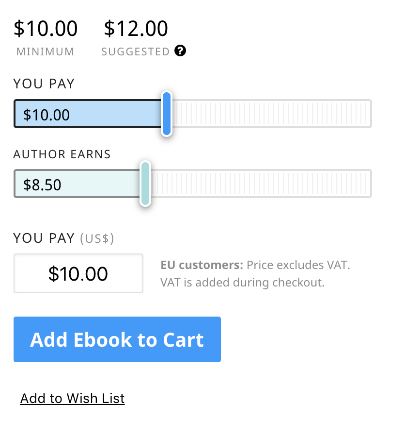
Sliding pay button with minimum price
Leanpub nails the art of “feel good” pricing. Their ebook checkout shows a $10 minimum and a $12 suggested price,...
Copywriting/Pricing/Data
Feb 2, 2018
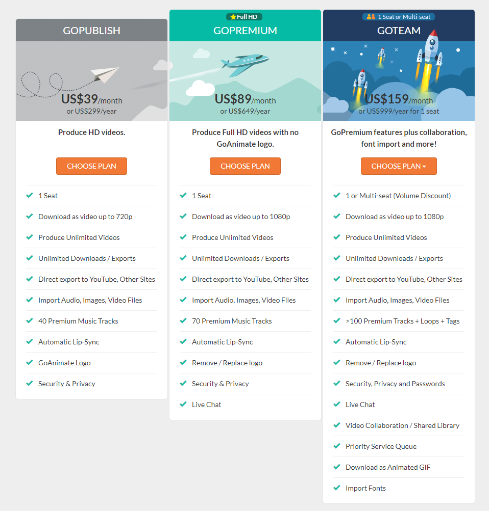
GoAnimate's The Three Pronged Pricing
Ever notice how pricing pages come in neat sets of three? This GoAnimate (now Vyond) table nails the “Good, Better,...
Copywriting/Pricing/Advice
Jan 31, 2018
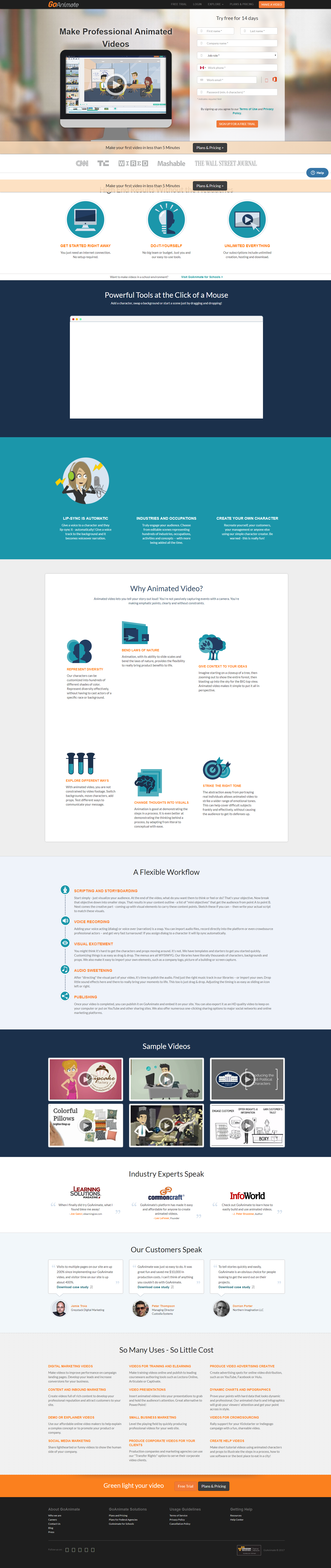
GoAnimate landing page that explains product visually
GoAnimate’s homepage breaks a common marketing rule—because it doesn’t just tell you what it does, it shows you. The hero...
Copywriting/Home Pages/Videos
Jan 31, 2018
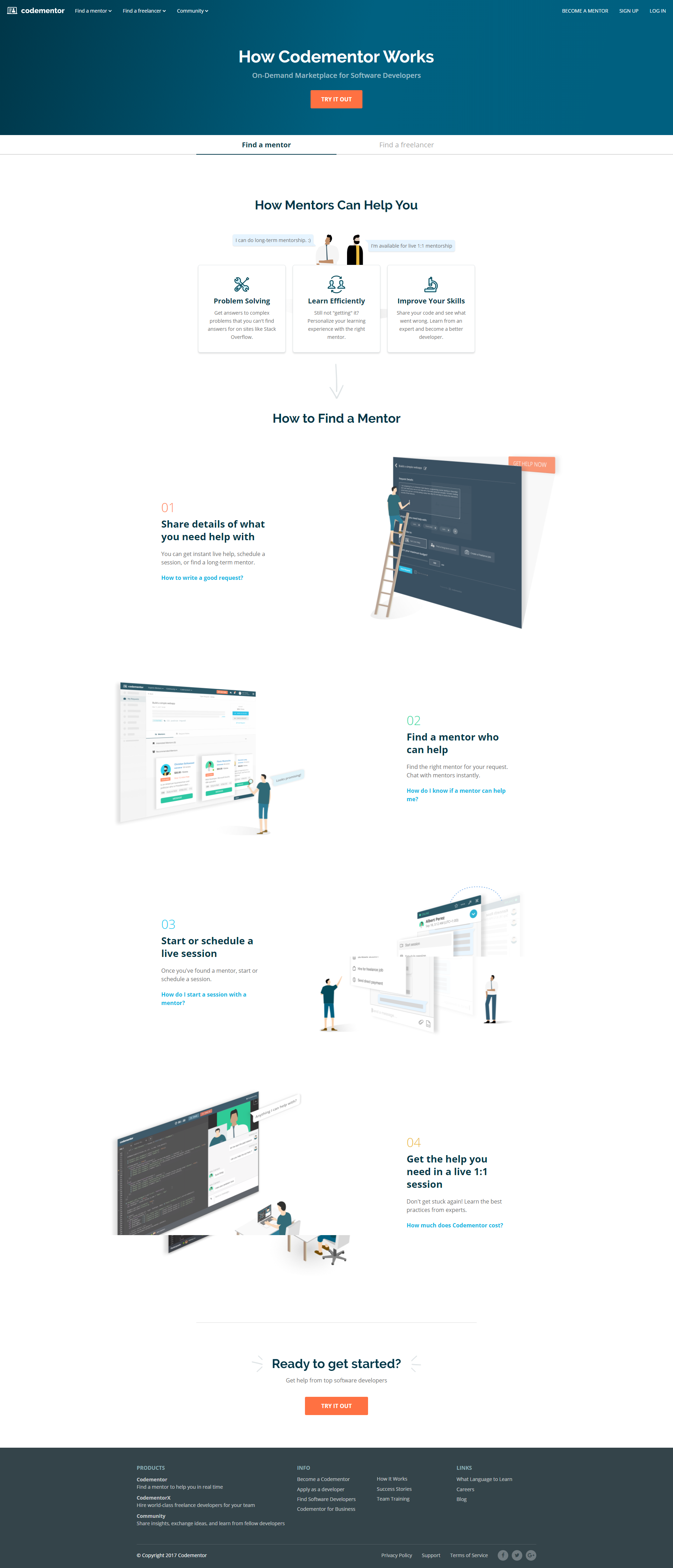
Codementor “How It Works” Page
Codementor’s “How It Works” page is a masterclass in clarity. It takes something potentially confusing—on-demand coding mentorship—and makes it feel...
Copywriting/Home Pages/About Pages
Jan 7, 2018
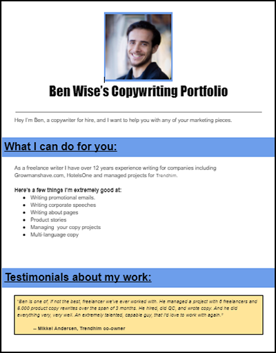
Ben Wise: Copywriter
Ben used to send clients a messy Google Drive folder full of good stuff they couldn’t find. Now, he’s got...
Copywriting/Portfolio/Videos
Jan 1, 2018
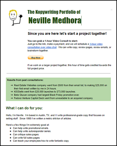
The “Price Upfront” Portfolio Template
Most freelancers build portfolios that feel like a museum tour. Neville Medhora built one that feels like a checkout page....
Copywriting/Portfolio/Data
Jan 1, 2018
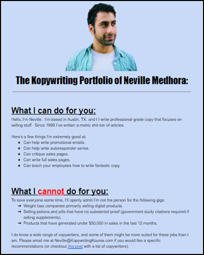
The “Neville Style” Portfolio Template
Everyone’s fussing over building fancy portfolio sites. Neville Medhora didn’t. He made his copywriting portfolio a plain Google Doc. Yup…...
Copywriting/Portfolio/Advice
Jan 1, 2018
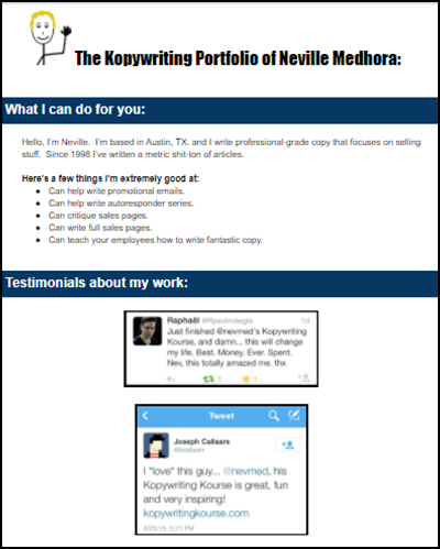
The “Basic” Portfolio Template:
Most portfolios look like resumes on steroids. Too many words, too much noise, not enough proof. Neville Medhora’s portfolio flips...
Copywriting/Portfolio/Data
Jan 1, 2018
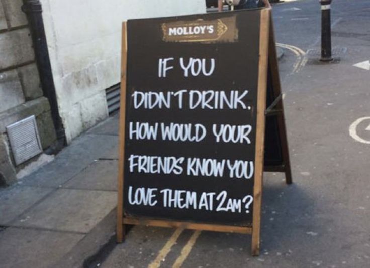
Molloy's Love Your Friends Sign
This chalkboard outside Molloy’s pub doesn’t push pints. It sells connection. A handwritten message reads: “If you didn’t drink, how...
Ads/Print Ads/Copywriting
Dec 13, 2017
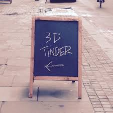
3D Tinder Bar Sign
A London pub scribbled two words on a chalkboard: “3D TINDER.” That’s it. No logo, no promo, no explanation. And...
Ads/Copywriting/Restaurant Signs
Dec 13, 2017
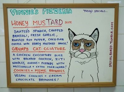
Vinnie's Pizzeria Specials Sign
Most restaurant specials lists are snoozefests. Vinnie’s Pizzeria flipped that script with a playful, handwritten board starring “Grumpy Cat-ciatore.” It’s...
Copywriting/Restaurant Signs/Images
Dec 13, 2017
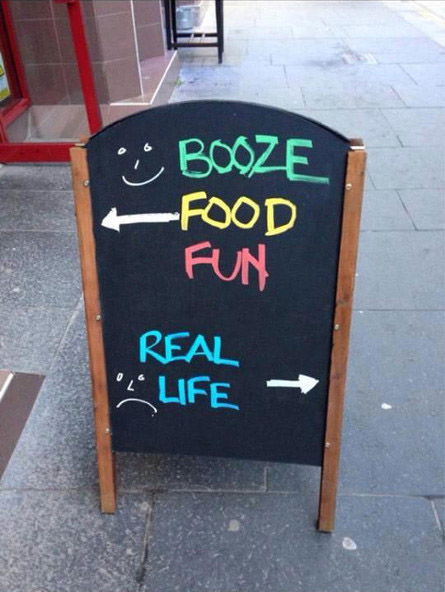
Escape Real Life Sandwich Board
This sign doesn’t sell. It teases. With a few chalk strokes, it gives people an emotional choice: “fun” or “real...
Ads/Copywriting/Restaurant Signs
Dec 13, 2017
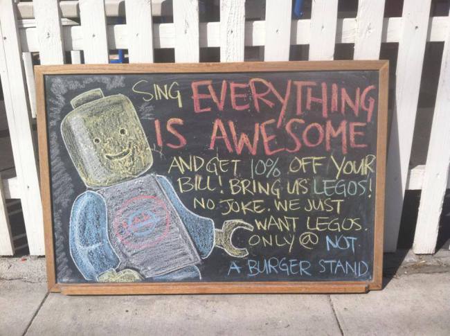
Lego Promo Restaurant Sign
This chalkboard from “Not A Burger Stand” is marketing genius. It offers 10% off if you sing a certain hit...
Ads/Copywriting/Restaurant Signs
Dec 13, 2017
Randy Savage Voice Order Restaurant Sign
This chalkboard is pure marketing muscle. It promises 10% off if you order “in the voice of Macho Man Randy...
Ads/Copywriting/Restaurant Signs
Dec 13, 2017
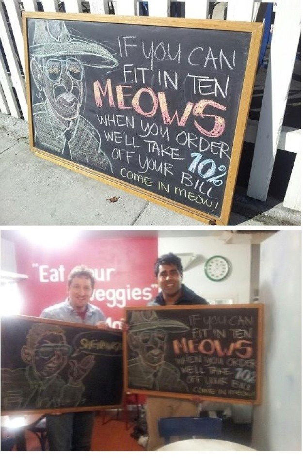
Meow for 10% off restaurant sign
A local café put up a chalkboard that said: “If you can fit in ten meows when you order, we’ll...
Ads/Copywriting/Restaurant Signs
Dec 13, 2017
Traffic Think Tank Pricing
This pricing page looks simple, but it’s a masterclass in persuasion. Just two clean options—monthly or yearly—but packed with powerful...
Copywriting/Pricing/Advice
Dec 12, 2017
Traffic Think Tank Sales Page
Most sales pages sell stuff you can hold. Traffic Think Tank sells community — something you can’t touch — and...
Copywriting/Advice/Sales Pages
Dec 12, 2017
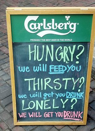
The solution chalkboard sign
This Carlsberg chalkboard might be the simplest ad ever — and that’s why it’s genius. No glossy poster, no big...
Ads/Print Ads/Copywriting
Dec 7, 2017
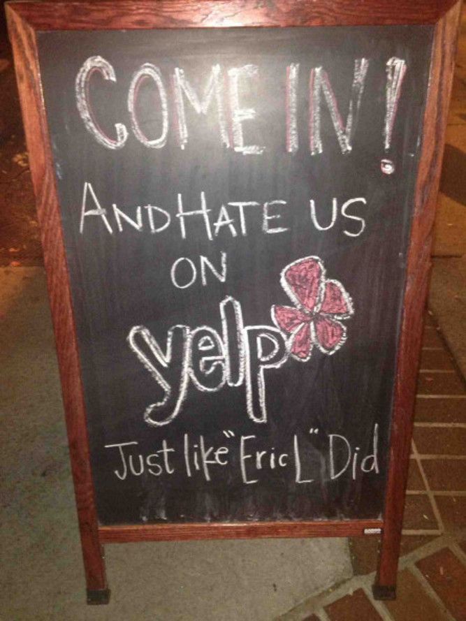
Yelp review sandwich board
This restaurant didn’t panic over a bad Yelp review. Nope. They turned it into a sidewalk sign that reads, “Come...
Copywriting/Restaurant Signs/Advice
Dec 7, 2017
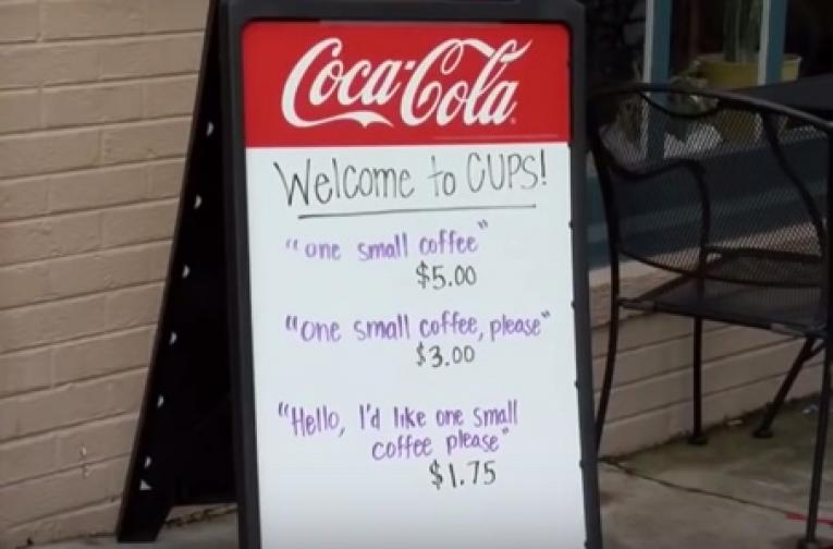
CUPS polite pricing sign
CUPS Coffee & Tea pulled off a genius marketing move with one simple sign. Instead of listing prices by size,...
Ads/Copywriting/Restaurant Signs
Dec 7, 2017
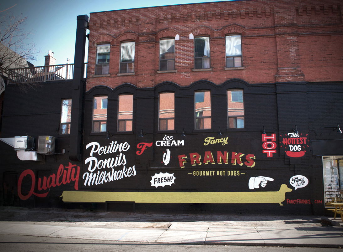
Fancy Franks Wall Sign
Fancy Franks didn’t just slap some paint on a wall. They built an ad that never turns off. Their brick...
Ads/Copywriting/Restaurant Signs
Dec 4, 2017
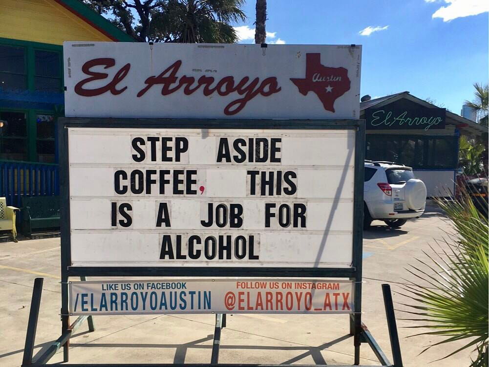
El Arroyo Coffee Sign
El Arroyo in Austin doesn’t need fancy ads. They’ve got a signboard that does all the work. Each day, a...
Ads/Copywriting/Restaurant Signs
Dec 4, 2017
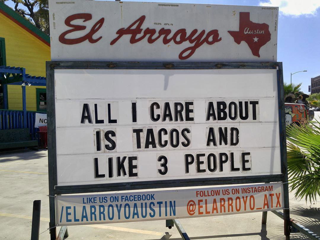
El Arroyo Taco Sign
A restaurant in Austin called El Arroyo turned a basic street sign into an internet-famous marketing machine. Instead of pushing...