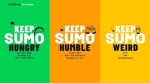
AppSumo nails their company culture using just three punchy phrases: Keep Hungry, Keep Humble, Keep Weird. These aren’t just words...
Formulas/Copywriting/Motivation
May 4, 2025
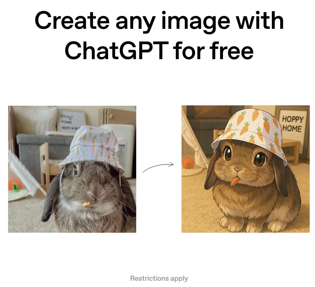
OpenAI ChatGPT Image Reddit Ad
You’d think OpenAI wouldn’t need ads. But this Reddit ad? It’s brilliant. A single image showing a bunny photo turned...
Ads/Copywriting/Before & After
May 3, 2025
Posted byAyman Al-Abdullah
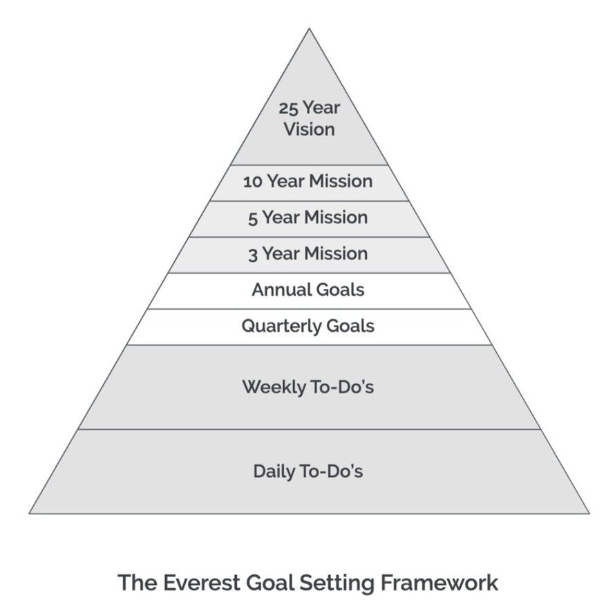
The Everest Goal Setting Framework Pyramid
That pyramid image nails it. Big goals look huge and scary until you slice them into smaller, chewable chunks. The...
Formulas/Motivation/Images
May 3, 2025
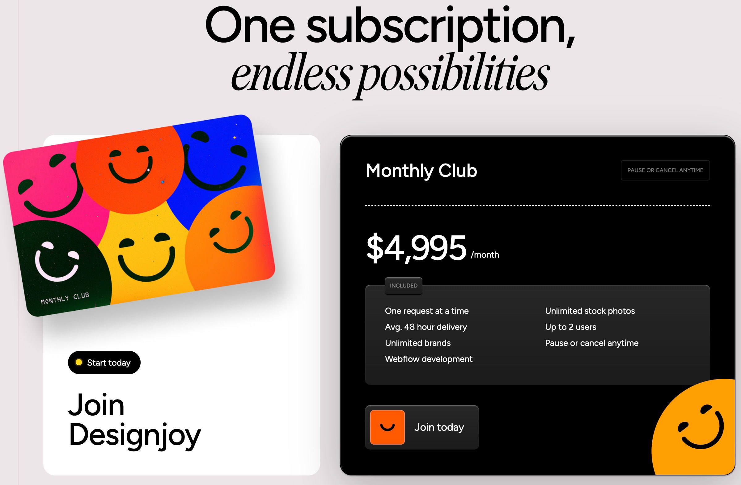
DesignJoy Monthly Pricing
Sometimes the smartest pricing move is also the simplest one. Designjoy nails this by offering just one price: $4,995/month. No...
Copywriting/Pricing/Design
May 3, 2025
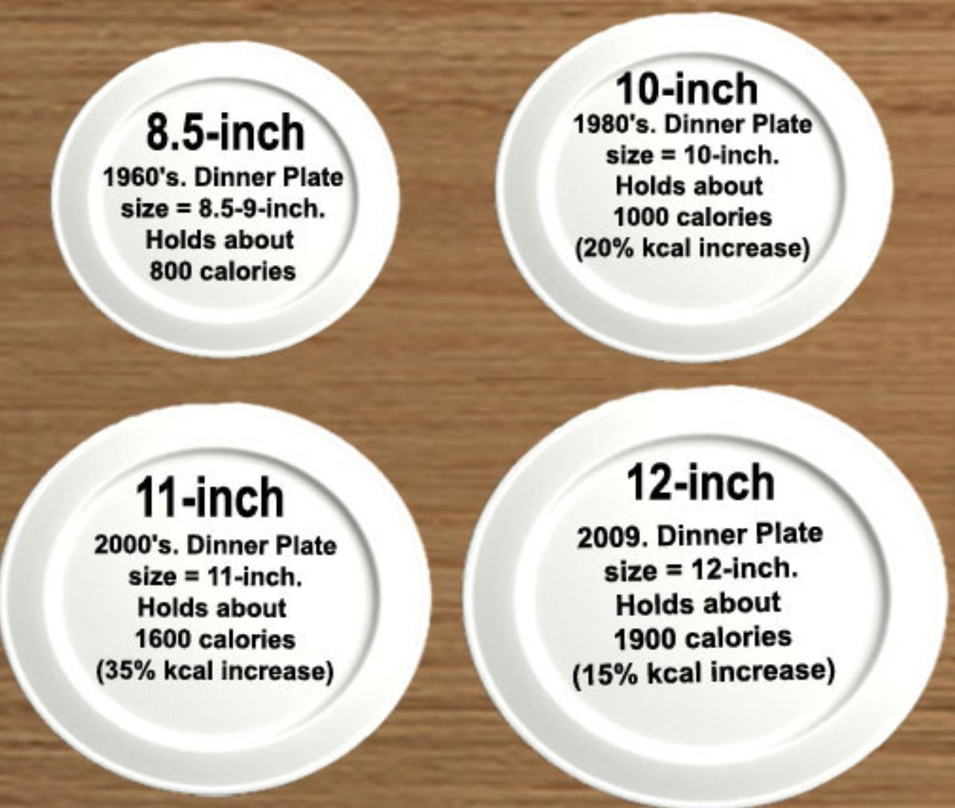
Dinner plate comparison sizes over the years
Look at this image: dinner plates have grown from 8.5 inches in the 1960s to 12 inches today. Calories nearly...
Before & After/Data/Images
May 2, 2025
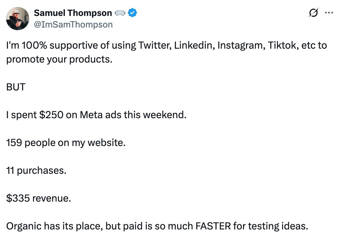
Sometimes paying for traffic is faster than organic
This tweet nails it: organic marketing builds a solid long game, but paid traffic is the speed hack for learning...
Ads/Tweets/Data
May 2, 2025
Posted byNeville Medhora
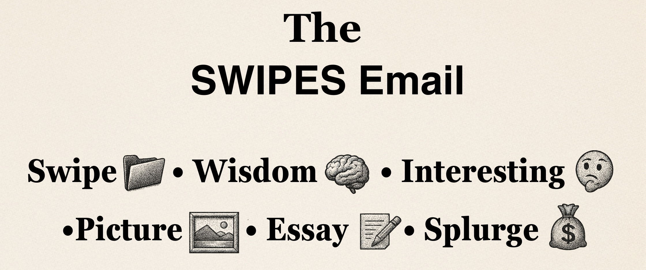
🎤 The SWIPES Email (Friday, May 2nd, 2025)
Swipe: We're always investing time and energy in Copywriting Course upgrading other people's pages/emails....and sometimes forget about our own! For...
SWIPES Email/Newsletter
May 2, 2025
Posted byNoah Kagan
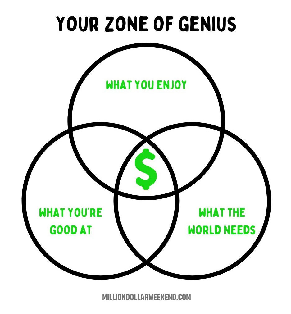
Your Zone of Genius Venn Diagram
Everyone's seen the Venn diagram showing where your passion, skills, and market demand overlap. That’s where money and meaning meet....
Motivation/Data/Images
May 2, 2025
Posted byNeville Medhora
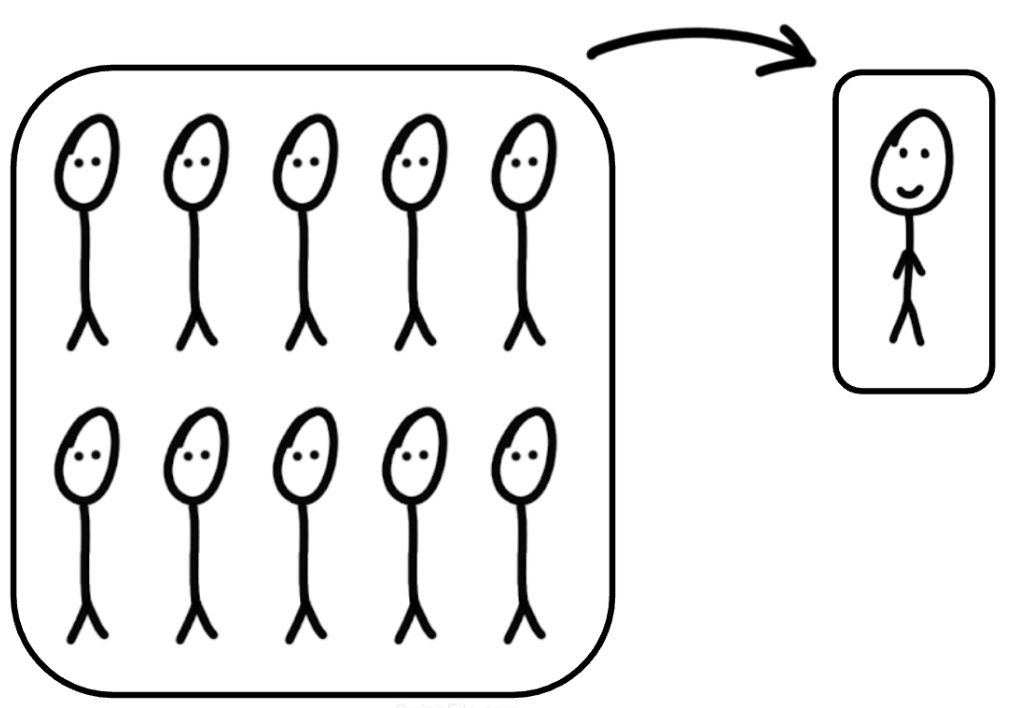
1 person will do what 10 people used to do.
Look at that old newspaper headline about teachers protesting calculators. People thought math skills would vanish! Fast forward, and calculators...
Essay/Wisdom/Copywriting
May 1, 2025
Hubspot competitor ad
EngageBay’s Reddit ad is a perfect example of going straight for the jugular in a crowded market. They know exactly...
Ads/Copywriting/Before & After
May 1, 2025
Posted byAyman Al-Abdullah
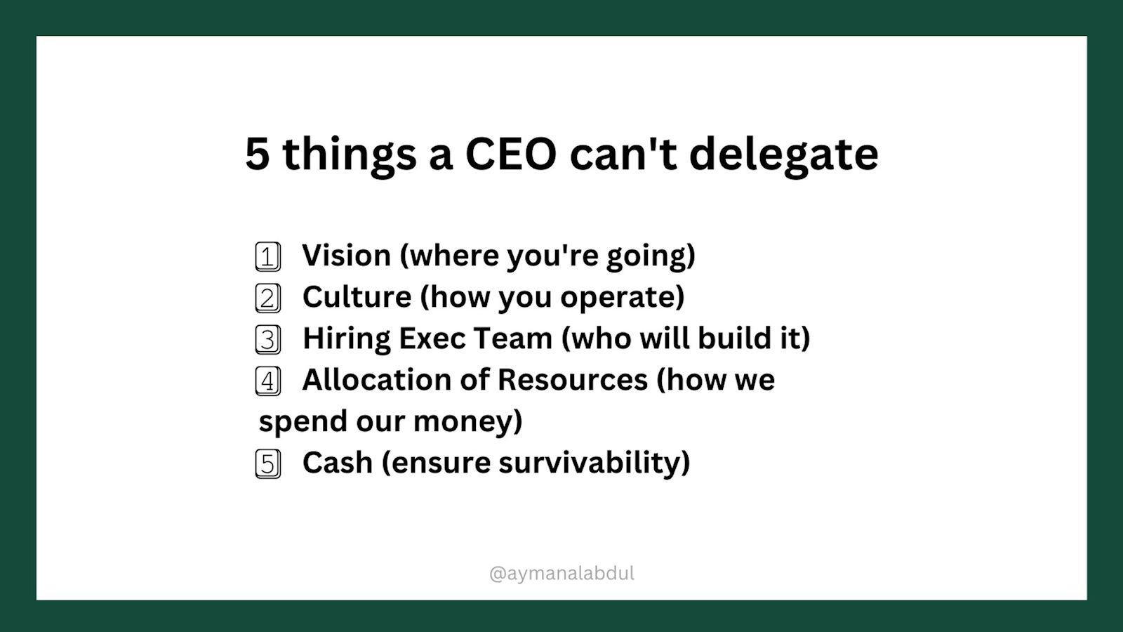
5 things a CEO can't delegate
This visual nails what every founder eventually learns the hard way: some things are too important to hand off. If...
Images/Advice
May 1, 2025
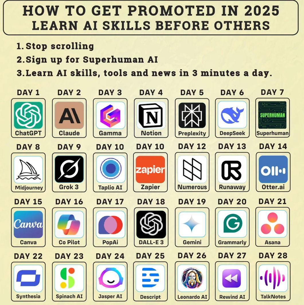
AI Newsletter Reddit Ad
This Reddit ad for “Superhuman AI” nails attention, promise, and structure in one tiny post. The headline “How to Get...
Ads/Copywriting/Newsletter
May 1, 2025
Posted bySam Parr
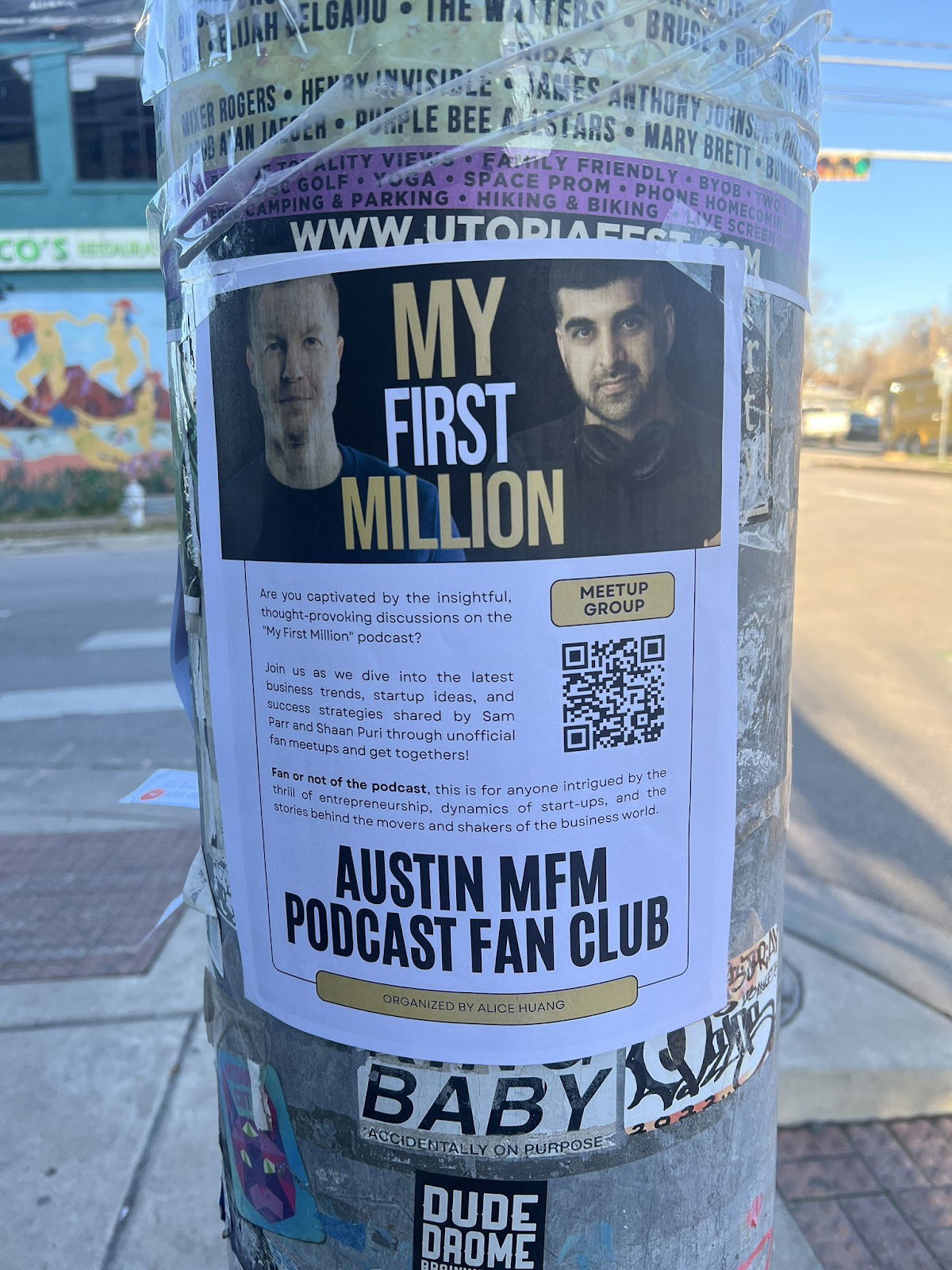
My First Million Fan Club Flyer
Spotted on a random Austin pole: a “My First Million” fan meetup flyer. Simple paper, bold faces, and a QR...