423 Before and After Examples
Discover the power of transformation with our Before and After Examples. See how products and services can change lives, looks, or spaces. From home renovations to personal makeovers, witness the dramatic differences and get inspired by real-life changes.
I got tired of struggling to find study space at packed libraries @UWaterloo 🎓
📚That's why I built Spots, a tool that helps you find open classrooms for studying on campus! No more wandering around—just focus on getting stuff done 💪...

Studying Space Software X Post
Akshar Barot solved his own problem. He couldn’t find study space on campus, so he built “Spots”—a tool that shows...

Before and After House Exterior Makeover
Nothing beats a good before-and-after to show transformation. This house remodel pic says more than any ad copy could. It...
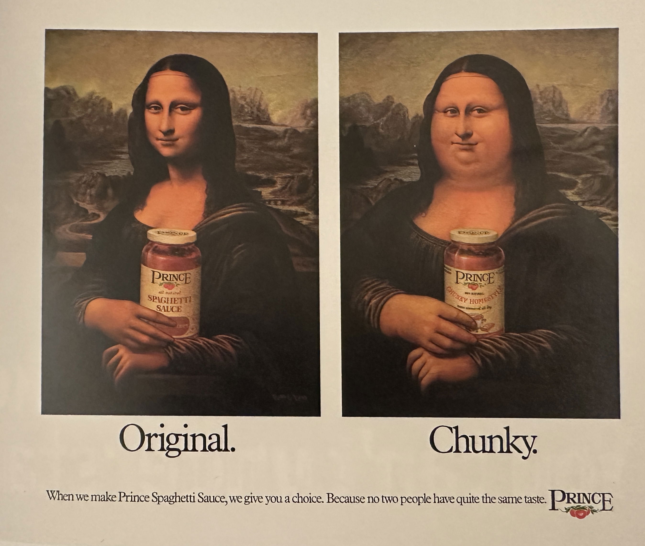
Prince Chunky Spaghetti Sauce Print Ad
This old-school ad from Prince Spaghetti Sauce nails “simple idea, strong visual.” It shows two Mona Lisas holding sauce jars—one...

Public VS Private Sector Innovations
This image perfectly highlights a truth marketers should love: competition breeds innovation. The private sector's “then vs. now” shows giant...
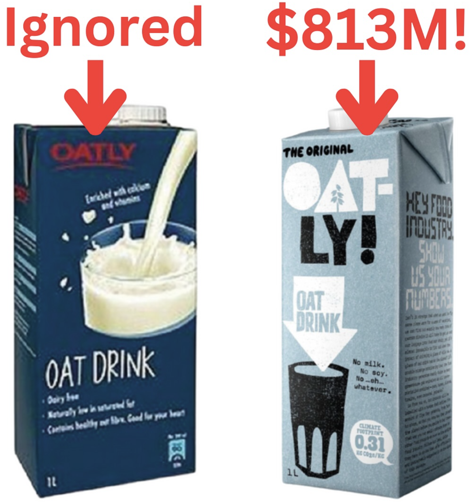
Oatley Milk Before/After Branding
Oatly’s old packaging looked like every other “healthy” drink—plain, blue, boring. Then they flipped the script and built an identity...
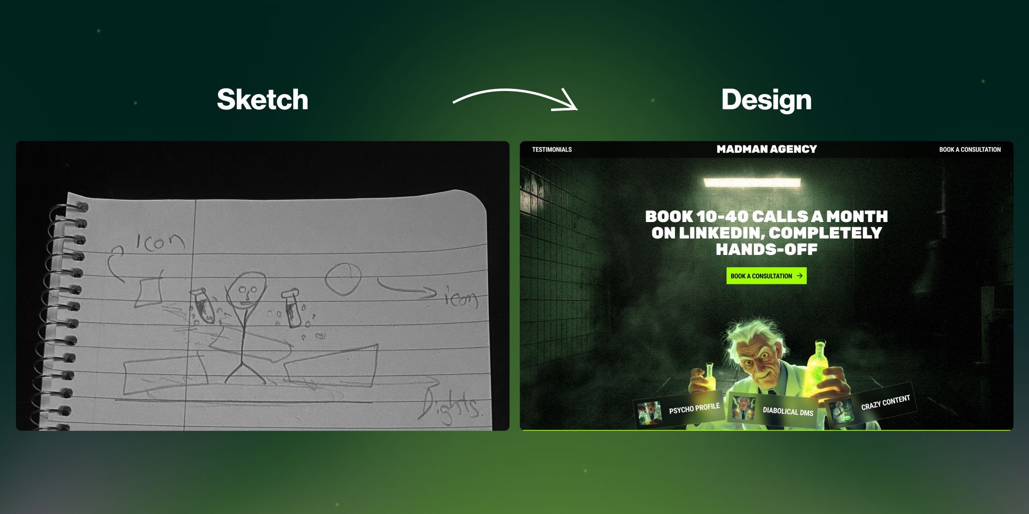
Sketch to finished website design
This image shows a creative agency’s transformation from a napkin sketch to a polished website. It’s a killer visual metaphor...

Tesla Interior Refreshes and Simplicity
Tesla interiors started with buttons everywhere. Over the years, they’ve stripped it all away—leaving one big touchscreen and a clean,...

Tesla front self driving camera stack over the years
This image of Tesla’s front-facing dash cams shows one thing perfectly: clear visual progress. Each generation looks sleeker and smarter....
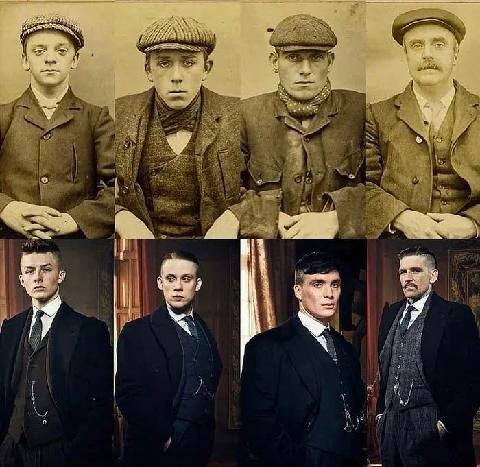
Peaky Blinders Real Life to Characters image
One image, two rows, and a flood of context. This Peaky Blinders comparison instantly shows the transformation from real-life gangsters...
The Business Of Air Purifiers and Single-SKU Businesses with Mike Feldstein
Mike Feldstein went from chasing floods and fires to selling sleek air purifiers. Sounds random, right? Nope. It’s actually a...

Mac Mini port history image
Check out this image of every Mac Mini since 2005. Fewer ports. Sleeker look. Better experience. Apple didn’t just remove...
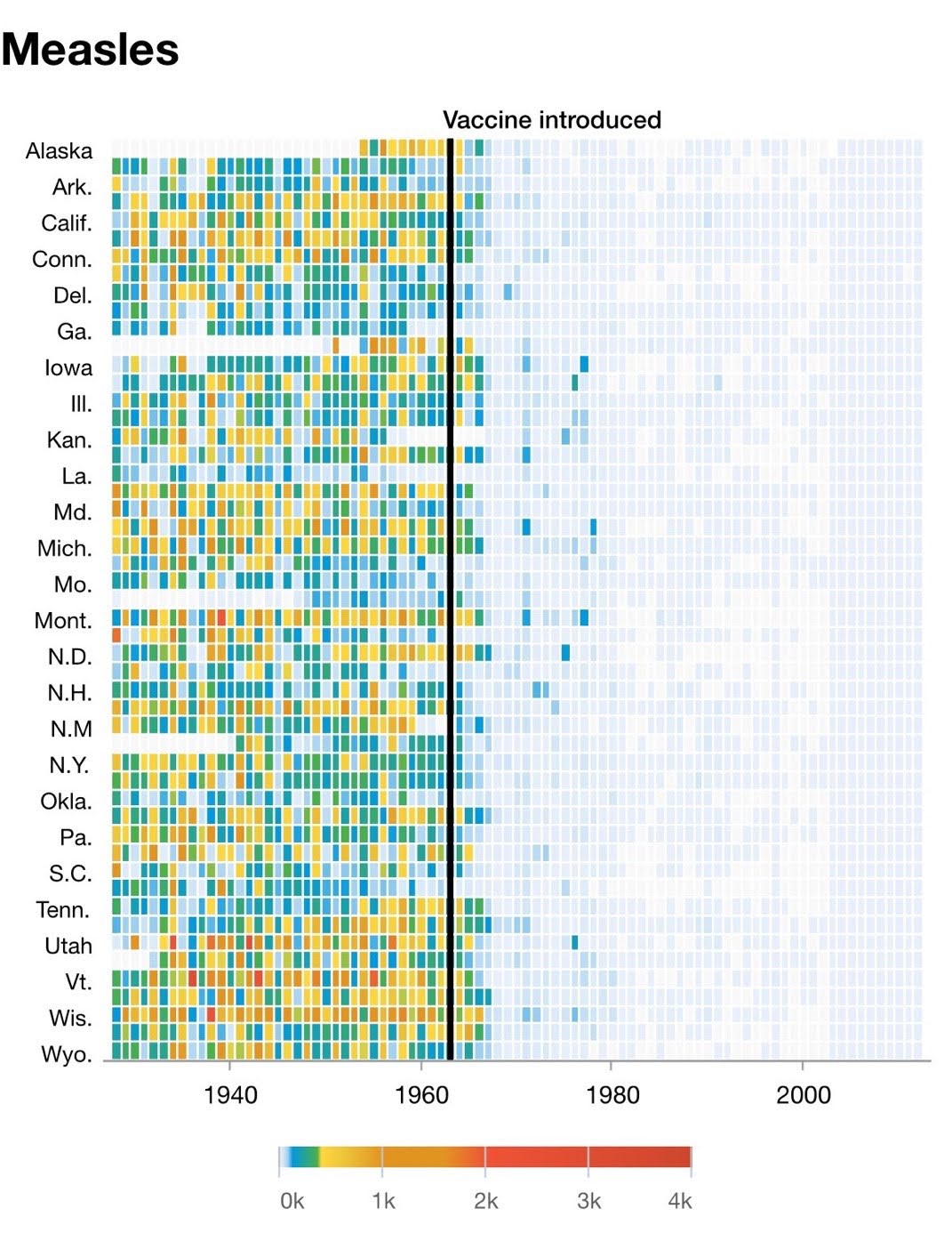
Measles Decline Chart After Vaccine In 1963
This chart tells a powerful story: before 1963, measles was everywhere. After the vaccine? Practically gone. No hype, no slogans,...
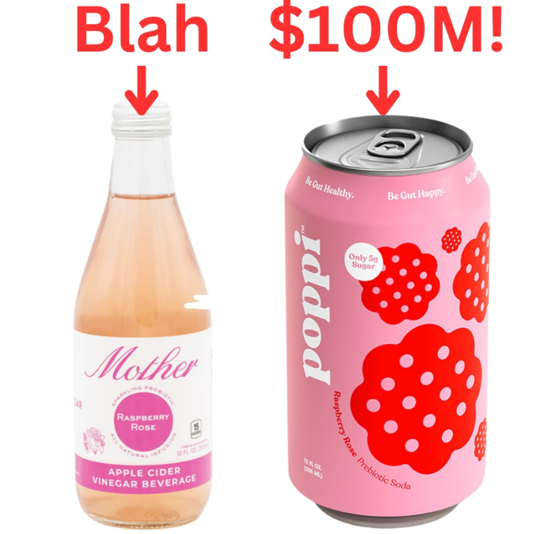
Poppi Rebranding before and after
A simple rebrand turned a bland apple cider vinegar drink into a $100M soda phenomenon. The shift from “Mother” to...
.png?width=3840&quality=80)
La Croix Re-branding
La Croix didn’t just redesign a can. They redesigned their category. Instead of trying to look like a fancy bottled...
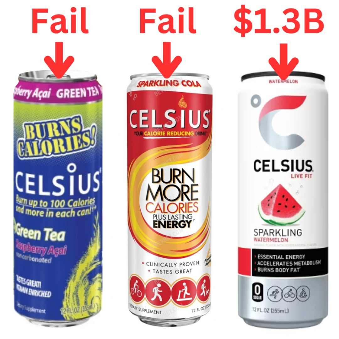
Celsius can design rebrand
Celsius didn’t get it right the first (or even second) time. Their early cans screamed “diet drink” and “burn calories.”...
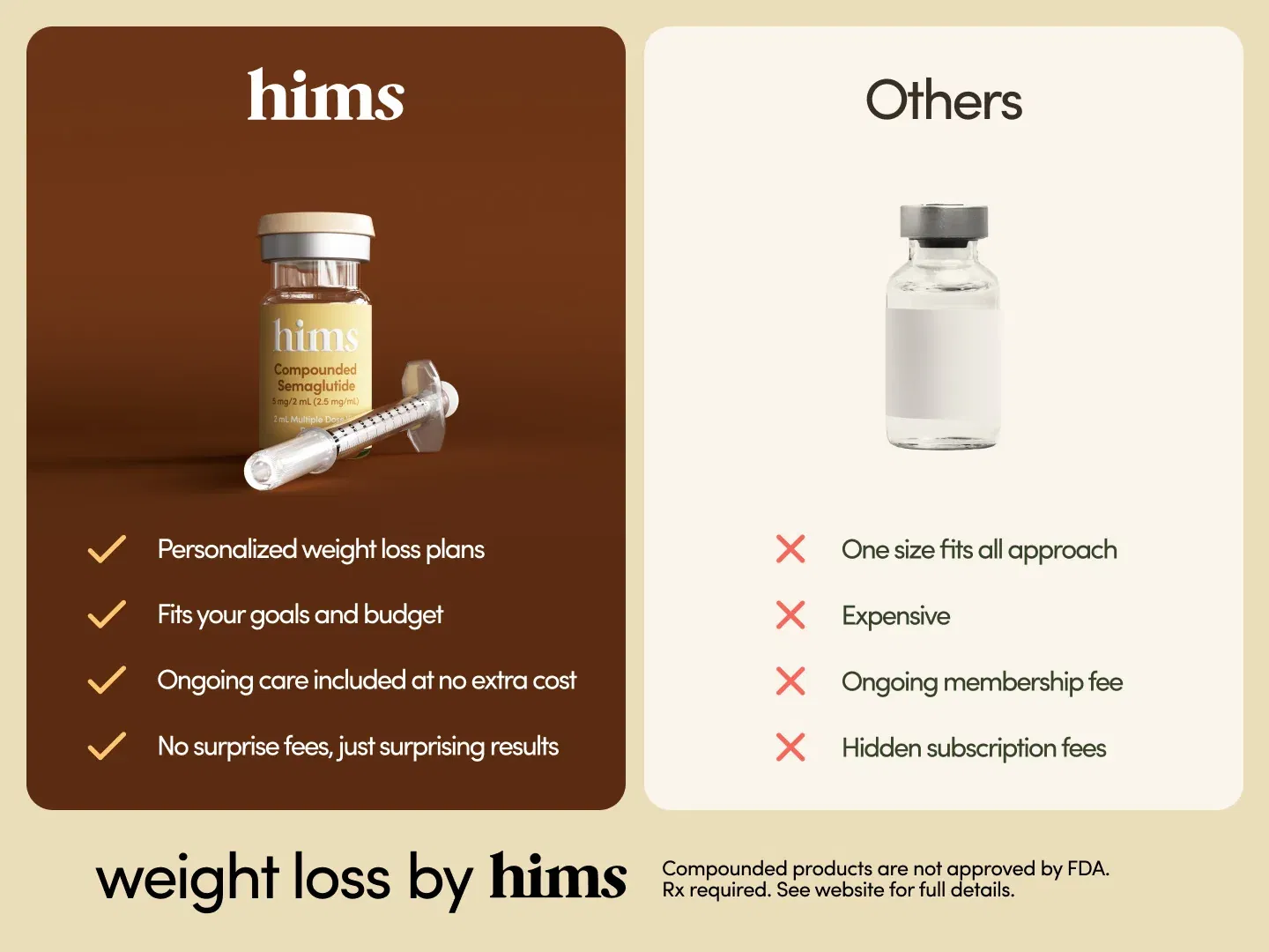
Hims Weight Loss Semaglutide Ozempic Shot Before/After
Ever notice how clear “this vs that” visuals instantly click in your brain? Hims nails this with a clean side-by-side...
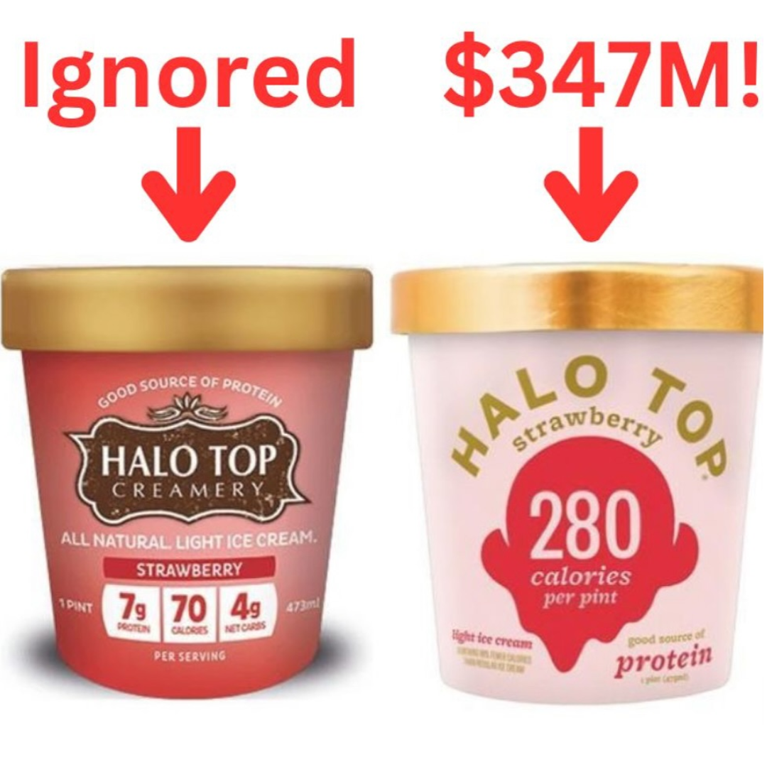
Halo Top Ice cream before and after packaging
Halo Top didn’t win by shouting “We’re delicious!” like every other brand. They won by showing “Only 280 calories per...
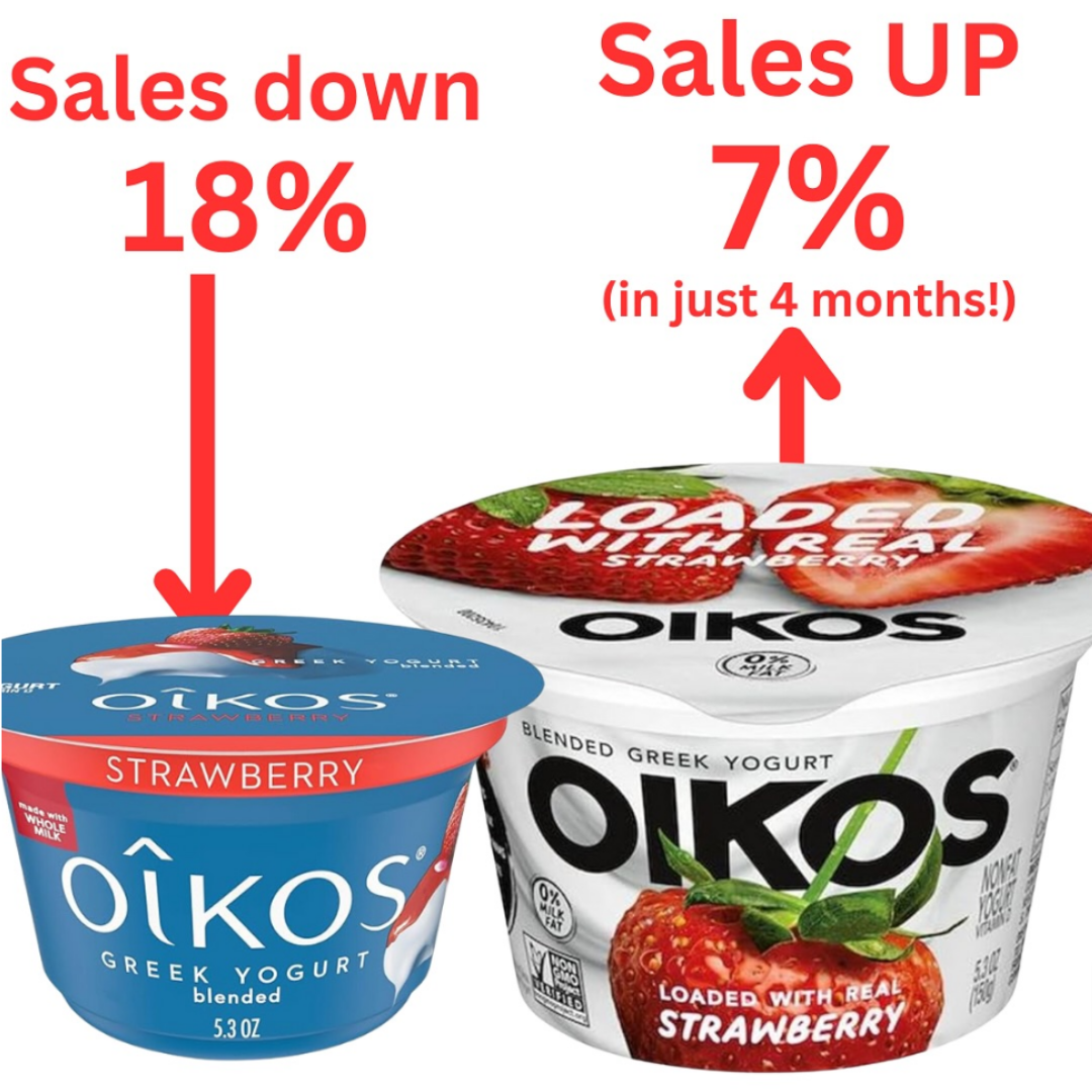
Oikos before and after packaging
Oikos didn’t change their yogurt recipe. They just changed the packaging colors and focus. The dull blue tub got swapped...
If something's not working, change it....no one cares
Jason Cohen dropped a truth bomb for marketers: almost no one’s watching that closely. If you need to change pricing,...
Simpler Hair Color Instagram Product Demonstration Ad
A guy films himself on his phone, applies a men’s beard dye, and boom — gray turns to black in...
Starting as a total beginner
When you’re just starting out, trying to pick a niche right away can feel like throwing darts blindfolded. Instead, go...
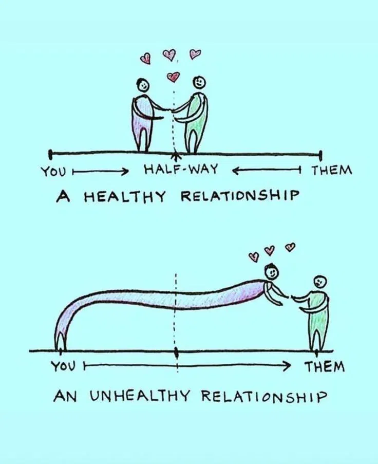
Health -vs-Unhealthy Relationship Graphic
This sketch nails a truth most brands forget: relationships should be balanced. One person (or brand) can’t carry all the...

Spindrift Before & After Rebranding
Spindrift’s old cans tried to convince us they were healthy with lots of text and health claims. The new look?...
Biggest mistake of people learning trading.
Everyone in trading has that “ouch” moment. Chris Dunn breaks down why those painful trades are actually goldmines for learning....