3,027 Copywriting Examples From the Present and Past
Dive into the art and science of copywriting with examples that convert. Discover persuasive techniques, headline formulas, and copywriting strategies used by top marketers. Ideal for anyone looking to enhance their writing skills.

Simple mission statement
Most mission statements are fluff — full of “innovation” and “synergy.” HighLevel flipped that script. Their mission ends with a...

Technical statistics as usage proof for GoHighLevel
Ever seen a company casually drop stats like “4.6 billion conversations” or “1 billion API hits daily”? That’s not bragging....

Two Column Email Signup Form Template
This simple two-column layout nails what every email signup form should do: grab attention fast and make signing up frictionless....

Market cap of BitCoin vs other assets
This chart does something hard: it turns $900 trillion of global wealth into something that makes sense at a glance....

Simple Email/Newsletter Signup Template
Most signup pages try to do too much. Too many boxes. Too many distractions. The best ones? They’re dead simple....

Putting a hard rule on your community to join
Consumer Club doesn’t let just anyone in. To join, your company has to make at least $1M ARR. That one...

AIDA Formula Email Template
This image is a working outline for the timeless AIDA formula: Attention, Interest, Desire, Action. It’s the easiest way to...
Dumb = Complex. Smart = Simple.
There’s a killer tweet floating around that nails a universal truth: “Dumb people admire complex language. Smart people admire simple...

GoHighLevel Three Tiered Pricing Plan
Look at this pricing table. Three clear options: $97, $297, and $497 per month. But the real magic? Every plan...

Automated chat booking on calendar
We’ve all been there: 10 back-and-forth emails just to find a meeting time. Painful. This ad for HighLevel’s automated booking...

$30,000 minimum pricing page
Ever seen a price tag with three zeros and still thought, “That’s fair”? That’s the magic of smart tiered pricing....

Good email outreach for a book authoring company
This cold email from Author Inc feels like it was written just for Neville. It opens with a personal idea,...

Promoting your products online
Even the richest man alive is out here tweeting about his product. Damon Chen reminds us that Elon Musk doesn’t...

GoHighLevel signup page gives 14-day free trial and free onboarding support.
Most SaaS trials flop because users never get started. HighLevel fixes that by stacking irresistible onboarding bonuses right into their...

Turns out many people aren’t depressed, they just don’t have something worthy to work on.
Dr. Nicholas Fabiano shared a study titled A Wandering Mind Is an Unhappy Mind with a great insight: people are...

GoHighLevel Software Comparison & Replacement Chart
This chart is genius. It doesn’t just say GoHighLevel replaces all your tools — it shows it. Every marketer knows...

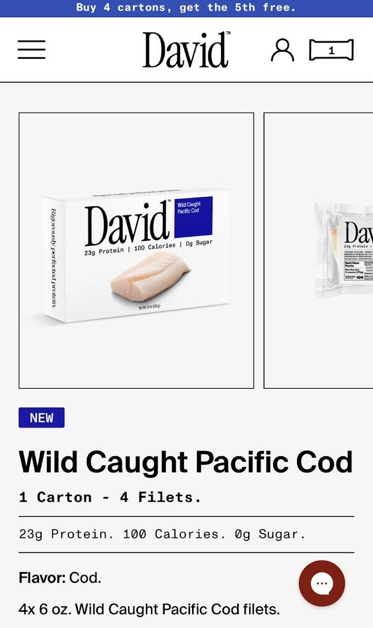
Next protein trend is…..cod fish??
David, known for protein bars, just launched… fresh cod. Yep, the same bold logo and clean packaging—but now with raw...

People don’t want tools they want a result
Maxx Blank nails it: people don’t buy dashboards or apps; they buy results. Tools are just the middleman. The future?...

Time to run an ad campaign comparison chart
Beehiiv nailed this one. Their ad uses a single chart to show how absurdly faster their ad network is compared...

Massive shift in economy over 30 years
In 1990, America was powered by manufacturing. Fast forward to 2024, and health care has taken over nearly every state....
Focusing is important
Jay Yang nails it: lack of focus crushes more dreams than lack of talent. In marketing and business, chasing ten...

Interesting BitCoin meme for HODL’ing
This meme nails a simple but powerful message: “We’re early.” It shows the evolution of Apple computers from the 80s...
Use the A.I.D.A. Formula for selling anything
The AIDA formula is one of those old-school tricks that still absolutely works. It turns any pitch into a smooth...
BTC marketcap > Gold
Dan Held dropped a spicy tweet: if Bitcoin’s market cap equals gold’s $23 trillion, each BTC hits about $1.15M. He...