1,913 Images and Illustration Examples That Teach Things
Drawings and illustrations and photography can transmit more information from human-to-human than text can. This board is perfect for designers and marketers seeking visual inspiration.
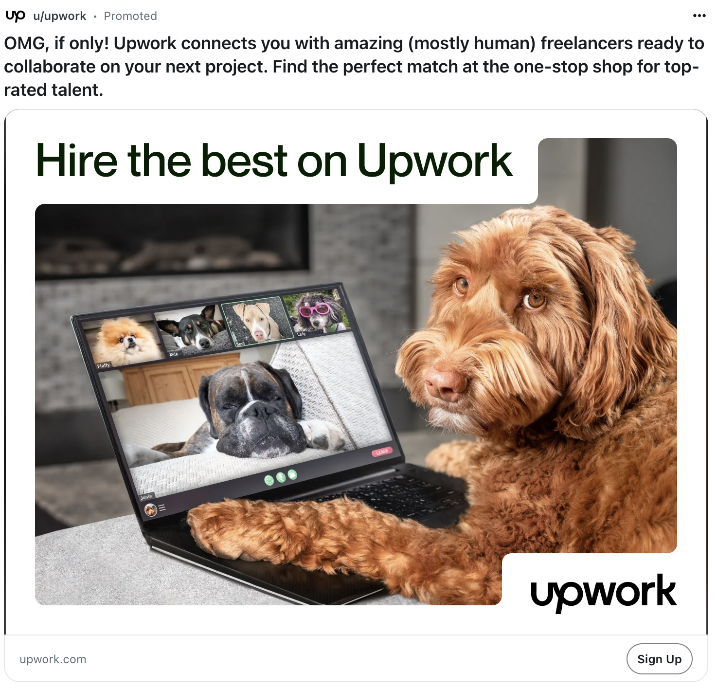
UpWork Dog Ad on Reddit
This Upwork ad isn’t fancy, but it grabs your eyeballs fast. A dog sitting at a laptop doing a conference...
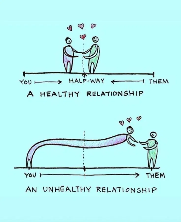
Health -vs-Unhealthy Relationship Graphic
This sketch nails a truth most brands forget: relationships should be balanced. One person (or brand) can’t carry all the...
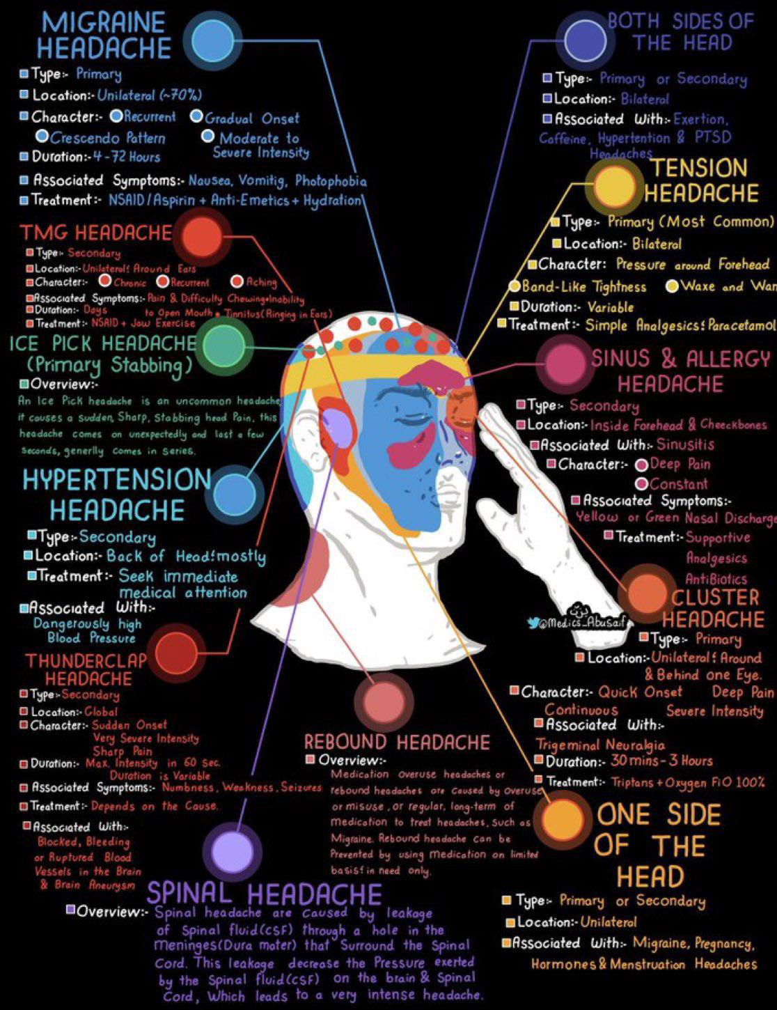
Headache explainer chart
Ever see an infographic that just clicks? This headache chart nails it. In one glance, you can understand eight types...
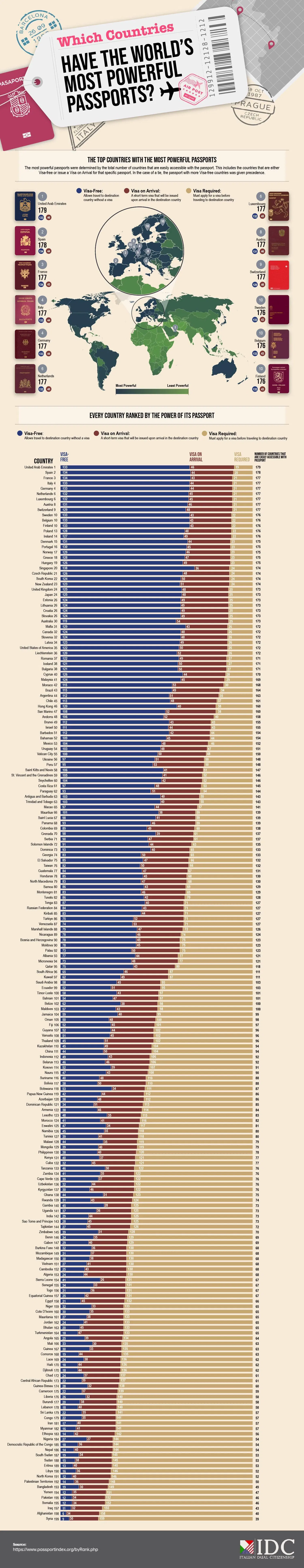
Which countries have the worlds most powerful passport infograph
This passport infographic is a masterclass in visual storytelling. It instantly shows which countries’ citizens have the most travel freedom—and...

Spindrift Before & After Rebranding
Spindrift’s old cans tried to convince us they were healthy with lots of text and health claims. The new look?...
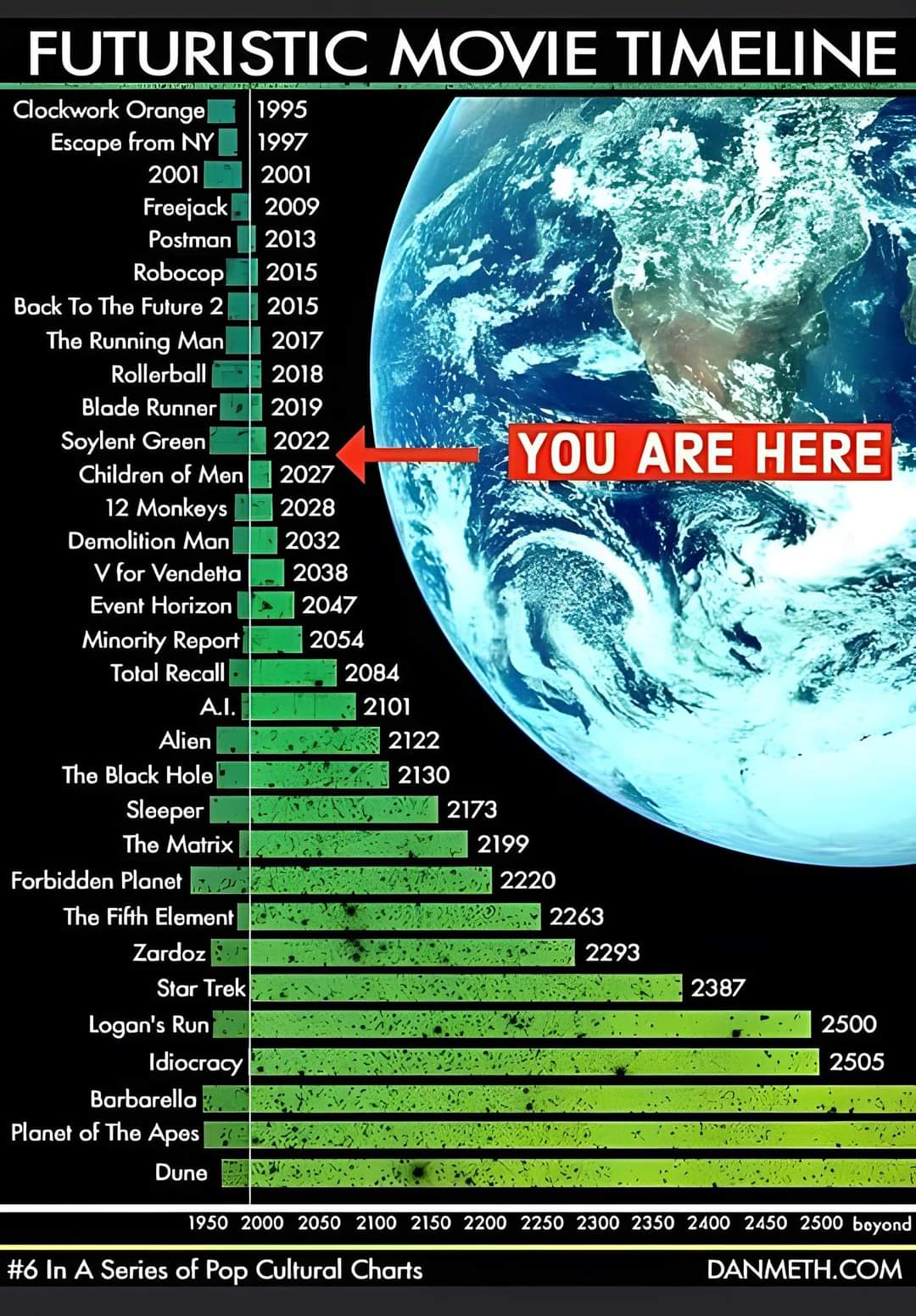
Future dates of movies in a timeline
This timeline of futuristic movies hilariously shows where we are in time. According to Hollywood, we should be eating Soylent...
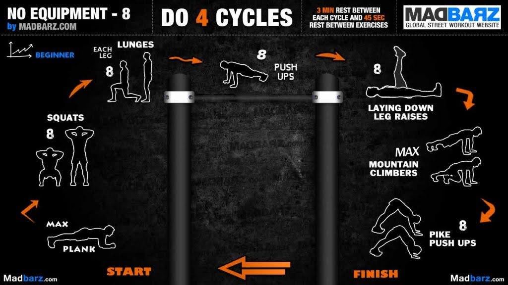
Building muscle with no equipment
This Madbarz graphic shows a full-body workout—no equipment needed. Simple, catchy, and beginner-friendly. But what’s really interesting isn’t the fitness...

Brick and Batten Home Before and After Image Post
A simple before-and-after shot can sell transformation better than a thousand words. This image from brick&batten shows how a traditional...
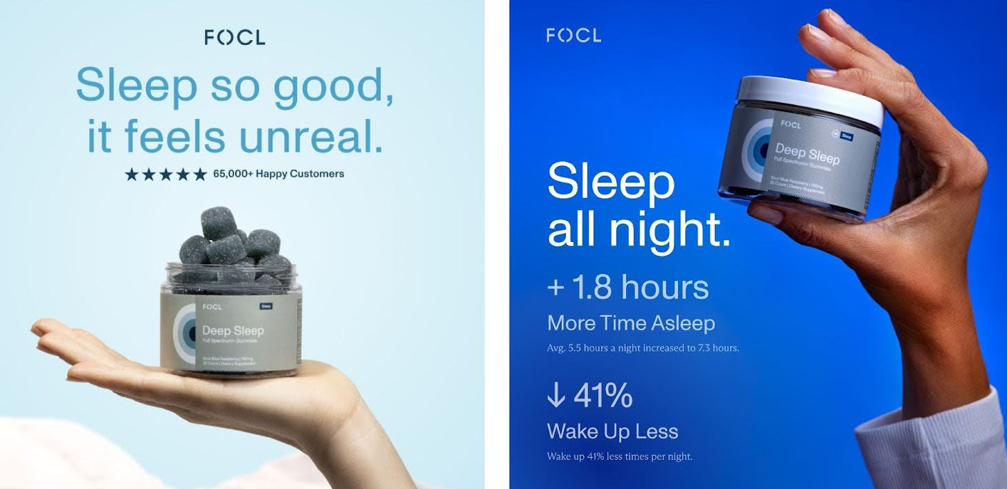
Re-designed sleep aid working 5% better
Both FOCL ads sell the same gummies, but the dark blue version wins. Why? It nails the fundamentals of direct-response...

Sweet image showing how to pack a backpack
This isn’t just a photo of a backpack. It’s a masterclass in visual communication. The North Face uses transparency to...

Starship Size Vs Cyber Truck
Sometimes we don’t grasp how massive something is until we see it next to something familiar. This image of Starship...
The Heavenly Before and After ad
Nothing grabs attention like a good transformation. This interior design ad nails it with a simple formula: show the “before”...
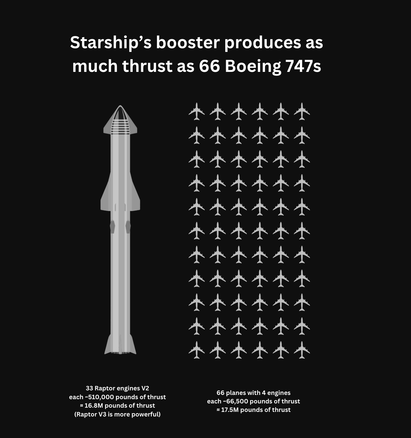
Starship more powerful than 66 Boeing 747's
SpaceX doesn’t just say “we make big rockets.” They show it. This image compares the Starship’s booster thrust to 66...
Binary counting easily demonstrated with wooden blocks
A short clip of a wooden counter explaining binary went viral. Why? It made something people usually avoid (binary math!)...
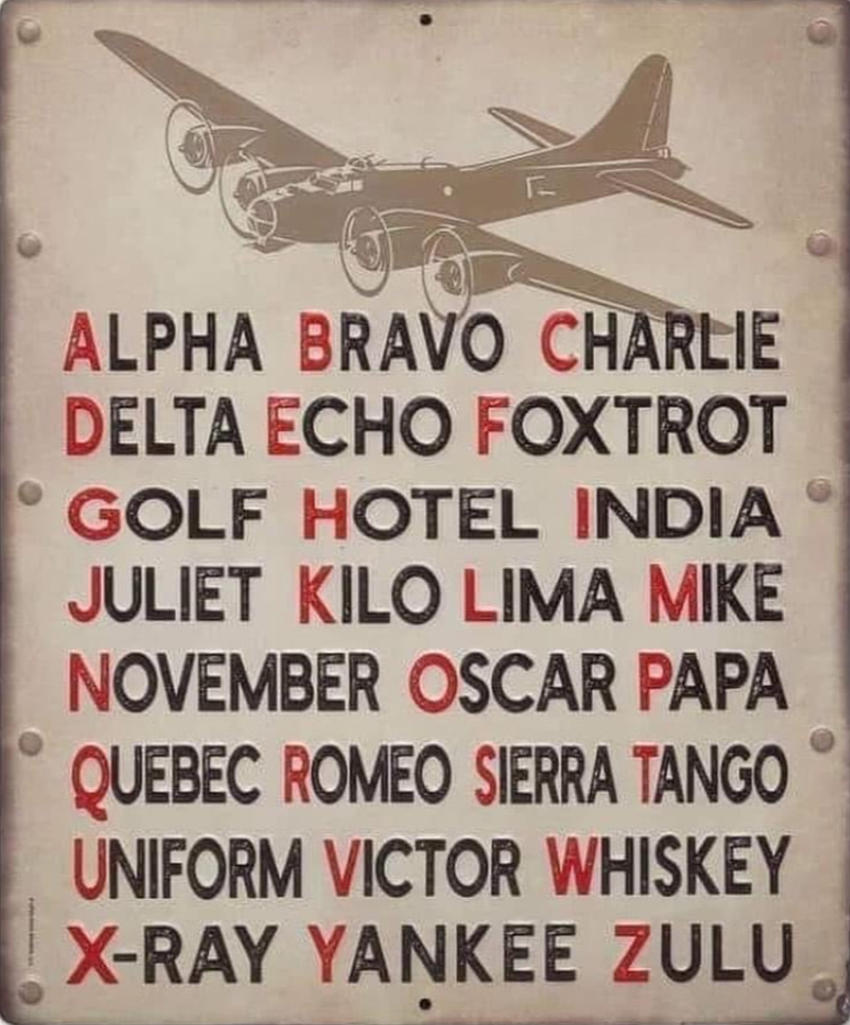
International Radiotelephony Spelling Alphabet Guide
This old-school phonetic alphabet was invented to prevent miscommunication over noisy radio lines. Instead of saying “B,” you say “Bravo.”...
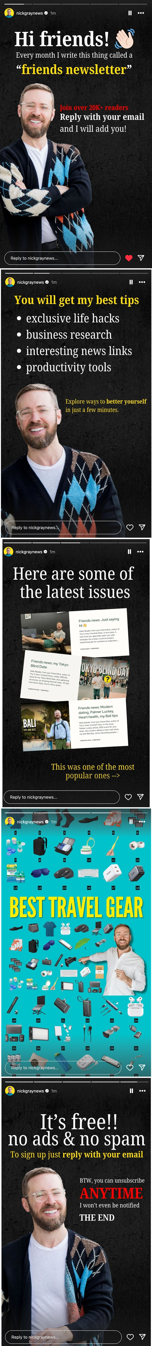
Nick Gray’s Instagram Story Newsletter Promotion
Nick Gray doesn’t just post selfies. He uses Instagram Stories to sell his newsletter like a pro. His post reads...

How to make a salad infographic
This graphic nails visual communication. In one quick glance, it teaches you how to build an infinite variety of salads...
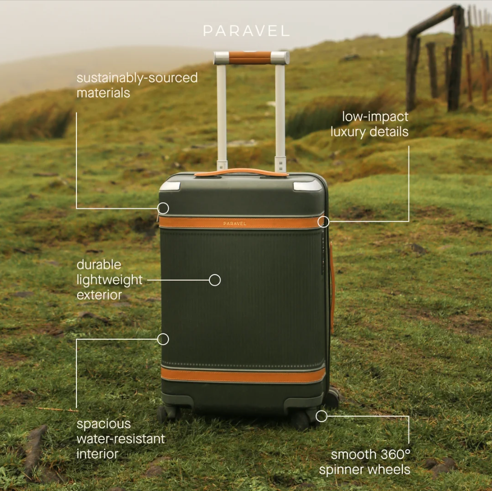
Paravel luggage beautiful text mockup
This ad from Paravel nails minimalism. One photo, five short callouts, and boom — you instantly know what makes their...
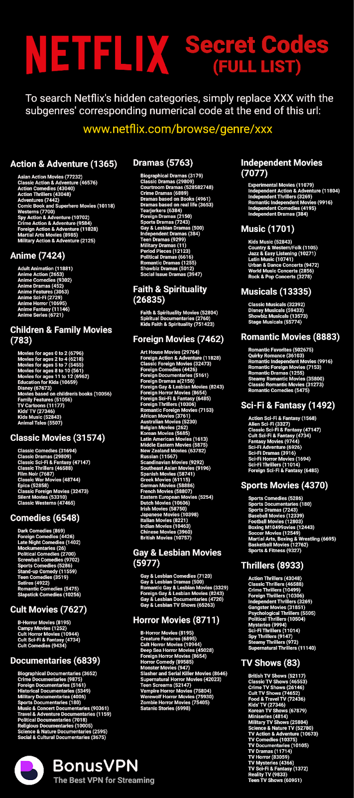
Cool NetfFlix “Secret Codes” URL Chart
Netflix has secret “codes” that unlock hidden genres, from “Slasher and Serial Killer Movies (8646)” to “Romantic Gay & Lesbian...

The Copywriting Roadmap
Everyone wants to get good at copywriting fast, but most people skip the fundamentals. This roadmap from Copywriting Course nails...
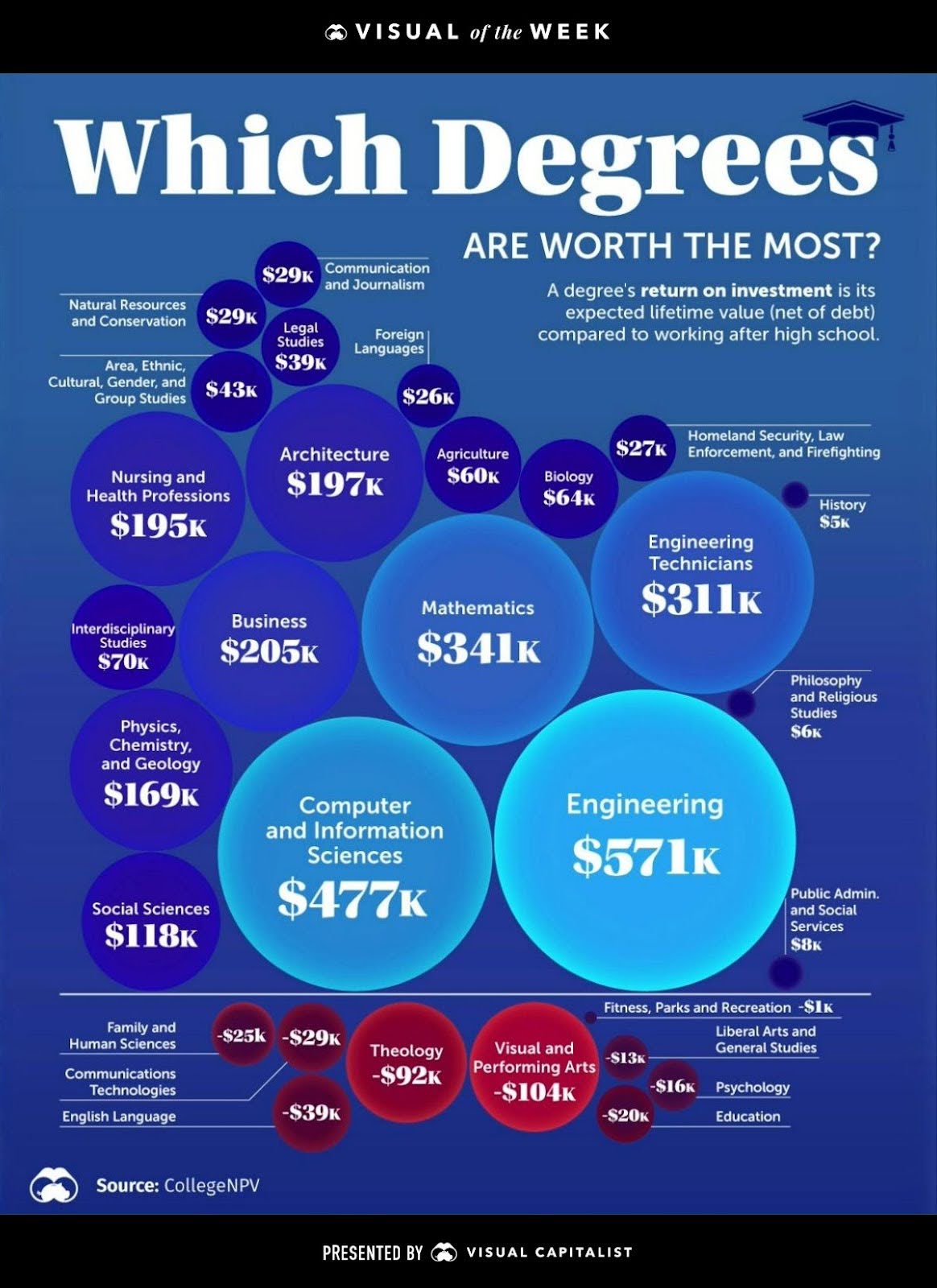
Which degrees are worth the most chart
This chart compares the lifetime ROI of different college degrees. Some majors, like Engineering or Computer Science, are financial powerhouses....
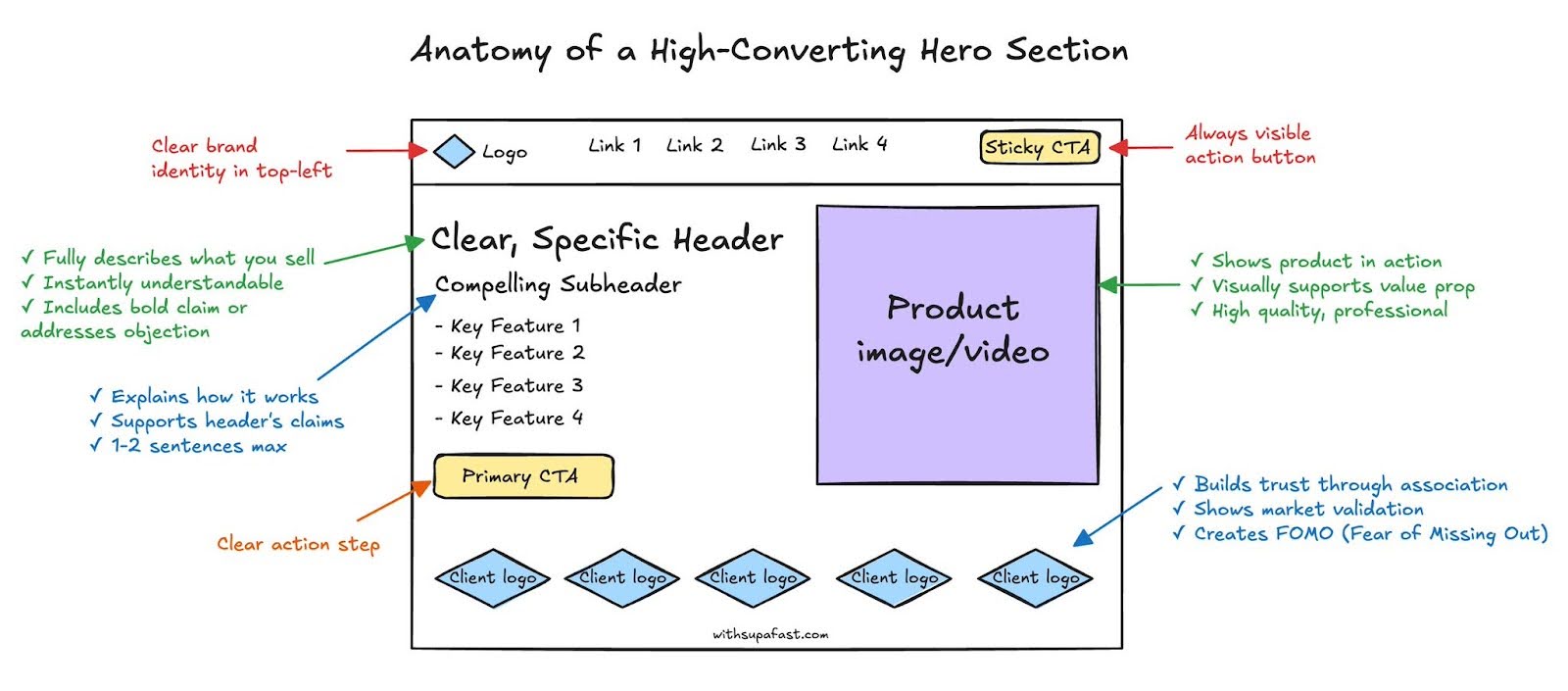
Anatomy of a hero section
The first few seconds on your site decide if visitors stay or bounce. That’s why your hero section needs to...

Evolution of the Pepsi logo from 1898 - 2009
Just look at that lineup. Over 100 years of logo evolution from fancy swirls to ultra-clean minimalism. Pepsi’s branding is...

How to use chopsticks graphic
This simple “how to use chopsticks” graphic is weirdly great marketing. It takes something tricky, breaks it down clearly, and...