2,046 Images and Illustration Examples That Teach Things
Drawings and illustrations and photography can transmit more information from human-to-human than text can. This board is perfect for designers and marketers seeking visual inspiration.

This 1911 print ad is the definition of sneaky marketing. It kicks off like a scandalous “how-to-kiss” guide, complete with...
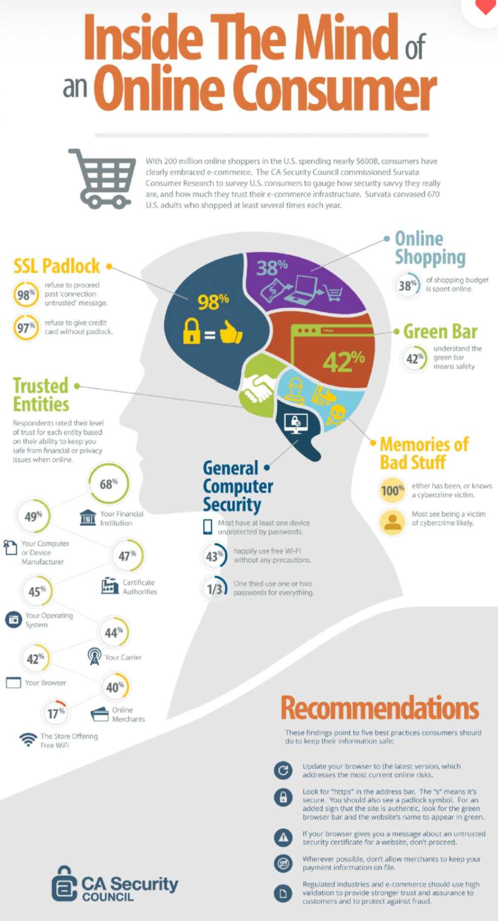
Online shoppers are smarter than ever about security. They notice the tiny lock icon and green bars in the URL...


Our brains love pictures. This simple chart nails it: people remember about 65% of what they see with an image,...

Ever felt like your blog needs more “pop”? Turns out there’s a sweet spot for images—and it’s not “as many...

People buy from people, not robots. Joe Sugarman nailed this with his “Human Relationships” trigger — the idea that just...


In this 1942 ad, Nestle turned an everyday candy bar into battlefield fuel. They didn’t say “buy chocolate because it’s...

This animation of Toys R Us stores popping up (and later disappearing) across the U.S. is oddly hypnotic. But there’s...

Most people overthink their cold emails. They spend an hour polishing one version and then wonder why they feel stuck....

Most cold emails bomb because they scream “sales pitch” from the first line. The image above nails the difference: one...

Only 20% of your blog text gets read. That means 80% of your words are wasted! The fix? Make your...

Ever think a quick Slack reply won’t hurt? Spoiler: it does. This graph nails it — a simple 5-minute interruption...

Ray Dalio’s chart on empires rising and falling looks basic, but it perfectly maps every marketing trend cycle too. The...

This sketch nails a truth about creativity: more isn’t always better. A pile of ideas rarely spark magic. It’s when...

Ever seen an email jam-packed with buttons? “Read this.” “Watch that.” “Buy now.” “Book a call.” It’s chaos. The image...

This NimbleBar landing page nails what every course page should do: show results, build trust, and make hitting “Enroll” feel...

Most “how-to” content fails because it never tells readers what to do. People don’t need vague steps—they need specific actions...

Most marketers cram five different CTAs into one email. “Join,” “Click,” “Call,” “Read more,” “Buy.” The reader freezes, overwhelmed by...

This Nikon S-2 ad from 1956 looks like something you’d see on a landing page today. They literally drew arrows...