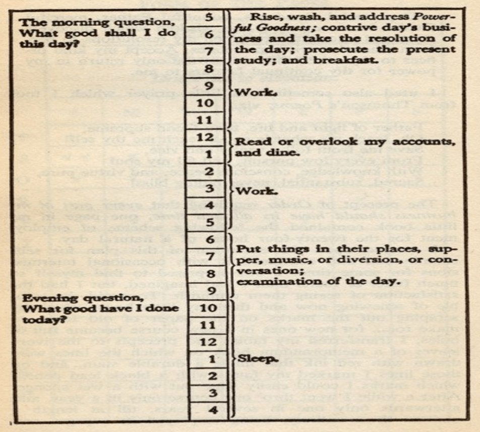
Organizing your day
Ben Franklin was a productivity beast. His daily schedule asked one simple question every morning: “What good shall I do...

Copywriting over the years
This simple drawing nails a big truth: technology changes, humans don’t. From Shakespeare’s stage to TikTok, the tools evolve, but...
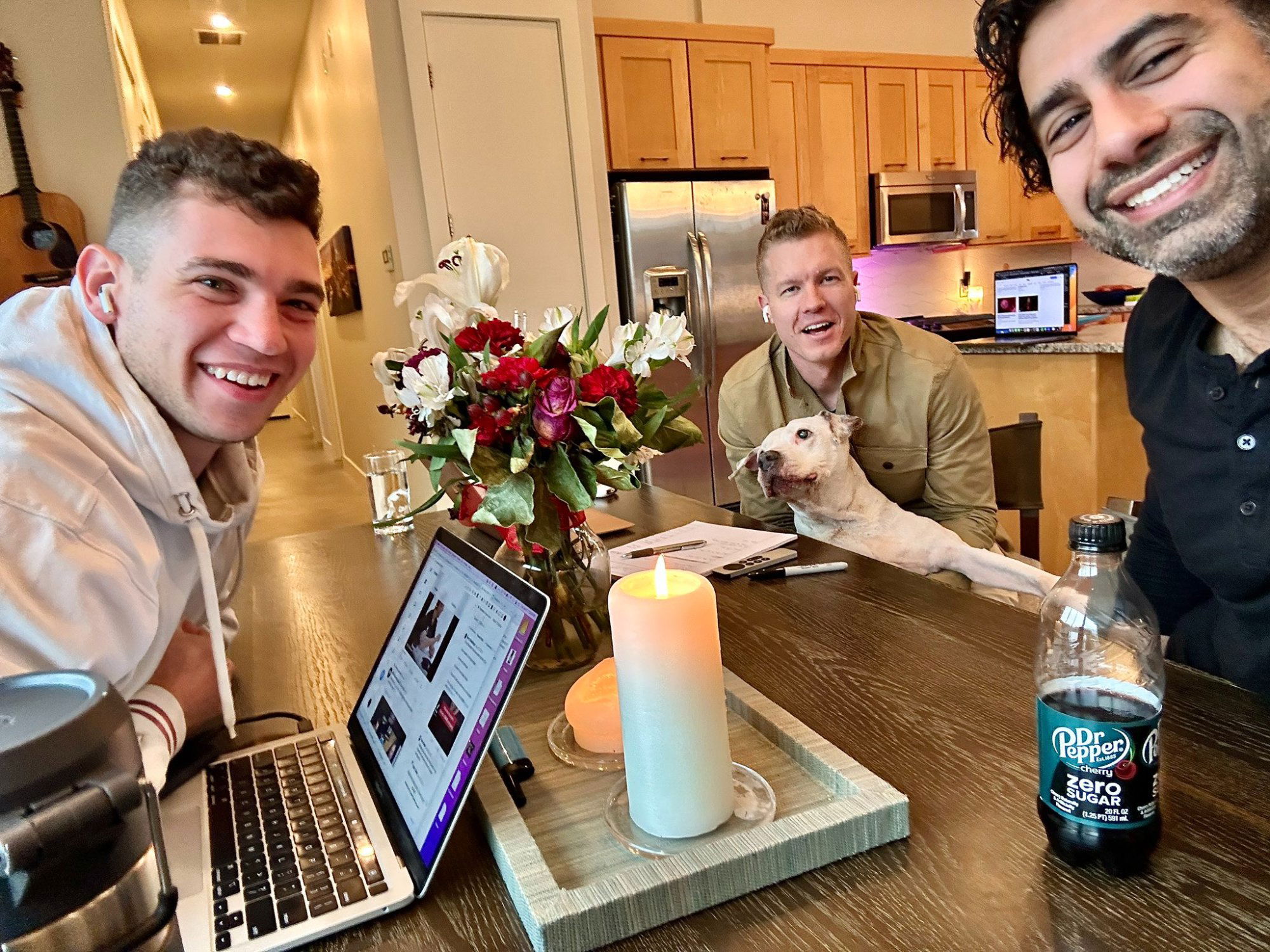
Co-working session
Even a casual workday photo can say a lot about your brand. This shot of buddies co-working on a chilly...
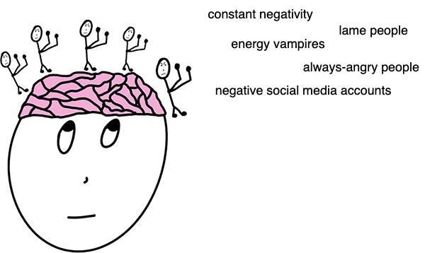
The Political Style of Your Brain
Your brain is not a democracy. It’s a dictatorship—and you’re the ruler. The image nails this idea: you’ve got little...

Handwritten door flyer
This flyer looks like someone jotted a quick note on a “While You Were Out” slip. It’s casual, personal, and...

Volvo Turbo Wagon Ad
Volvo pulled a genius move with this ad. They took a boring “family wagon” and flipped the script by comparing...

The Circle Of Influence
This simple diagram nails a truth most marketers forget: worry about what you can control first. The “Circle of Influence”...
Notes about billionaires
Talking with someone close to multiple billionaires reveals an odd truth: once you remove all limits, everything is accessible. Planes,...
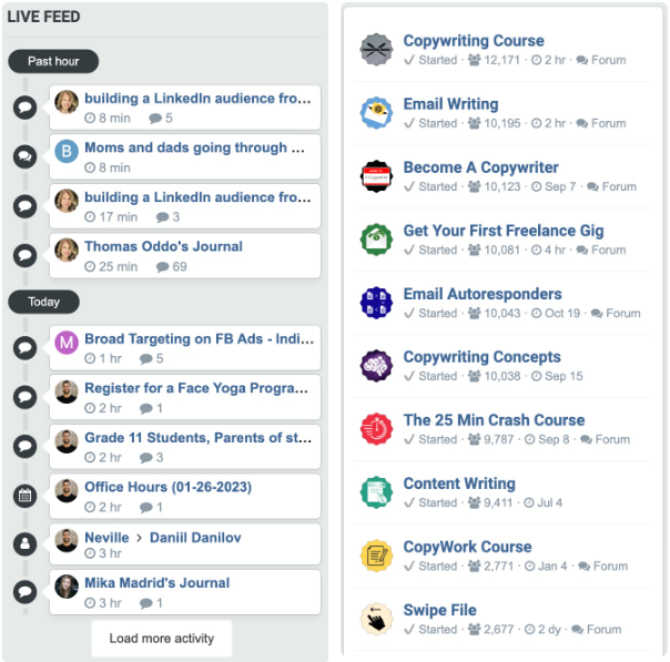
Private community benefits
Most people build communities on Facebook or Slack. Neville from Copywriting Course built his own forum instead. Why? He needed...
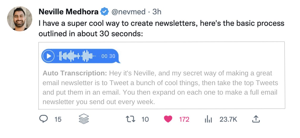
Two ideas for Twitter
This idea mockup shows how Twitter could mix short voice notes with text transcripts. Neville Medhora’s example tweet perfectly demonstrates...
A common path I've seen people take online:
Everyone talks about "making money online" like it’s a mystery. It’s not. It’s actually a simple step-by-step ladder you climb...
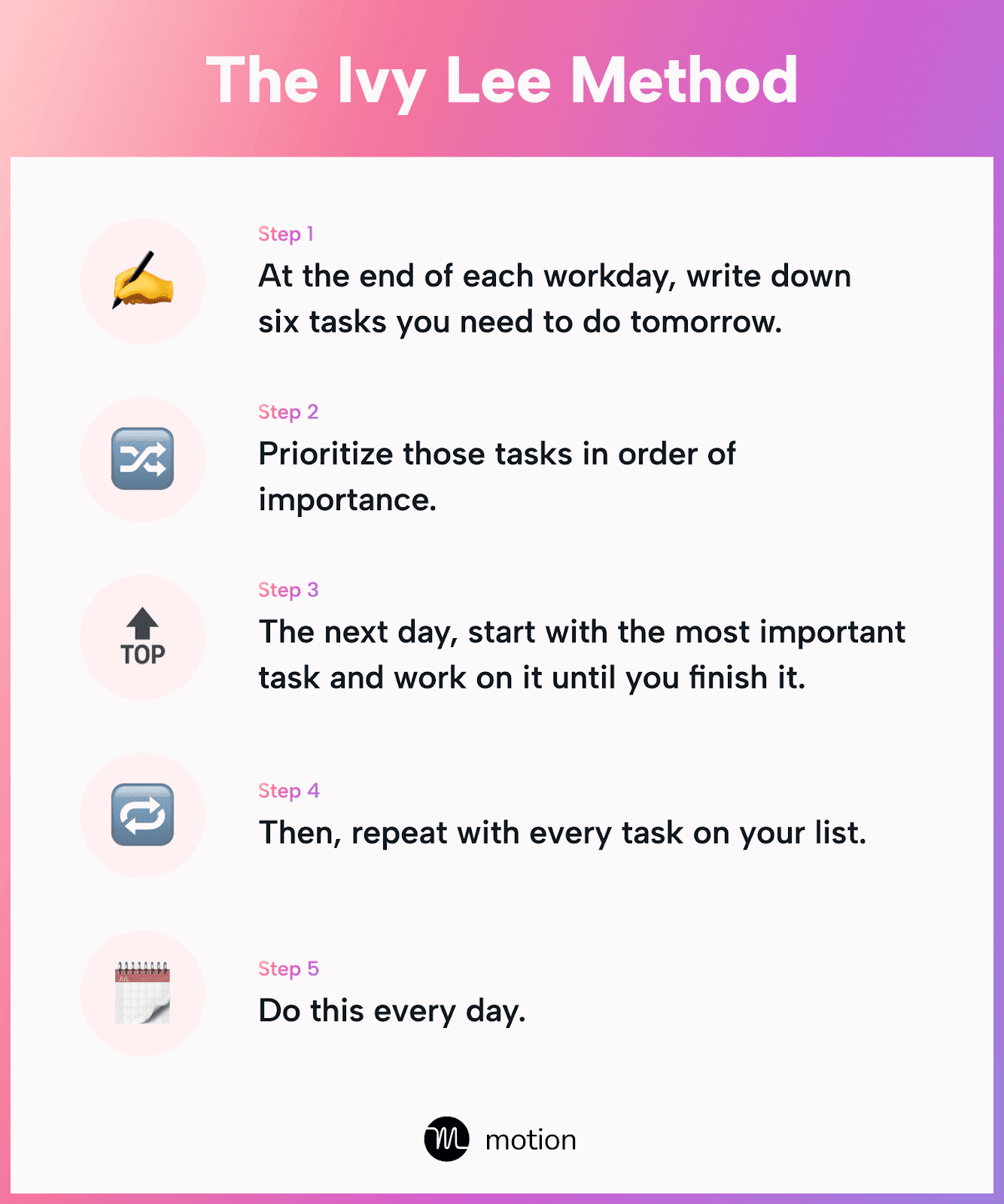
The Ivy Lee Method for productivity
If your to-do list looks like a CVS receipt, here’s a cure. The Ivy Lee Method is over 100 years...
Online entrepreneur path
Everyone wants to “make money online,” but few know the real sequence that works. This simple path shows how people...

1962 “Pet Monday” ad
Yep, they actually sold live monkeys through the mail in the 1960s. Wild. But what’s crazier is how perfectly this...

Simple visual + text potato guide
This potato chart is a masterclass in visual learning. In one scroll, you instantly get which potato to use and...
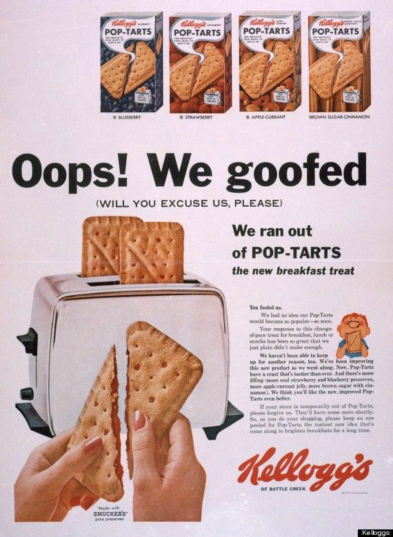
Grabbing headline Pop-Tart Ad
In 1964, Kellogg’s ran a full-page ad with a headline that screamed: “Oops! We goofed.” You can’t not read it....
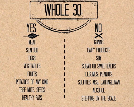
Whole 30 Rules
These Whole30 visuals are basically the perfect marketing diet too: clean, clear, and easy to digest. One look and you...
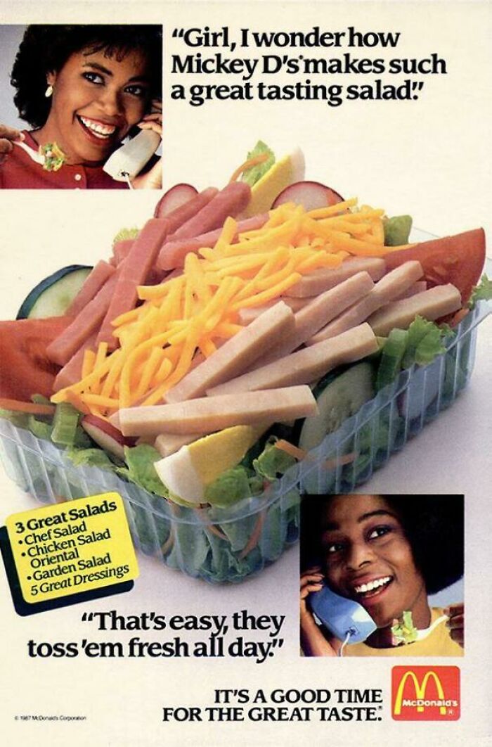
McDonald’s Salad Ad from 1987
This old-school McDonald’s ad sells salads with… gossip. Two friends casually chatting over the phone make the brand feel friendly,...

Cool graphic shows lifespan of different parts of a house
This is an awesome infographic that shows how long different parts of your home will last. In one glance, you...
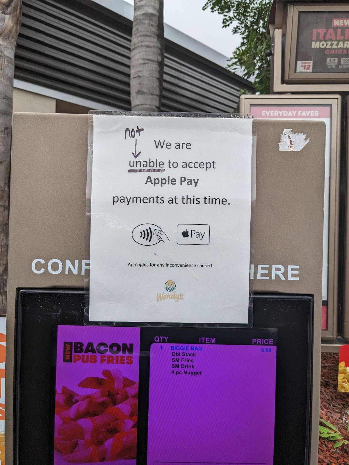
Rouge grammar vigilante simplifies a sign
Someone edited a Wendy’s sign that said “We are unable to accept Apple Pay at this time” by crossing out...
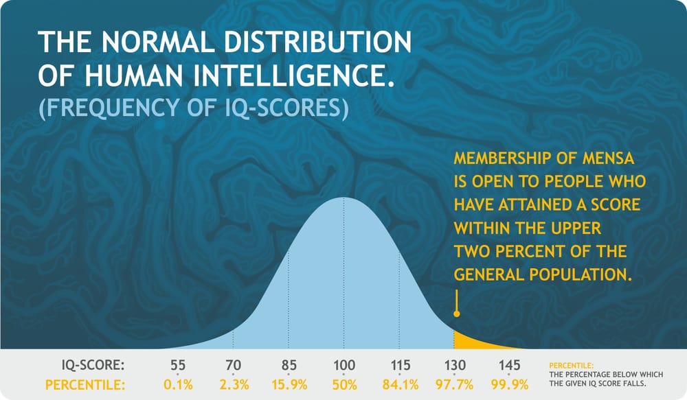
IQ score distribution chart
This chart nails one thing: exclusivity sells. Mensa doesn’t promise fun or networking. It promises you’re part of the smartest...
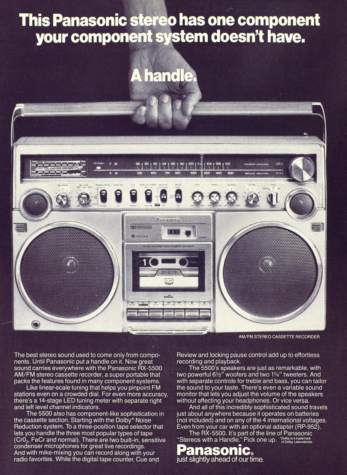
Awesome 1980 Boom Box print ad
This Panasonic ad nails the art of simplicity. Instead of cramming specs, they highlight one feature that changes everything: a...
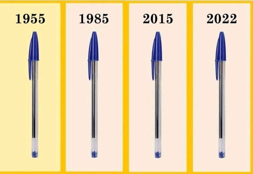
The basic Bic Pen has been the same since 1955
Sometimes the smartest marketing move is to not change a thing. The image says it all: the same BIC pen...
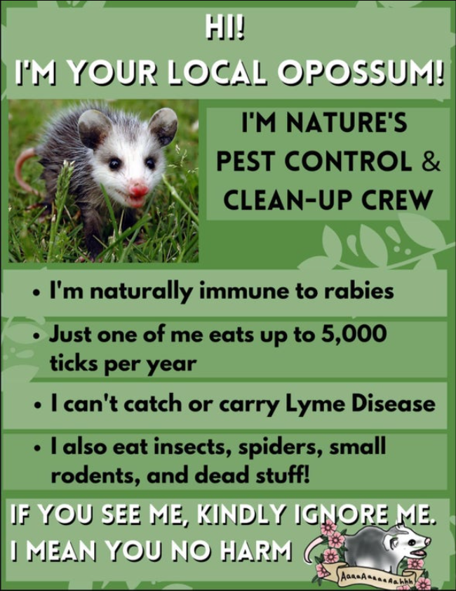
Opossum one pager flyer
This one-page flyer turns an often-feared animal into a friendly neighborhood hero. Instead of telling people “don’t hurt opossums,” it...