423 Before and After Examples
Discover the power of transformation with our Before and After Examples. See how products and services can change lives, looks, or spaces. From home renovations to personal makeovers, witness the dramatic differences and get inspired by real-life changes.

Nomadic Matt Travel Journal Instagram Promo Image
Nomadic Matt’s image showing his travel journal is a masterclass in visual storytelling. No fluff, just arrows, and short text...

Microaquire Headline Before/After
This simple tweak turned a bland CTA into a powerful magnet. The image shows two signup buttons. One says “Sign...

Build a startup like this...
Most startups build in silence for months, only to launch something no one wanted. Henrik Kniberg’s famous MVP sketch shows...

Words to use instead of "very"
This quick chart shows how one word swap can make your writing 10x stronger. Instead of saying “very noisy,” say...

Building Courses to Community Path
Ever notice how course creators all seem to follow the same growth path? It starts with one course and ends...

Before and after print ad for non profit
WWF nails emotional contrast with this simple visual. On one side, you see a shark fin. On the other, just...

Vintage camera ad has a bold headline
Back in the 70s and 80s, pro-level photography meant big cameras and heavy gear. Then Pentax dropped this ad telling...

Saas company has an entire page of case studies
Most brands toss up a few one-line testimonials and call it a day. Klaviyo flips that script. Their customer section...

Vintage camera ad
Most people didn’t believe a camera this small could take good pictures. Kodak’s copywriters didn’t dodge that doubt—they hit it...

Before and after IG ad for financial newsletter
Finimize nails a classic visual formula: confused newbie vs. confident pro. But instead of using a fancy design, they use...

Great homepage with illustrated before and after image
This landing page nails the message with one glance. The headline promises a clear benefit: less time wasted, more insights....

1973 Brylcreem Hair Length Ad
This Brylcreem ad didn’t just sell hair gel, it sold sex appeal. It showed “before” and “after” headshots—same guys, new...

Homepage displays product demo and a try before you buy feature
This homepage sells the product in one line: “We instantly summarize text.” No fluff. Just clarity. Then it instantly shows...

A coffee alternative compares their product to traditional coffee to convert sales
MUD/WTR nails their landing page by going straight at coffee’s weak spot: side effects. Their side-by-side chart clearly shows “MUD/WTR...

Reddit ad for skin care product uses before and after photos
Kiehl’s keeps it simple and powerful in this ad. They lead with “Since 1851,” instantly building trust. Then they drop...

Landing page image that shows feature benefits
This signup page for Capital One Shopping’s Price Protection is a masterclass in visual communication. Instead of paragraphs of text,...

Emotional before and after ad
SmartNomad nailed the emotional contrast. The left side shows a stressed worker rubbing her eyes in frustration. The right side?...

Before and after fitness Instagram ad
StretchItApp nails the classic “before and after” ad. The first image shows limited flexibility. The second shows amazing progress. But...

Image that visually explains
Acorns takes a $0.50 roundup and makes it look like a life-changing decision. This ad turns spare change into potential...
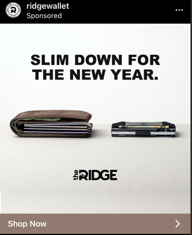
Great before & after Ad
Ridge Wallet nailed the classic "before and after" format—without a single gym photo. Their ad shows a bulky, overstuffed wallet...
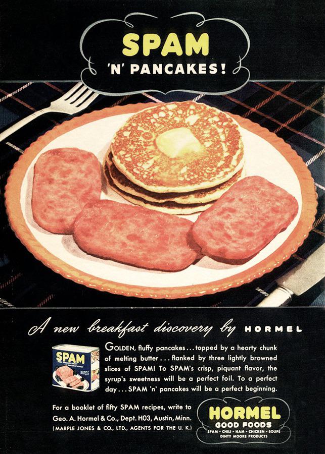
Spam & Pancakes Print Ad
In 1941, Spam pulled a clever move: they showed people that Spam wasn’t just for lunch. It could be breakfast...
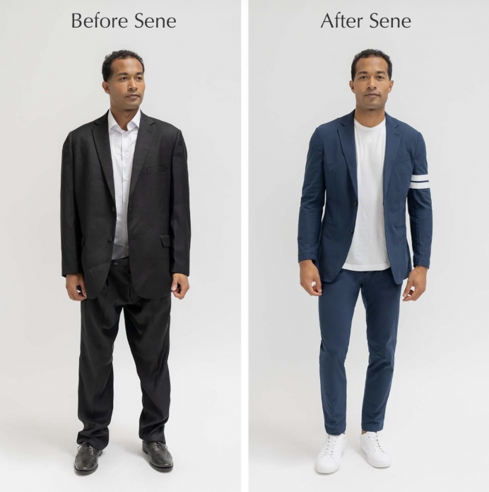
Before & After Instagram Ad
This Sene ad nails visual storytelling. One model, two outfits: one frumpy “Before,” one sharp “After.” No words needed to...
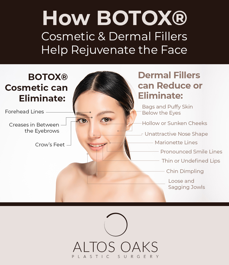
Botox and Dermalfill Ad
This Botox ad nails visual communication. Instead of dumping copy in a paragraph, it uses callouts to map exactly where...

Scan Cafe Before and After Photo
This image from ScanCafe nails the “before-and-after” concept beautifully. One glance and you instantly get what the product does: it...