457 Sales Page Examples
Unlock the secrets of effective sales pages with Swipefile's curated examples. From compelling copy to strategic design, learn how top marketers structure pages that convert. Whether you're selling a product, service, or course, our sales page gallery offers inspiration and strategies to boost your conversion rates.
Mr. Beast Sales Upgrade Video for ViewStats Pro
Mr. Beast dropped a masterclass in selling upgrades. In one short video for ViewStats Pro, he explained why he built...
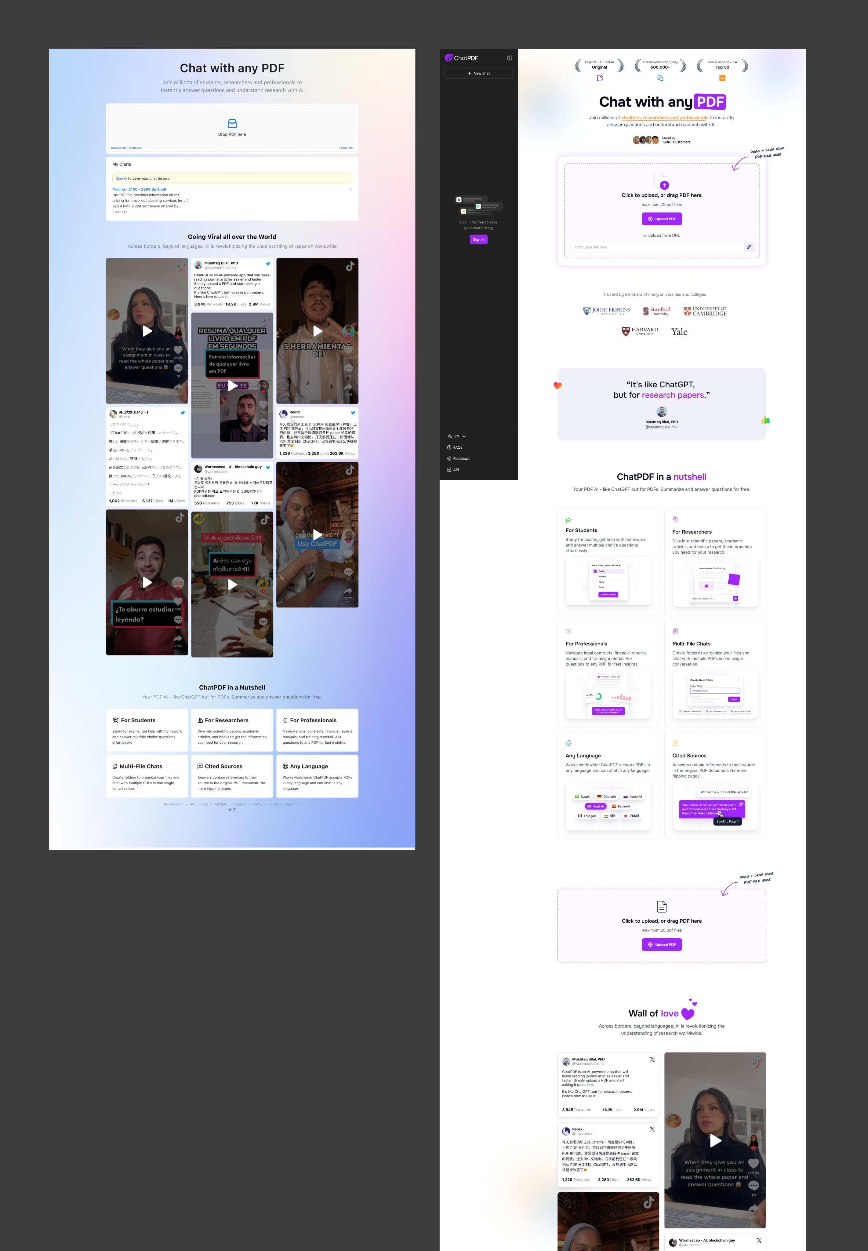
Before and After of Chat with any PDF Sales Page
The new Chat with any PDF site nailed a subtle but powerful marketing principle: clarity converts. The redesign makes it...

Convert Sail Before and After Sales Page Redo
Convert Sail took a plain honey product page and made it irresistible. The transformation shows how small visual and copy...
Latecheckout Agency great single-page website
Greg Isenberg’s team at Late Checkout found one small change that skyrocketed conversions: showing results in a clear, trust-packed chart....
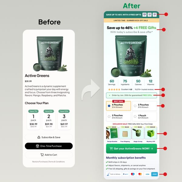
Before and after of product page
The “before” page looks clean but a little too plain. The “after” page screams value, urgency, and clarity. It’s packed...
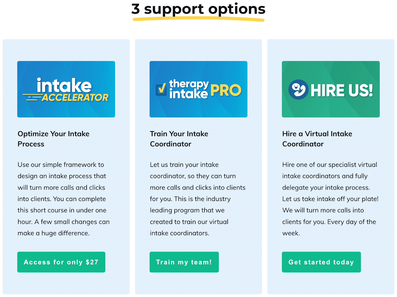
Great 3-tier explanation of a sites offerings for sale.
Productive Therapist nails the classic 3-tier pricing layout. It’s clean, visual, and instantly tells the buyer: “Pick the one that...
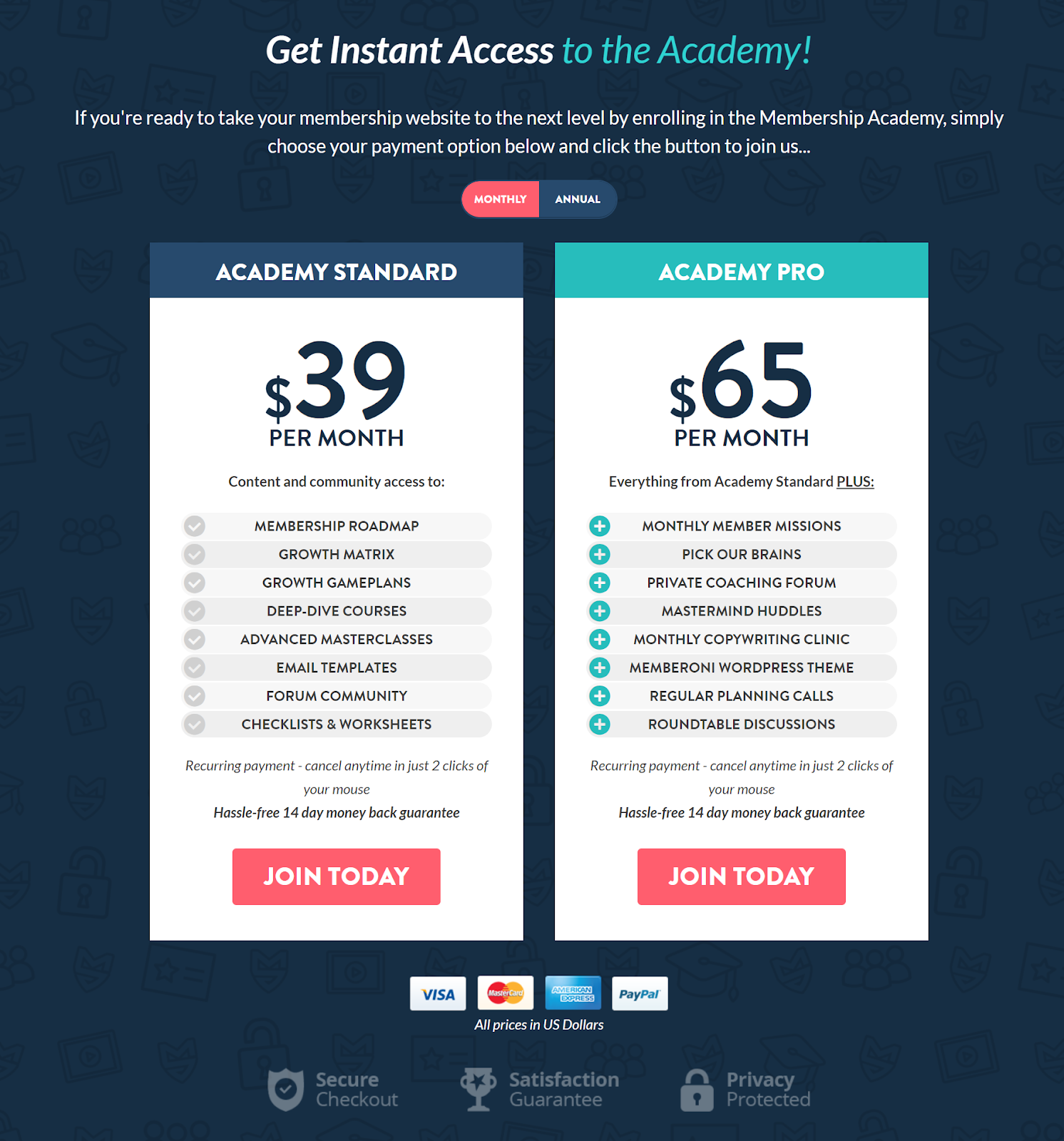
MembershipGeeks Pricing Structure
MembershipGeeks nails their pricing page. Two clear options. Clean layout. Each plan’s value spelled out like a restaurant menu. Why...
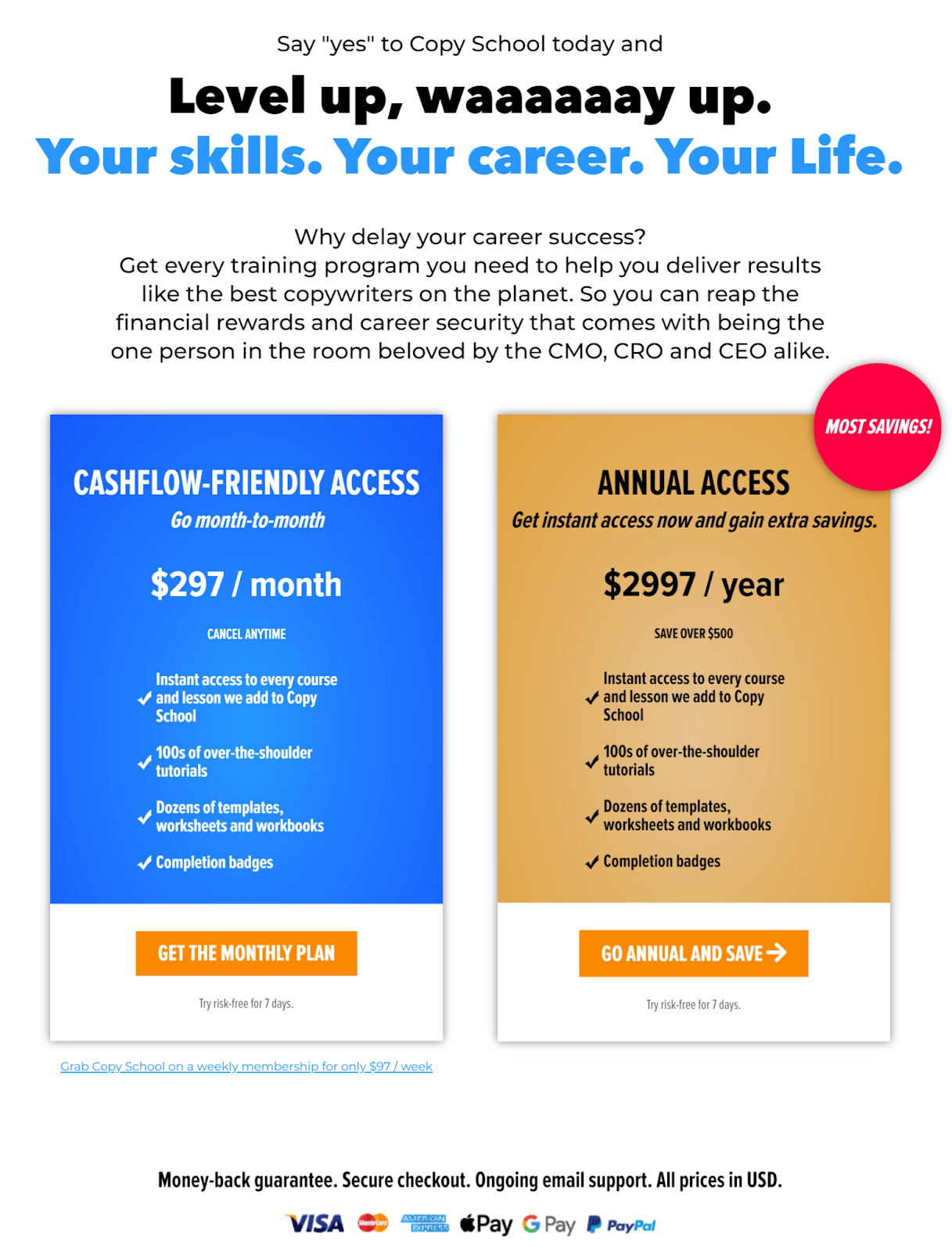
CopyHackers Copyschool Pricing Structure
Most pricing pages feel like a math workbook. Too many buttons, too many plans, too much thinking. Copy School flips...

Kreated sales page
This sales page is pure conversion candy. It’s got everything a visitor needs to trust, engage, and buy — no...
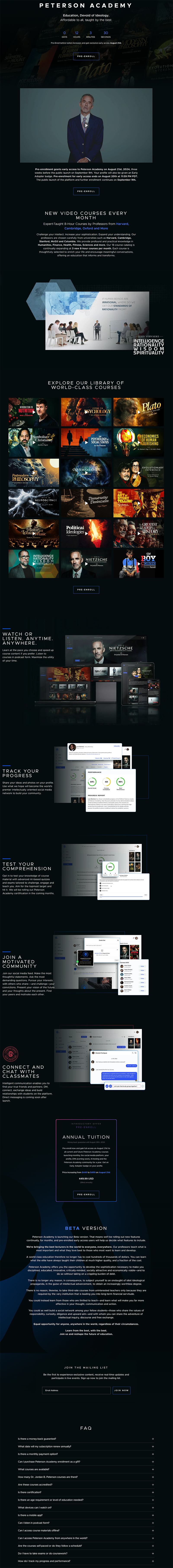
Peterson Academy Sales Page For Beta Program
Peterson Academy’s landing page nails the feeling of “I need to join this.” It mixes high-end visuals with smart psychological...
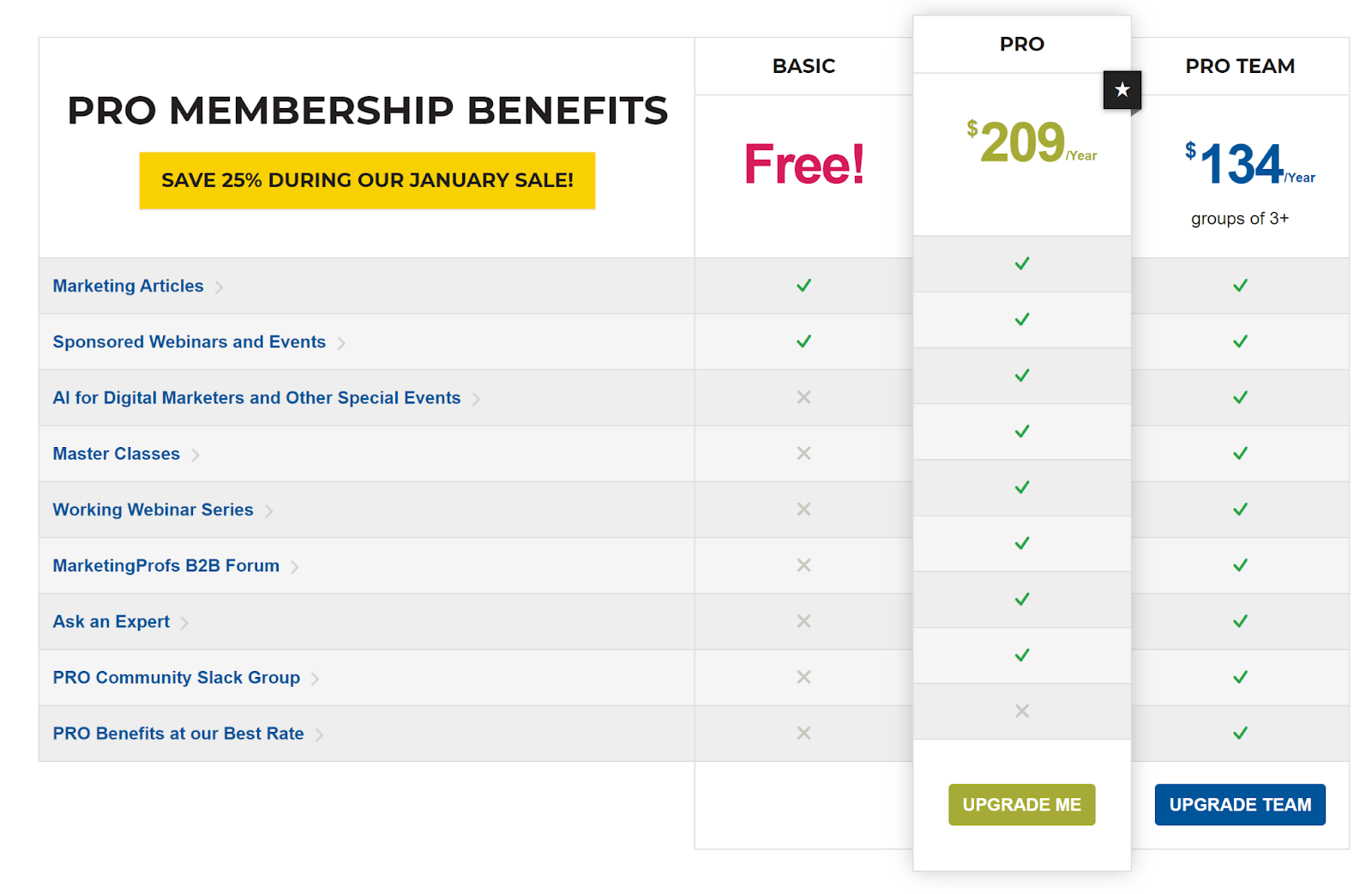
MarketingProfs Three-Tiered Pricing
MarketingProfs nails their pricing table. It’s clean, simple, and makes upgrading feel obvious. Each plan stacks neatly next to the...
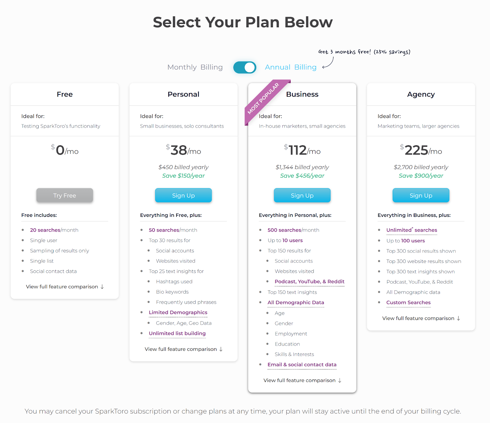
SparkToro Pricing Plan
SparkToro’s pricing page is a mini masterclass in conversion-focused design. Four clear tiers, strong contrast between options, and a “most...
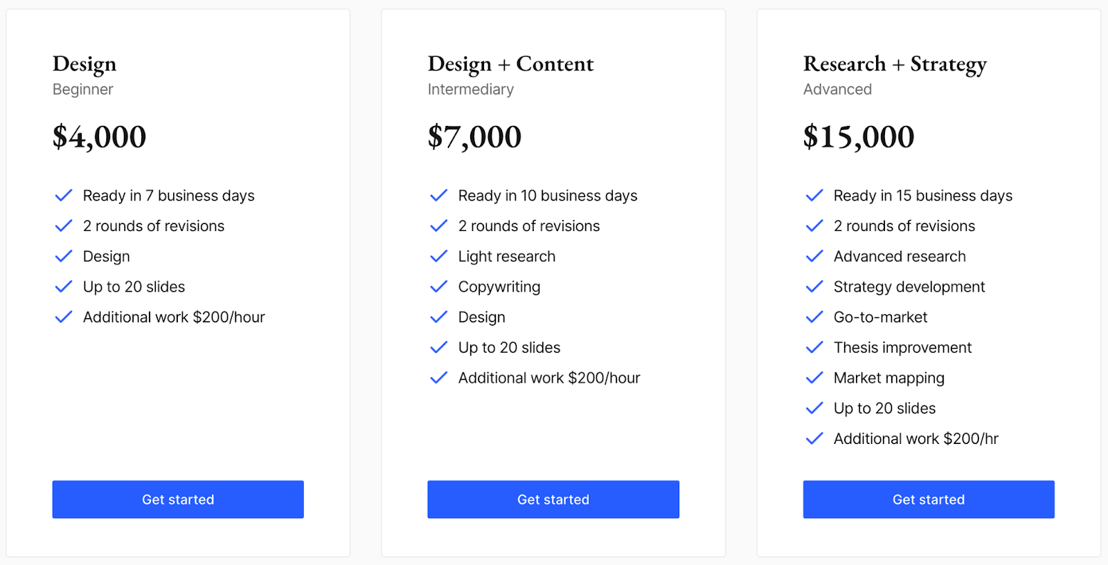
Better Pitch Project Pricing
Three columns. Three prices. One solid marketing move. This pricing page uses tiered pricing to guide the buyer toward the...
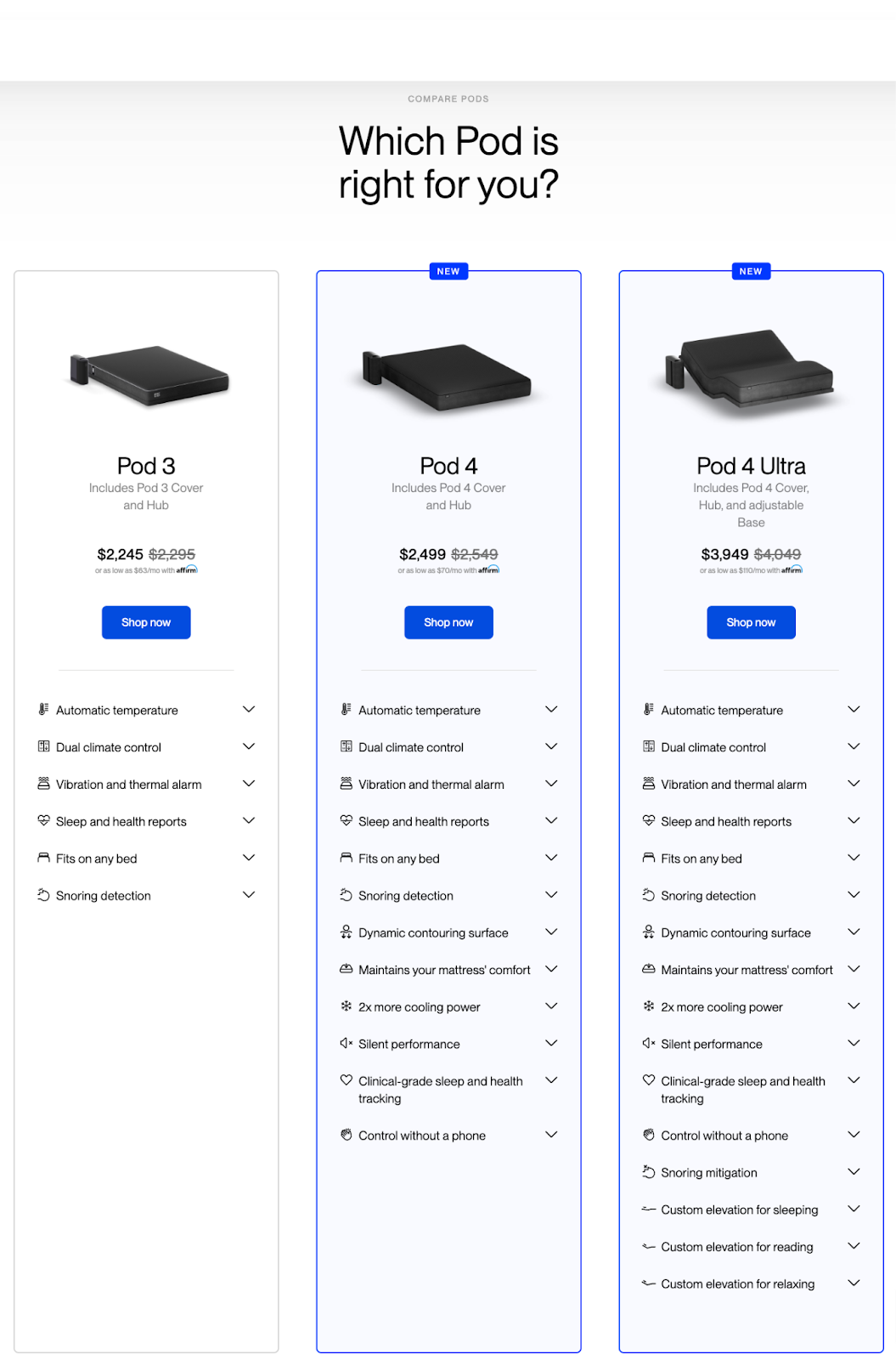
Eight Sleep Product Comparison Page
Ever been stuck trying to choose between three similar products? Eight Sleep nails the comparison page game. Their layout makes...
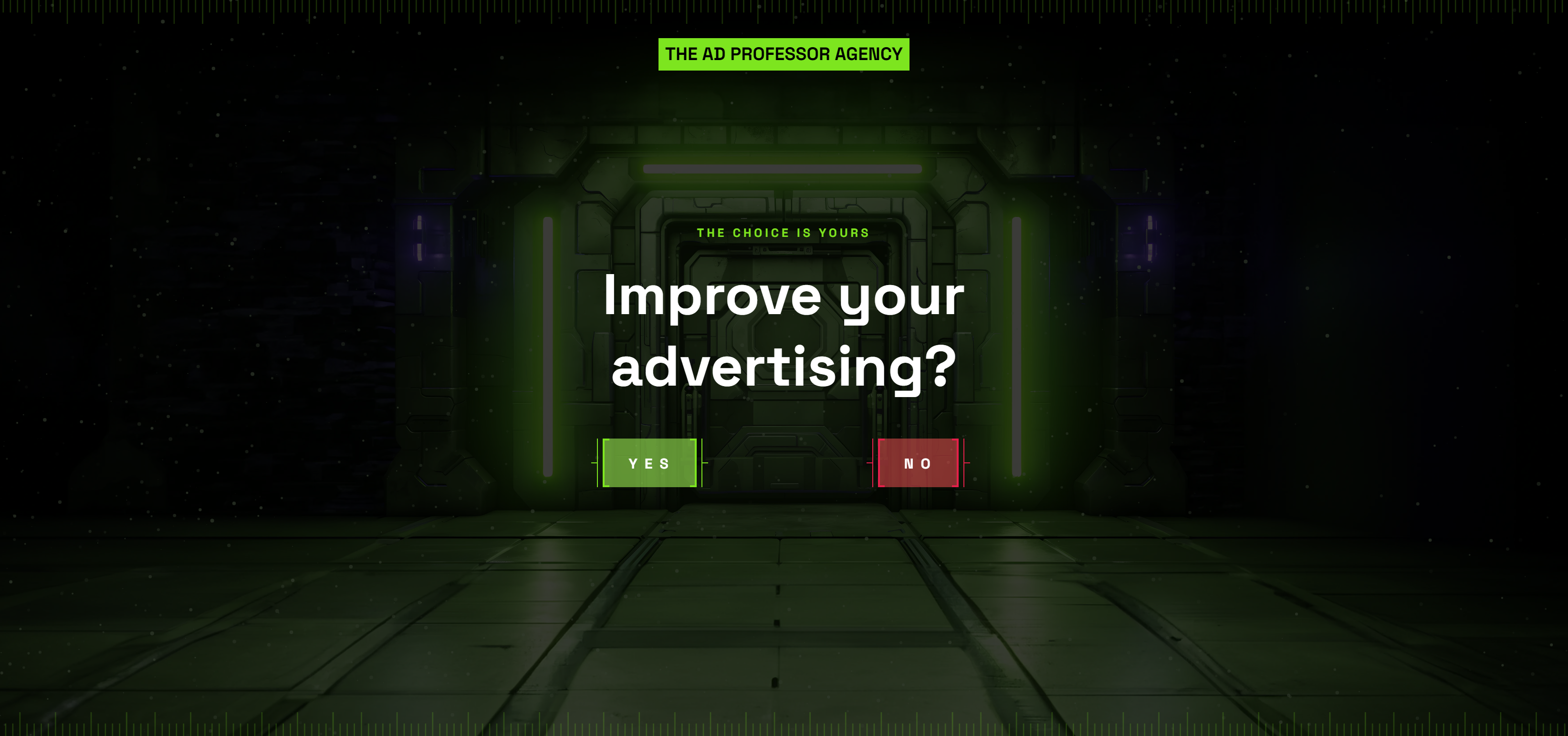
Ad Professor Agency Homepage
This homepage gives you only two choices: “Improve your advertising?” YES or NO. That’s it. No fluff. No scrolling. Just...
DesignScientist Agency Homepage
Most design agencies talk about “beautiful branding.” This one talks about “scientific revenue growth.” That’s a totally different flex. The...
Retention.com’s Home Page
This homepage is a masterclass in clarity and focus. Retention.com knows exactly who they’re talking to (DTC brands) and what...
"The Slippery Slope" and "The AIDA Formula"
Ever feel like good sales copy just pulls you in line by line? That’s the “Slippery Slope” in action —...
Genius Litter Comparison Chart
Sometimes words aren’t your best sales tool—charts are. Genius Litter nails this by comparing their cat litter against others in...

Copywriting Course Landing Page Split Test
This A/B/C/D test from Neville Medhora’s Copywriting Course is a masterclass in how tiny tweaks can change conversion rates big...
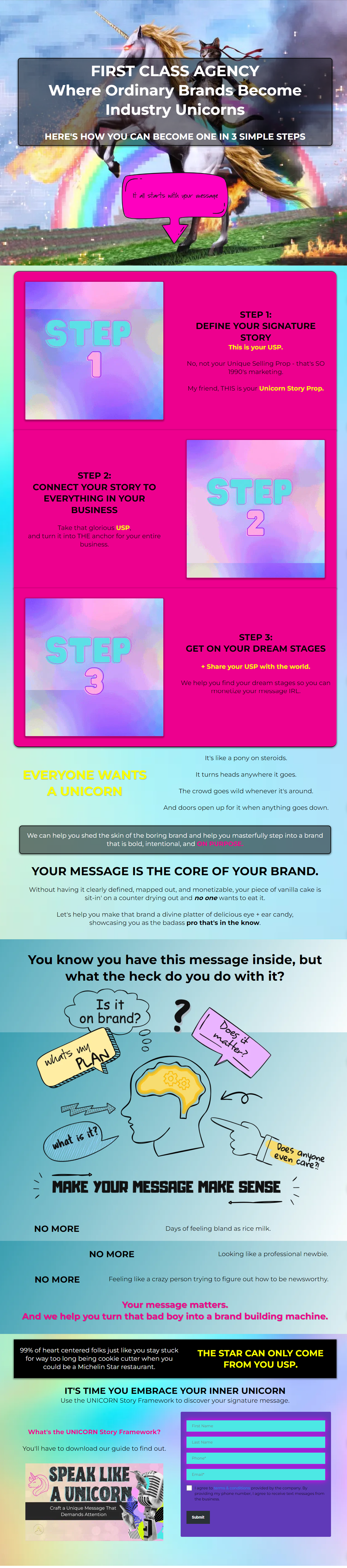
Hilarious and unique marketing agency landing page
This homepage from First Class Agency is a masterclass in grabbing attention. Bright colors, bold fonts, a unicorn with a...
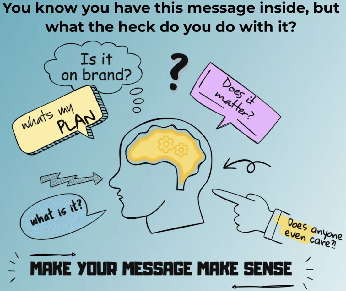
Awesome agency messaging graphic
Ever see a visual that instantly clicks? This one nails it. A simple head graphic asking every question your brain...
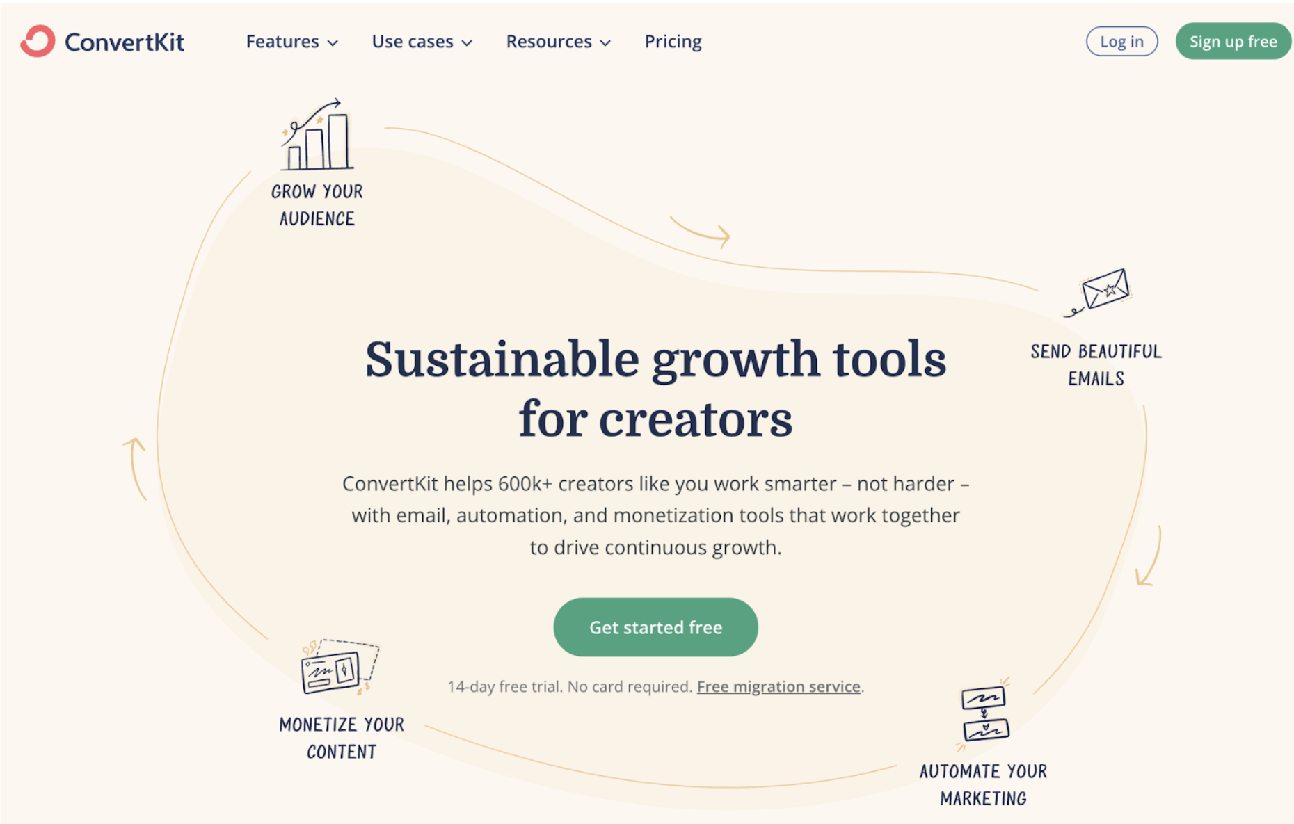
ConvertKit awesome home page graphic
ConvertKit’s homepage nails visual storytelling. Instead of dumping product features, it shows a “Creator Flywheel” that instantly explains how the...
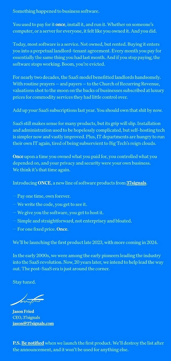
Awesome copy announcing “Once”
37Signals didn’t just write a sales page for Once.com—they wrote a manifesto. Instead of monthly bills, they pitch software you...