Search for a command to run...
“Write with the door closed, rewrite with the door open."
Interactive pricing sliders are sneaky-good marketing tools. They make visitors stop, play, and engage before deciding what to buy. That’s...
This course pricing setup is sneaky smart. It’s split into stages, each with its own price tag, but the “Best...
Howitzer nailed their testimonial section. Instead of a long scroll, they pack multiple reviews into one screen — with sources...
This SaaS homepage screams clarity. Right away, you know it’s a tool for Reddit marketing. The moving Reddit mascots instantly...
Sometimes all you need is a killer headline and great visuals. This 1978 Dodge ad nailed it with humor, boldness,...
Eufy turned a simple “thank you” email into a conversion machine. After raising $1M on Kickstarter, they sent out a...
Ever finished checking out and got hit with an offer too good to skip? That’s exactly what blk. Water nails...
Big bold text. Simple question. Emotional hit. That’s Nike’s genius at work. This ad makes you feel comfort before you...
Here’s a great example of a headline doing triple duty. Wealthfront’s line “Over 465,000 people are already using Wealthfront to...
Summari nails the “show, don’t tell” rule by using looping GIF demos instead of long feature lists. Each GIF shows...
The first image on this Amazon listing does all the heavy lifting. Before a single feature is mentioned, Sony shows...
This homepage sells the product in one line: “We instantly summarize text.” No fluff. Just clarity. Then it instantly shows...
This pricing table does something sneaky-smart. It’s basically a free trial—but framed so well it builds perceived value instead of...
That red-and-white Swiss flag? It stands for precision, integrity, and trust. Same thing their gaming regulations scream. Switzerland’s casino and...
Designjoy nails transparent pricing. Each plan shows the price, what’s included, and has a big button to either “Get started”...
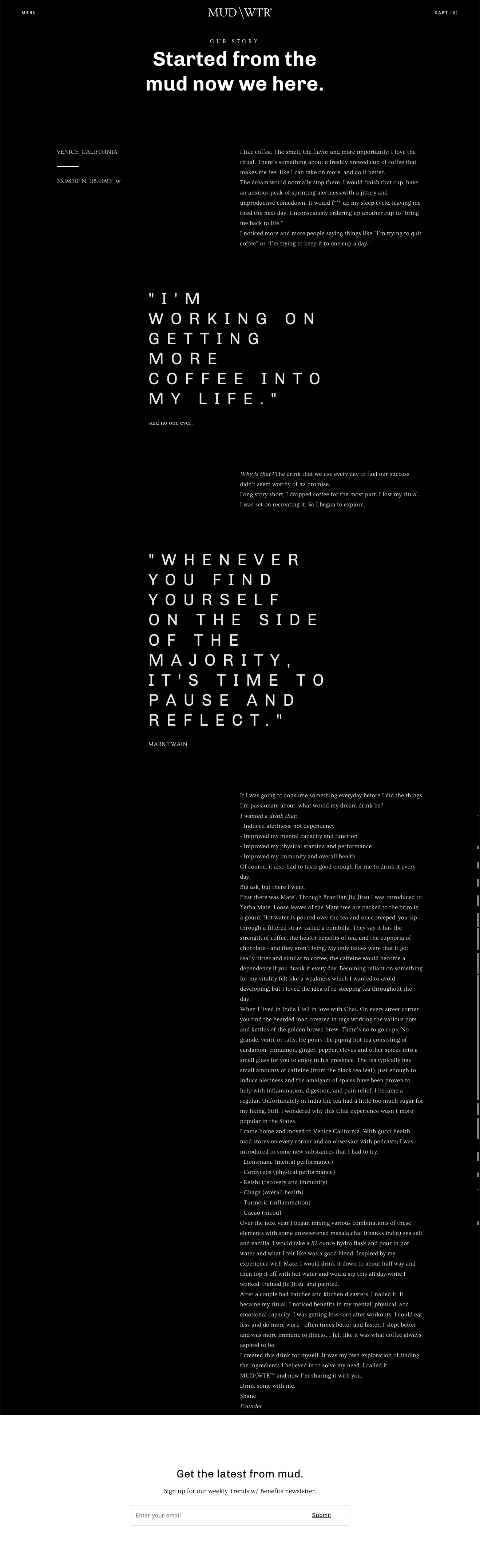
Most brands blame poor conversion on weak copy. But sometimes, it’s not the words—it’s how they’re shown. MUD/WTR’s “Our Story”...
Designjoy nails the perfect mix of showing skill and stacking proof. Their homepage design isn’t just pretty—it’s persuasive. What’s Happening...
Designjoy’s “Membership Benefits” page is a masterclass in selling by showing. The layout, icons, and cheeky copy all prove they...
A moving billboard featuring Matthew McConaughey proves that keeping copy short can pack a big punch. Just a bold quote,...
MUD/WTR nails its landing page by looping a smooth video and matching it with a headline that sounds more like...
This MVMT ad is a clean lesson in showing and selling at the same time. It mixes cool lifestyle imagery...
MUD/WTR nails their landing page by going straight at coffee’s weak spot: side effects. Their side-by-side chart clearly shows “MUD/WTR...
This blk. water landing page keeps things simple and consistent from top to bottom. Same offer. Same CTA. Same promise....