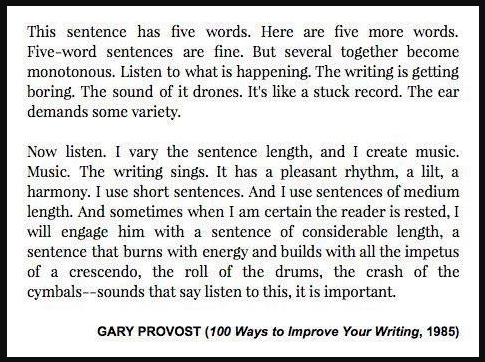
Gary Provost’s short lesson shows how sentence length can turn writing from boring to beautiful. He literally shows what happens...
Ads/Copywriting
Apr 23, 2022
Bose black friday email has the perfect formula to make sales
This Bose Black Friday email isn’t flashy—it’s smart. Every section turns a product into a tiny conversion machine. Star ratings,...
Copywriting/Emails/Data
Apr 23, 2022
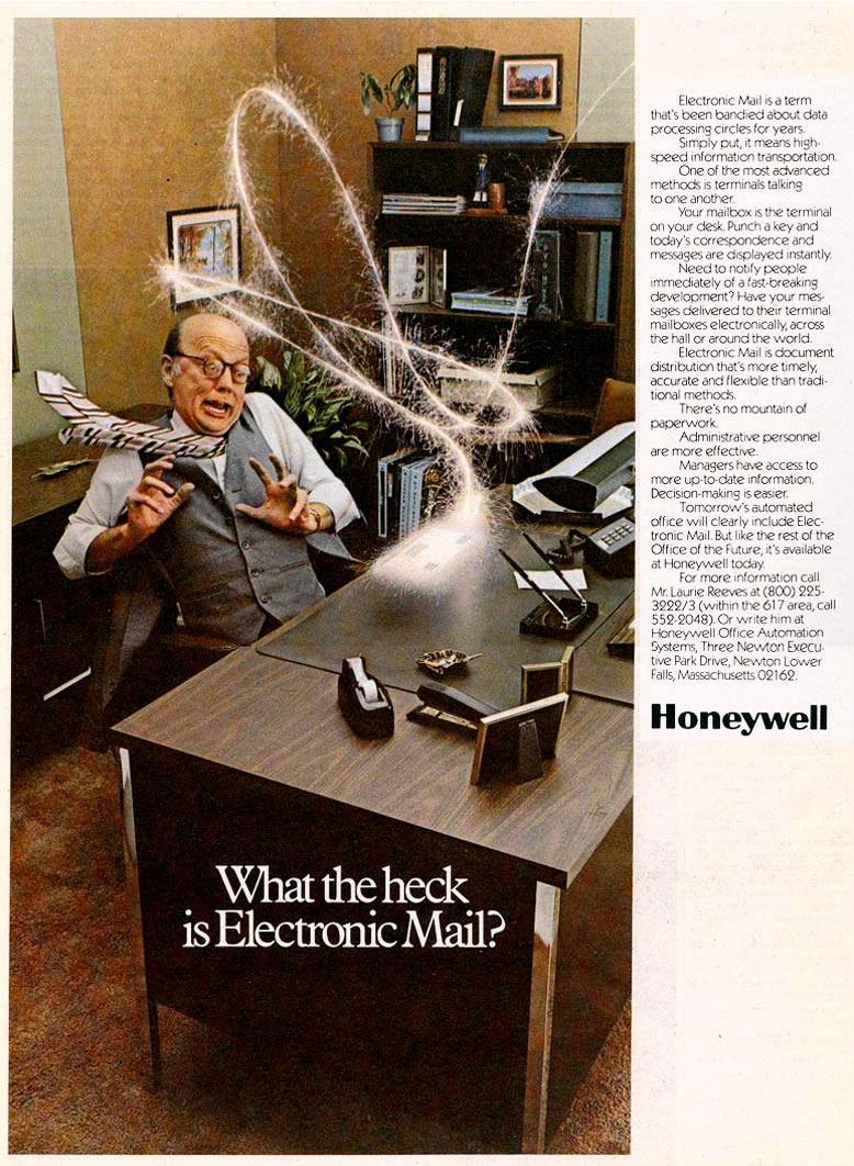
1977 Honeywell "Electronic Mail" Ad
This 1977 Honeywell ad tried to explain a wild new idea: “Electronic Mail.” The dramatic photo says it all—a terrified...
Ads/Print Ads/Copywriting
Apr 22, 2022
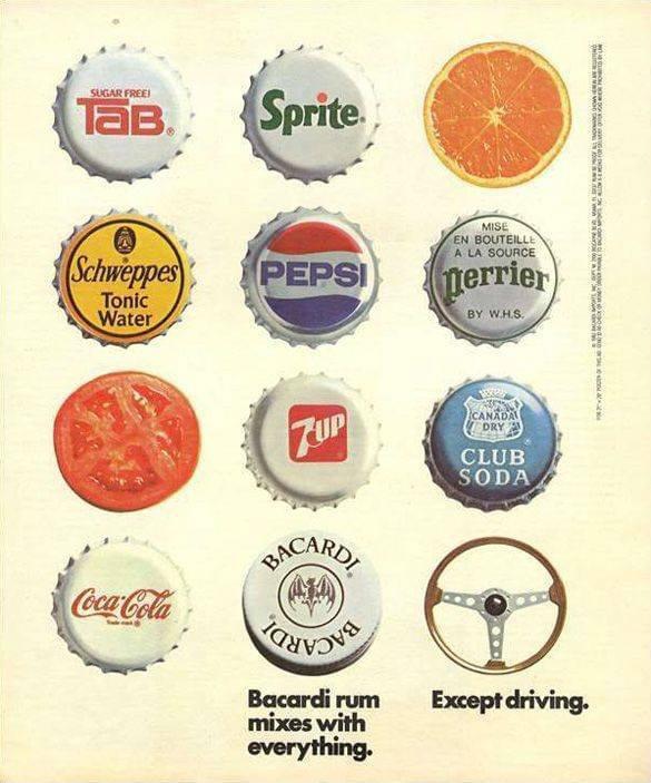
1983 Bacardi Rum Bottlecap Mixer Ad
This Bacardi ad is a masterclass in visual storytelling and contrast. It lists iconic drink brands like Pepsi, Sprite, and...
Ads/Print Ads/Copywriting
Apr 22, 2022
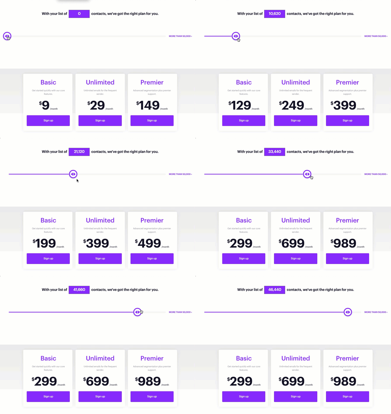
Email marketing service pricing slider
Ever play with one of those pricing sliders that move as you add more contacts? It feels good, right? That’s...
Copywriting/Pricing/Data
Apr 22, 2022
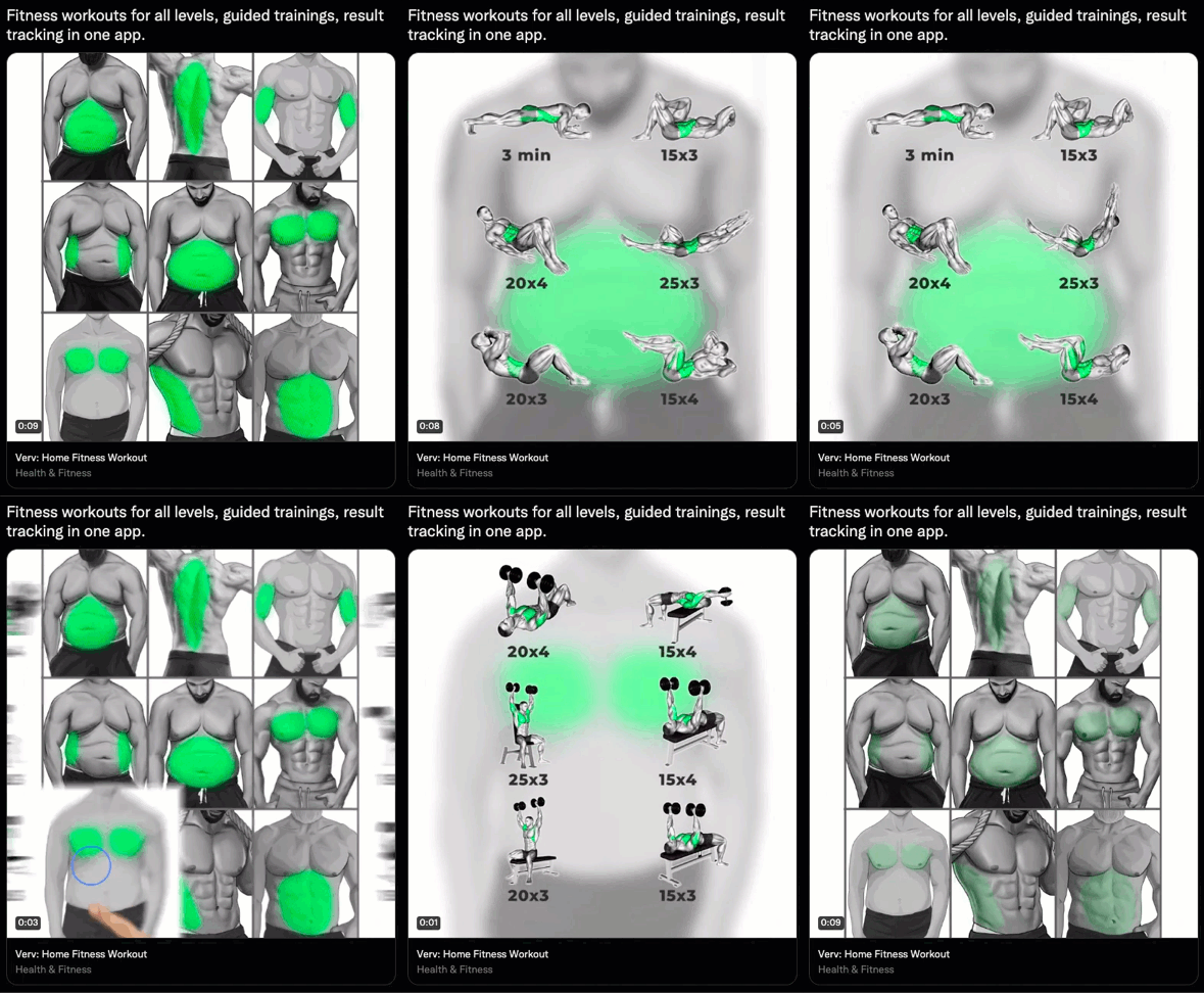
Twitter Ad for fitness app using animation to show value
This ad nails the basics: one headline, one clear message, and visuals that instantly explain everything. It promises “fitness workouts...
Ads/Copywriting/Videos
Apr 21, 2022
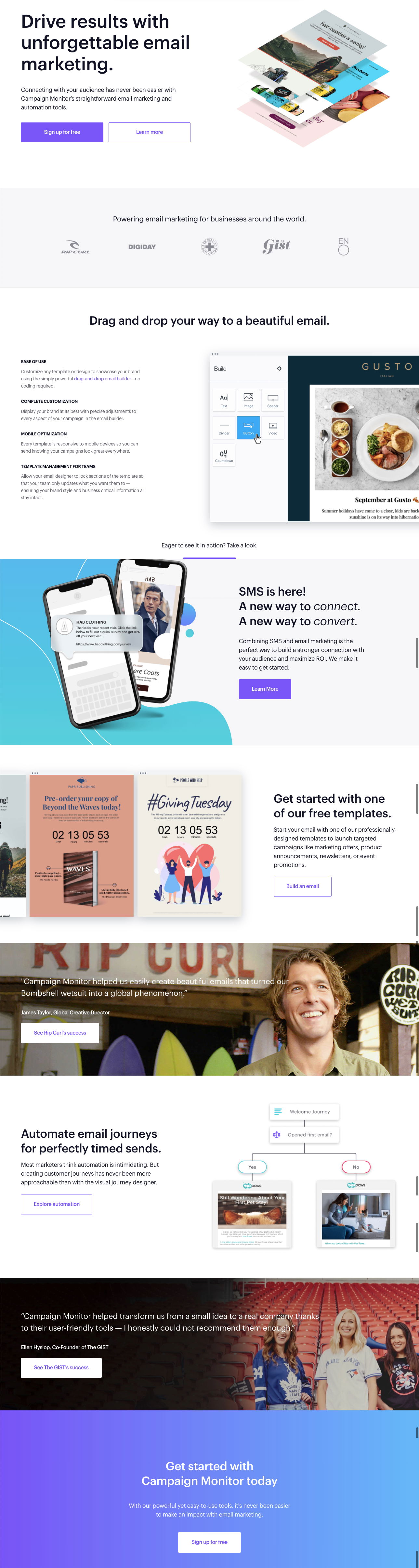
Campaign Monitor Homepage with customer success story
Campaign Monitor nails what most SaaS homepages struggle with: showing, not just telling. Their homepage instantly explains what the product...
Home Pages/Images/Advice
Apr 21, 2022
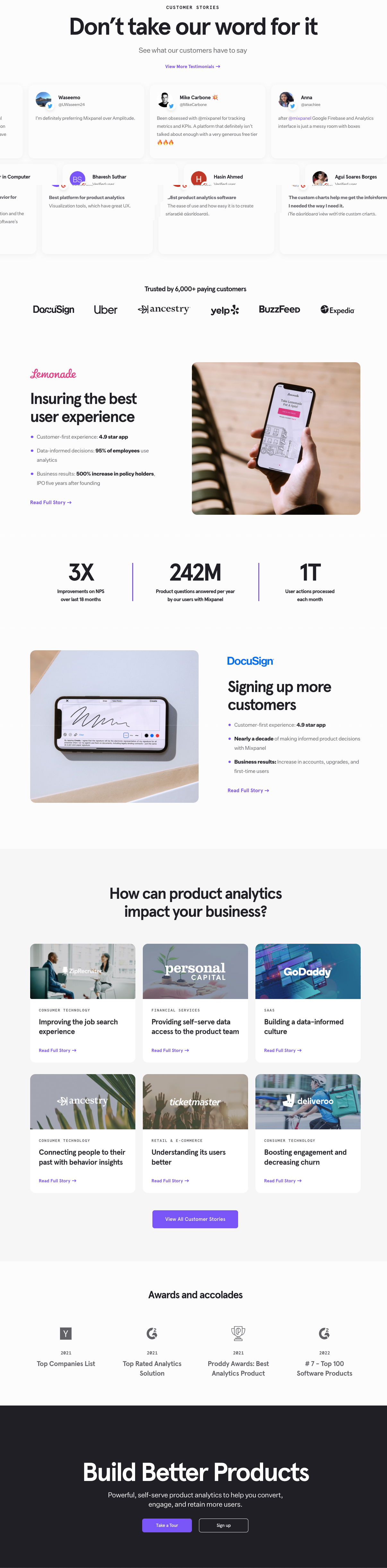
Mixpanel has an entire page dedicated to testimonials
Mixpanel nails the art of trust-building with a single page. Before mentioning features or pricing, they hit you with proof:...
Copywriting/Data/Testimonials
Apr 20, 2022
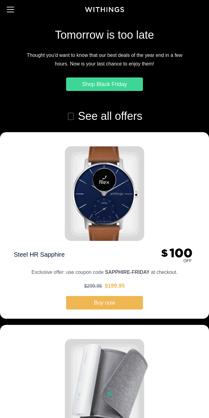
Black friday email for watch brand gives sense of urgency
Withings nails the art of urgency with one simple line: “Tomorrow is too late.” No fluff, no hype. Just pure,...
Ads/Copywriting/Emails
Apr 20, 2022
Pricing for SAAS urges annual pricing
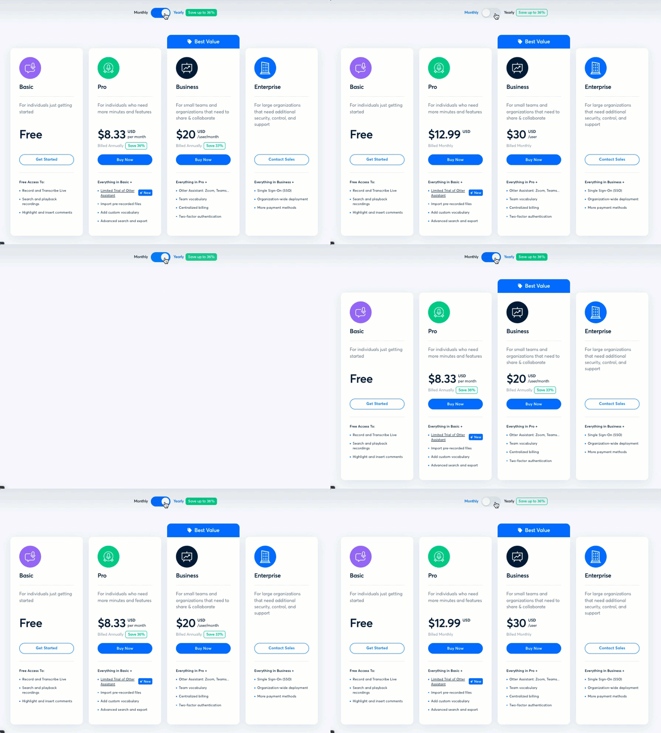
Otter.ai nails pricing psychology. Their pricing page isn’t just pretty—it’s a conversion machine. Notice how the toggle between “Monthly” and...
Copywriting/Pricing/Advice
Apr 17, 2022
Career page on SaaS site using video testimonials of employees
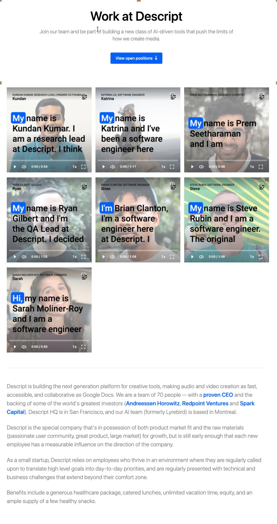
Hiring pages are usually walls of boring text. But Descript flips that. For every open role, they showcase a short...
Videos/Advice/Testimonials
Apr 17, 2022
Sales page for affiliate program sparks ideas for creators
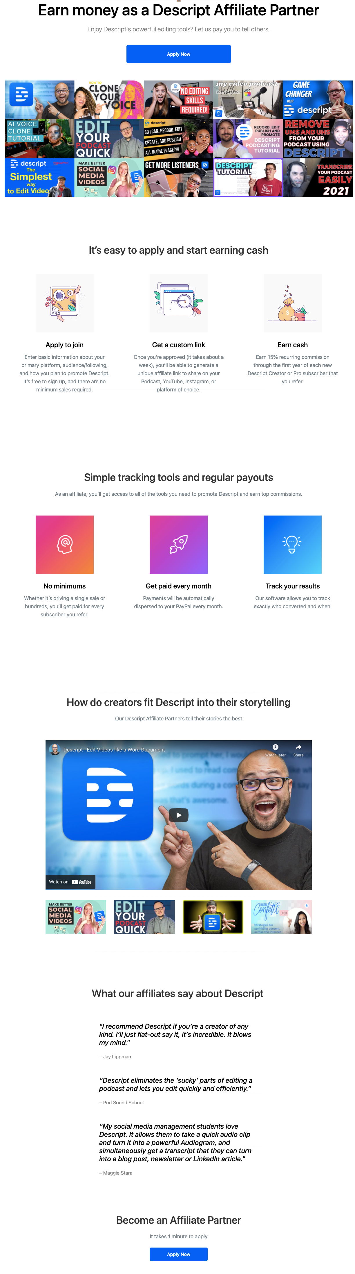
Descript’s affiliate page is a masterclass in making people say “yes.” It’s packed with examples, testimonials, visuals, and a dead-simple...
Copywriting/Advice/Sales Pages
Apr 16, 2022
Awesome homepage headline and matching visuals for audio/video editor
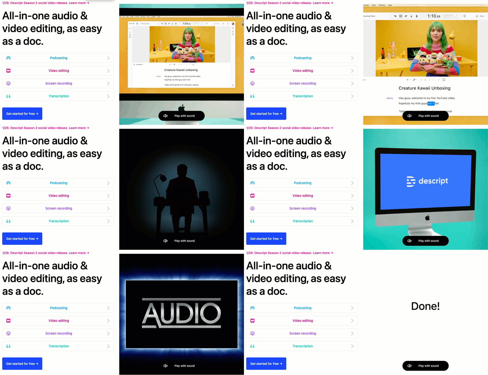
Descript nails it with this headline: “All-in-one audio & video editing, as easy as a doc.” It instantly removes friction....
Ads/Copywriting/Videos
Apr 15, 2022
Homepage for consultant with clear copy
This page nails every part of good sales copy. You instantly know who it’s for, what problem it solves, and...
Copywriting/Home Pages/Data
Apr 14, 2022
About page with great use of stats for social proof
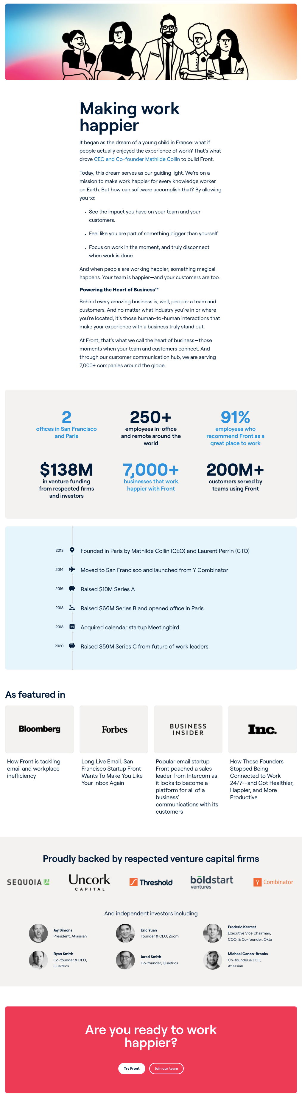
Front’s homepage is a masterclass in social proof done right. Instead of shouting “We’re awesome,” they calmly show it. Big,...
About Pages/Data/Social Proof
Apr 14, 2022
Request sales call form with added social proof
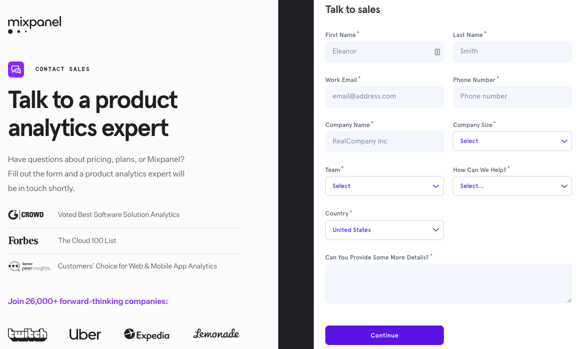
Mixpanel’s “Talk to Sales” page isn’t just a form. It’s a confidence booster. Before you even think twice about hitting...
Signup Forms/Copywriting/Advice
Apr 13, 2022
Writing feature & benefits formula
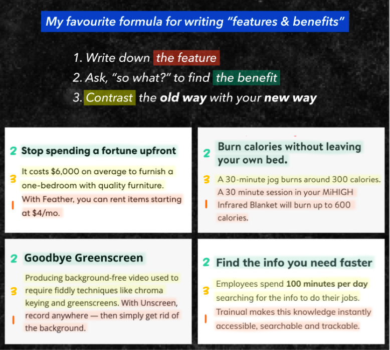
Ever struggled to turn product features into something customers actually care about? This 3-step formula nails it. It’s simple, fast,...
Formulas/Copywriting/Advice
Apr 13, 2022
Account upgrade email transforms into sponsorship offer
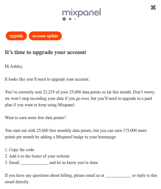
Mixpanel nailed the “pay or play” strategy in this upgrade email. Instead of forcing users to upgrade, they offer a...
Copywriting/Emails
Apr 12, 2022
Hand drawn explanation of web dashboard
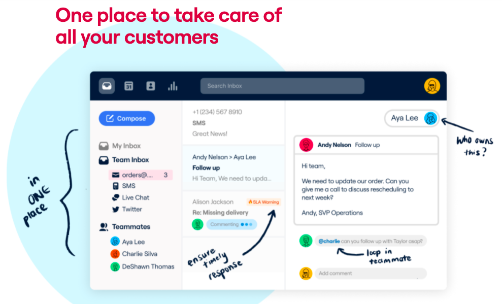
This image nails how to sell software without a wordy pitch. Instead of listing features, it shows them right where...
Images/Advice/Product Descriptions
Apr 12, 2022
Edit any website javascript trick for mockups
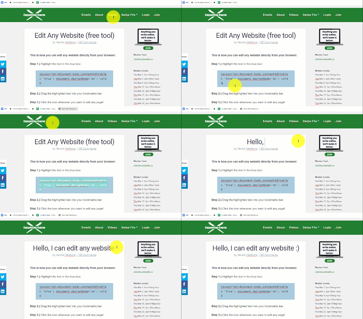
Ever wanted to test new headlines right on your own homepage before pushing them live? This little JavaScript trick lets...
Ads/Copywriting/Images
Apr 12, 2022
Wealthfront visually displays the diverse investment options they offer
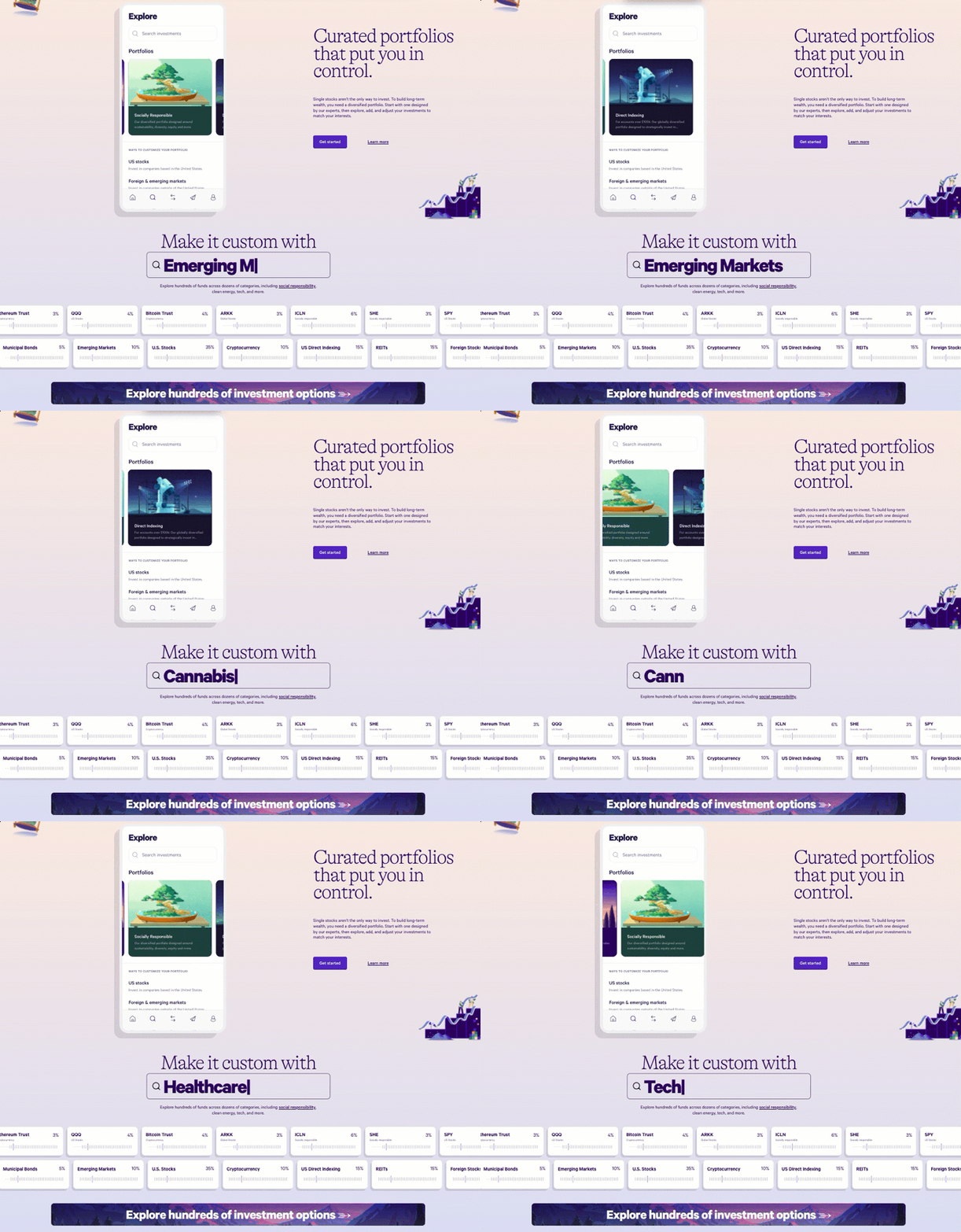
Wealthfront nails the first impression. Their homepage animation isn’t just pretty—it shows exactly how customizable investing can be, without needing...
Home Pages/Videos/Images
Apr 9, 2022
Sony professional camera old school style feature / benefits product descriptions
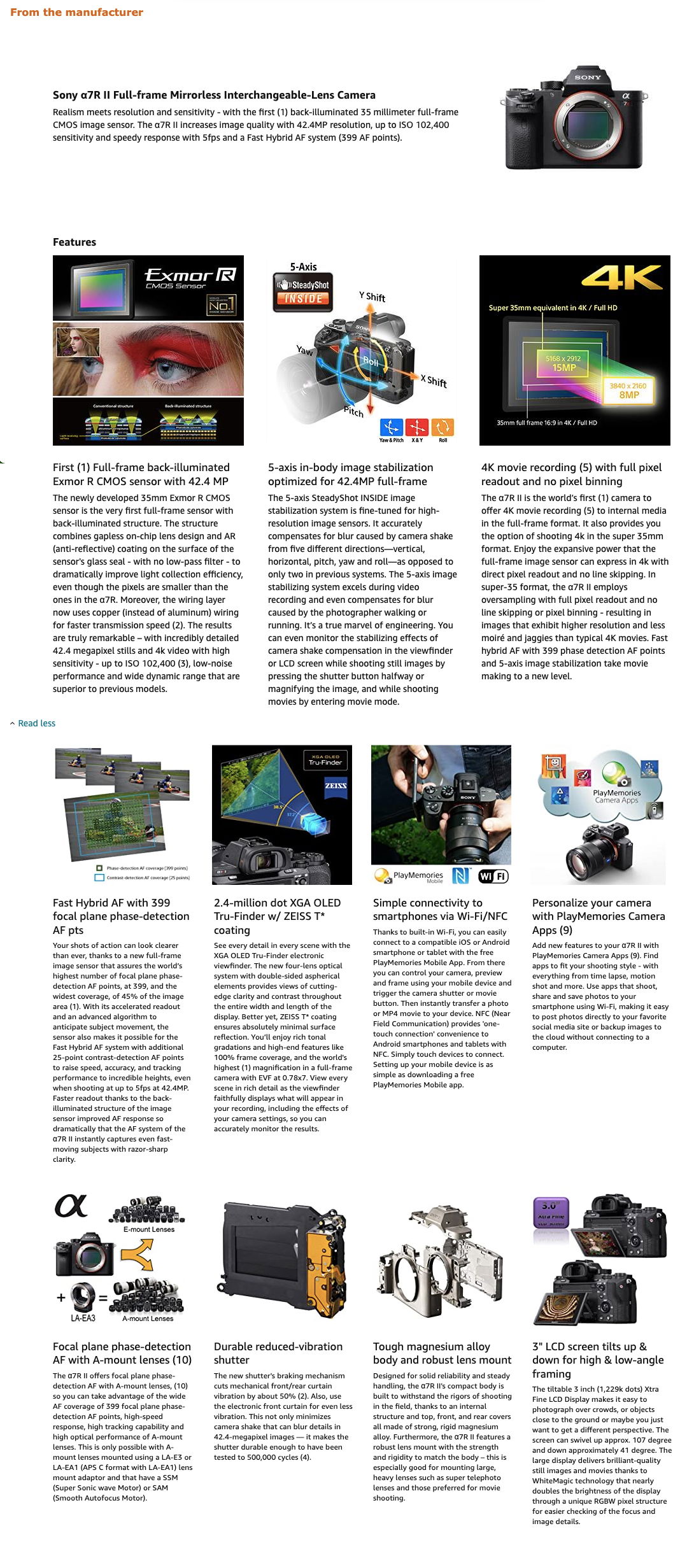
This Sony camera product page feels straight out of a vintage magazine ad. It walks through every single feature —...
Ads/Copywriting/Sales Pages
Apr 8, 2022
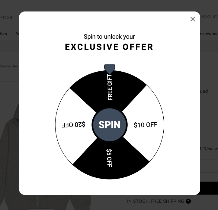
Gamified popup for e-com store
This popup nails the “fun + reward” combo. Instead of a boring email signup box, it turns lead capture into...
Copywriting/Emails/Pop Ups
Apr 8, 2022
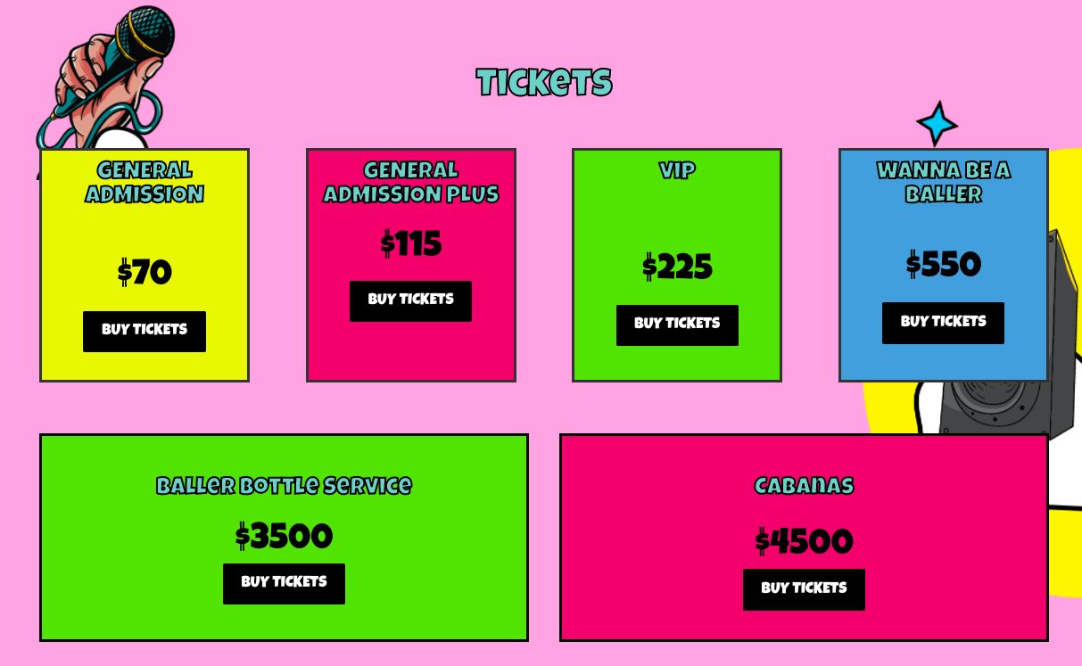
Music fest colorful pricing page with colorful copy for each tier
This event poster nails the psychology of pricing. Instead of boring tiers like “Basic” and “Premium,” each ticket name oozes...