Search for a command to run...
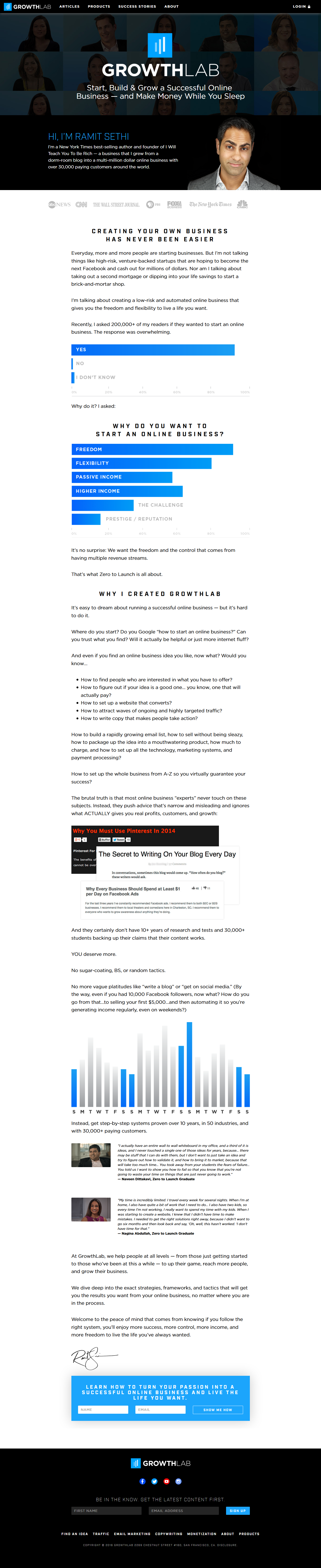
Ramit Sethi’s GrowthLab “About” page doesn’t start with hype. It starts with blue bar graphs showing exactly what readers want:...
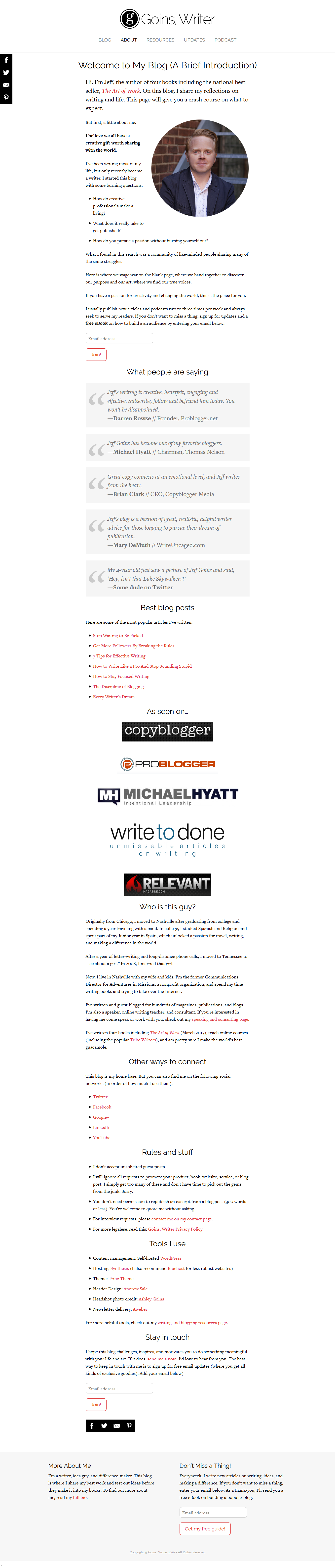
Jeff Goins’ “About” page feels like coffee with a friend—but reads like a masterclass in soft selling. It’s personal, trustworthy,...
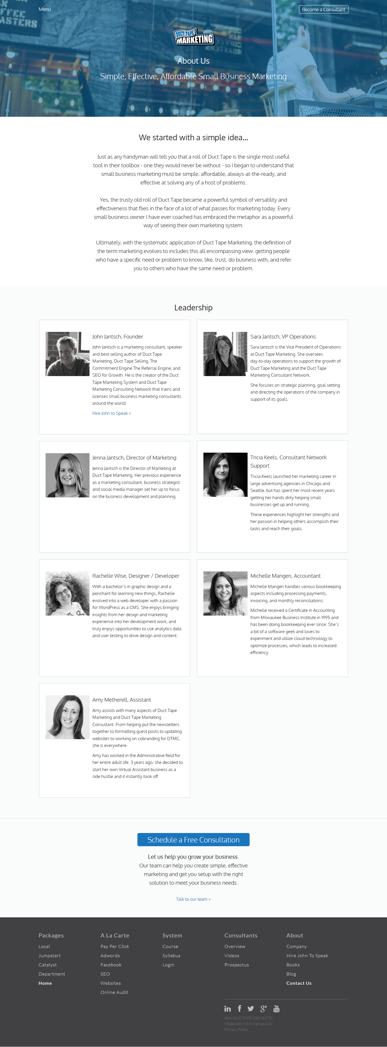
Most About pages are snooze fests. Duct Tape Marketing’s isn’t. It’s short, clear, and gets you from “Who are these...
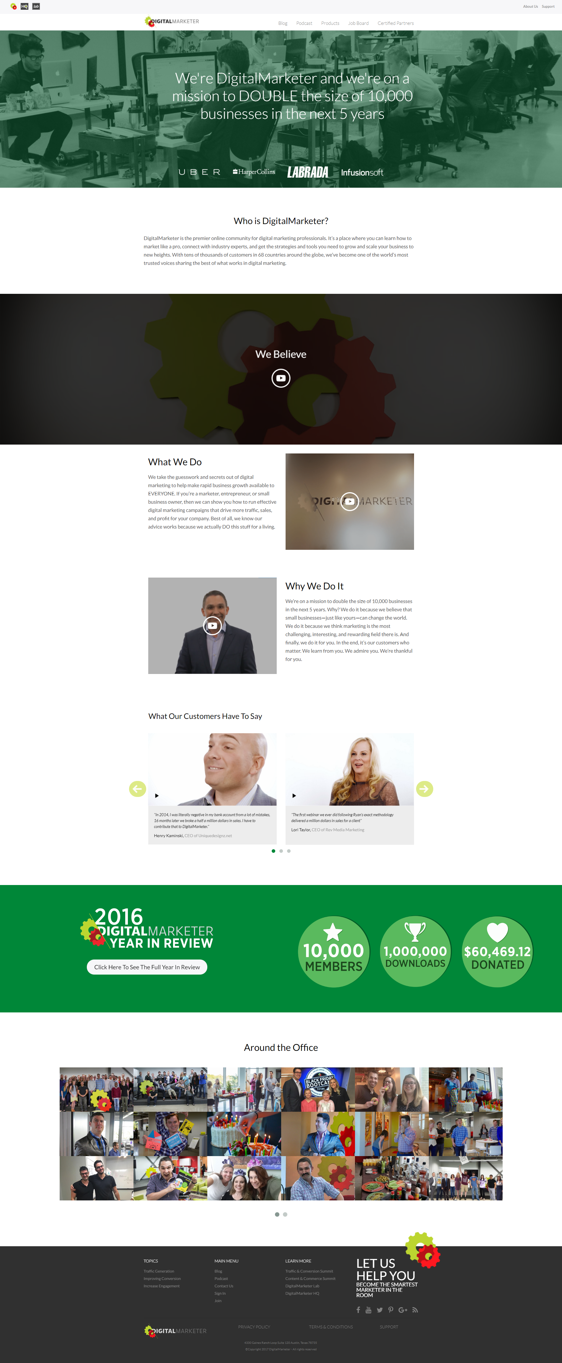
Most “About” pages read like a snoozer résumé. DigitalMarketer flips that script with a scroll-based video story showing who they...
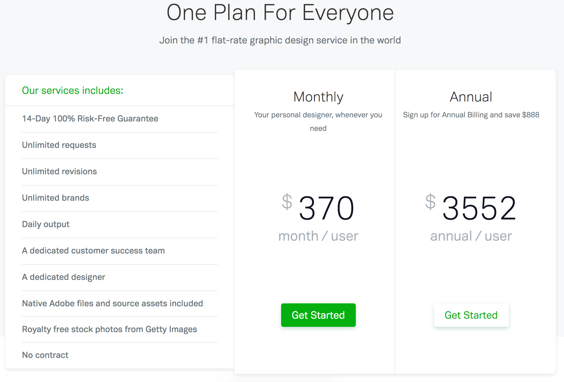
This pricing page nails clarity with a single offer: one plan, two payment options. No clutter, no confusion, just action....
Most About pages are dry company bios. Crazy Egg flips the script and turns theirs into a friendly funnel. It...
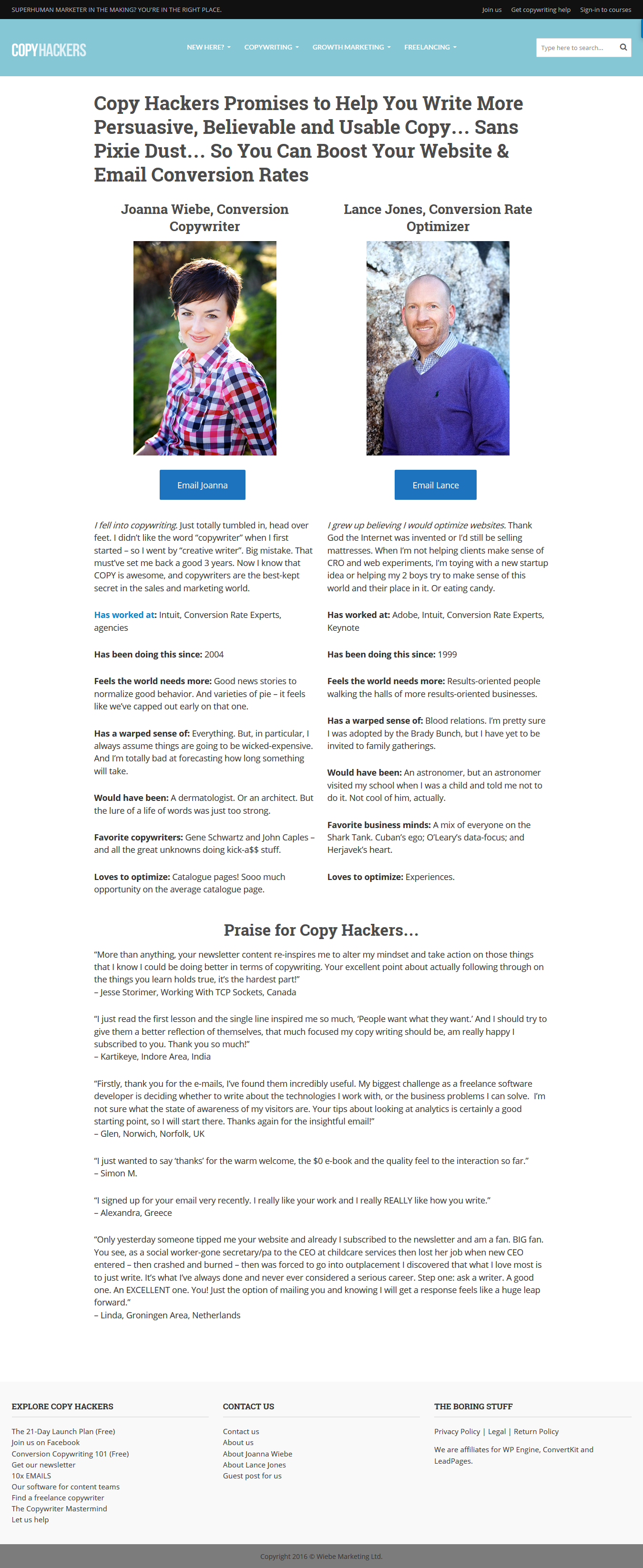
Most About pages feel like corporate wallpaper. Copyhackers’ version feels like a friendly chat over coffee. It’s personal, story-driven, and...
Most plugin sales pages are snooze-fests. WPMU Dev looked at that problem and said, “What if our features had capes?”...
Most analytics pages feel stiff and math-y. SegMetrics flips that. Their site makes data look profitable, powerful, and even a...
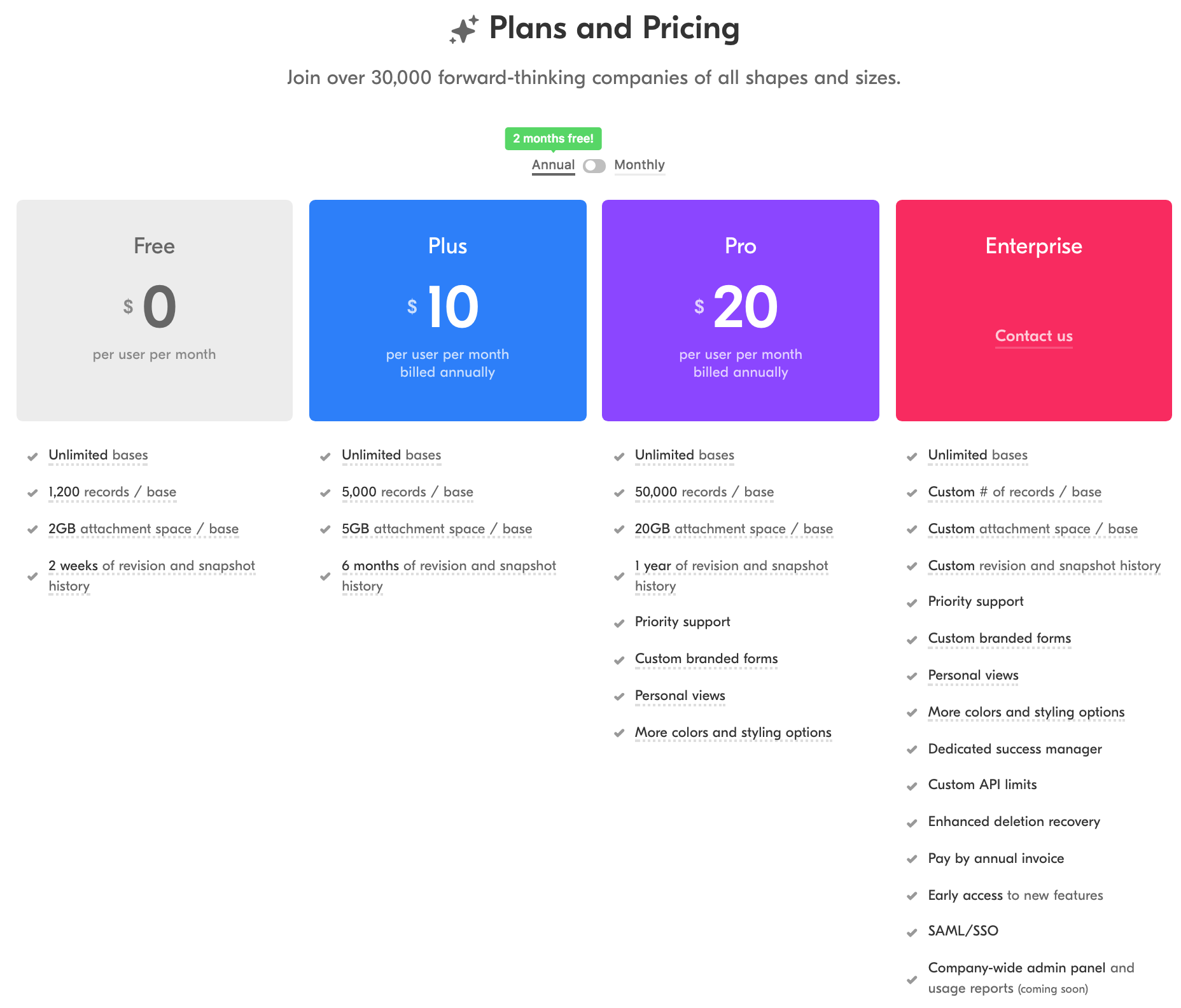
Airtable’s pricing page is sneaky smart. That little “Annual vs Monthly” switch with a green “2 months free!” tag does...
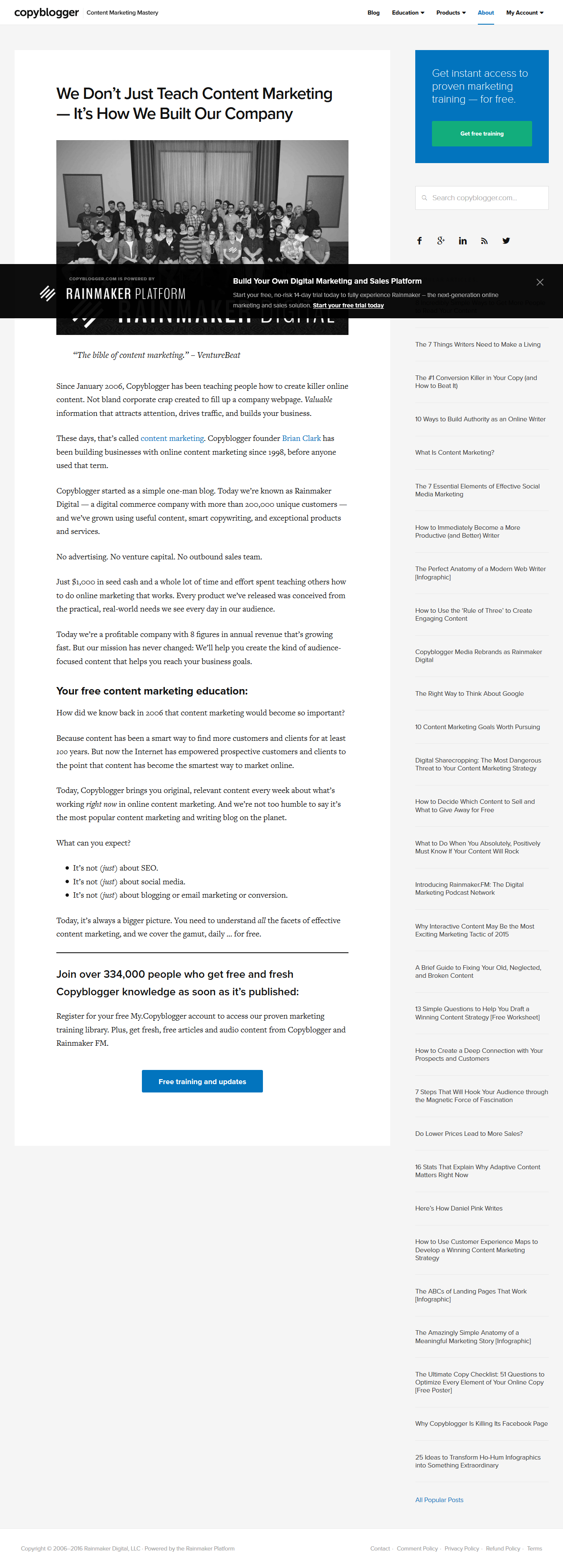
Copyblogger didn’t grow by shouting louder. They built trust one blog post at a time. No ads, no outbound sales,...
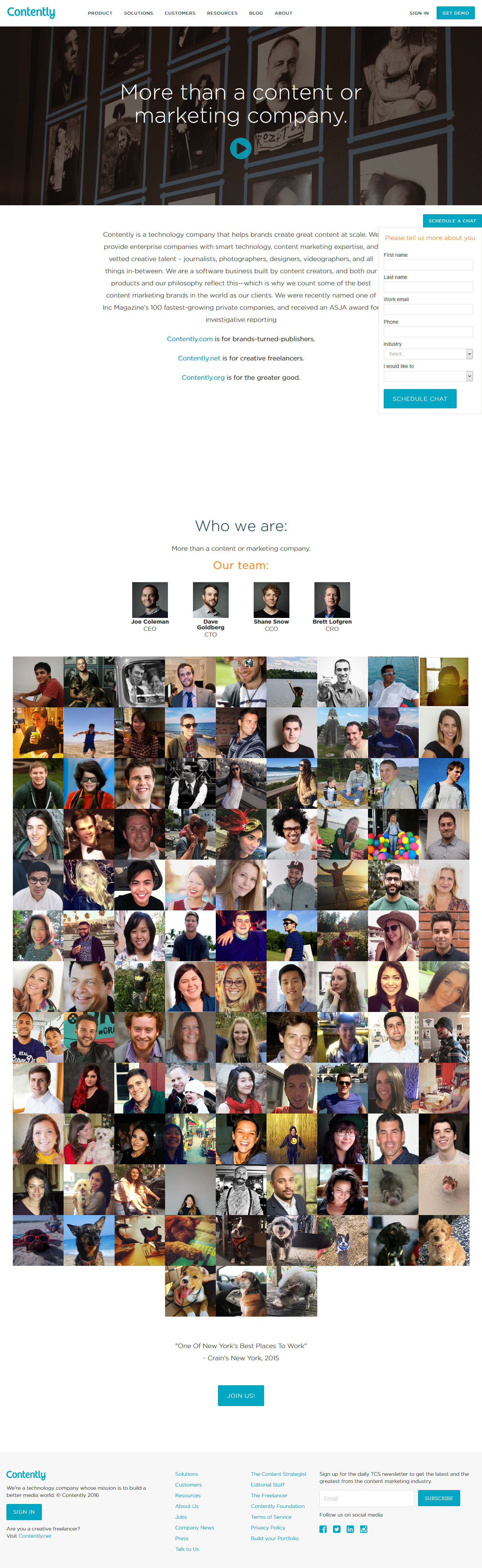
Most company “About” pages are snooze-fests. Contently flips the script. Their page opens with a slick video, slides into a...
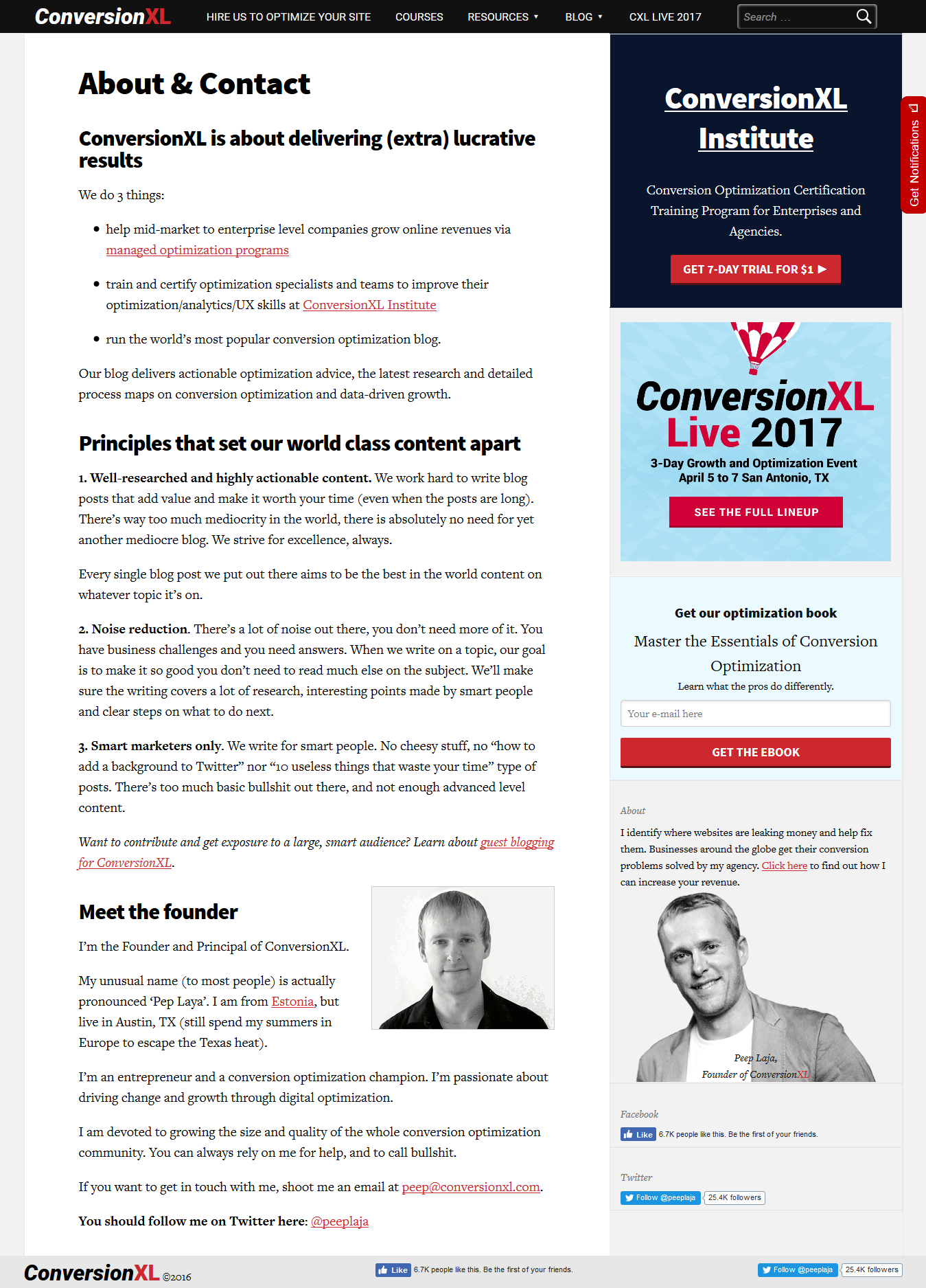
Most “About” pages read like a press release. ConversionXL flips that by adding a looping GIF of founder Peep Laja...
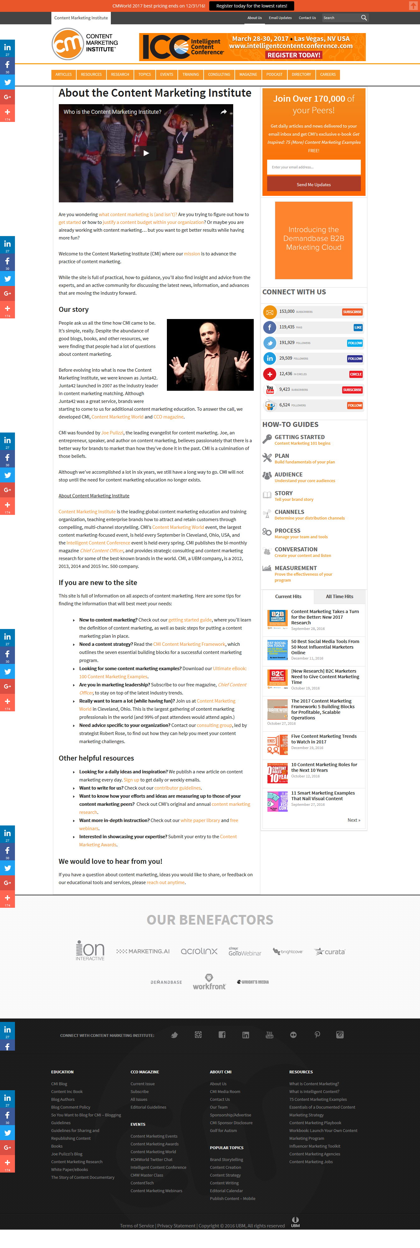
Most “About” pages are digital sleeping pills. The Content Marketing Institute flips that script. They lead with a cheerful video...
Most company About pages are snooze-fests. Buffer flipped that script. Their page feels like walking into a room full of...
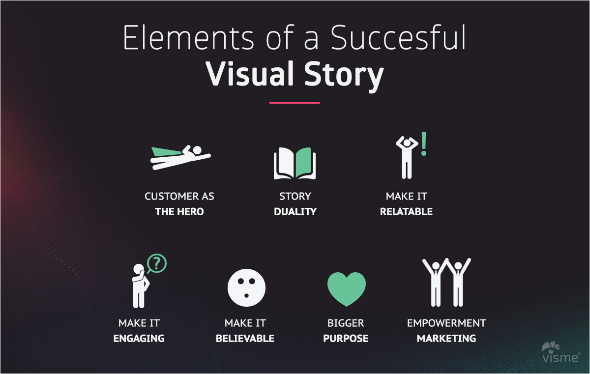
The best brand videos hook you like a short film, not a commercial. They tell stories where the customer is...
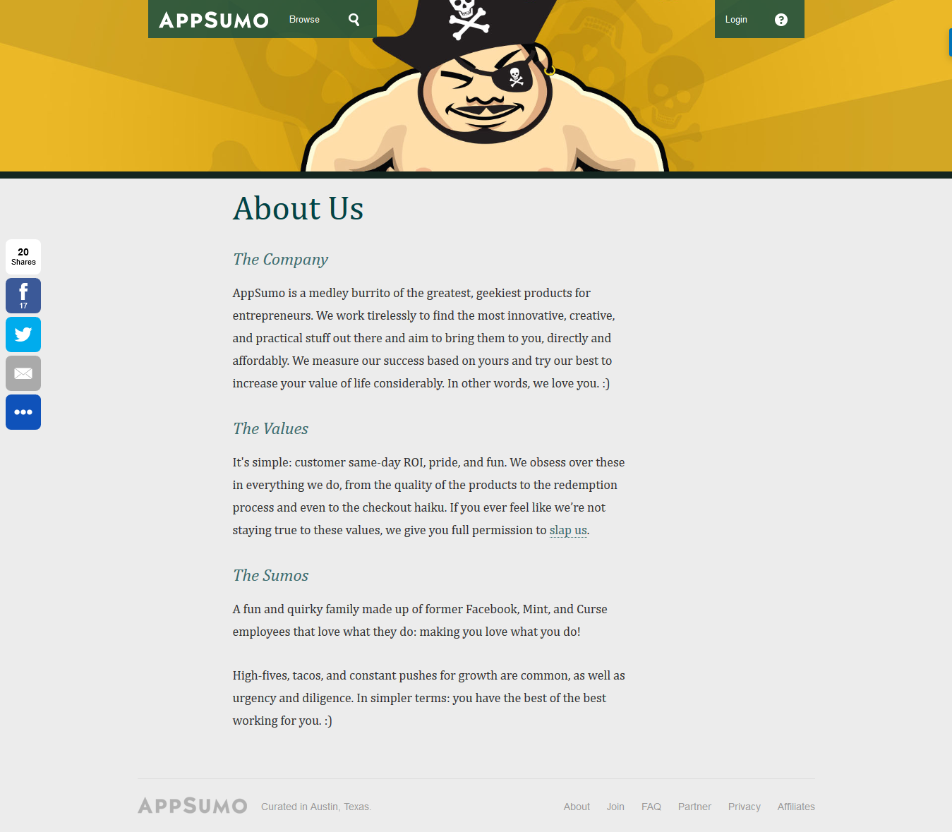
Most “About Us” pages sound like a corporate yawn. AppSumo flips that script. Their page feels like chatting with a...
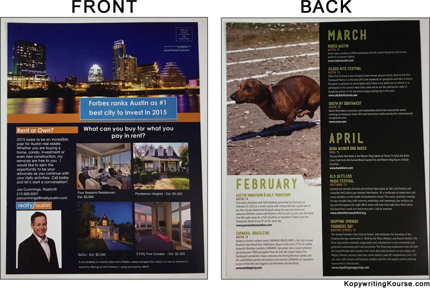
This Realty Austin flyer isn’t just pretty—it’s built like a psychological funnel. Every color, picture, and layout choice guides your...
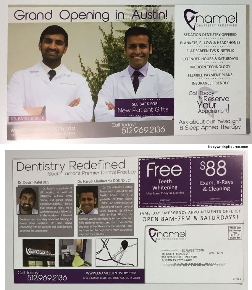
This dental flyer looks great at first glance. Clean layout, happy dentists, shiny teeth—what’s not to love? But a heatmap...
Before your brain even reads the text, your eyes land on that smiling family. Boom—trust and warmth. Then, your eye...
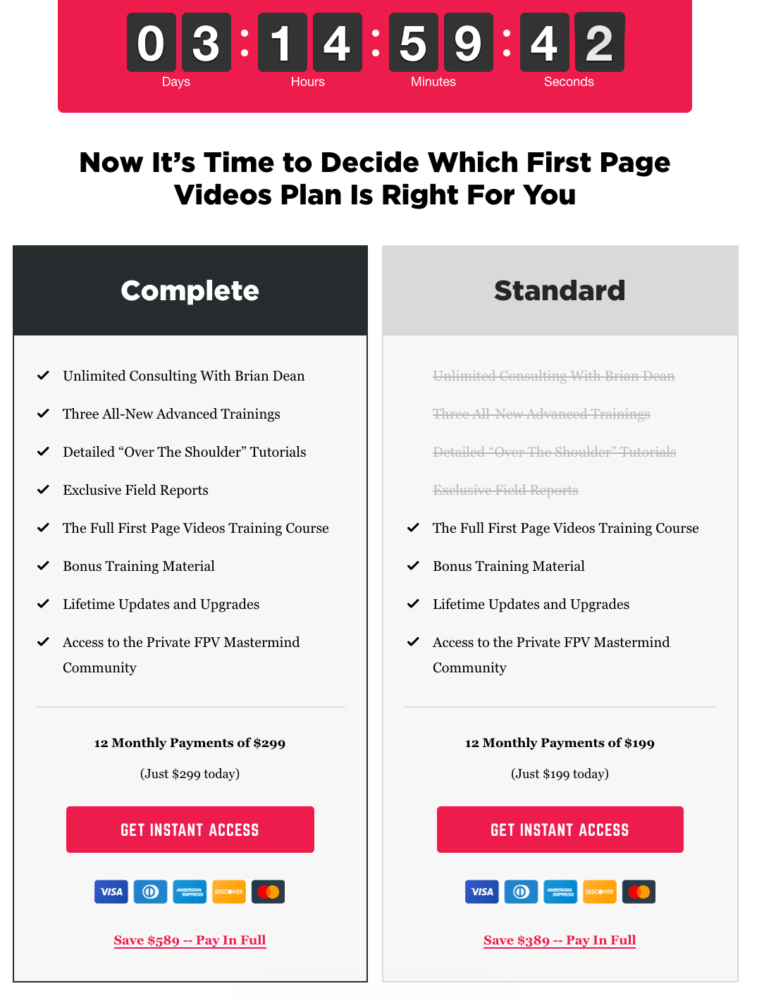
Two columns. One clear winner. And a red-hot countdown clock daring you to buy. Brian Dean’s First Page Videos pricing...
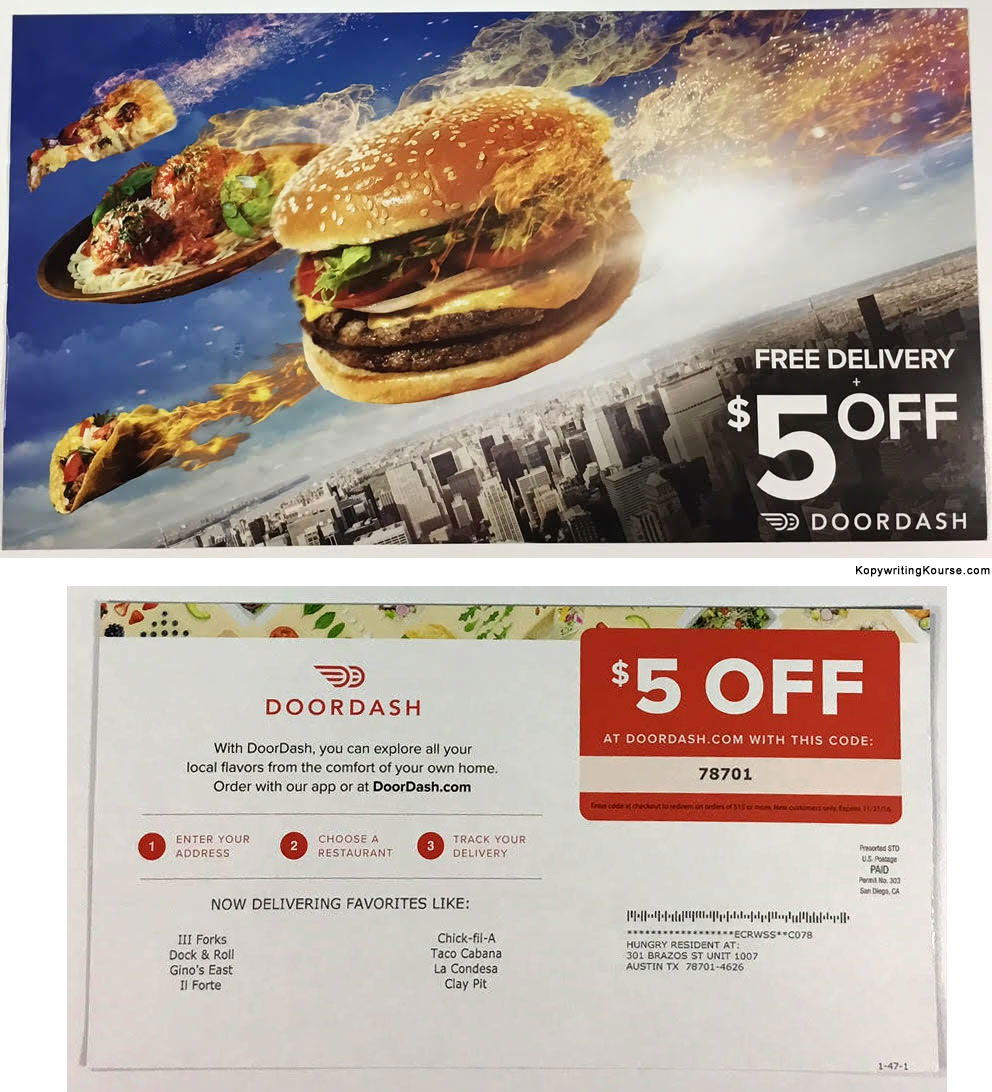
DoorDash sent out a direct mail piece with a burger flying through the sky. You can feel the speed, smell...
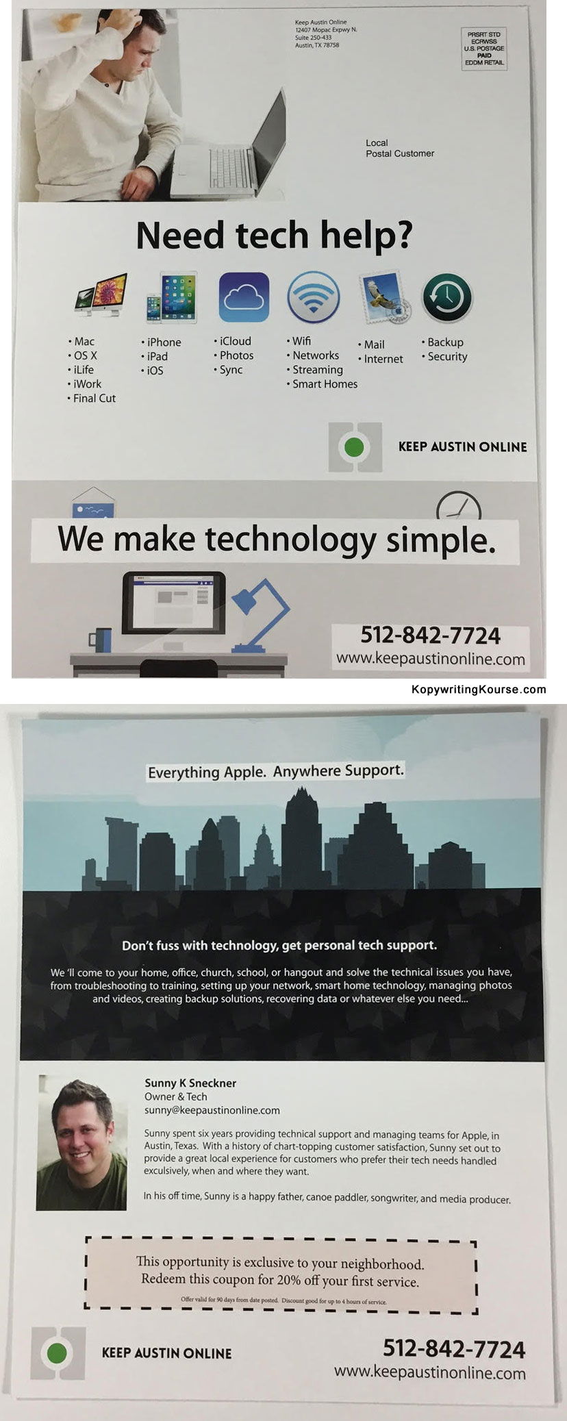
Ever notice how some flyers just flow? This Apple-inspired tech support mailer does it perfectly. Your eyes start at the...
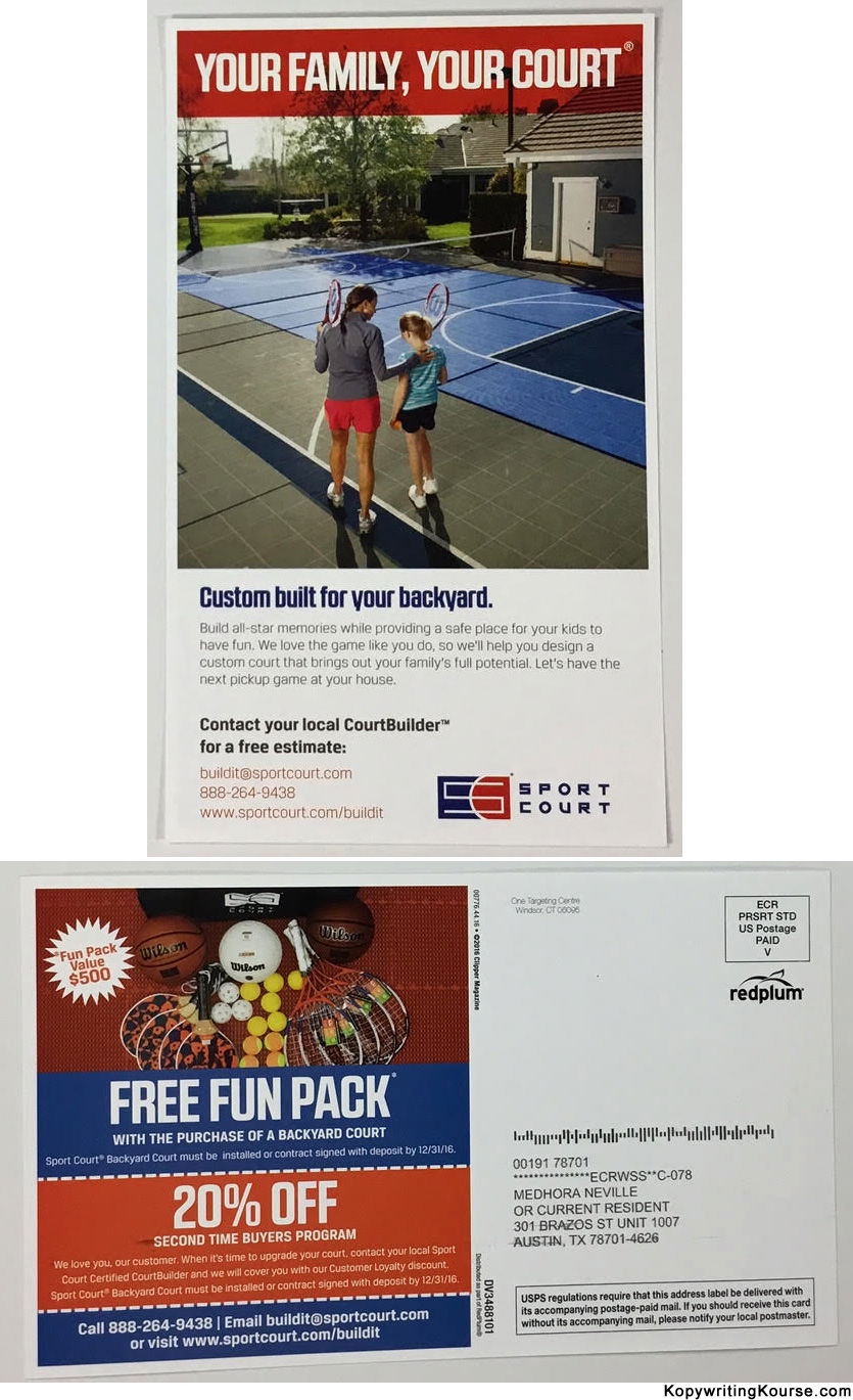
This SportCourt postcard nails direct mail design. It grabs attention, tugs emotion, and lands a clear offer — all without...