Recreate PostHog Aesthetic for Your AI Library
Published on


Alex Lieberman
@businessbarista·Apr 17
Okay, Claude Design slaps.
I wanted to recreate the @posthog aesthetic but for @tenex_labs (to build an internal library of curated AI resources for new employees).
Here was the input and the output with 30 seconds of tweaking. https://t.co/nDbwZqKBEN
You don’t need a full-time art team to make your AI library look like a $10M product. Alex Lieberman used Claude to remix PostHog’s playful desktop aesthetic into a Tenex-branded “Academy OS” in minutes. Same layout logic, totally different vibe. Here’s how to steal the structure without ripping the brand.
Prompt recipe to Claude for this look
Tell Claude you want a “single-page marketing site framed inside a fake desktop UI, with a left file sidebar and right utility icons, inspired by PostHog’s OS aesthetic but reimagined for an internal AI library.” Specify colors (e.g., warm parchment, wine-red CTAs, serif headlines), your metaphor (academy, lab, dojo), and the four-step journey you want employees to take. Ask for: 1) layout wireframe, 2) visual style description, 3) example headline + subhead + CTAs. Then paste the best pieces into your actual site builder and tweak typography, spacing, and icons for brand fit.
Deconstruct the PostHog aesthetic first
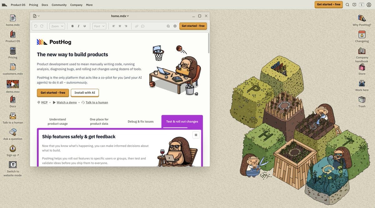
- Desktop OS frame: left sidebar as file tree (home.mdx, pricing, demo.mov) and right rail for utilities (handbook, store, work here).
- Muted paper background: warm beige with subtle noise so the main window pops without harsh contrast.
- Chunky CTAs and tabs: bold, rounded buttons and step-by-step nav (“Ship features safely & get feedback”) that read like a workflow.
- Mascot world-building: hedgehogs and boxy topiary blocks spelling P-O-S-T-H-O-G to make the product feel like a friendly little universe.
Then reassemble it for an AI library
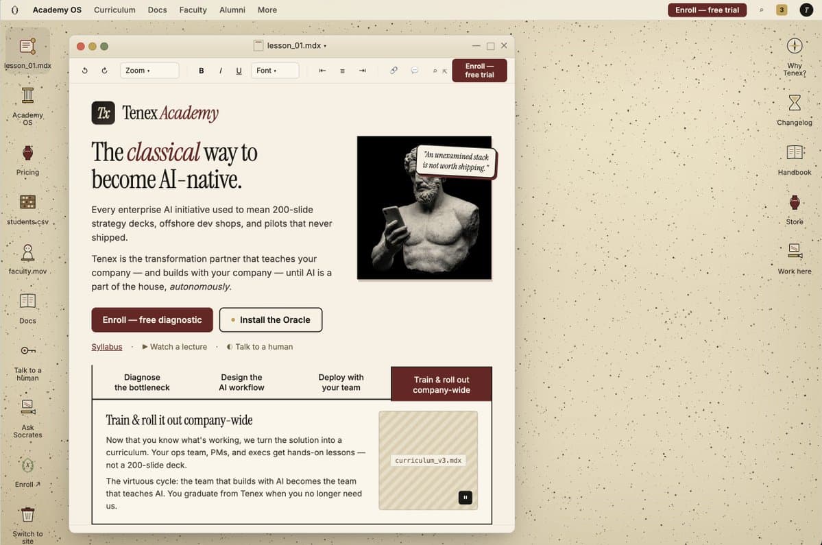
- Swap mascot for metaphor: Tenex trades hedgehogs for a marble philosopher checking his phone, signaling “serious but witty” AI education.
- Keep the OS metaphor: same faux-desktop layout, but rename files to match your AI library (syllabus.mdx, students.csv, faculty.mov).
- Upgrade the copy frame: PostHog says “The new way to build products”; Tenex becomes “The classical way to become AI-native.” Mirror that pattern for your promise.
- Anchor the journey: Turn PostHog’s feature steps into an AI curriculum map: diagnose, design workflow, deploy, train & roll out company-wide.
How to position your AI library like Tenex
Tenex Academy frames the whole experience as “the classical way to become AI-native,” instantly making the library feel like a serious curriculum instead of a random bookmark list.
PostHog positions its OS-style interface as “the new way to build products,” turning what could be a boring docs layout into a playful control center people actually want to explore.
Creative Variations
Analyzed by Swipebot
Loading analysis...