Apple’s Revenue Chart VS Tech Companies
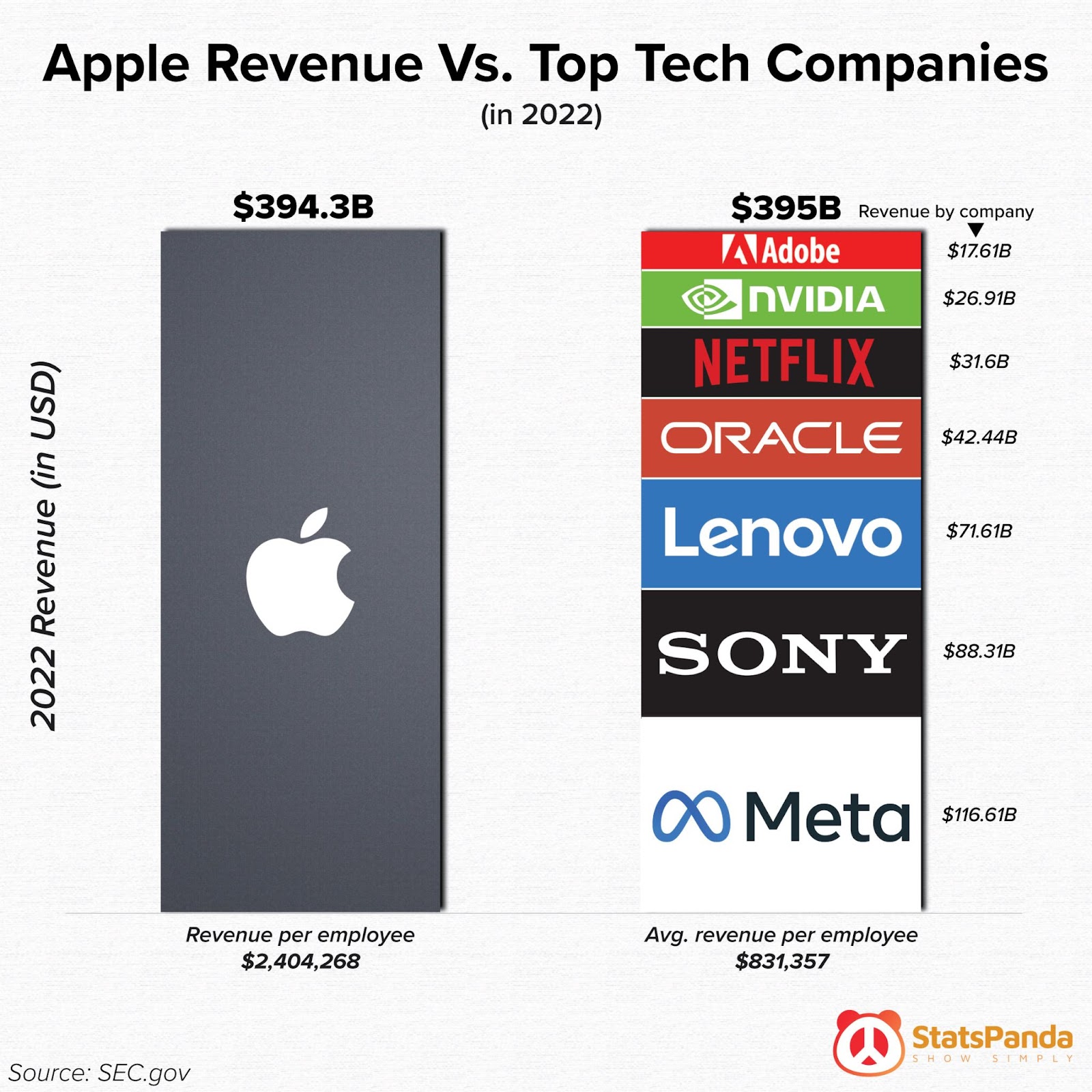
The format of this chart easily demonstrates how Apple’s 2022 revenue was the combined revenue of alllll these big tech companies 😬
The format of this chart easily demonstrates how Apple’s 2022 revenue was the combined revenue of alllll these big tech companies 😬

This before-and-after image is the perfect way to showcase your redesigns. It’s perfect for sharing on social media to get in front of potential clients.…
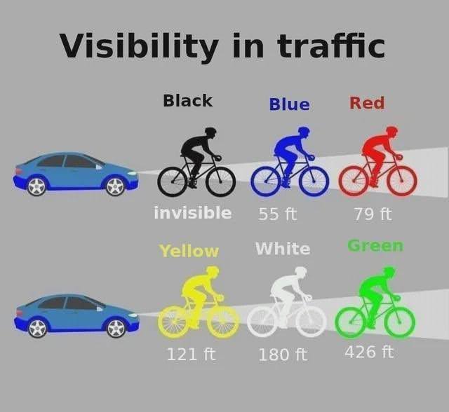
I love stuff where your brain just “gets it right away.” This chart shows the top colors to wear for max safety on a bike. You learn something valuable from …

Learning can take many forms, and some are better than others:
• Lecture: 5% (Average Retention Rate)
• Reading: 10%
• Audio/Visual: 20%
• Demonstration: 30%
• Group Discussion: 50%…


This is a chart showing 50 different ways to spend time alone, I really like these charts, especially when you share on social media because people click on them to …

This insane stat shows barely 2% of people reading Reddit ever post anything.
This backs up the “The 90-9-1 Rule” that states:
• 90% of people just lurk.
• 9% …


