
The Copywriting Course Business Model
This is how Copywriting Course gets traffic from free sources (blog + social media) and turns it into community subscriptions and large projects leads.…
Different swipes related to money.
This is how Copywriting Course gets traffic from free sources (blog + social media) and turns it into community subscriptions and large projects leads.…
If you ever want to sell a company for a very high multiple, here’s some qualities of that company:
– It owns a niche.
– It has recurring revenue.
– …
Mike was selling air purifiers for $1,000. He couldn’t sell many at that price, so he upped it to $2,000 and then he couldn’t keep them in stock.
What changed?…
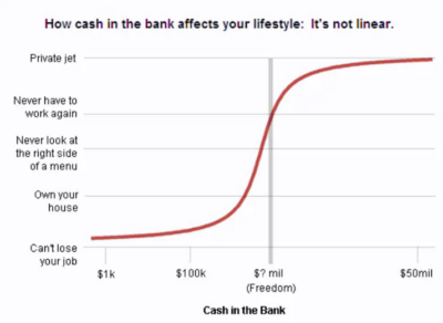
Great chart by @asmartbear that shows how cash in the bank affects your lifestyle.
$1,000 = “I can’t lose my job.”
$100,000 = “I can own my house.”
$2,000,000+ = …
When an industry dies, it doesn’t just disappear into oblivion right away. It slowly shrinks, then shrivels, then consolidates, then becomes a small niche. Think:
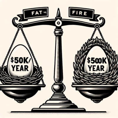
There’s an amazing subreddit called /r/fatFIRE which is full of people trying to be F.I.R.E. (Financially Independent Retire Early)
“FAT”-FIRE means they want to retire, but in luxury style.
So …
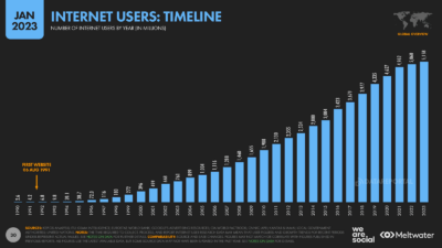
In 2003 (20 years ago) around 700 million people were on the internet. Now it’s nearly the entire planet.
Many people in 2003 felt they missed their “big shot” after …
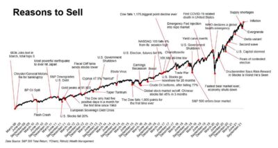
This graph shows allllll the different excuses to sell over the last 15 years.
It explains a simple-yet-complex concept to hold very long term, and ignore short term fluctuations. This …
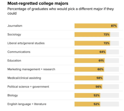
This shows the college majors people most regret getting, usually due to a lack of opportunity the major gets vs the amount of effort/cost to acquire it.
Do you regret …
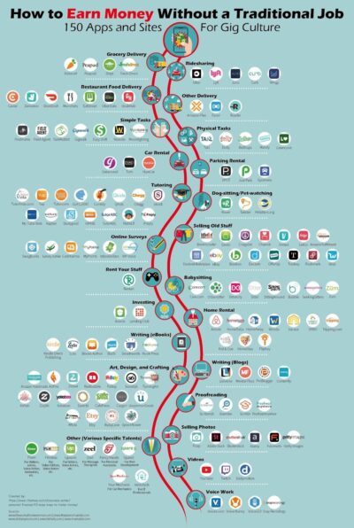
“How do I make money?” This graph has answers! Just glancing at it you’ll discover a ton of different services you probably didn’t even know about for making some side …
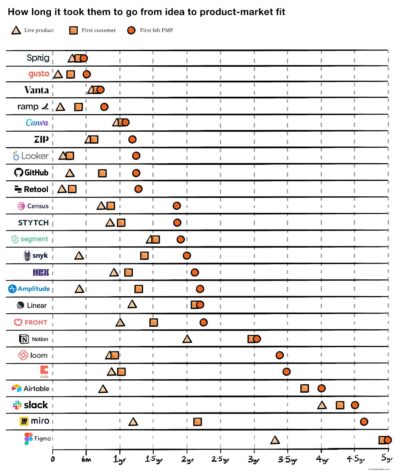
How long it took each of these companies to:
▲ Launch a live product
◼ Get their first customer
⚫️ Get Product Market Fit
I’m not the biggest fan of …


Wow…this graphic shows a surprising conclusion:
When Nike sells a $100 shoe, they make only $5 in profit.
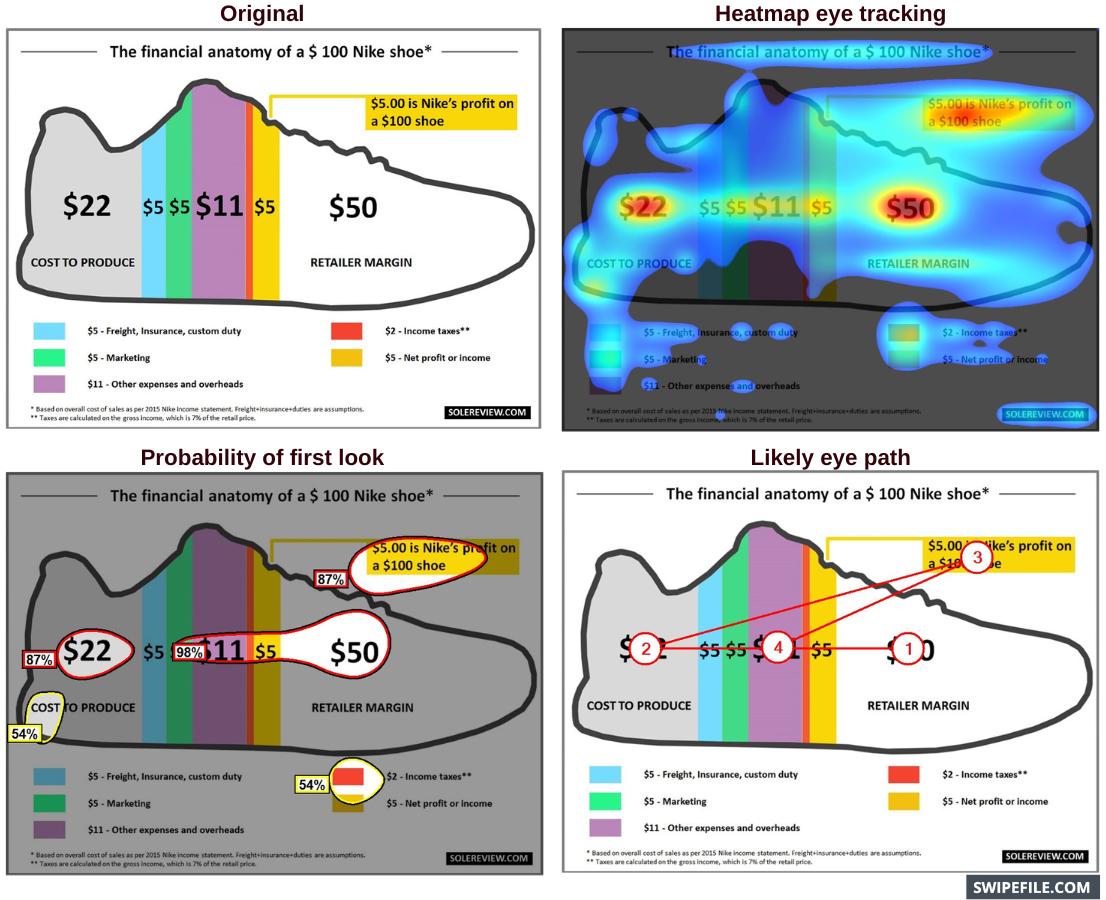
Chat GPT:
Wow, the data presented in this graphic is truly eye-opening …
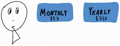
What do you think is a better pricing structure?
• Monthly payments
• Yearly payments
?
There’s clearly pro’s and con’s to each one:

My personal thought is that both …
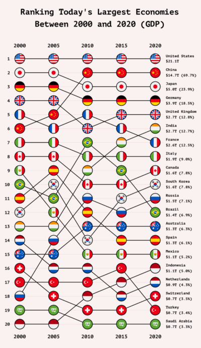
I love different ways of “showing data” and I’ve never seen this style before. It shows the movement in size of different economies over 20 years. It displays less information …
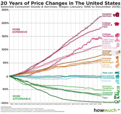
Basically everything that’s heavily government regulated has gone up in price, and everything competing in the free market gets cheaper.…
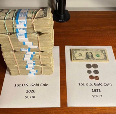
Inflation is a hard concept to explain….but this simple picture really “shows” it perfectly!
It’s easy to see how much the buying power of the dollar has decreased in ~100 …
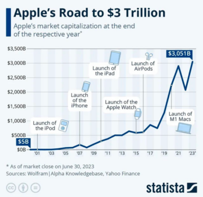
This is a cool visualization of major produce releases that helped Apple reach a $3T+ valuation. It would be cool to make a revenue chart like this with other companies, …

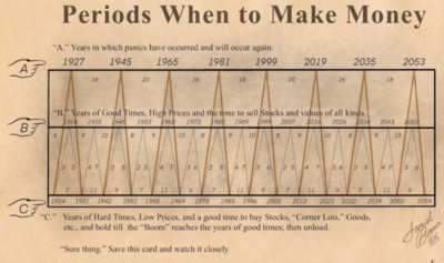
The overall point of this chart is to show that booms & busts happen with regular frequency, and that it’s not an uncommon occurrence.
I love when something takes a …
If you want to build something big (or run a small company with large outputs), you need to some form of “scale.”
There’s 4 main ways to scale:…