
Before and After Website Redesign
This before-and-after image is the perfect way to showcase your redesigns. It’s perfect for sharing on social media to get in front of potential clients.…
A good swipe file is not only one format or one genre. It spans across industries and mediums, so that inspiration can be taken from many places.
This before-and-after image is the perfect way to showcase your redesigns. It’s perfect for sharing on social media to get in front of potential clients.…

The world of online casinos is not just rapidly growing—it’s an ever-transforming ecosystem offering global players unparalleled convenience and a rich palette of gaming options. Insight into the operational mechanics …
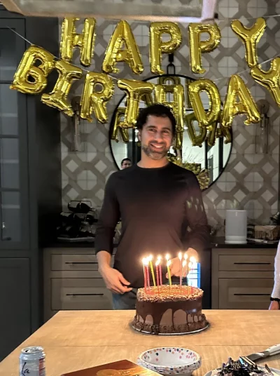
Last week was my 40th birthday, and I’m thankful to have friends/fam that surprised me with like 2 weeks worth of celebrations! Think I got like FIVE cakes for this …
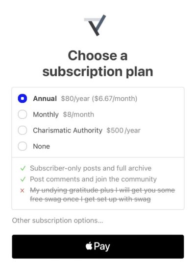
This is a very easy to understand 4 tier pricing structure for a newsletter. Users can make up their mind right before they read an article if they want to …
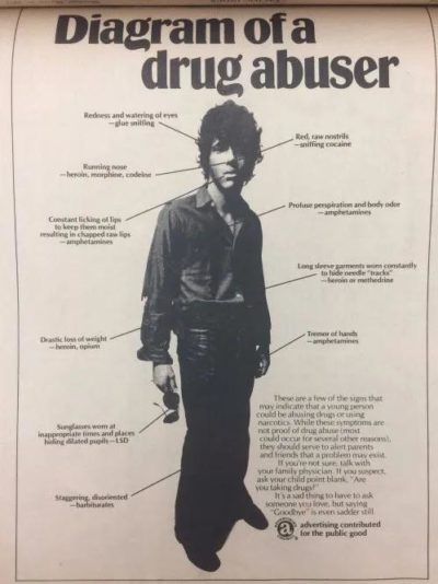
This advertising campaign from 197😂3 uses text + arrows to learn how to spot a drug abuser. This is from 50 years ago and would be hilarious to publish today …

Recent shifts in Bitcoin’s pricing can be attributed to a series of developments on multiple fronts. While cryptocurrency enthusiasts and financial experts are dissecting the comments made by Binance CEO …
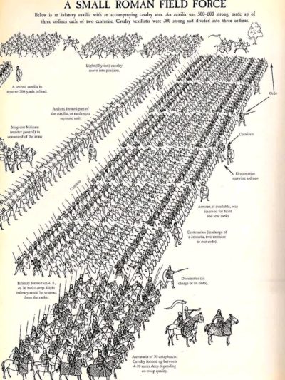
This is a great diagram showing how a full Roman field force army would advance, and all the little details of what each sub-unit should be doing.…
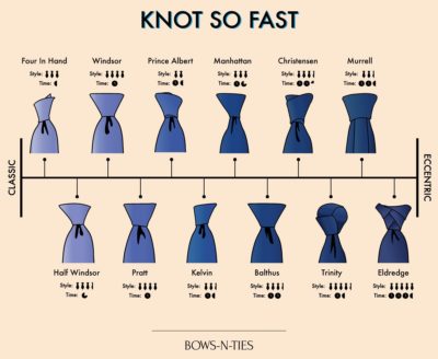
Super cool tie graphic. It includes even more information by giving two rating scales:
• Style Level
• Time to Tie…
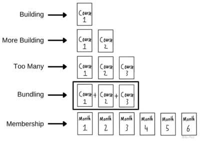
For people who build courses or digital products, this is often the path that takes:
→ Build a course
↪ Build several courses
↪ Have too many courses, gets confusing…

The world of online casinos functions based on a set of fundamental principles, but many players often find themselves questioning the fairness of these virtual platforms due to a lack …
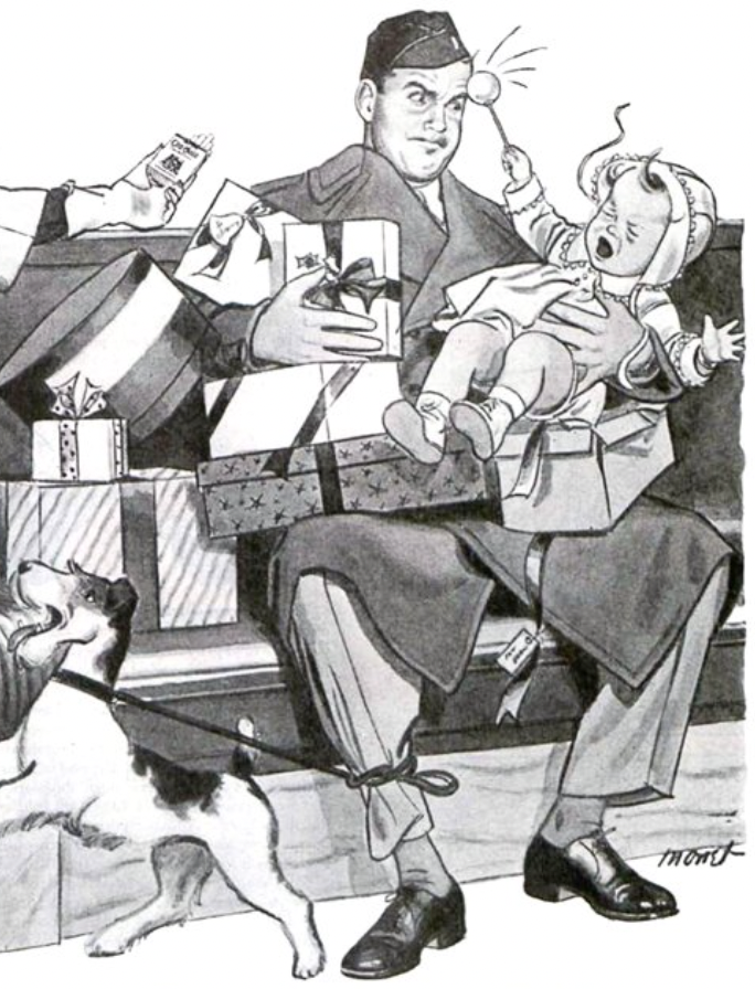
This ad from 1945 is hilarious in this day and age, but the reason it’s SwipeFile-worthy is how well they depicted “irritation” of the man in the picture 😂
 …
…
This is proof that you don’t need to have any design experience to create a ad. It’s literally done in your notes app and screen captured. They trash the competition …

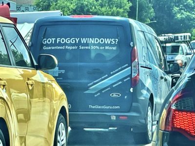
This is a simple (yet effective) add from Glass Guru on one of their work vans:
This is very straightforward and …
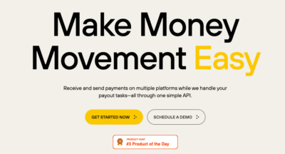
I love complicated tech Saas companies with simple. The bold typeface headline catches your attention quickly and the sub explains what they do. The Producthunt badge gives instant social proof.…
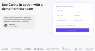
This request a call page displays a testimonial box with the face of the ceo of ClickUp + the bottom is filled with an impressive list of tech clients.…
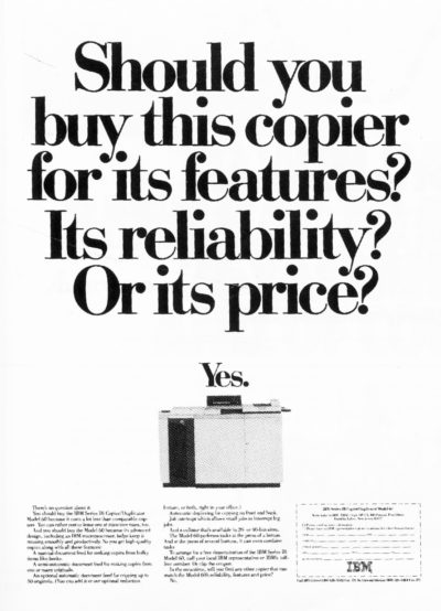
This copy writer used questions to pitch the product. These are more than likely the same questions a shopper would ask.…
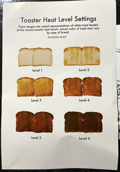
This is a cool chart sent along with a toaster that visually shows the different heat settings.
The numbers 1, 2, 3, 4, 5, 6 don’t really mean much, but …
The headline sets up the sub line to tell you why it’s so great with its many benefits. This could be an old school print ad.…
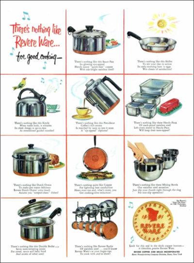
This is a simple and effective print ad showcasing the entire lineup of a cookware brand, and it gives an image and quick description of each product.…
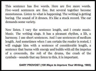
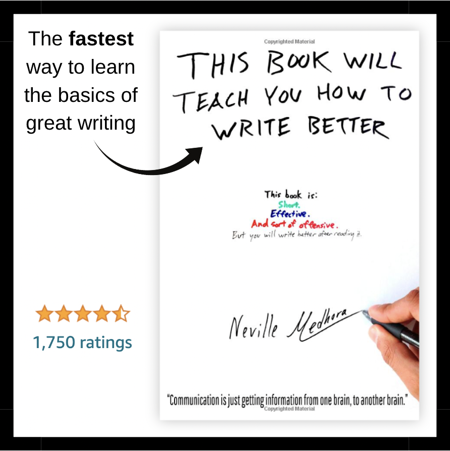
A interesting take on keeping your writing fresh and interesting even if you are not saying the most interesting things.…