163 Home Pages Examples
Discover home page designs that convert. Explore examples where layout, content, and user experience come together to drive engagement and sales. Essential for web designers, marketers, and business owners looking to optimize their site's front door.
Most Popular in Home Pages

Flat-Fee Property Tax: Save or Pay Nothing
This flat‑fee property tax ad is a masterclass in making a scary, complicated expense feel simple and safe. In one...

Hampton multi-city landing page cop
Hampton’s new homepage hits hard on one message: founders don’t have to go it alone. But instead of staying vague,...
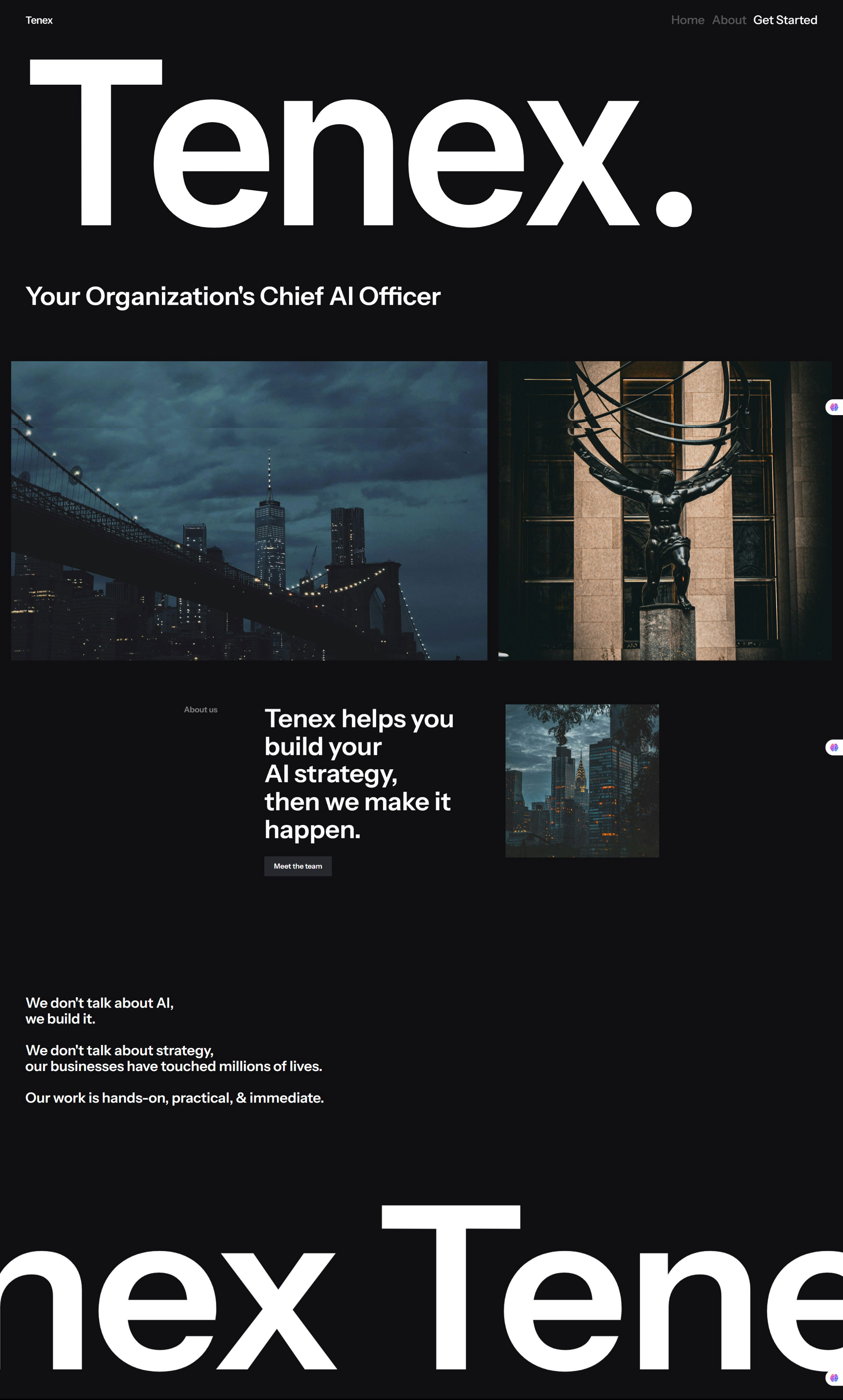
Tenex Homepage
Most AI websites look the same: stock robot images, buzzwords, and corporate fluff. Then you land on Tenex — black...

Cool growth Mario image
Mailmodo nailed this Super Mario-themed ad. It instantly clicks with gamers and marketers alike—Mario eats the power-ups and grows 3x...

Wallet Opening Words Landing Page
This “Wallet Opening Words” sales page is like a confetti cannon for your eyeballs. It’s loud, fun, and bursting with...
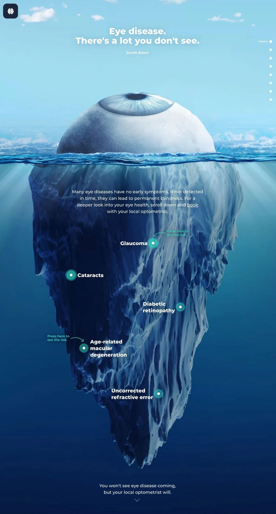
Eye Iceburg with callouts
This ad turns an eye into an iceberg to show what’s lurking beneath the surface. You can see a calm,...

Cool headline: Finding trends before they take off
Exploding Topics nails their homepage with one killer line: “We help companies find exploding trends before they take off.” The...

Microsoft's first homepage in 1994
Back in 1994, this was Microsoft’s official homepage. No fancy animations. No responsive design. Just a bold layout that worked...
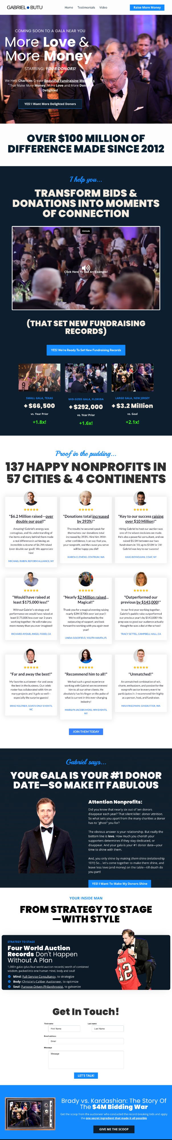
Homepage for professional charity gala auctioneer
Gabriel Butu’s landing page is a masterclass in authority and energy. He’s not just saying he’s great at fundraising—he’s proving...
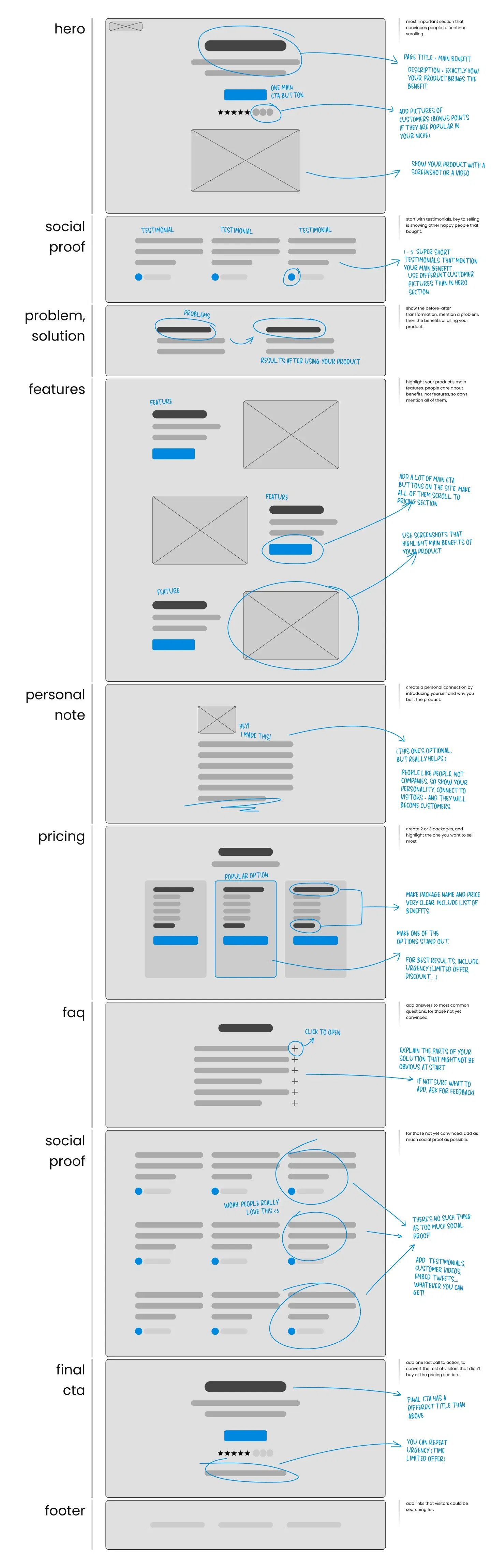
Website Layout That Sells
This mockup nails what every high-converting landing page needs. It’s a visual blueprint showing exactly which sections to include and...
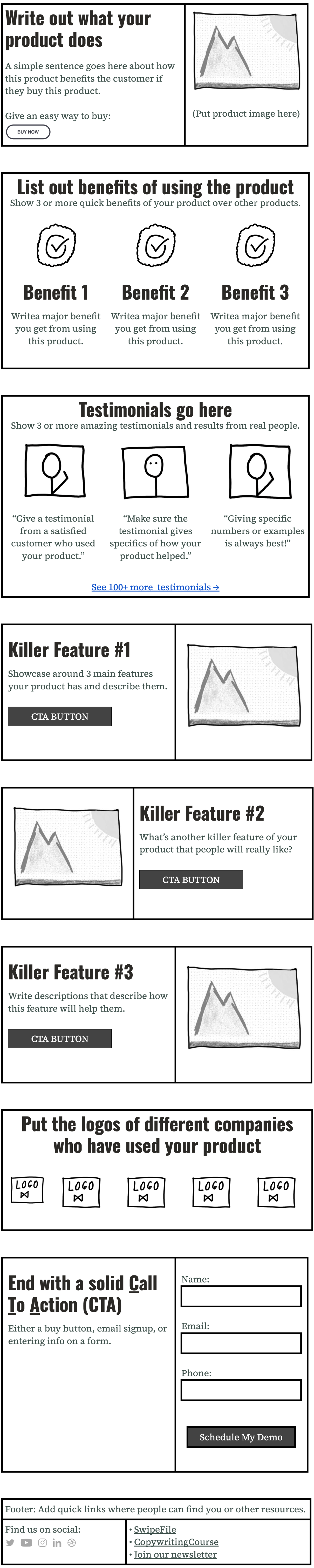
Editable homepage template
Most homepages try to do too much. This one doesn’t. It’s just a clean outline that forces you to say...
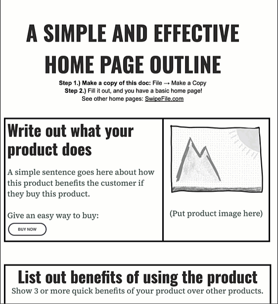
Homepage Outline Template
Ever get stuck staring at a blank homepage? This editable Google Doc outline gives you a fill-in-the-blanks system to create...
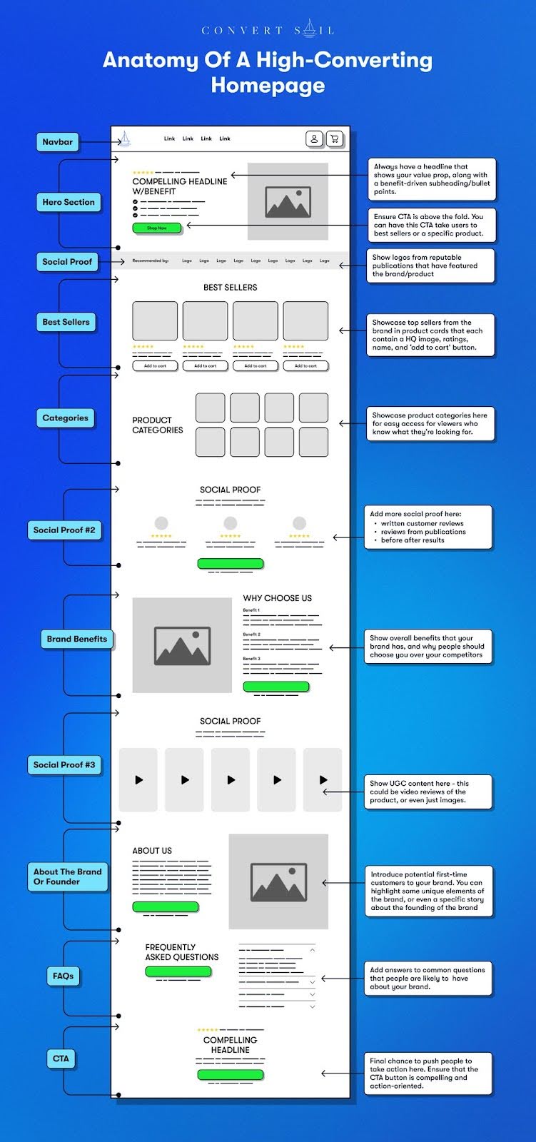
Anatomy Of A High-Converting Homepage
Convert Sail dropped a killer visual that breaks down what makes a homepage actually convert. Spoiler: it’s not fancy animations...
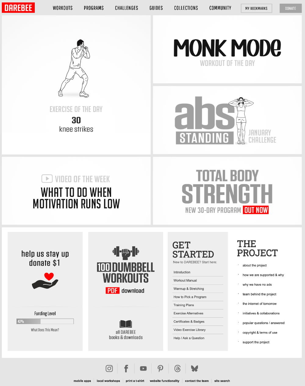
Darebee Homepage
This homepage is a masterclass in clean, action-driven design. Darebee’s layout is simple, visual, and gets you moving fast—literally. No...
Removing homepage and simplifying boosted sales
Jaspr Air didn’t change their offer or design. They just made their site simpler. Fewer clicks, fewer options, big lift...

Olgam Life First Time Doners Webpage
Most plasma donation sites feel like medical brochures. Olgam Life flips that on its head. Their site walks first-time donors...
Latecheckout Agency great single-page website
Greg Isenberg’s team at Late Checkout found one small change that skyrocketed conversions: showing results in a clear, trust-packed chart....

Kreated.com. Get Roasted.
Kreated found a clever way to get clients: they sell $75 “website roasts.” Instead of just pitching design services, they...

Kreated sales page
This sales page is pure conversion candy. It’s got everything a visitor needs to trust, engage, and buy — no...
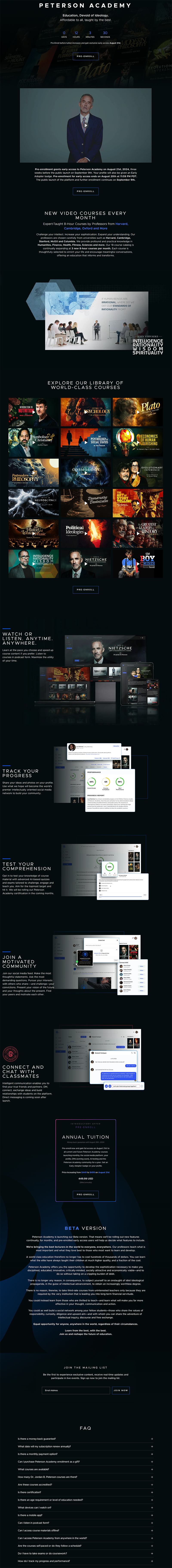
Peterson Academy Sales Page For Beta Program
Peterson Academy’s landing page nails the feeling of “I need to join this.” It mixes high-end visuals with smart psychological...
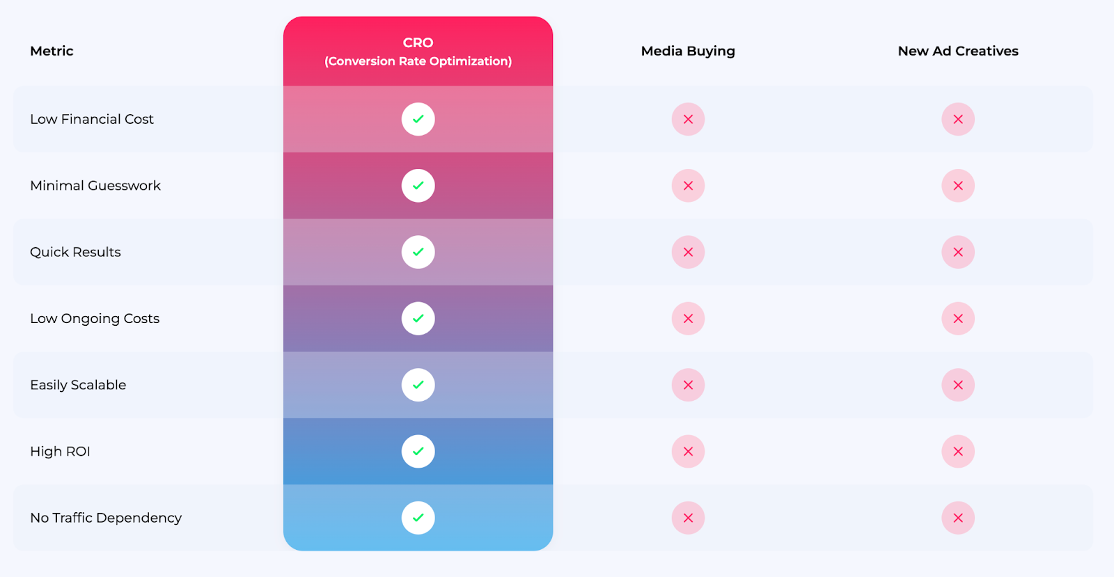
ConversionWise CRO Comparison Graphic
This chart from ConversionWise nails the perfect visual pitch. It quickly shows how their CRO service stacks up against media...
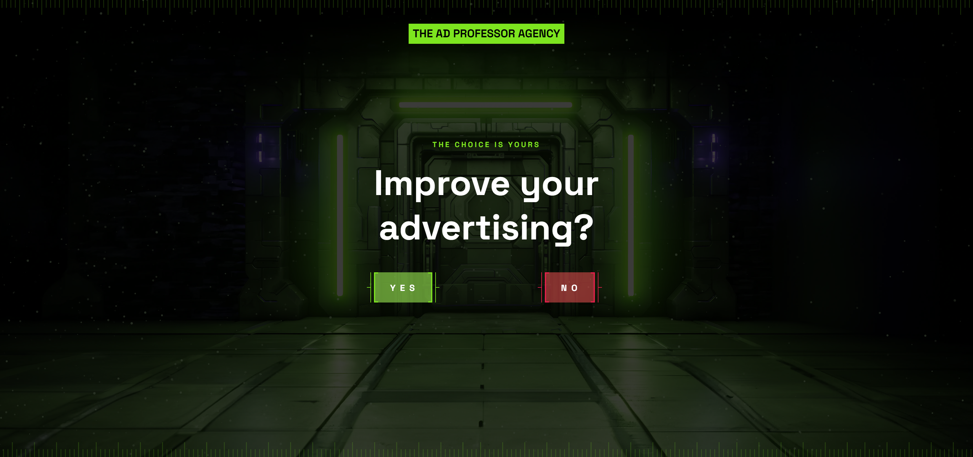
Ad Professor Agency Homepage
This homepage gives you only two choices: “Improve your advertising?” YES or NO. That’s it. No fluff. No scrolling. Just...
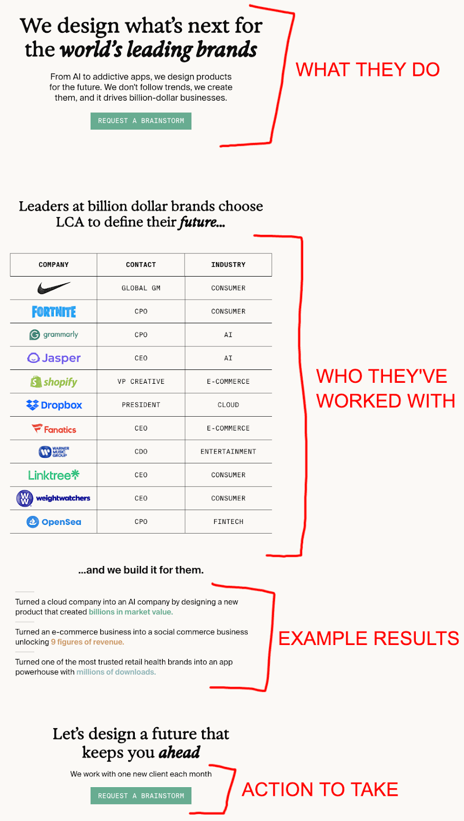
DesignScientist Agency Homepage
Most design agencies talk about “beautiful branding.” This one talks about “scientific revenue growth.” That’s a totally different flex. The...
Retention.com’s Home Page
This homepage is a masterclass in clarity and focus. Retention.com knows exactly who they’re talking to (DTC brands) and what...