Good headline on a ready-to-eat cake ad
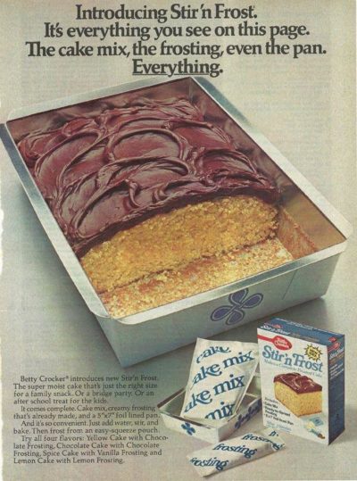
This 1975 print ad for “Stir N Front” cake mix is has a cool headline that shows it comes 100% ready to make.…
This 1975 print ad for “Stir N Front” cake mix is has a cool headline that shows it comes 100% ready to make.…

Apparently different types of fragrances are determines by the percentage of perfume oil they contain, which correlates to how long the scent will last on your skin 🤔…

In one graphic this chart shows the different sizes of:

This cool circle chart shows the different areas of your Comfort Zone.…
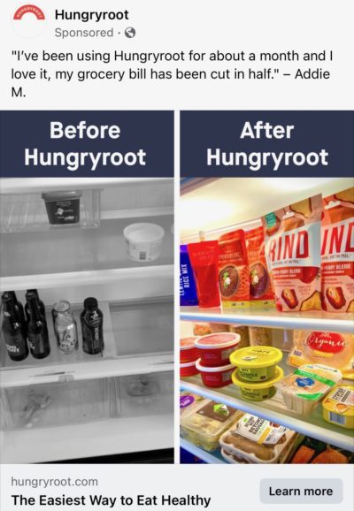
This is a cool before/after ad for food delivery service HungryRoot seen on Instagram and Facebook.
The image shows it’ll keep your pantry stocked, and the testimonial shows it’ll lower …

Recent shifts in Bitcoin’s pricing can be attributed to a series of developments on multiple fronts. While cryptocurrency enthusiasts and financial experts are dissecting the comments made by Binance CEO …

This is a pretty to-the-point page for a short-form clips agency. The headline and picture alone explain their product proposition!…

I’ve always liked this acronym H.A.L.T. which means….
If you’re not in a good mood, you’re either:
• Hungry
• Angry
• Lonely
• Tired…

This is a great Jello print ad. Perhaps they should’ve kept this cartoon character as their spokesman instead 🤪…
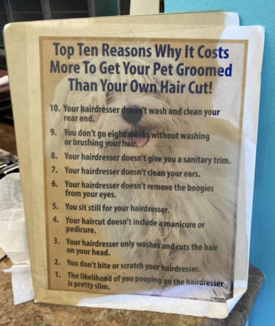
Every consultant or freelancer has had to justify their cost at times.
This dog groomer was sick of people snarky remarks like, “WOW it costs less to cut MY hair …
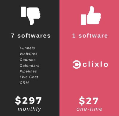
I like how Clixlo promotes their website builder by showing how many services (and their prices) you have to use to compare with their single service.
This is an ad …
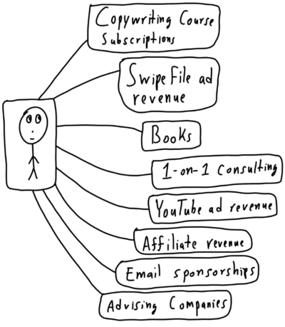
Different potential income streams for a copywriter.…

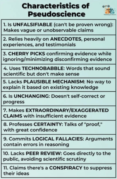
This is a great little chart that outlines what might be “pseudoscience” and how to spot it.…

This simple little image shows the differences between popular coffee drinks.
Kind of interesting that almost every coffee drink is just different levels of milk and espresso.…
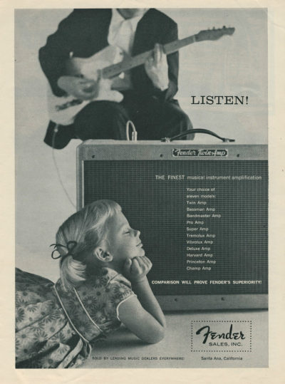
This is just an awesome ad in general because of the image. It also has some text explaining why Fender amps are better than the rest.
Overall awesome (and potentially …
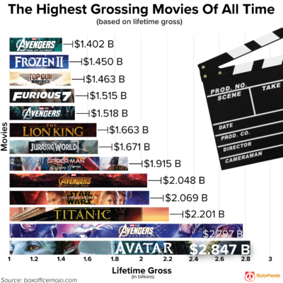
This easy-to-understand chart form visually shows the highest grossing movie data.…

I’m a huge fan of the TEXT + ARROWS diagram, and this diagram shows what the outfit of a Cardinal symbolizes in one easy image.…
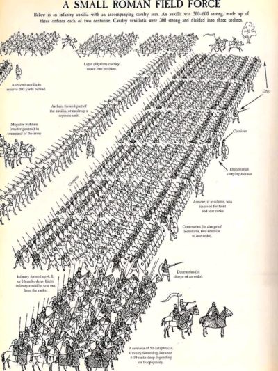
This is a great diagram showing how a full Roman field force army would advance, and all the little details of what each sub-unit should be doing.…

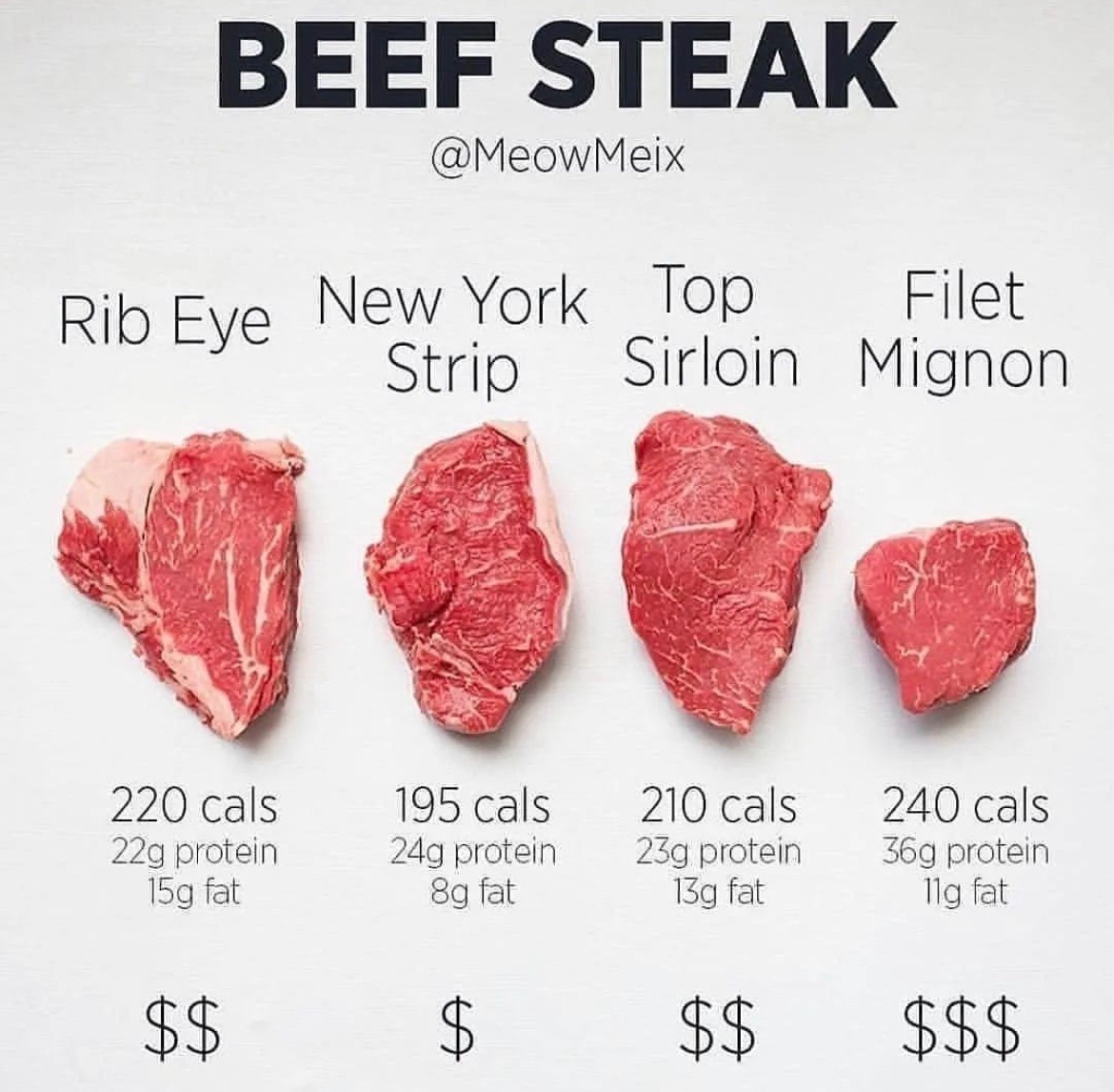
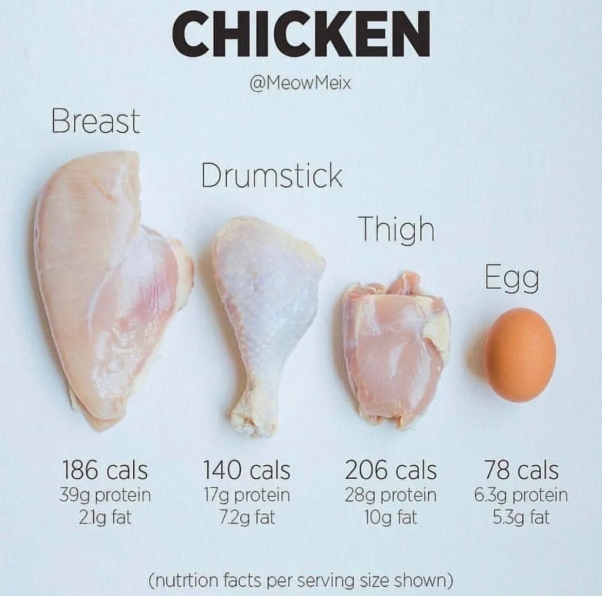
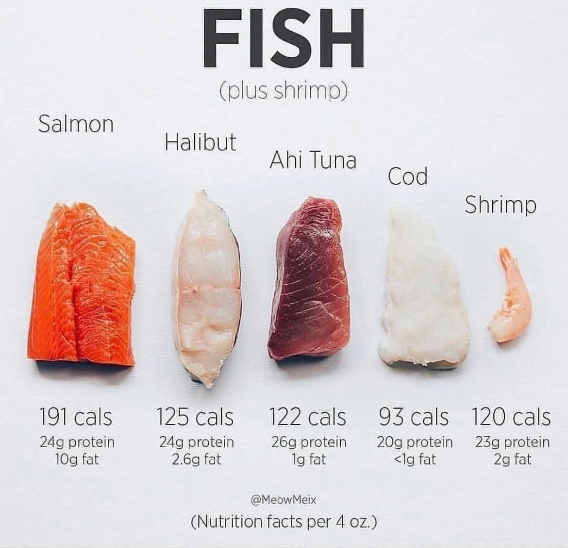
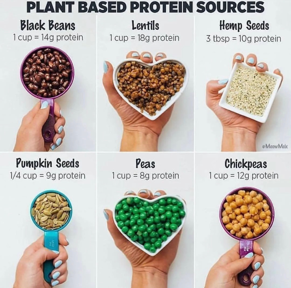
These are some great protein visualizations from MeowMeix.
Almost instantly you can compare proteins when laid out in this easy-to-understand fashion.
 …
…

I personally never know the differences between different types of chocolates…..until seeing this very easy chart!…