From Data to Impact

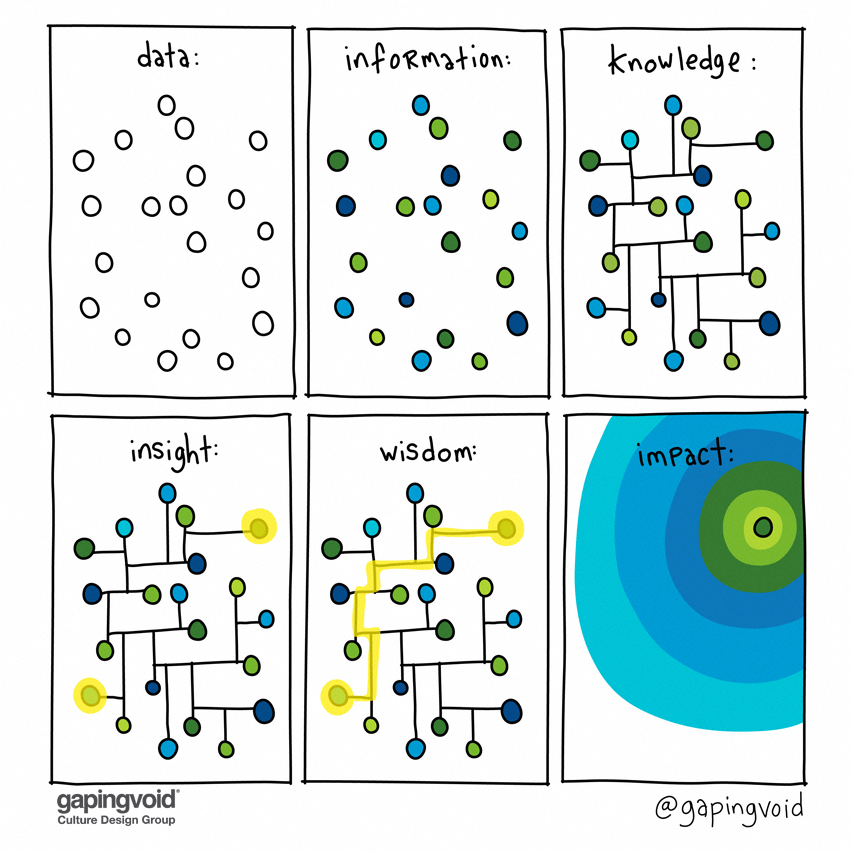
This cartoon (by Hugh MacLeod of gapingvoid.com) is part of a series that plays around with the relationship between various levels of knowing and doing.

What’s great about it:

  • It organizes related terms.
  • It takes a complex idea and makes it simple.
  • It’s very share-able (this drawing pops up on LinkedIn, Twitter, and other social media platforms all the time).
Visit Link

Bike Visibility in Traffic

I love stuff where your brain just “gets it right away.” This chart shows the top colors to wear for max safety on a bike. You learn something valuable from …

The Learning Pyramid

Learning can take many forms, and some are better than others:

• Lecture: 5% (Average Retention Rate)
• Reading: 10%
• Audio/Visual: 20%
• Demonstration: 30%
• Group Discussion: 50%…

pluto

How couples meet graphic

WOW. Look how rapidly online dating became the primary way couples meet.

I meet people who don’t like using dating apps, but by the math of it, it’s almost FOOLISH …