Search for a command to run...
Notion’s homepage is basically a “try before you try” experience. Instead of walls of text, it uses mini demos, gifs,...
Most new copywriters struggle not with writing, but with staying organized. This “Copywriting Command Center” solves that problem in one...
MonkeyLearn nails it with a pricing page that’s as clear as it gets. Four simple options—Free, Team, Business, and Enterprise—laid...
Bryan Harris’s 10K Subs sales page is a masterclass in trust-building. It’s not flashy. It’s clear, packed with proof, and...
Leadpages nailed their “We’re sorry” email after a 4-hour outage. Instead of hiding behind corporate jargon, they explained what went...
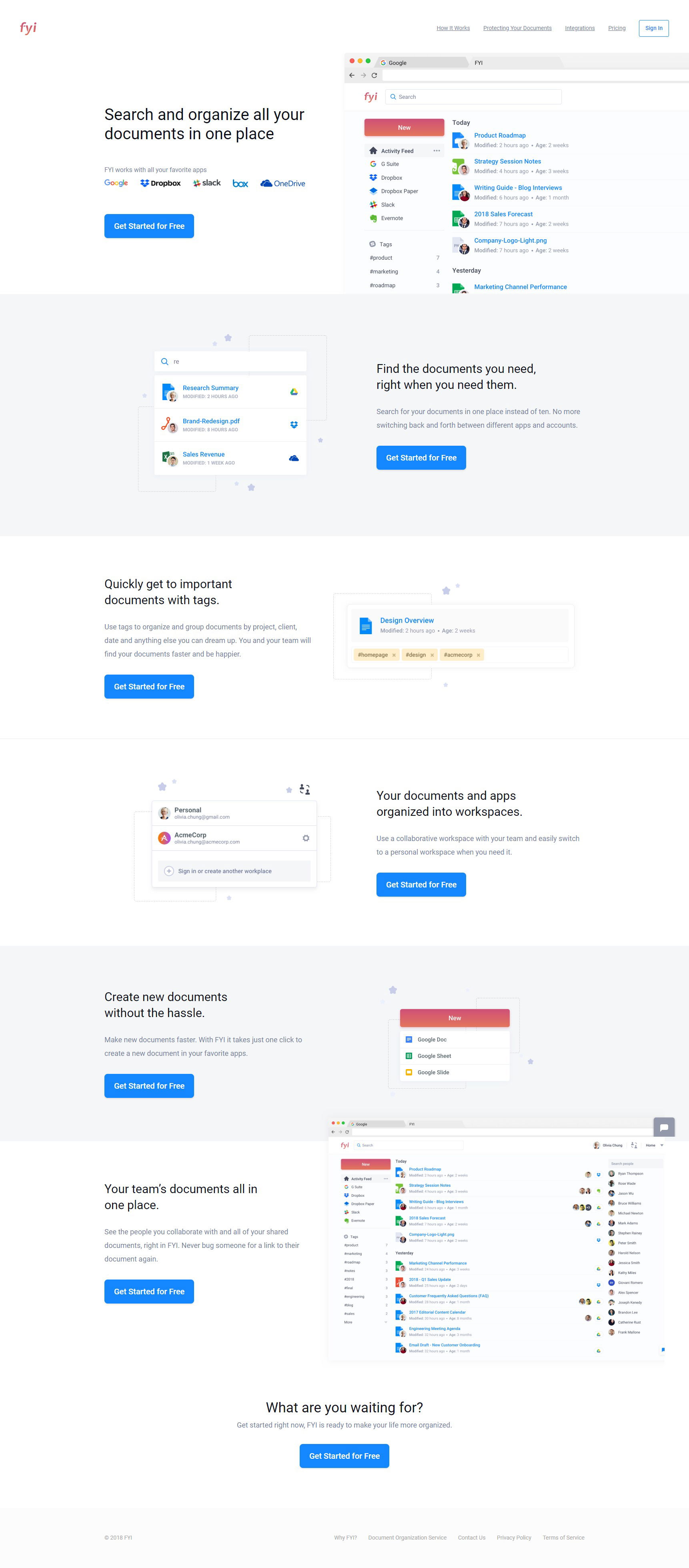
Some landing pages over-explain. Others under-explain. FYI’s page nails it perfectly. They use short sections, crisp headlines, and product visuals...
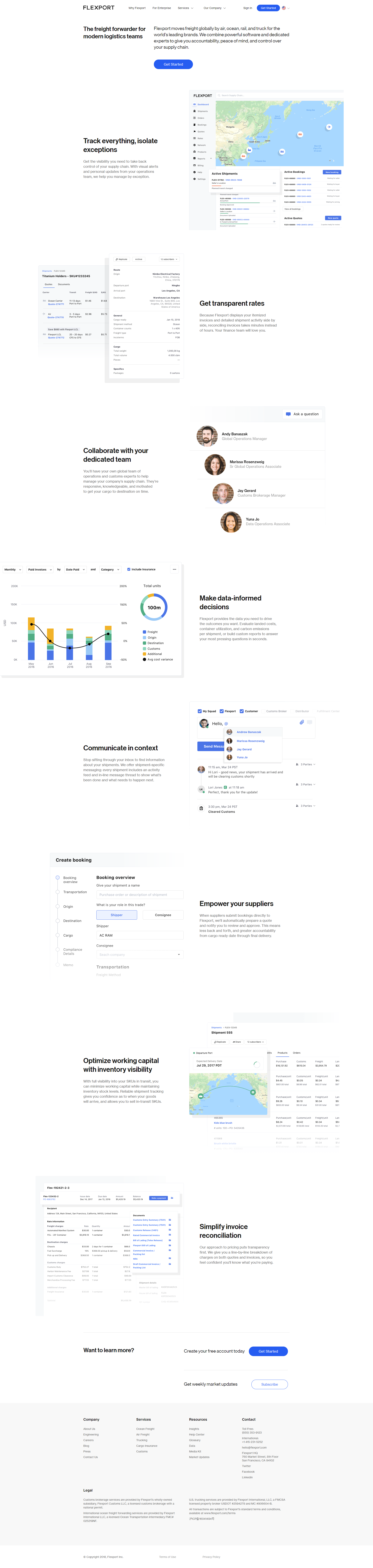
Flexport nailed one of the hardest things in SaaS marketing—making something complex look simple. Their “Why Flexport” page shows how...
Most software demos drag on forever. Monday.com flips that script with a 60‑second video that shows you exactly how to...
The Lava Shield explainer video nails the classic sales formula: show, tell, and prove. It highlights the shiny benefits of...
Most company “About” pages are boring. Stock photos, corporate speak, and a mission statement no one remembers. KlientBoost flips that....
WP Engine nails SaaS pricing with this clean 4-tier setup. You’ve got clear plans for small blogs, growing businesses, and...
Scott’s Cheap Flights nails what every signup page should do: make you want to hit that orange button. The page...
Check out this yoga studio’s pricing setup. Five clear tiers, from $39 to $150, each with specific perks. It’s simple,...
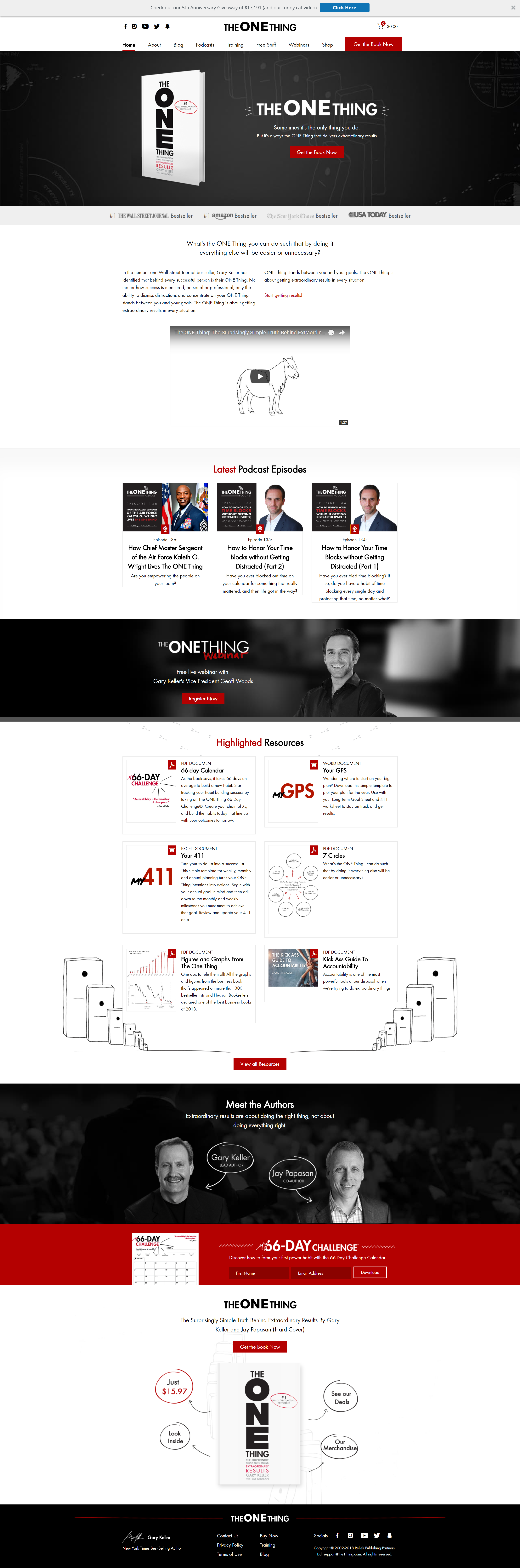
The homepage for The ONE Thing nails one big idea: take a single product and stretch it into an ecosystem....
“More leads = more sales.” That’s the hero line on Infusionsoft’s lead generation page—and it hits hard because it speaks...
Sketch nails it with their “special offers for existing customers” page. New users pay $99, but loyal ones get a...
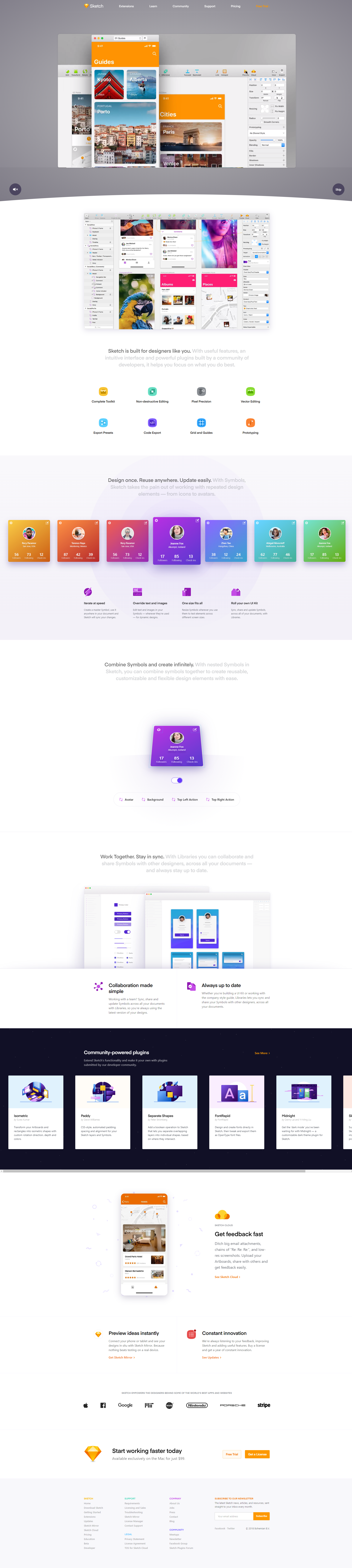
Sketch’s landing page doesn’t just talk about design tools—it shows them in action. Every scroll gives you a peek at...
Pat Flynn’s Smart From Scratch course page is a masterclass in honest selling. It blends storytelling, teaching, and clarity to...
This SecWhy Learning sales page does a solid job turning a tough sell (exam prep material) into an easy “why...
This weight loss sales page is a masterclass in direct response stacking. It doesn’t try to be clever—it just uses...
This LikeAGlove sales page nails one thing perfectly: solving a nagging problem with tech and showing it clearly. Finding jeans...
This sales page does everything right: it explains the offer, shows student results, and limits signups to 60 members. That’s...
Every feature on this WordPress plugin’s page has one thing: a short video demo. No long feature texts. No walls...
WriteLab’s homepage is clean, confident, and conversion-focused. It doesn’t just tell you what the product does—it shows you. Big difference....