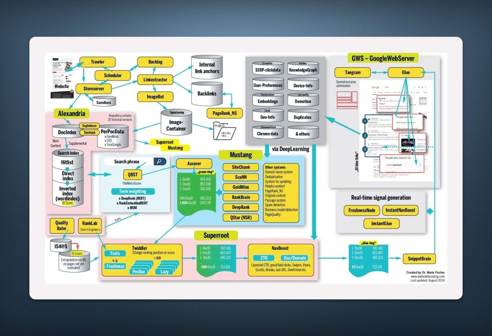
Google’s full search model document leak.
This flowchart looks like a spaceship control panel, but it’s actually how Google decides what shows up in search results....

Million Dollar webistes
This visual shows a goldmine: 40+ websites each pulling in $1M+ a year. From AI tools to Excel courses to...

Eye color chart based on parents eye color
This eye color chart is a masterclass in visual simplicity. It takes a complex genetic concept and turns it into...

Market Cap at IPO vs. Current Market Cap Chart
Everyone loves a good launch. This chart of IPO market caps vs. current values shows how hype often outruns reality....
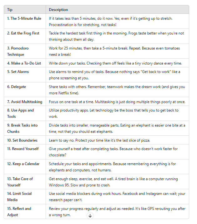
Time Management Tips List
This list of 15 time management tips is gold. Each one’s short, punchy, and funny enough to keep you entertained...

Great 3-tier explanation of a sites offerings for sale.
Productive Therapist nails the classic 3-tier pricing layout. It’s clean, visual, and instantly tells the buyer: “Pick the one that...
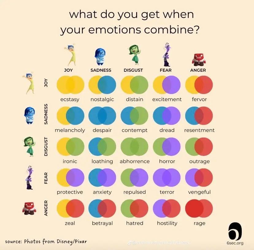
Cool “Inside Out Movie” chart of emotions
This “Inside Out” chart nails it: every emotion is powerful, but the magic happens when they mix. Marketers who understand...
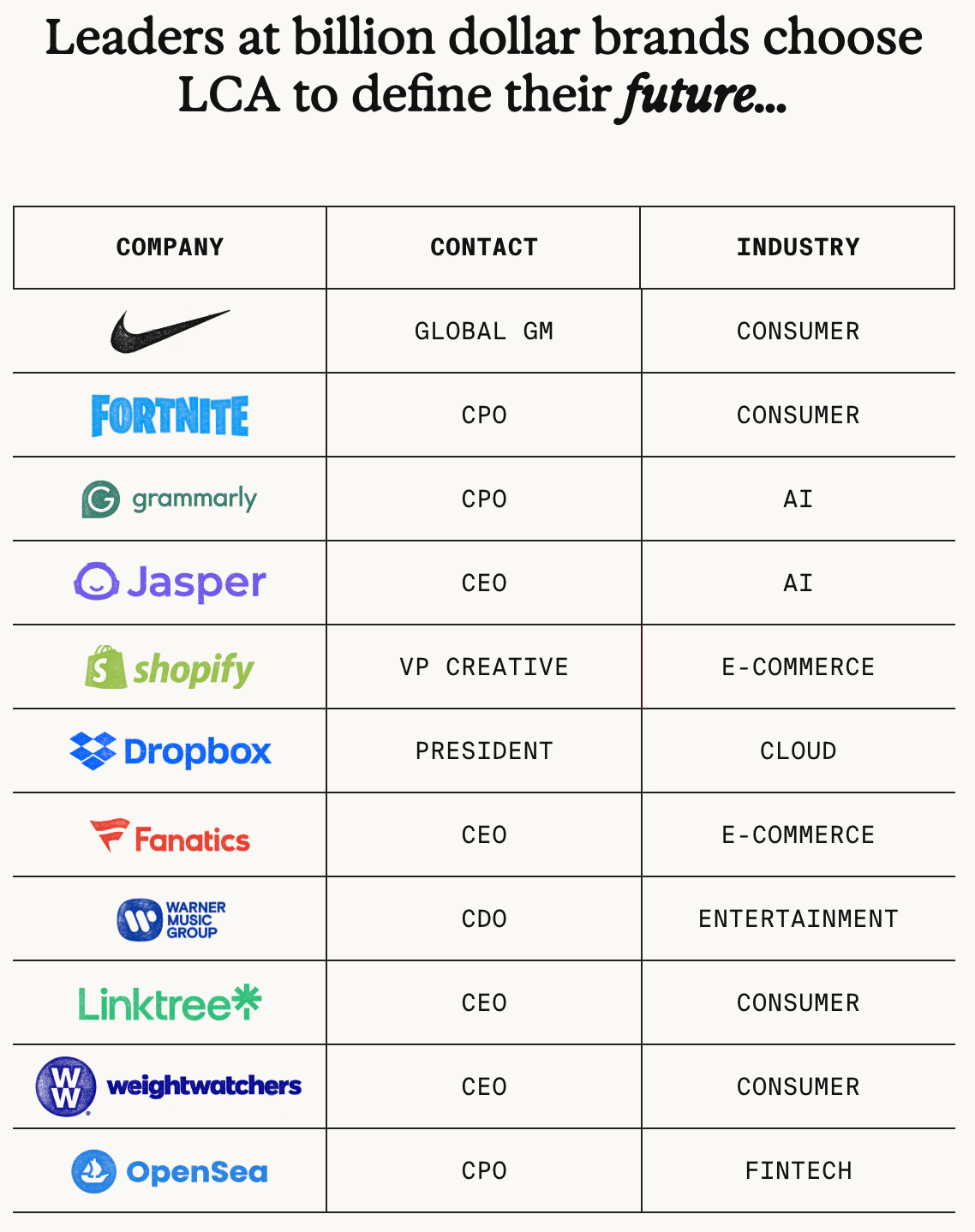
Late Checkout Agency Client List
This agency didn’t just name-drop clients. They turned their client list into a visual leaderboard of credibility. Big logos. Big...

X open source code
Most people chase likes. But according to the leaked X algorithm, likes barely move the needle. Replies and profile clicks...

Magic Call Script Signup Form
The “before” version looked nice but didn’t sell. The “after” version adds a simple graphic showing a web page and...
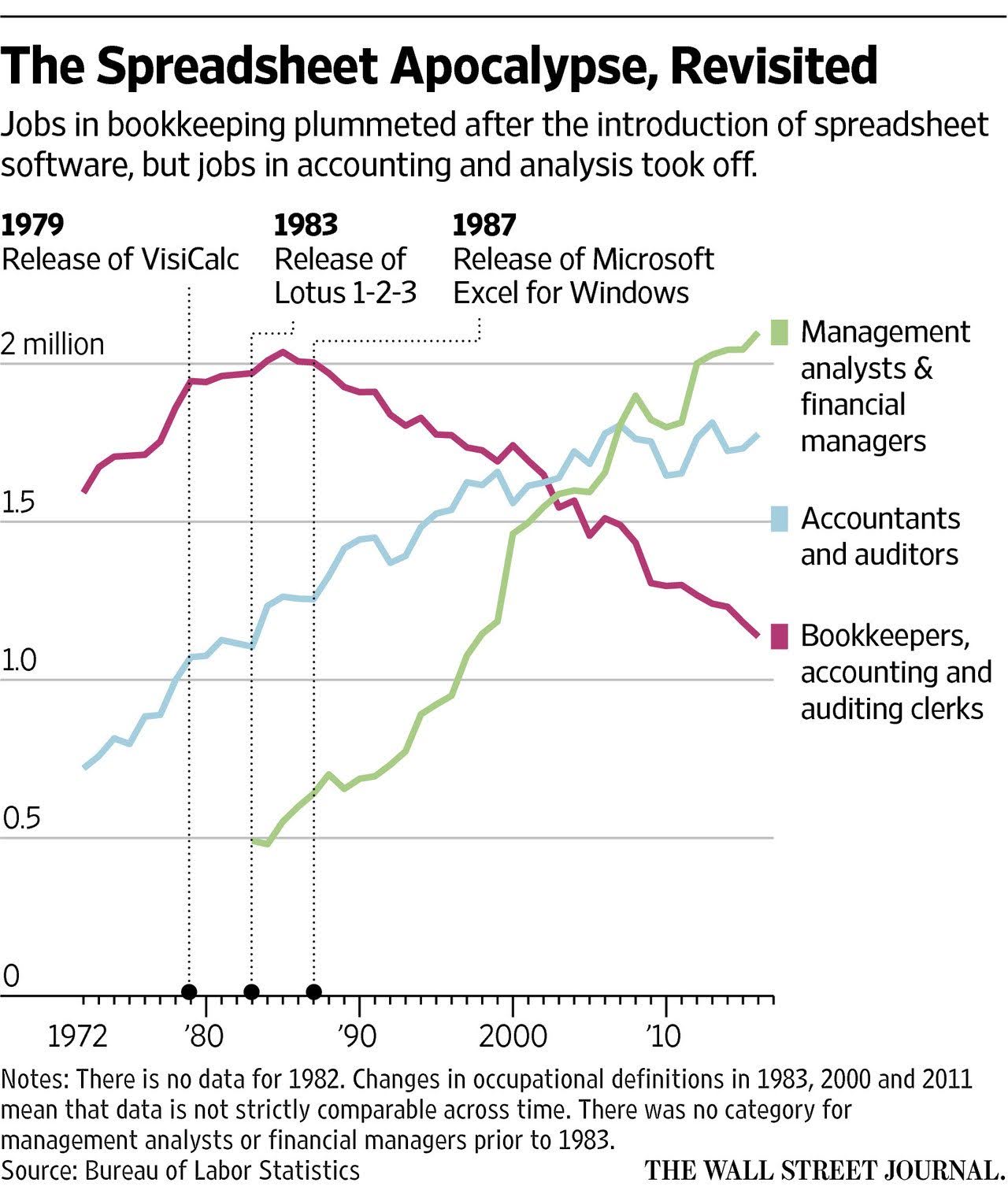
The Spreadsheet Apocalypse Graph
This graph shows how spreadsheets “killed” bookkeeping jobs but unlocked way more high-value roles in analysis and management. Every big...

How companies displayed the gun emoji chart
Ever notice how big tech quietly swapped the gun emoji for water pistols? This chart shows how Apple, Google, Microsoft,...
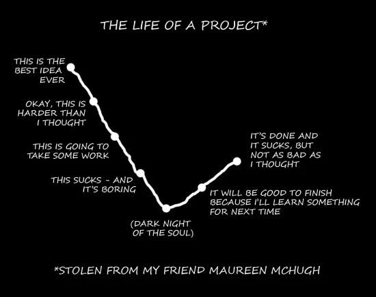
Life of a project timeline chart
Every marketer knows this chart is too real. You start out thinking your campaign idea is genius... then halfway in,...
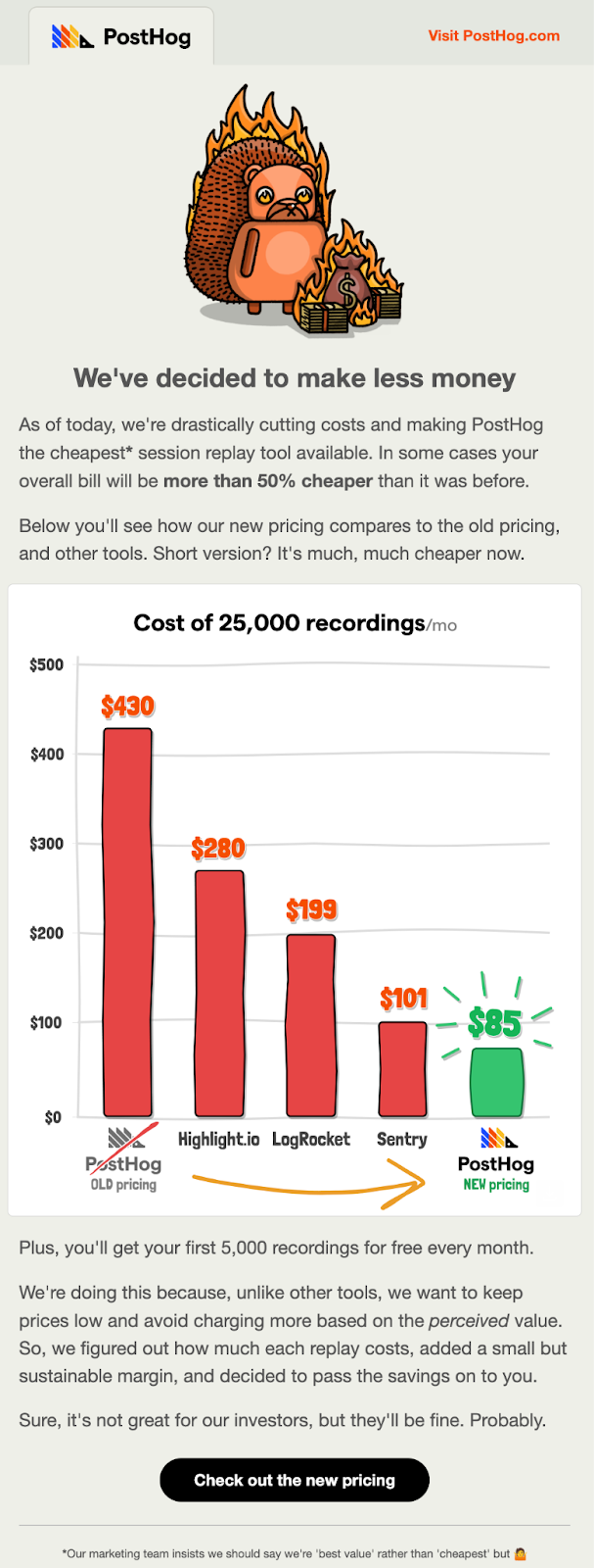
PostHog PricecutEmail
PostHog nailed this email. They didn’t just announce lower prices—they made it funny, visual, and insanely clear why it matters.Marketing...
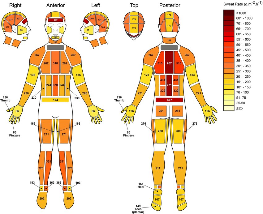
Chart showing amount of sweat produced by different areas of the body
Here’s a weirdly satisfying visual: a full-body sweat map showing exactly where humans sweat the most. It looks scientific, but...
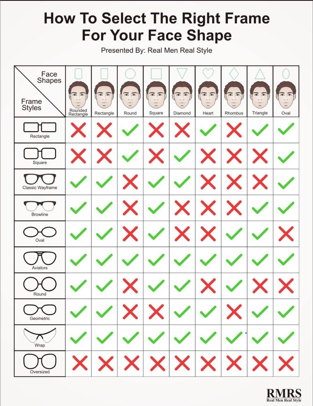
Men’s Glasses to Face Shape Chart
This chart by Real Men Real Style is marketing genius disguised as a style guide. It helps men instantly find...
Interview: Director of Engineering at X - Daniel O’shea
AI is shaking things up for writers. In a recent chat with the Director of Engineering at X, the topic...
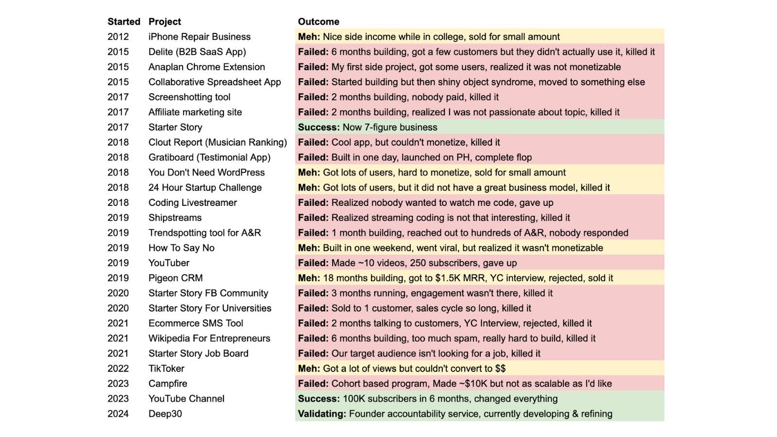
Pat Walls List of Projects and Outcomes
Pat Walls shared a brutally honest tracker of his startup experiments: every project, outcome, and lesson. Most are marked “failed,”...
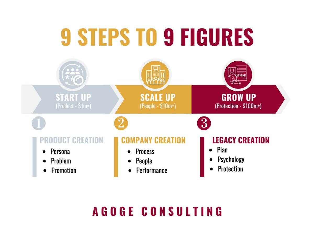
9 Steps to Figures Chart
Most founders overcomplicate growth. This visual from Agoge Consulting nails it: growing a company happens in three simple phases—Start Up,...
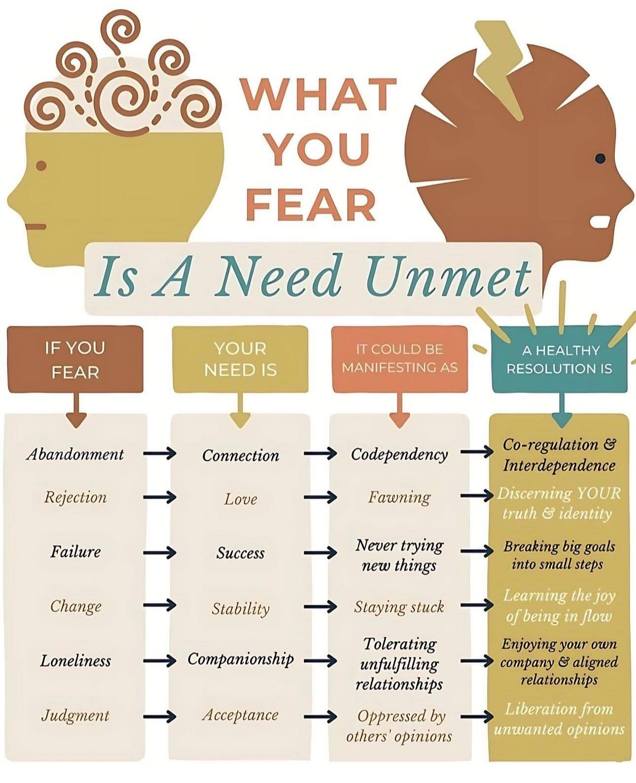
What needs are unmet? Self improvement chart
This chart nails a truth every marketer should remember: fear often hides an unmet need. Same goes for your audience....
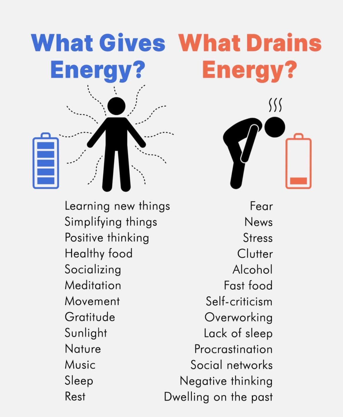
What Gives Energy? -vs- What Drains Energy?
This chart hits hard: creativity isn’t about more hours, it’s about better energy. If your tank’s empty, no hack will...

Shaan Puri Website
Shaan’s site hits you with clarity in five seconds flat: “I write things here.” Boom. You instantly know what he...
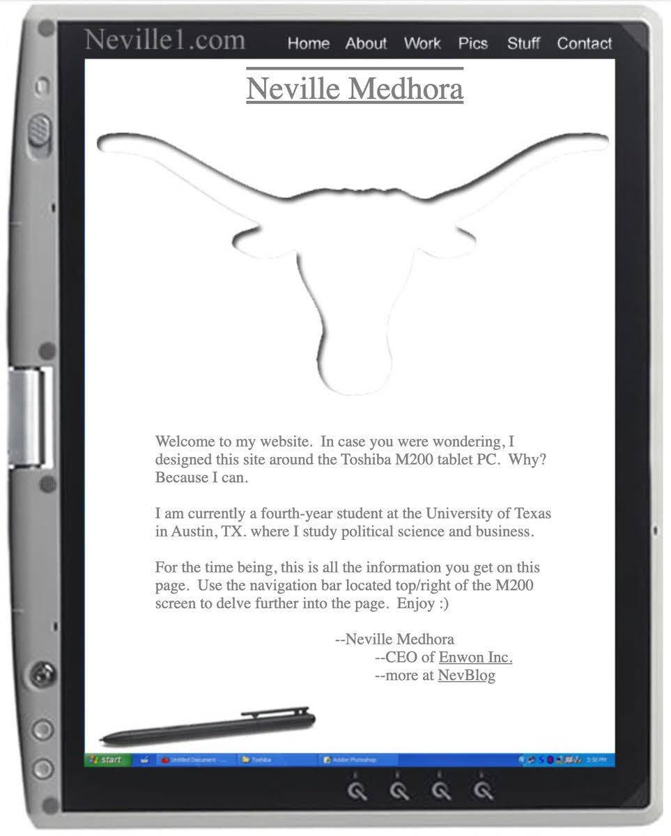
Neville college website
Back when most student websites were boring resumes, Neville Medhora made something personal and fun. His old site looked like...
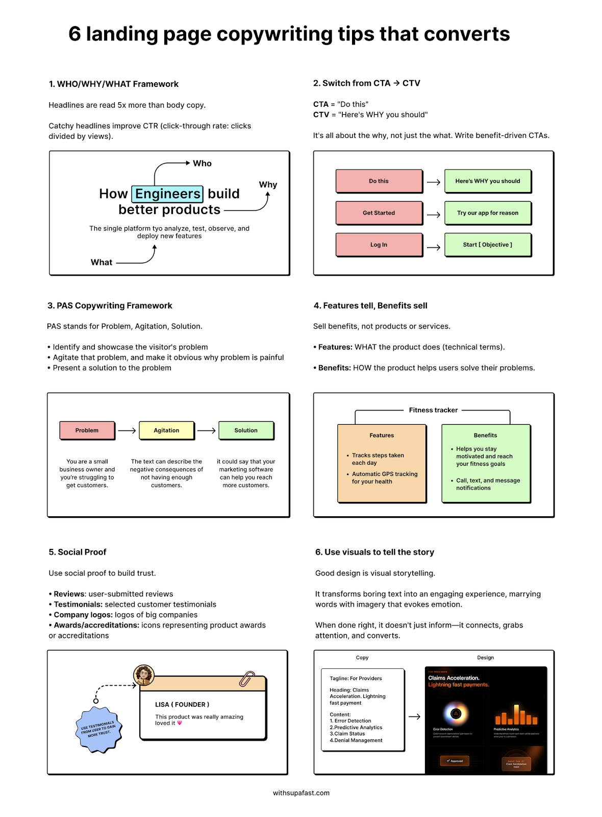
6 Landing page copywriting tips
Most landing pages flop because they talk about what they do instead of why people should care. This one-pager from...