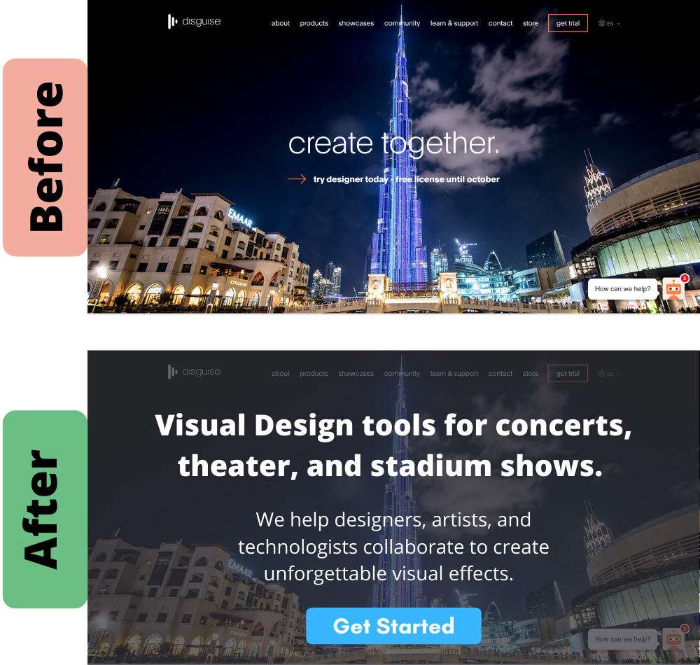
disguise’s home page before/after
disguise is a collaborative software tool for BIG visual productions, like concerts, theater shows, and major outdoor events.
The problem is, their home page doesn’t do a good job explaining what it is, how it works, or why it’s important.
disguise’s Hero section is especially weak.
Issues BEFORE the rewrite:
- Vague headline: “create together” could mean anything.
- No explanation: There’s no subhead explaining what the tool does or who it’s for.
- CTA with no context: Without #1 and #2, it’s hard to imagine someone opting into a free trial.
Improvements AFTER the rewrite:
- Clear headline: it identifies a clear purpose for the tool.
- More explanation: the subheader identifies who the tool is for and why they should use it.
- Easier CTA: with a clearer headline and subhead, this CTA should perform better.
