Hilarious “Food Poisoning” bar chart
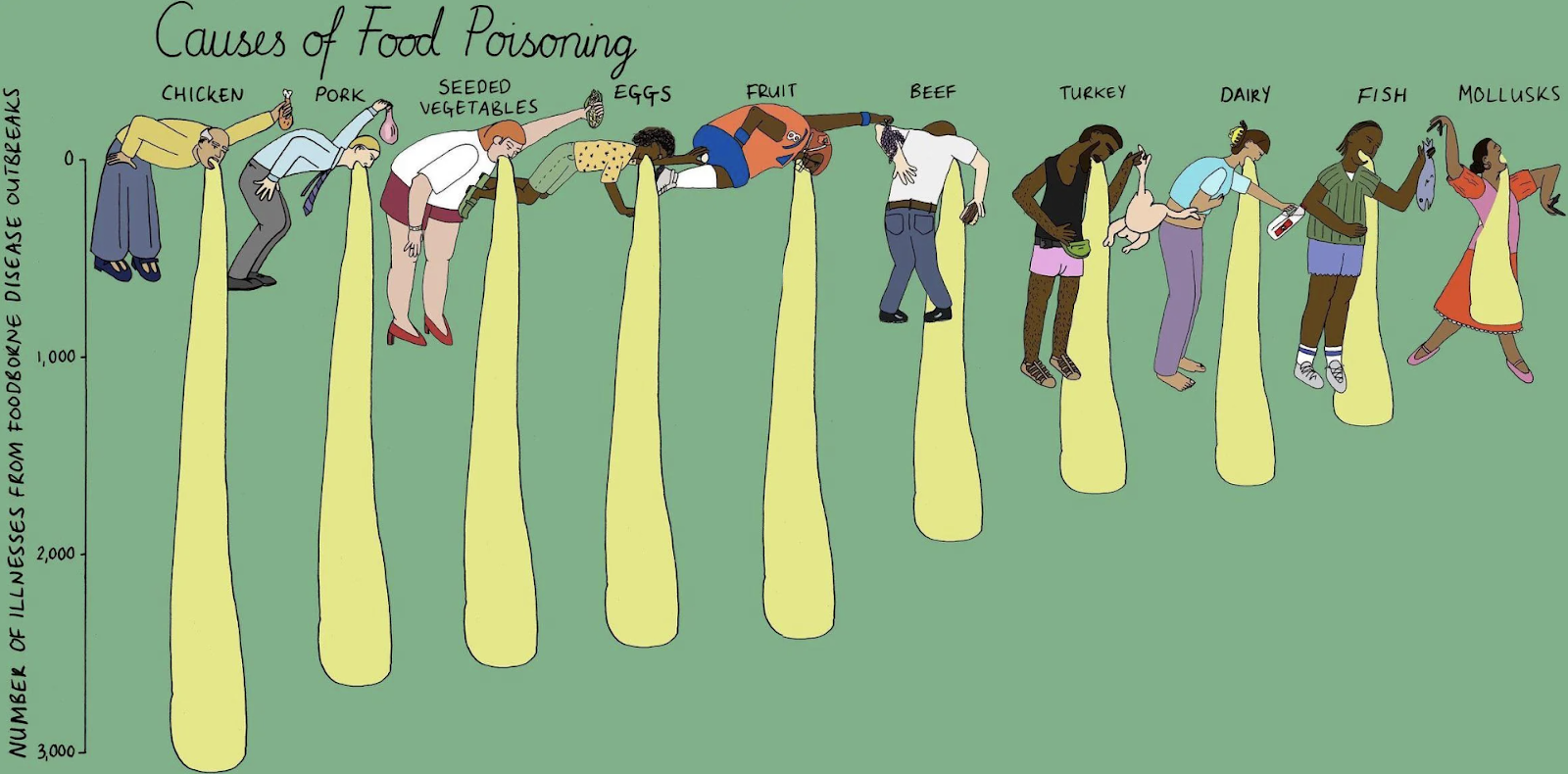
This amazing Causes of Food Poisoning bar chart hilariously demonstrate which foods cause the most cases. This is just so much more fun and engaging than a standard bar chart 😂
This amazing Causes of Food Poisoning bar chart hilariously demonstrate which foods cause the most cases. This is just so much more fun and engaging than a standard bar chart 😂

This before-and-after image is the perfect way to showcase your redesigns. It’s perfect for sharing on social media to get in front of potential clients.…
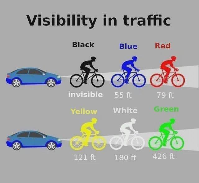
I love stuff where your brain just “gets it right away.” This chart shows the top colors to wear for max safety on a bike. You learn something valuable from …

Learning can take many forms, and some are better than others:
• Lecture: 5% (Average Retention Rate)
• Reading: 10%
• Audio/Visual: 20%
• Demonstration: 30%
• Group Discussion: 50%…

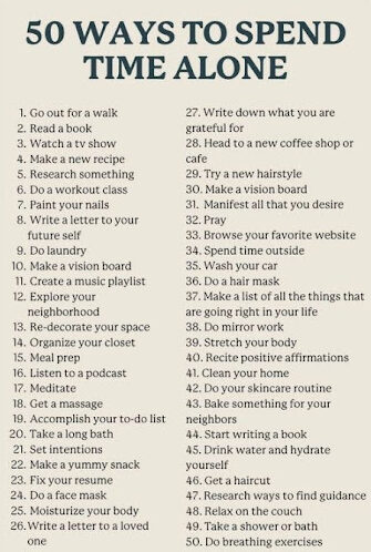
This is a chart showing 50 different ways to spend time alone, I really like these charts, especially when you share on social media because people click on them to …

This insane stat shows barely 2% of people reading Reddit ever post anything.
This backs up the “The 90-9-1 Rule” that states:
• 90% of people just lurk.
• 9% …


