How to launch new products advertorial by Ogilvy

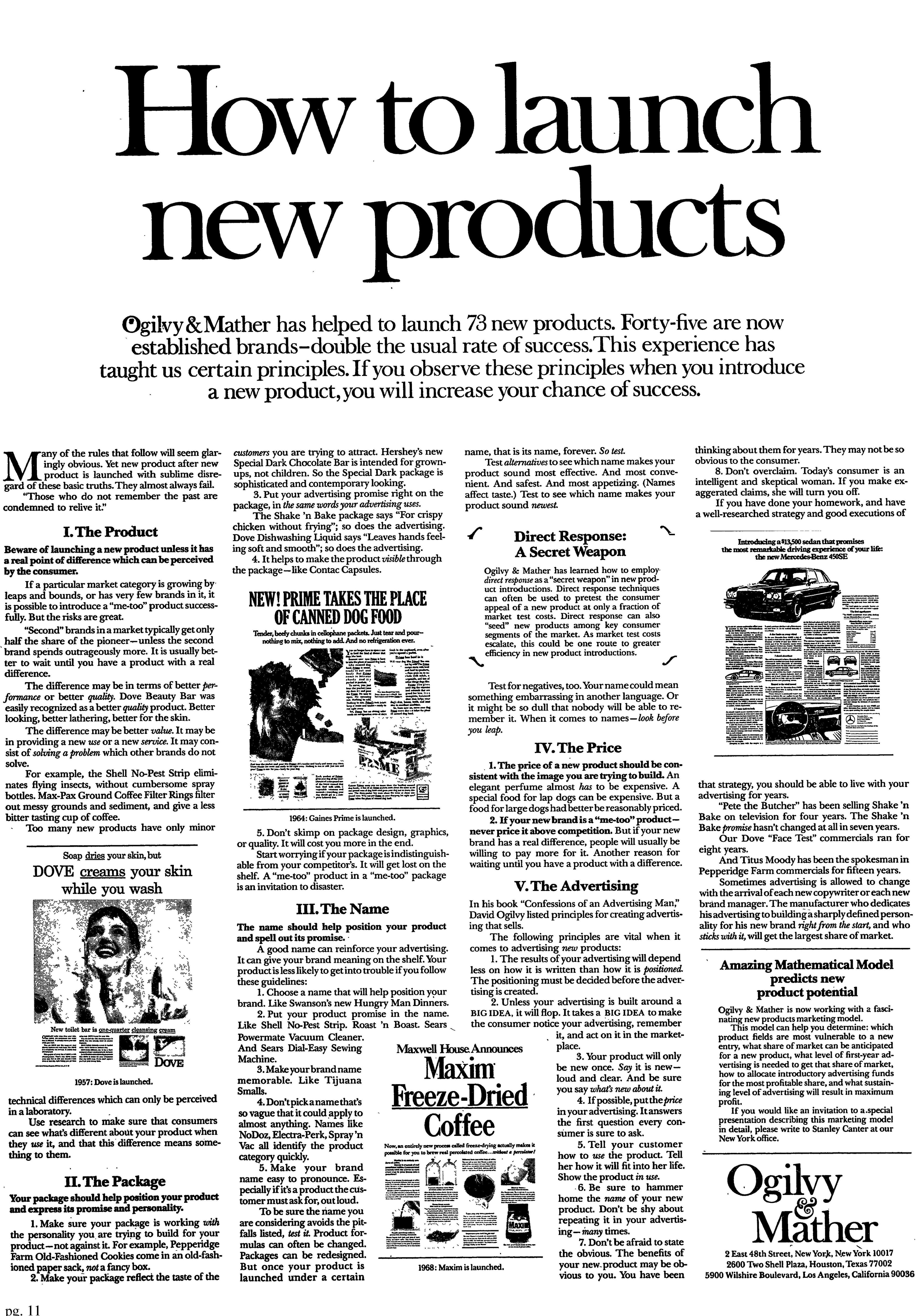
This Ogilvy & Mather ad doesn’t just talk about launching—it shows how to do it with style. Using heat maps, it reveals exactly where readers’ eyes go first and how they flow through the page. It’s like watching marketing psychology in motion.
Marketing analysis
The headline grabs 72% of the first glances. From there, eyes drift naturally downward, following subheads, visuals, and bold product names. Each section earns attention in sequence—proof that layout and copy go hand-in-hand.
Why it works
- Big headline steals first glance
- Subheads act as signposts
- Product visuals build credibility
- Consistent font keeps it easy to read
- Clear story arc (problem → proof → principle) earns trust
Examples
- Apple product pages guide eyes top-down with perfect hierarchy
- NYT runs heatmap tests to optimize headline placement
- Basecamp’s homepage headline gets 80% of first-glance attention
Analyzed by Swipebot
Loading analysis...