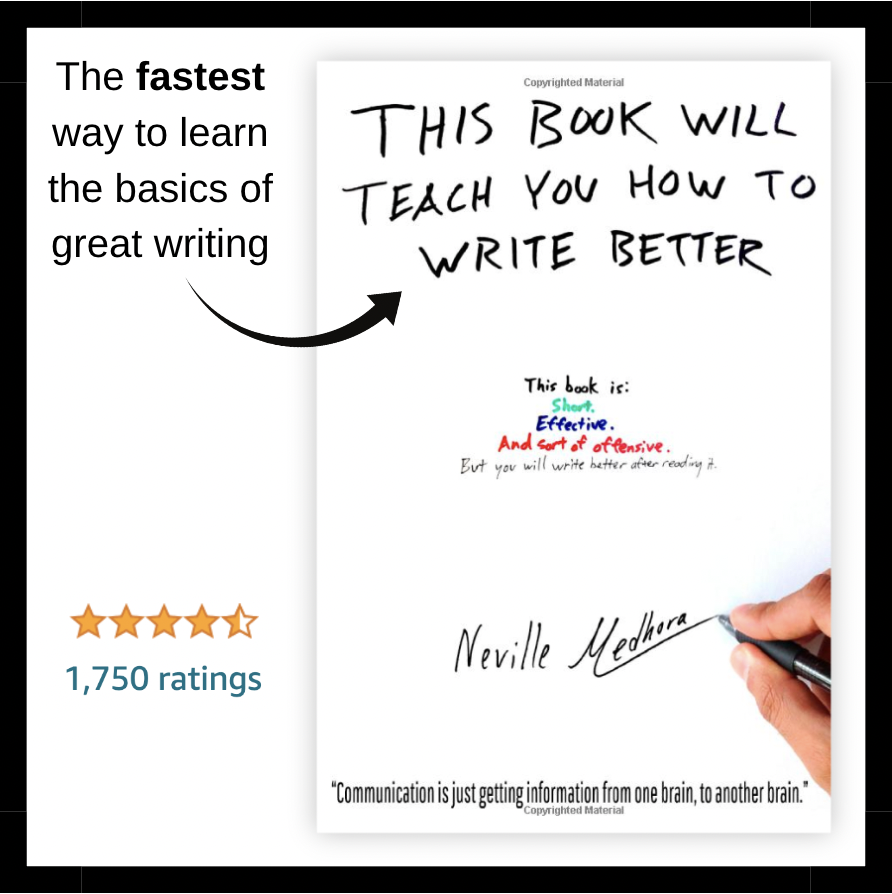
Complicated Copy Visual
When you make complicated copy with big words it feels confusing like this.…
When you make complicated copy with big words it feels confusing like this.…
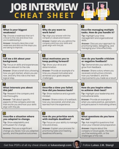
Mastering interviews can be tough, but this cheat sheet simplifies the process with common questions and valuable tips for crafting impressive answers.…
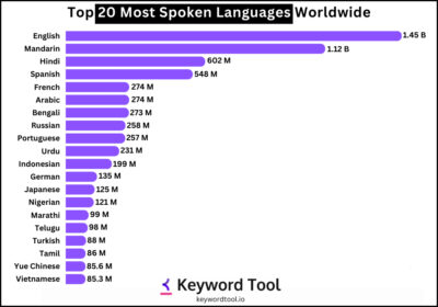
Take a look at this informative bar chart showcasing the most widely spoken languages across the globe. Bar charts are an excellent tool for making data easy to comprehend.…
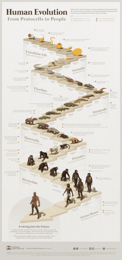
Check out this cool image of human evolution with a timeline showing what functions were gained and lost during the process.…

A great use of call-outs in this graphic demonstrates what to do and what not to do when breaking down a door. It is both humorous and informative.…
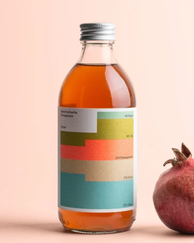
The “Swee Kombucha” packaging visually lists the ingredients inside the bottle.…
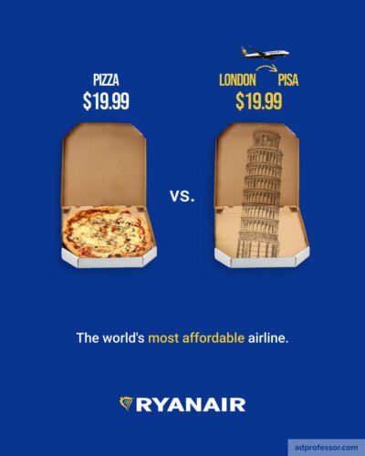
The hilarious print ad uses a comparison of the cost of a pizza to a trip from London to PISA 🙂…
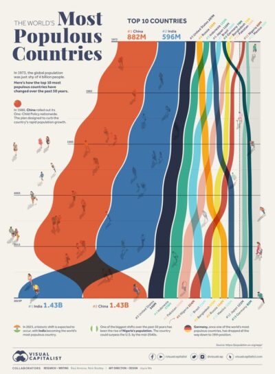
Interesting visual of the countries with the most people. The USA looks so tiny in comparison to the big two.…
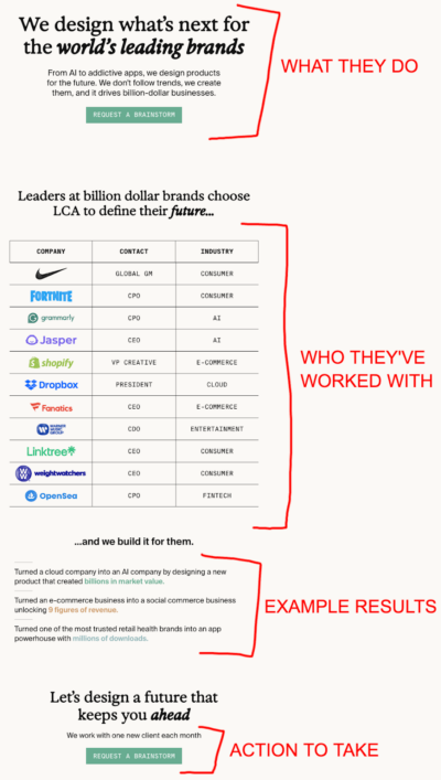
A simple, easy to read, results-showing page that results in a TON of signups.
Greg Isenberg at Late Checkout told me that listing this info out in this chart results …
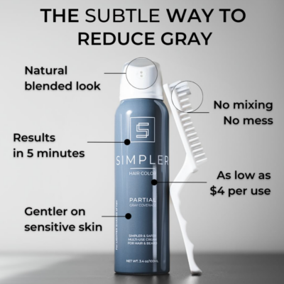
Great mark-up style ad explains benefits of product.…
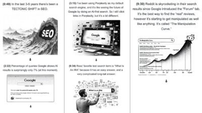
This awesome “Visual Shownotes” style from a Copywriting Course interview.…
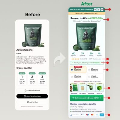
A fantastic method to highlight the changes made to the product page for Active Greens.…

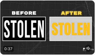
This before-and-after video edit of a Shaan Puri interview does an excellent job of showcasing video editing skills.
…
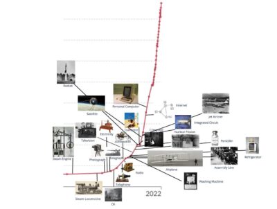
Easy to see a timeline showing the history of innovation along with a graph illustrating the global average GDP per capita over the long term.…
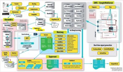
Each one of these boxes is a complicated system on it’s own, and multiple their complexity by this big interconnected web!…
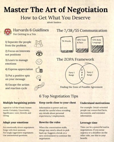
A quick guide to getting what you want with quick negotiation tips.…
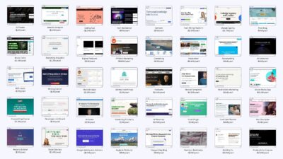
Here is a visual list of million-dollar websites curated by Starter Story. …
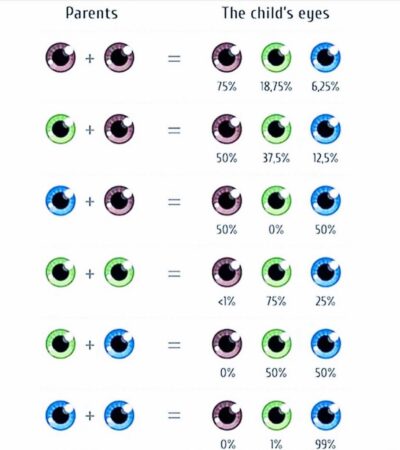
Here is a simple chart showing the possible eye colors of a child.…
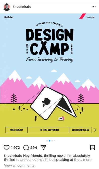
Fun branding with the perfect image for a design camp.…
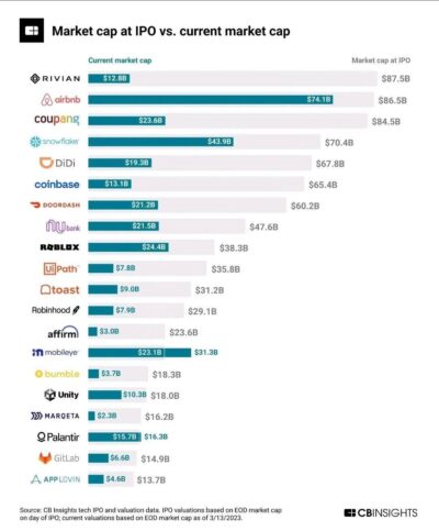
Interesting chart showing IPO market cap of a stock vs current price…