Social Network Active Users Comparison
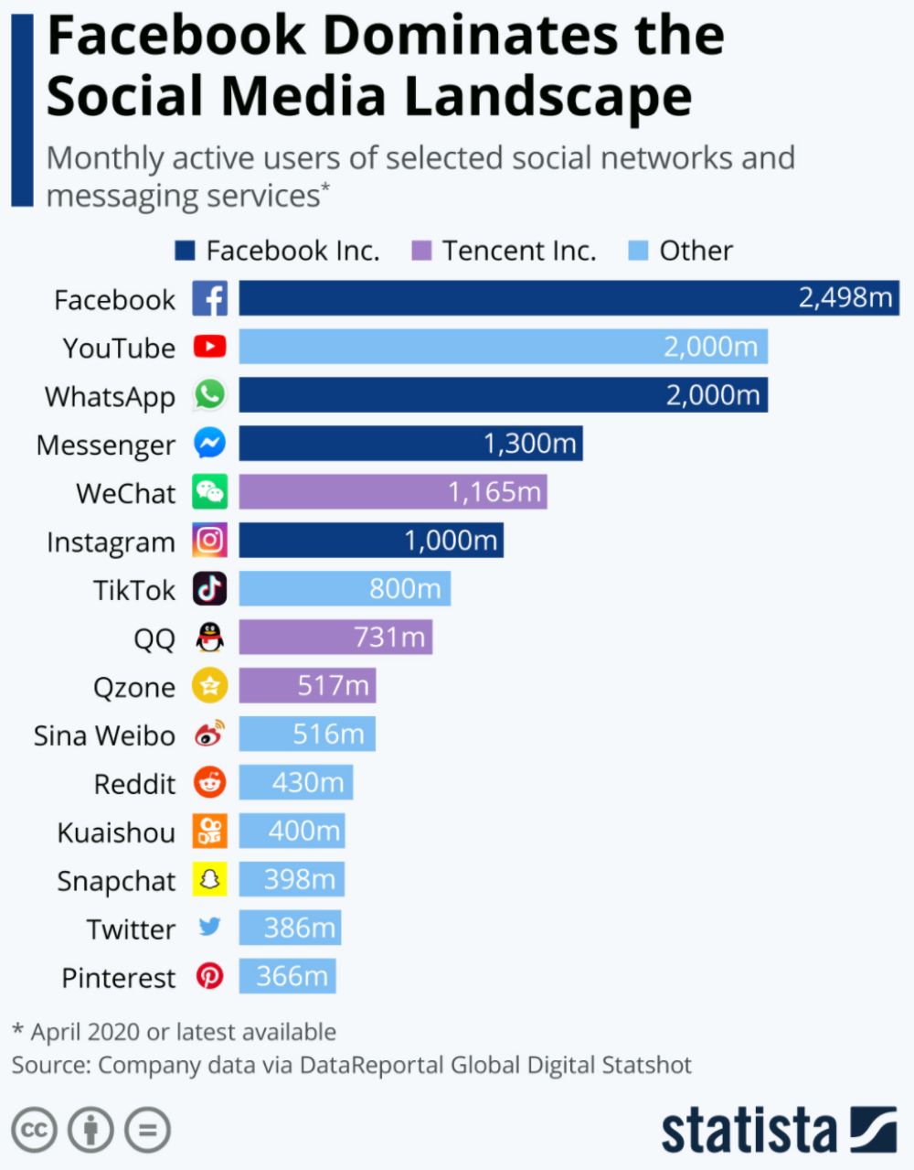
This graph shows the number of worldwide active users on different social media networks and messaging platforms in 2020.
Visit Link This graph shows the number of worldwide active users on different social media networks and messaging platforms in 2020.
Visit Link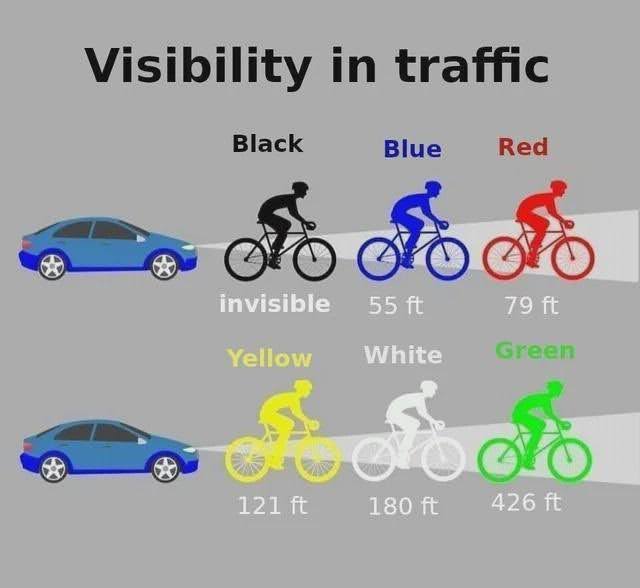
I love stuff where your brain just “gets it right away.” This chart shows the top colors to wear for max safety on a bike. You learn something valuable from …

Learning can take many forms, and some are better than others:
• Lecture: 5% (Average Retention Rate)
• Reading: 10%
• Audio/Visual: 20%
• Demonstration: 30%
• Group Discussion: 50%…

This is a chart showing 50 different ways to spend time alone, I really like these charts, especially when you share on social media because people click on them to …


This insane stat shows barely 2% of people reading Reddit ever post anything.
This backs up the “The 90-9-1 Rule” that states:
• 90% of people just lurk.
• 9% …
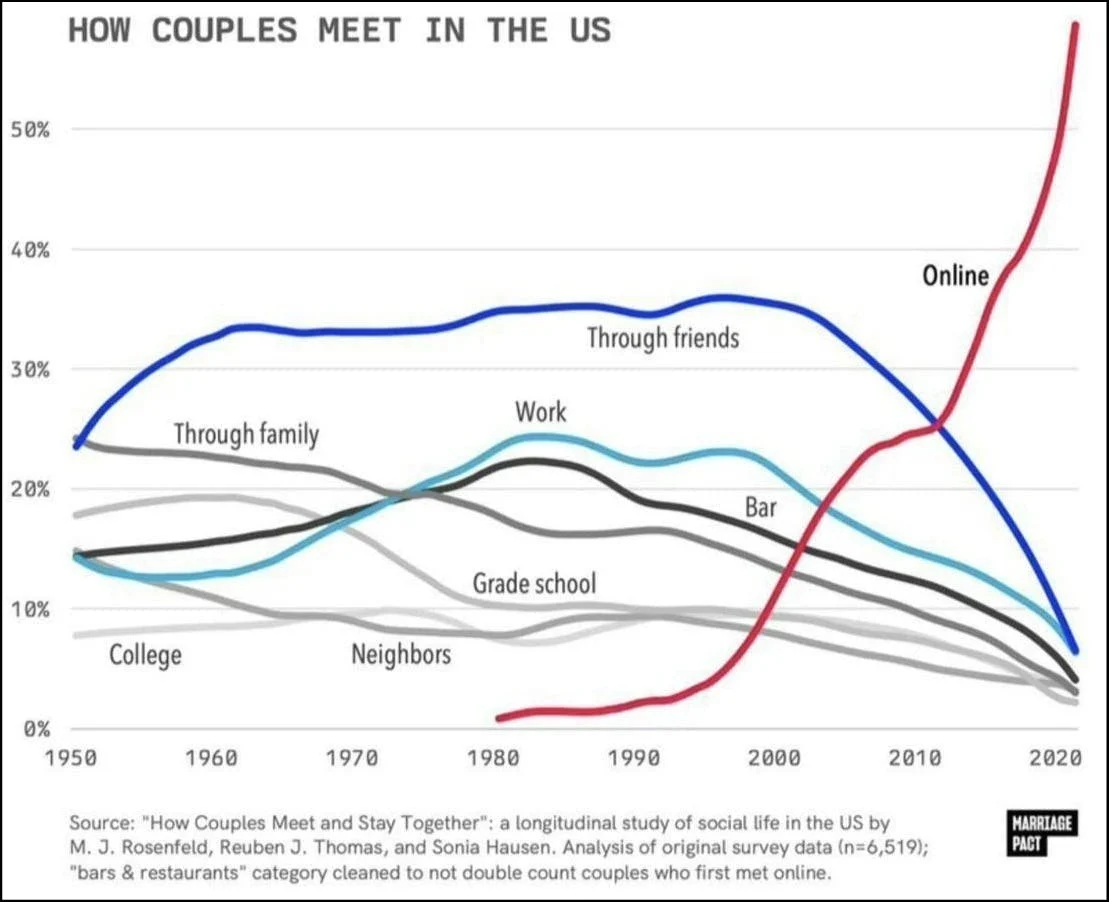
WOW. Look how rapidly online dating became the primary way couples meet.
I meet people who don’t like using dating apps, but by the math of it, it’s almost FOOLISH …


