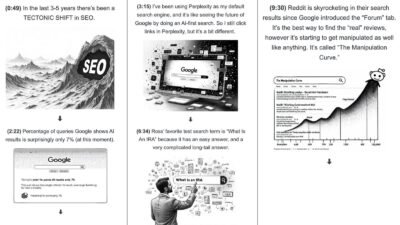
Podcast Shownotes Visual Style
This awesome “Visual Shownotes” style from a Copywriting Course interview.…
Good copywriting is about transmitting information from one brain to another brain, and sometimes IMAGES are better at doing that than copy!
This awesome “Visual Shownotes” style from a Copywriting Course interview.…
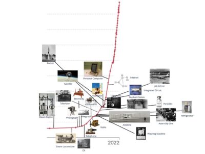
Easy to see a timeline showing the history of innovation along with a graph illustrating the global average GDP per capita over the long term.…

Each one of these boxes is a complicated system on it’s own, and multiple their complexity by this big interconnected web!…

Here is a visual list of million-dollar websites curated by Starter Story. …
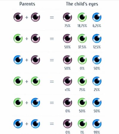
Here is a simple chart showing the possible eye colors of a child.…

Fun branding with the perfect image for a design camp.…
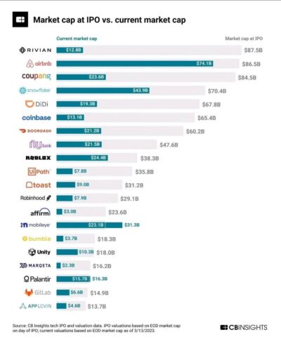
Interesting chart showing IPO market cap of a stock vs current price…
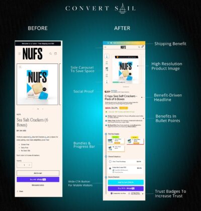
Page redesign of crackers that increased conversion.…
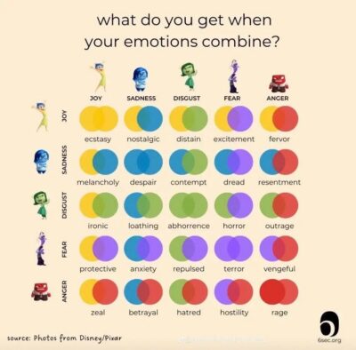
Remember that movie “Inside Out” where each character is an emotion that drives a person??
Well this is a cool graph that shows what emotions combined are:…
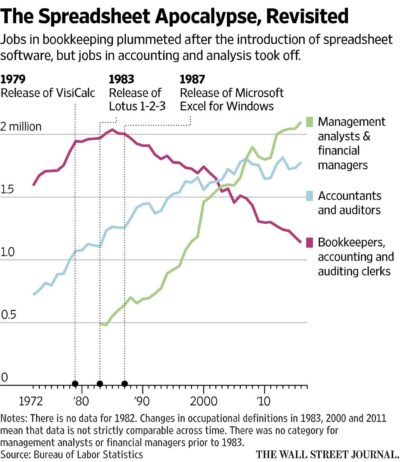
This interesting graph illustrates the decrease in bookkeepers, accounting, and auditing clerks following the release of spreadsheets. It also demonstrates that the growth of new jobs exceeds the job losses.…

This unique piece of direct mail shows you where Bartlett Tree Experts have trees they have taken care of in your neighborhood so you can walk around and look at …
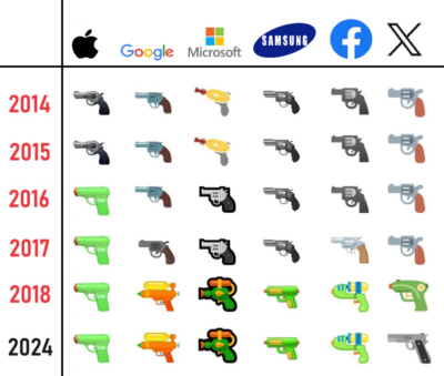
Every company has had its own take on the gun emoji over the years to match the changing viewpoints of their audience on firearms.…

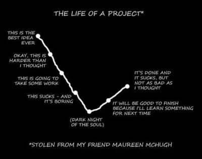
This hilarious project chart lays out the journey from idea to finished product…
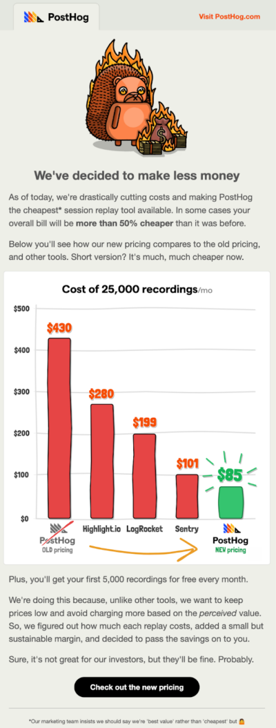
PostHog’s email showcases their price cut against competitors with an excellent chart and a humorous headline.…
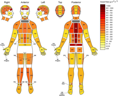
Ever wondered how much you sweat and where? There’s actually a chart for that. I really like the simple colors and callouts in this chart, which make it easy to …
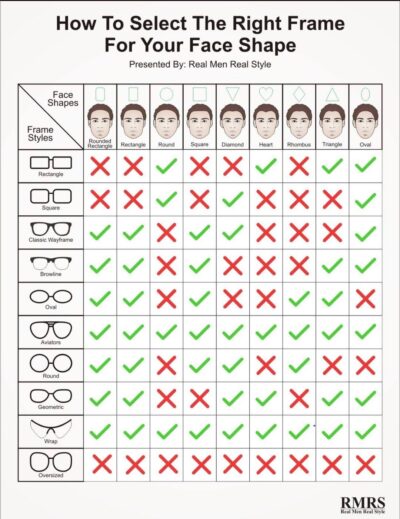
This easy chart quickly helps men pick what glasses shapes match their face. More importantly what shapes don’t. 🙂…

This social media ad showcases the different thickness options for groom’s wedding rings through images and minimal text.…
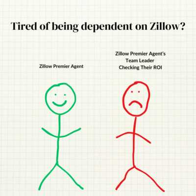
Fun eye-catching ad from Sell With Easy. There’s something about these simple stick figures that’s so engaging. Here’s another version of the ad with different colors and copy:
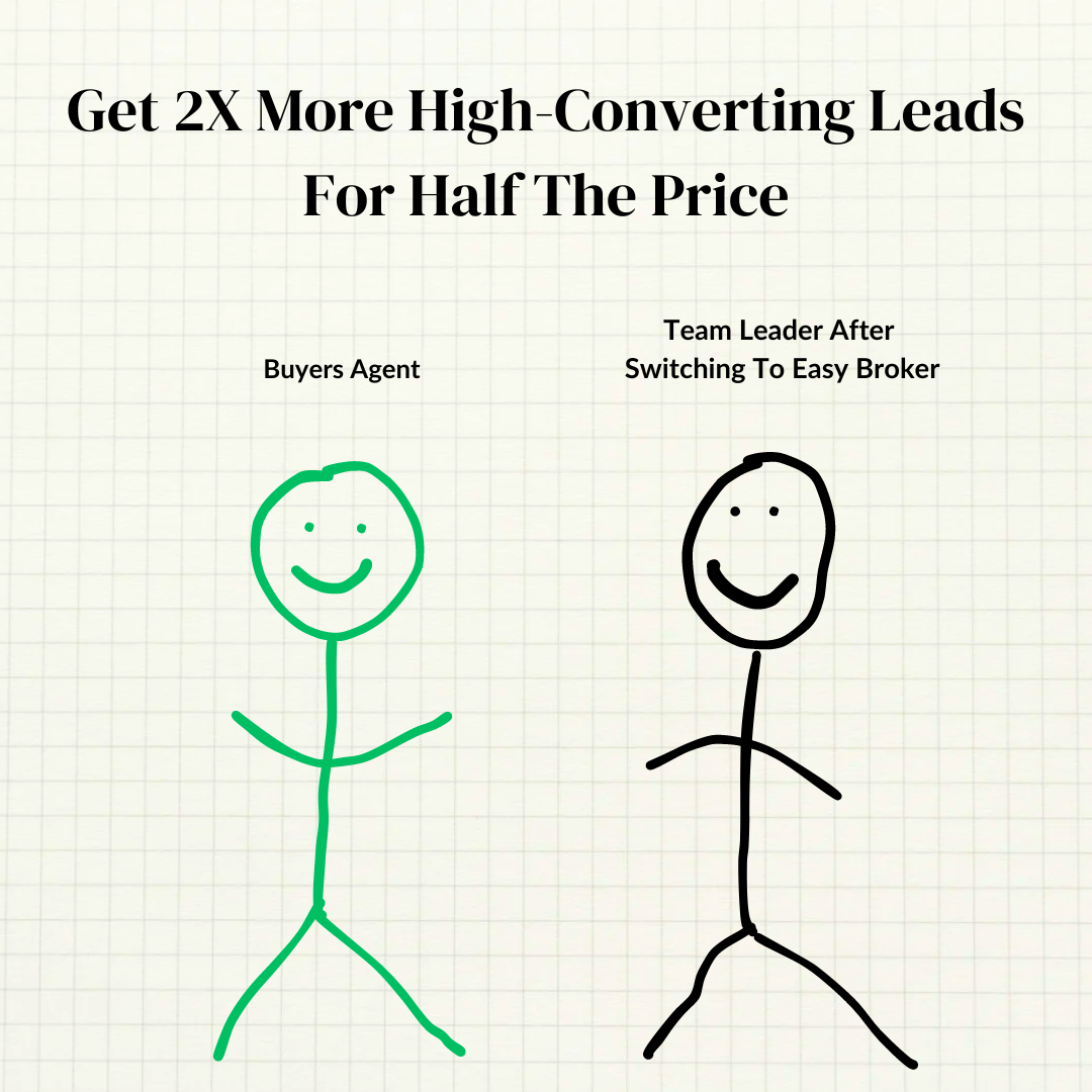 …
…

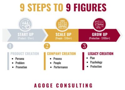
This chart effectively simplifies the process of growing a company by outlining the three distinct phases of a company and the essential steps required during each phase.…
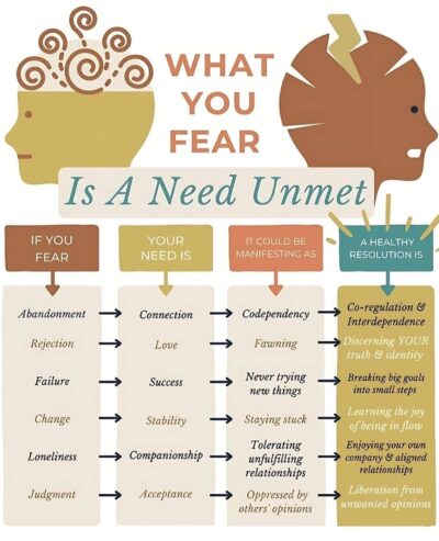
This is a great chart to help you overcome your fears. By following the arrows, you can pinpoint unmet needs and what you can do to meet them, alleviating your …