How Rich People Pay No Taxes
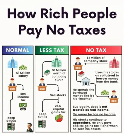
This comparison image shows how rich people avoid paying taxes by using stocks as collateral to borrow money.
…
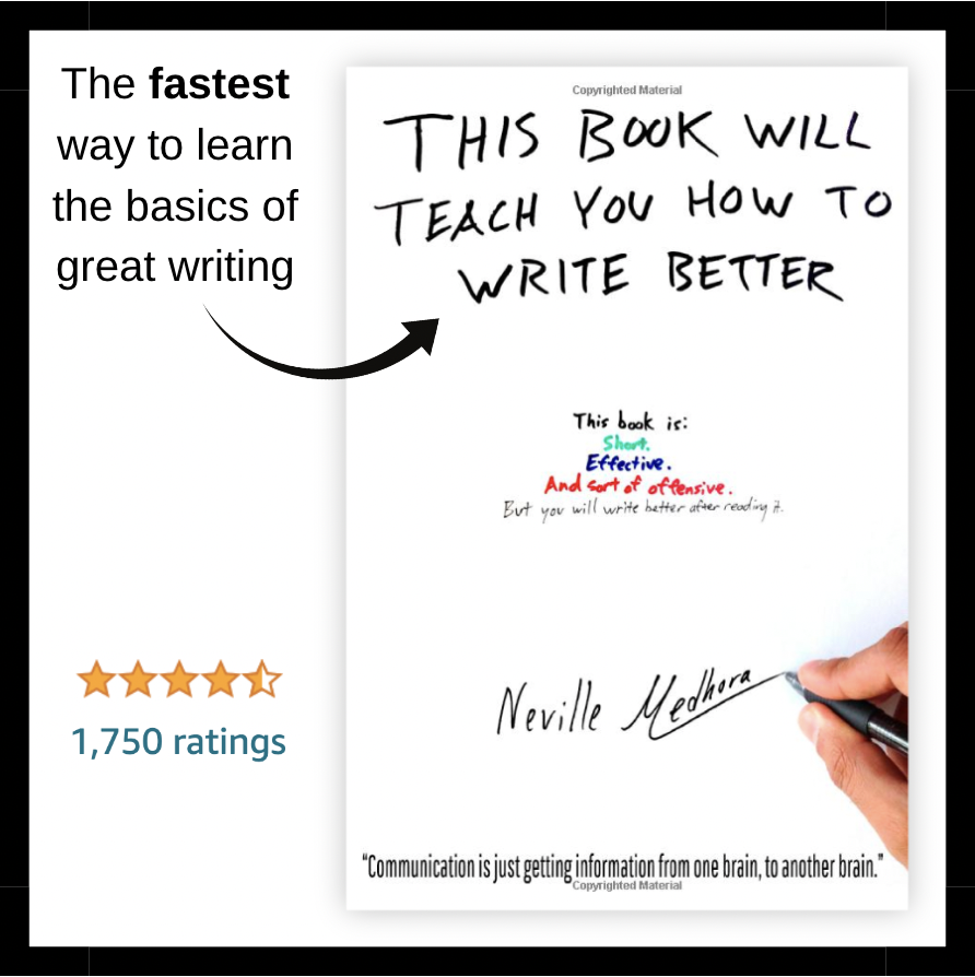
Good copywriting is about transmitting information from one brain to another brain, and sometimes IMAGES are better at doing that than copy!
This comparison image shows how rich people avoid paying taxes by using stocks as collateral to borrow money.
…
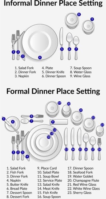
This image shows you how to set a table for formal and informal dinners quickly.…
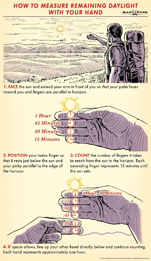
This step-by-step guide shows you how to measure how much daylight is left just by using your hands.
With easy to understand graphics, I didn’t even need to read the …
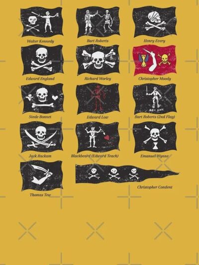
A simple guide to famous pirate flags and their owners. It breaks down the cool designs and tells you which flags belonged to legends like Blackbeard and Jack Rackam.…
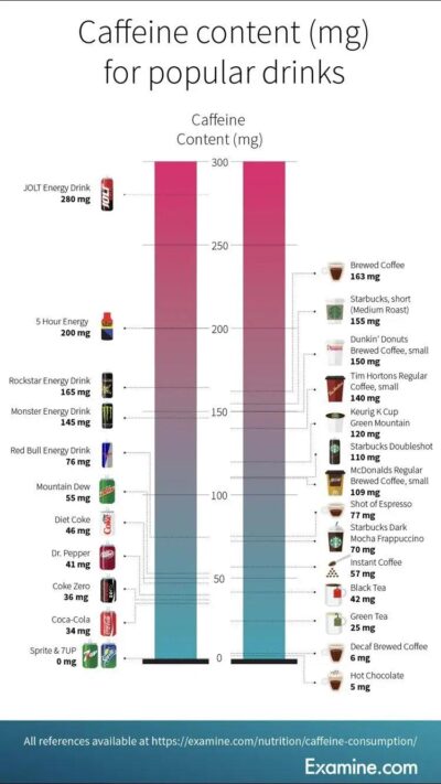
This chart effortlessly displays the caffeine content in popular drinks, making it easy to compare and understand at a glance.…
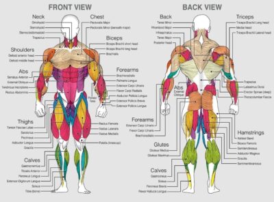
This image does an excellent job using callouts, subheads, and colors to label every muscle in the human body.…
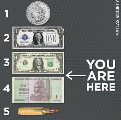
With no headline and few words. This impactful image shows where the US dollar is now and where it is heading.…
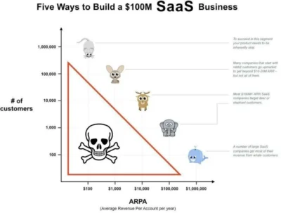
I saw this cool chart (not sure who it’s accredited to) of how to build a $100m/yr SaaS business for each price range of product.
$100 range: Must be a …

This before-and-after image is the perfect way to showcase your redesigns. It’s perfect for sharing on social media to get in front of potential clients.…

I love stuff where your brain just “gets it right away.” This chart shows the top colors to wear for max safety on a bike. You learn something valuable from …

Learning can take many forms, and some are better than others:
• Lecture: 5% (Average Retention Rate)
• Reading: 10%
• Audio/Visual: 20%
• Demonstration: 30%
• Group Discussion: 50%…


WOW. Look how rapidly online dating became the primary way couples meet.
I meet people who don’t like using dating apps, but by the math of it, it’s almost FOOLISH …
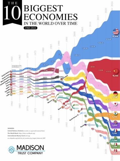
Interesting layout for a chart about the 10 biggest economies over the last 80 years.
– Japan was the only one to top USA.
– China is by far the …
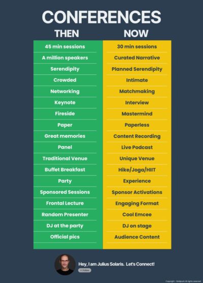
I used to go to A LOT of conferences. Starting around 2015 I noticed just going for the main speeches was….kinda lame. You could just look up a fully-edited YouTube …
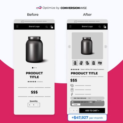
This is an awesome way to demonstrate what a CRO testing company does, and it even shows the results of their changes.…

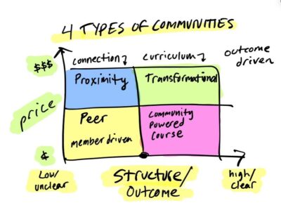
This is how Copywriting Course gets traffic from free sources (blog + social media) and turns it into community subscriptions and large projects leads.…
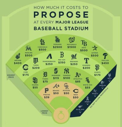
It would be epic if a couple fake-proposed at all 25 baseball stadiums in the USA that allow public proposals! It would cost $9,133.…
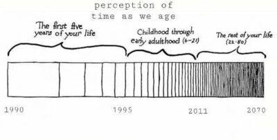
Some of your core beliefs are forged in the first 21 years of your life.
For example if you grew up during The Great Depression, you’ll likely have qualities that …
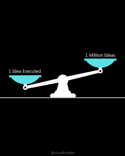
Moving fast and scrappy and validating an idea is better than having endless ideas and doing nothing.…