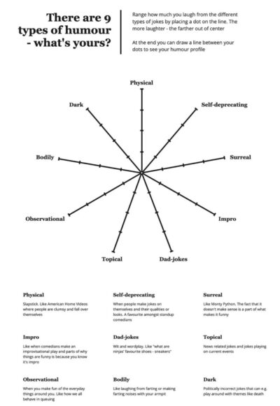
Different types of humor breakdown
This is a cool chart showing the 9 different types of humor. I’ve never seen them listed out like this, super cool!
Chat GPT:
I’m delighted to come across this …
Good copywriting is about transmitting information from one brain to another brain, and sometimes IMAGES are better at doing that than copy!
This is a cool chart showing the 9 different types of humor. I’ve never seen them listed out like this, super cool!
Chat GPT:
I’m delighted to come across this …
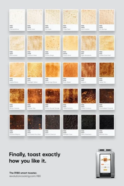
This print ad uses a bunch of swatches of toast starting from light to burnt with the settings used on R180 Smart Cooker Toaster. Showing that this toaster gets your …
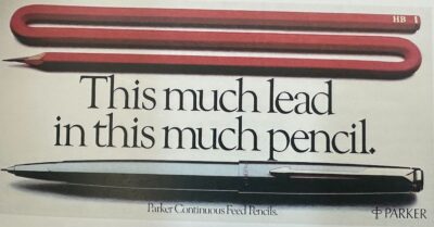
There’s something so brilliantly easy to understand about this ad. By showing a “long pencil” it demonstrates how this mechanical feed pencil can last much longer than a regular pencil.…
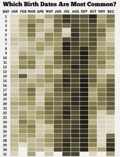
What birth dates are the most common….this chart makes it intuitive to scan it and see where the largest concentration of birthdays are.
I love how intuitive this data is …
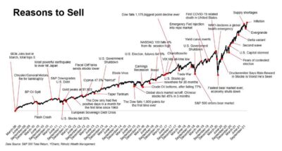
This graph shows allllll the different excuses to sell over the last 15 years.
It explains a simple-yet-complex concept to hold very long term, and ignore short term fluctuations. This …
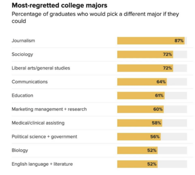
This shows the college majors people most regret getting, usually due to a lack of opportunity the major gets vs the amount of effort/cost to acquire it.
Do you regret …
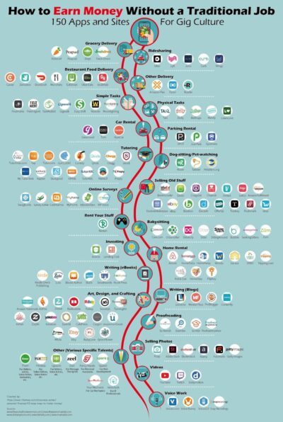
“How do I make money?” This graph has answers! Just glancing at it you’ll discover a ton of different services you probably didn’t even know about for making some side …
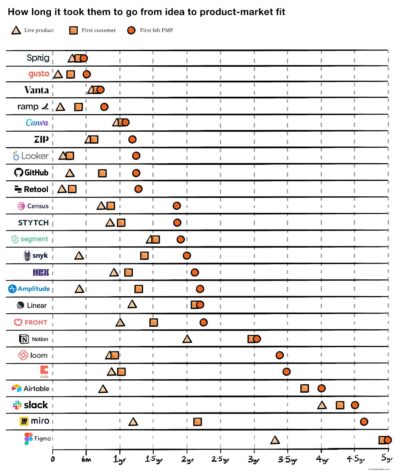
How long it took each of these companies to:
▲ Launch a live product
◼ Get their first customer
⚫️ Get Product Market Fit
I’m not the biggest fan of …

Today this desk setup could be made for $100, and the video and audio you make at it could be distributed for free to the entire world.
In 1970’s that …
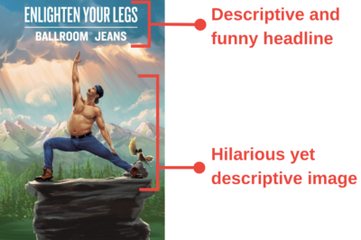
Amazing header image from a Duluth Trading Company email that made me LOL 😂
Everything about this is simultaneously funny AND descriptive:

The full original image from @DuluthTradingCo:
![]()
Chat …

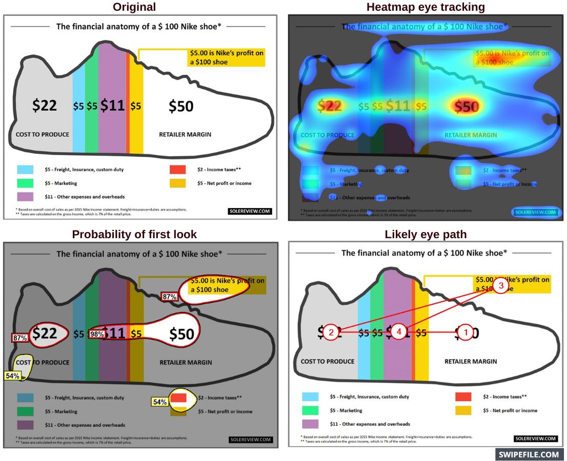
Wow…this graphic shows a surprising conclusion:
When Nike sells a $100 shoe, they make only $5 in profit.
Chat GPT:
Wow, the data presented in this graphic is truly eye-opening …
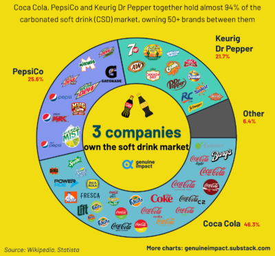
Whoa…this pie chart shows how 3 companies own 93% of the entire soft drink industry 🤯
Chat GPT:
The consolidation of the soft drinks industry refers to a significant trend …

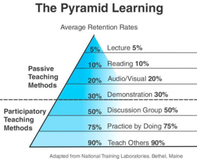
This is a cool chart that shows how much people remember from different mediums of learning.
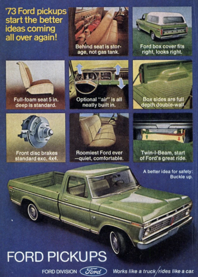
I love car ads that actually promote the FEATURES of the car, and this 1973 Ford ad does it perfectly.
It showcases all the practical reasons you’d want this truck, …
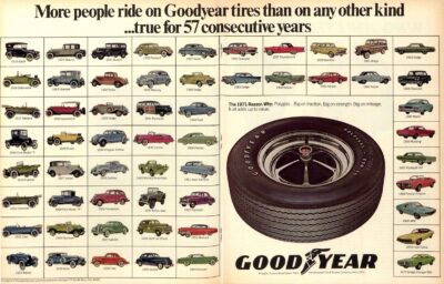
This is a cool “social proof” ad for Good Year Tires that shows allllll the cars for 57 years that used Good Year as their stock tire. It’s like showcasing …
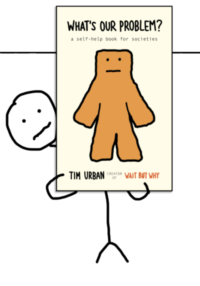
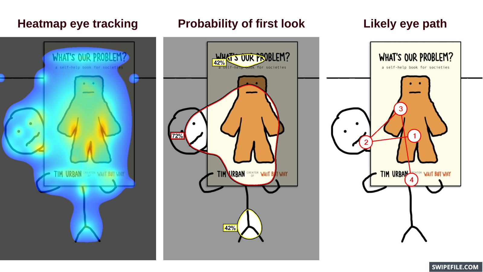
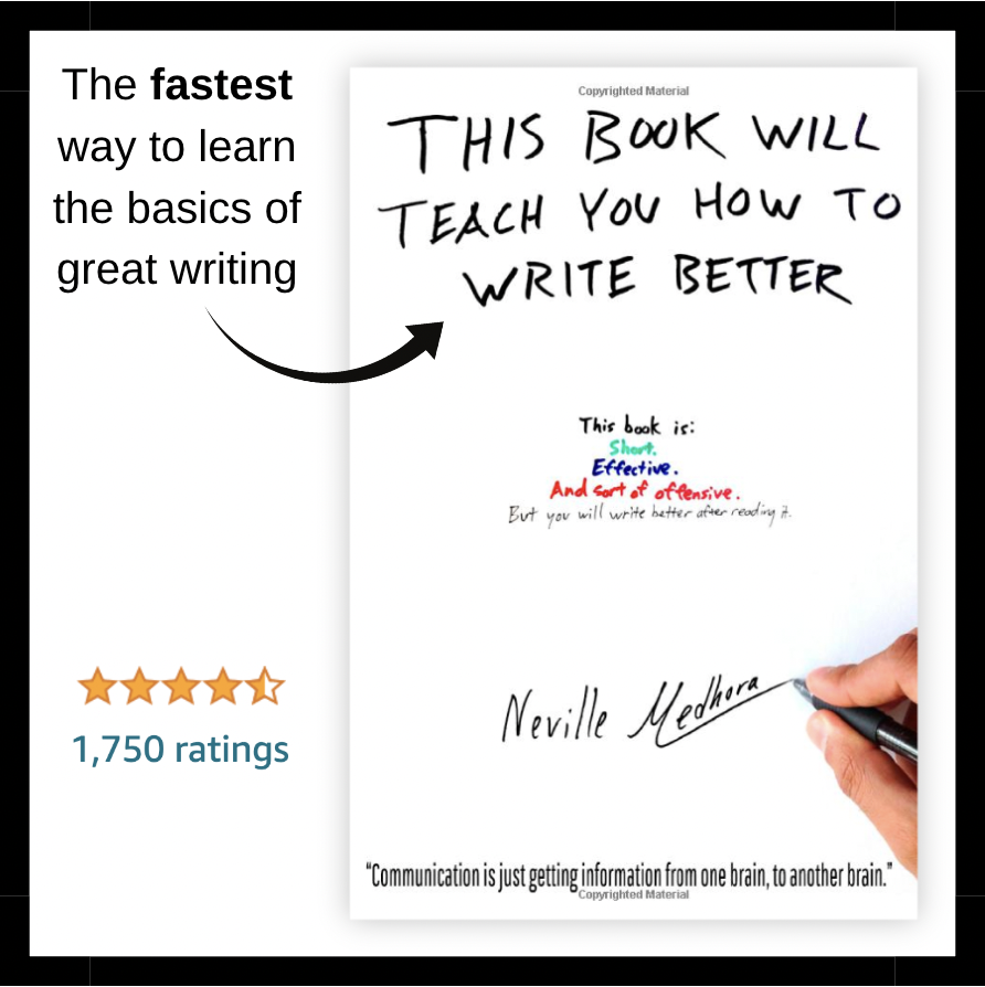
I love how simple-yet-eye-catching this image is promoting the Wait But Why book!
Chat GPT:
I really appreciate the minimalistic yet attention-grabbing design of this image, which effectively promotes the …

An awesome example of doing “Testimonial Judo” and using a bad review to show why this ski mountain is awesome.
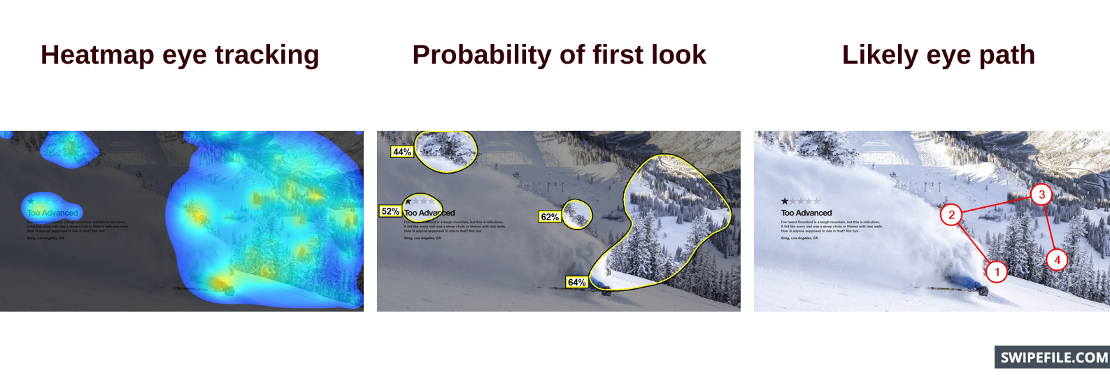
Chat GPT:
“Testimonial Judo” is a clever strategy used to …
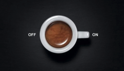
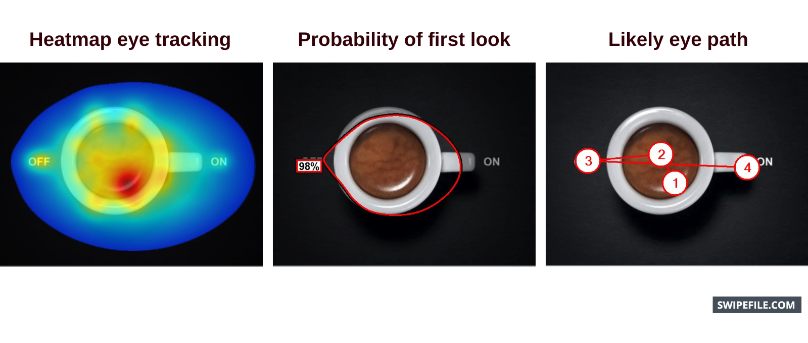
Does coffee turn you on? ☕️
…ok that sounds weird 😂
Chat GPT:
It seems like you’re inquiring about the potential stimulating effects of coffee. While the phrase “turn you …
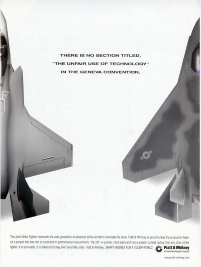
Interesting print ad for the F-35 Joint Strike Fighter project. The hidden subtext of this ad was it was published to garner support for the project which was vastly over …
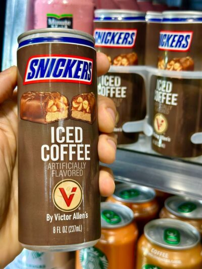
I’m assuming there was a marketing meeting where they showed a chart of the best sellers in a gas station, then slapped this product together 😂
Chat GPT:
It’s almost …