Search for a command to run...
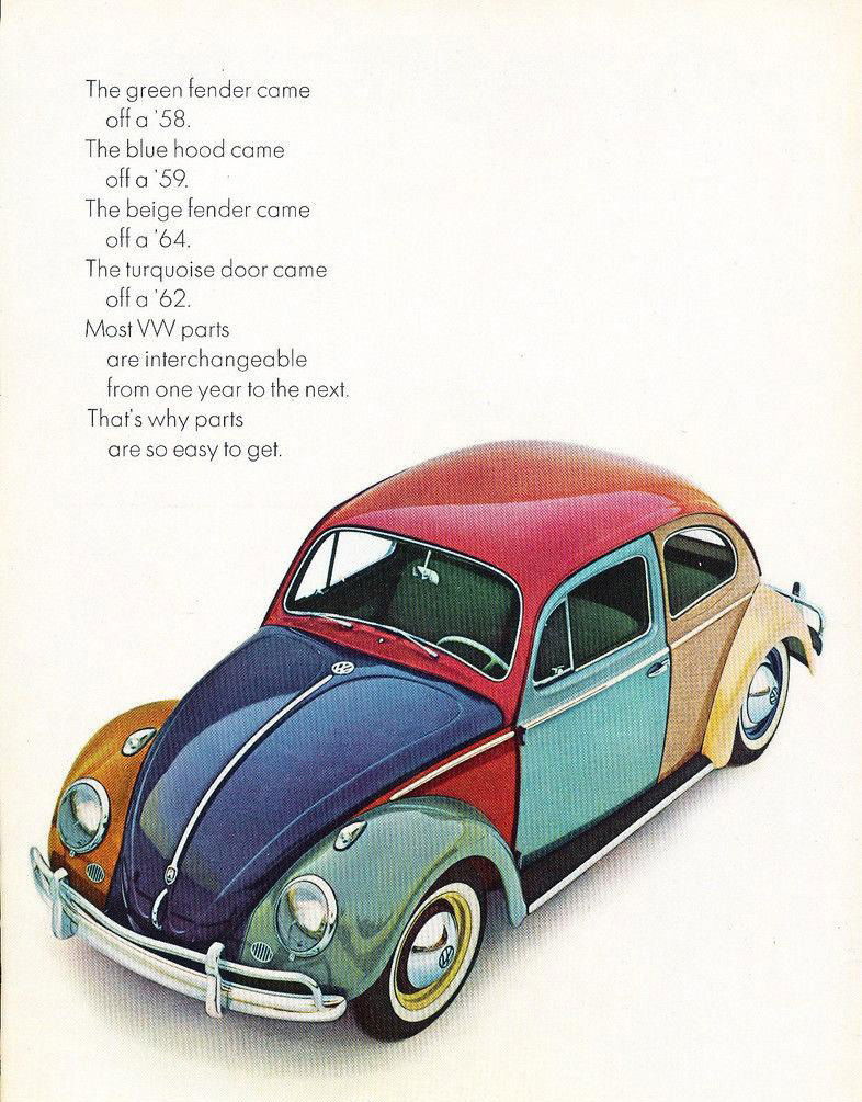
Volkswagen didn’t just tell you their cars were reliable. They showed you. This 1965 Beetle ad mashed together parts from...
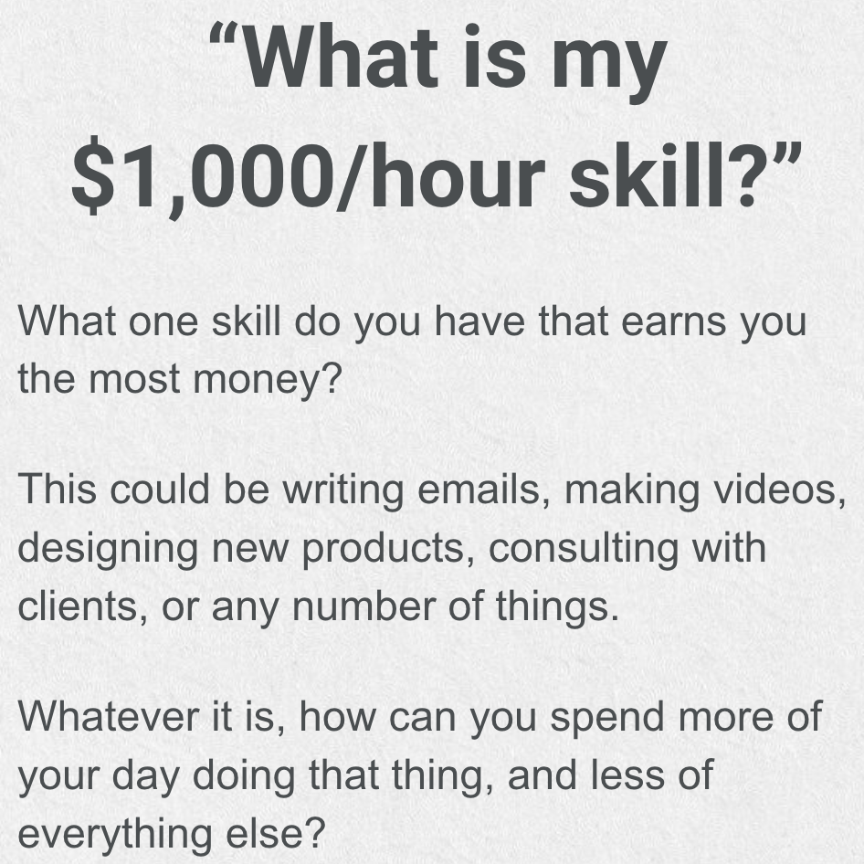
Most people get stuck doing $10/hour tasks. But real growth happens when you identify and double down on your $1,000/hour...
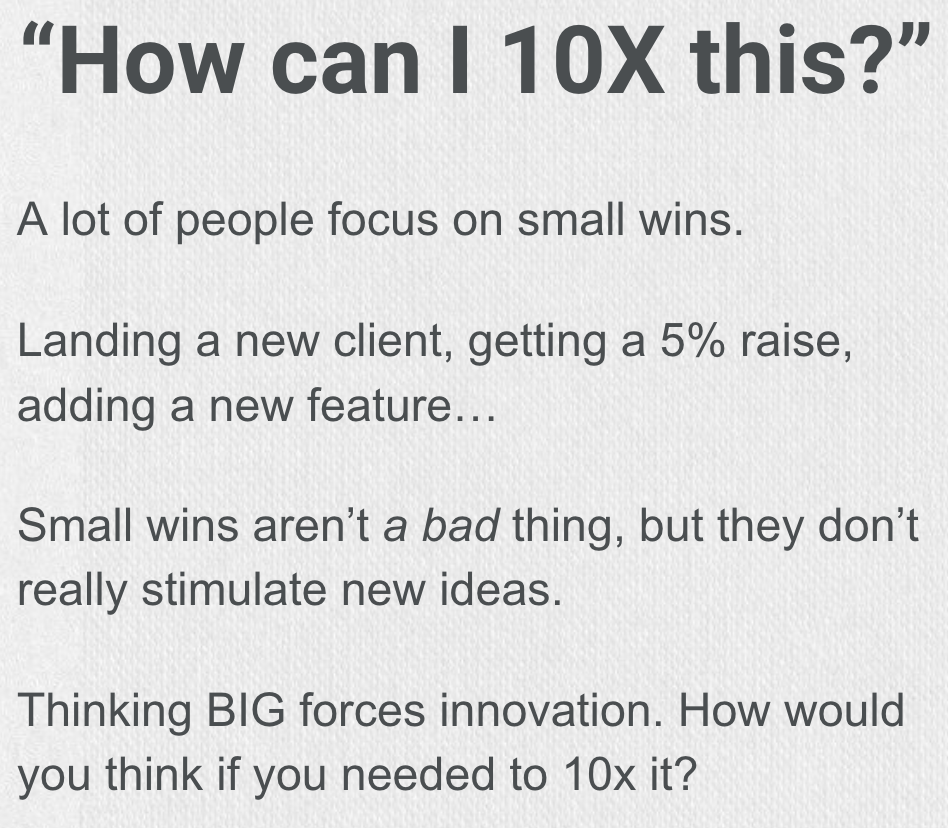
Most people play small. They chase 5% gains and small wins. That’s fine if you want safe results. But if...
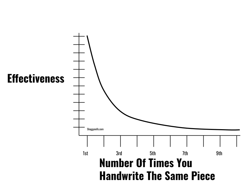
That first time you handwrite a killer sales letter, your skills jump way up. Second time? Still good. But by...
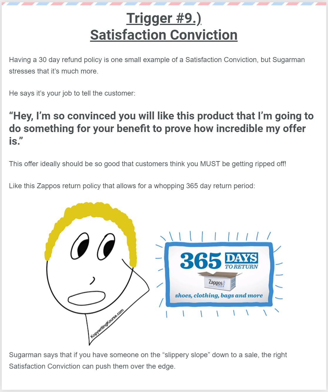
Ever notice how Zappos offers a full 365 days to return anything? That's not just generous—it’s a masterclass in what...
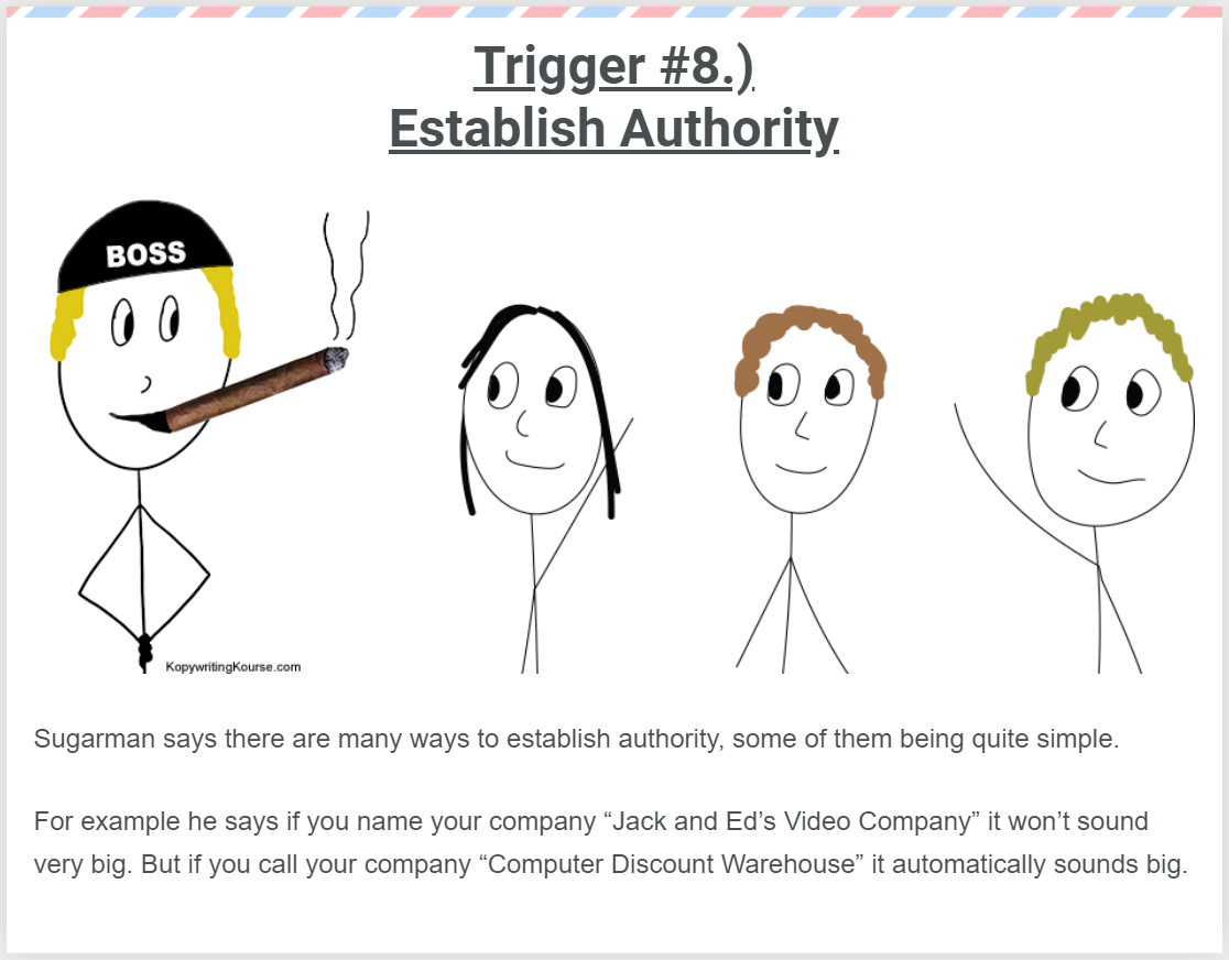
Ever notice how some companies just sound bigger? Joe Sugarman nailed this idea: authority isn’t earned slowly, it can often...
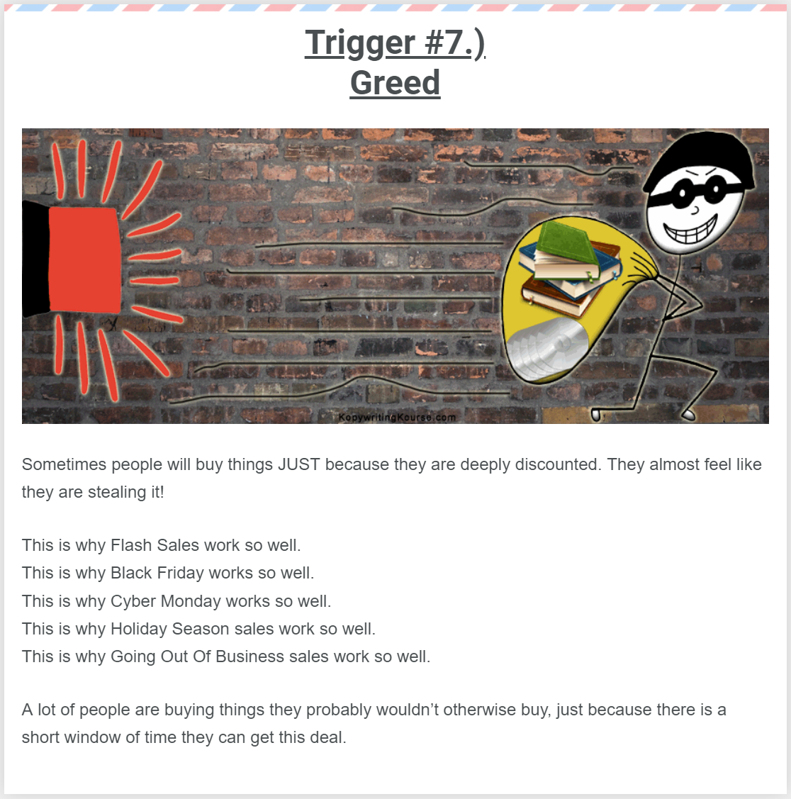
Ever notice how a big discount suddenly makes something irresistible? A person might not need another pair of shoes, but...
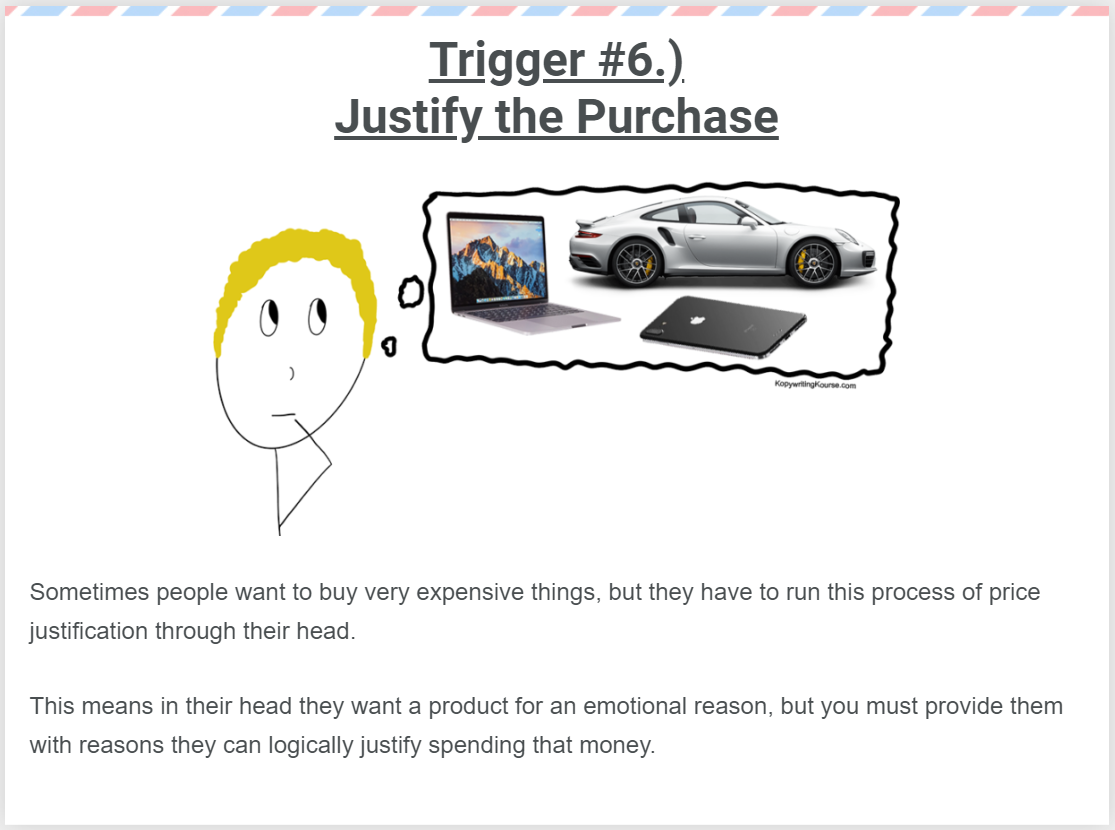
People don’t buy luxury cars, MacBooks, or Rolexes just because they “need” them. They buy them because it feels good...
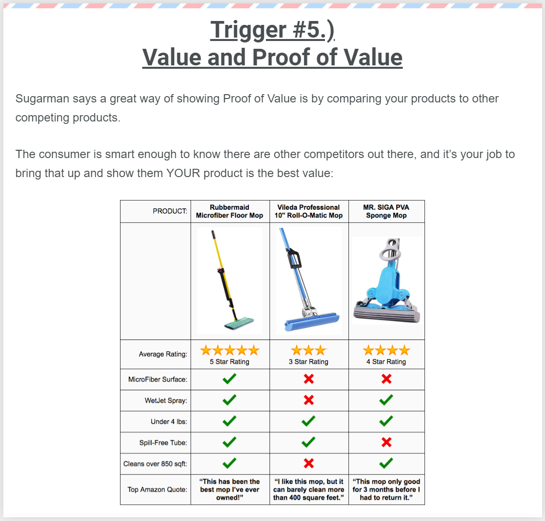
Joe Sugarman says one of the easiest ways to prove value is to compare your product directly to its competitors....
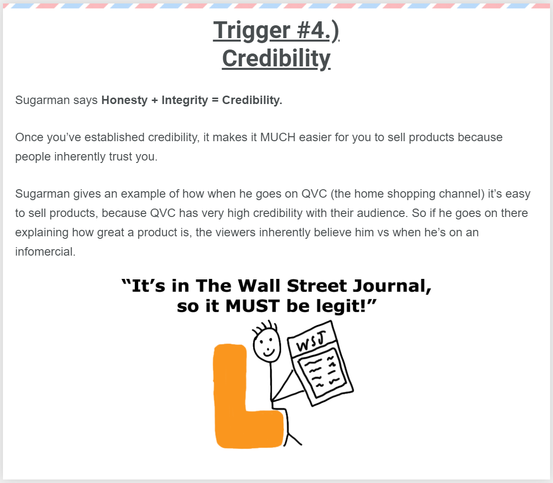
Joe Sugarman nailed it: Honesty + Integrity = Credibility. Once people trust you, selling gets way easier. The image drives...
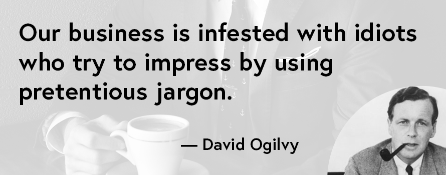
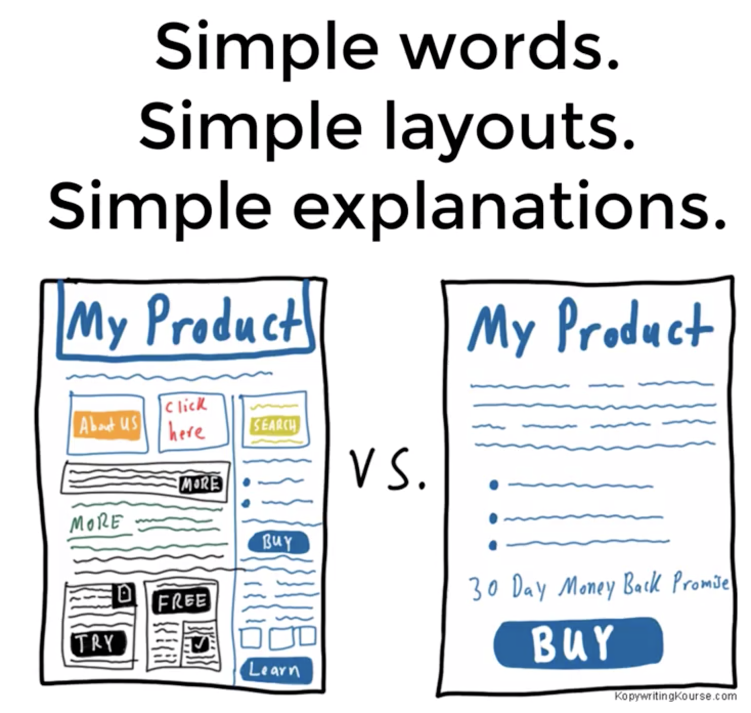
David Ogilvy called it straight: too many marketers hide behind big, fancy words instead of writing to sell. His quote...
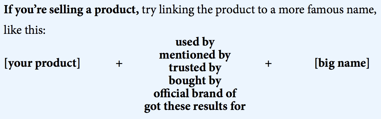
Look at this HouseOfRave move: they dropped a few famous logos (MTV, LV, Wells Fargo) at the bottom of every...
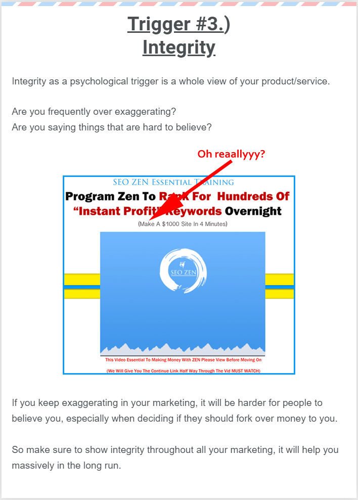
Ever see a landing page that screams “Make $1,000 in 4 minutes!” and immediately think… yeah, right? That’s the reaction...
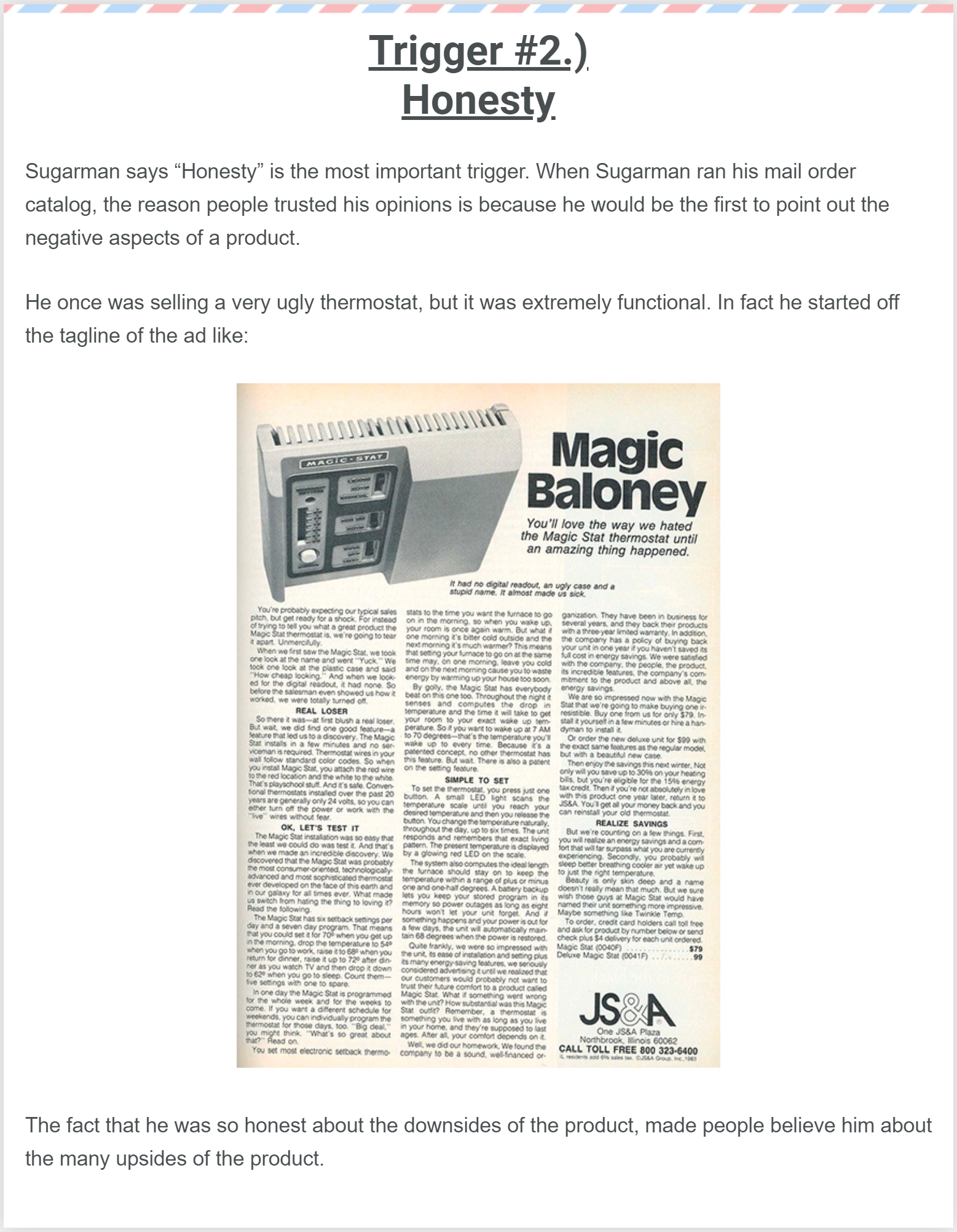
Joe Sugarman once sold a thermostat so ugly he led with that fact in the ad. The headline brutally called...
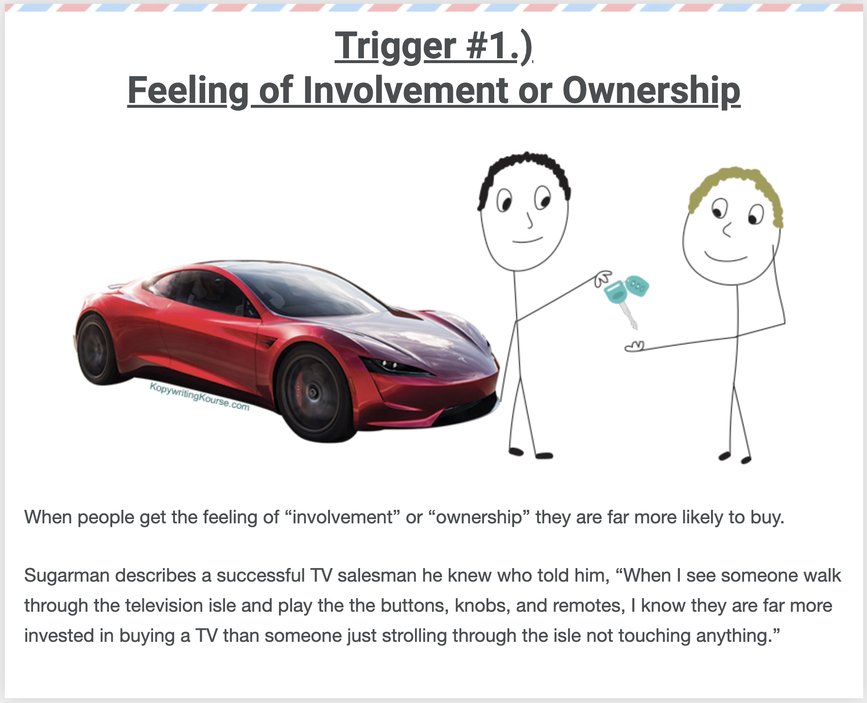
Ever notice how hard it is to give back a car after a test drive? That’s the “ownership effect” in...
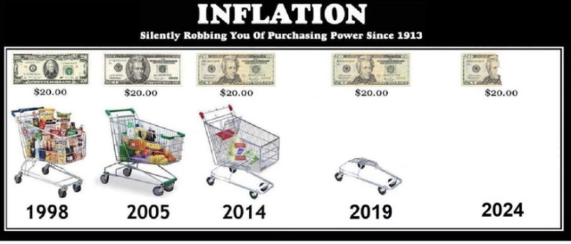
This image nails the concept of inflation in one glance. No charts. No jargon. Just five shopping carts getting more...
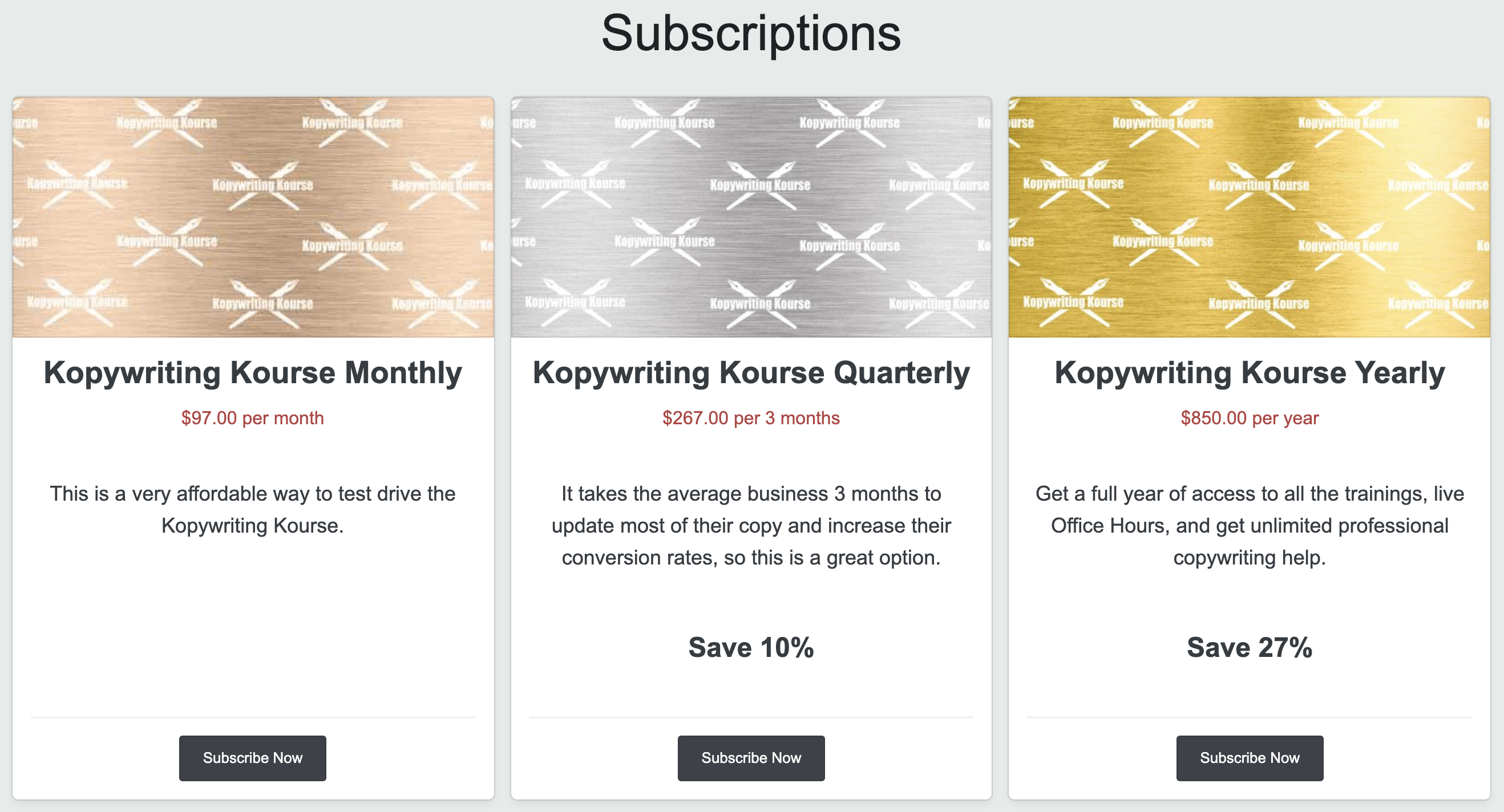
This pricing page from Kopywriting Kourse shows how simple tiers can drive more sales. Three options, clear savings, and a...
A single image can sell more than a thousand words ever could. This before-and-after yard transformation nails it—no text, no...
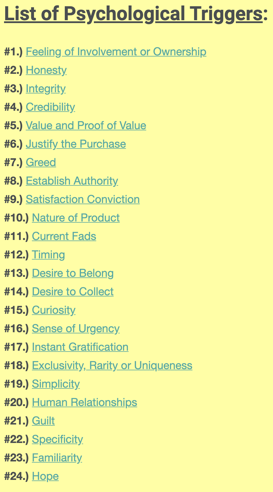
Joseph Sugarman didn’t just write ads—he engineered them. His 24 psychological triggers are the secret sauce behind copy that pulls...
Joe Sugarman’s list of “psychological triggers” is basically a cheat code for persuasion. Every great ad, sales email, or landing...
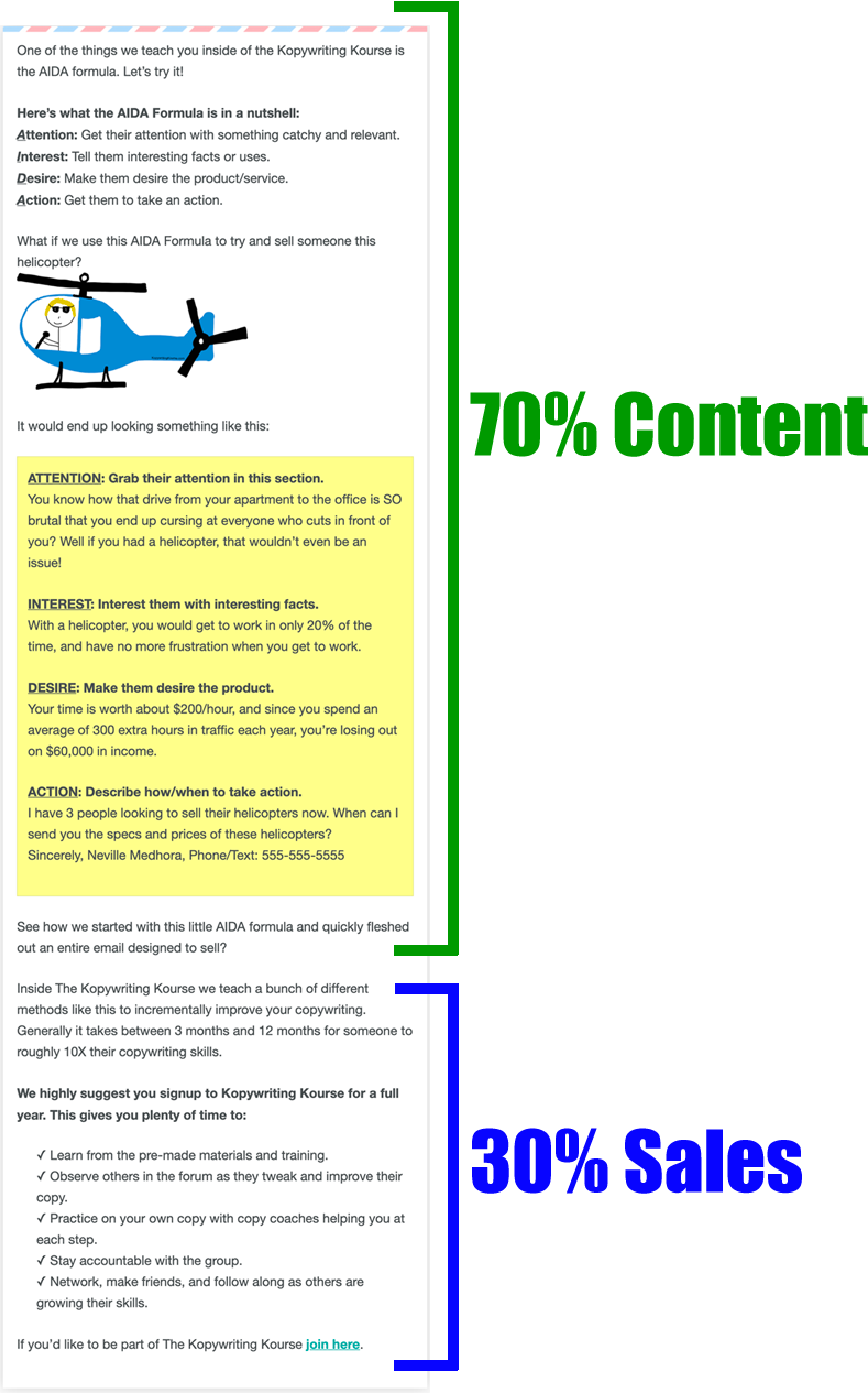
Ever notice why some marketing emails don’t feel like marketing? They teach you something useful first, then sneak in the...
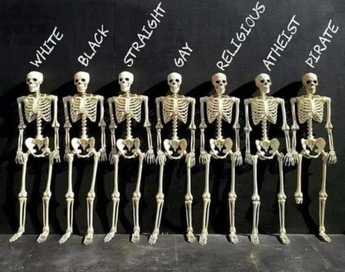
Seven skeletons, lined up. Labels above them read “White,” “Black,” “Straight,” “Gay,” “Religious,” “Atheist,” and finally… “Pirate.” Every skeleton looks...