Hilarious “Food Poisoning” bar chart
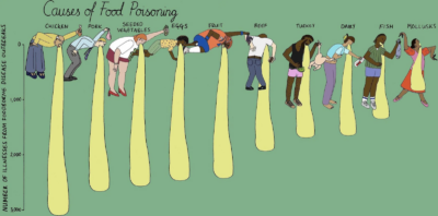
This amazing Causes of Food Poisoning bar chart hilariously demonstrate which foods cause the most cases. This is just so much more fun and engaging than a standard bar chart …
This amazing Causes of Food Poisoning bar chart hilariously demonstrate which foods cause the most cases. This is just so much more fun and engaging than a standard bar chart …
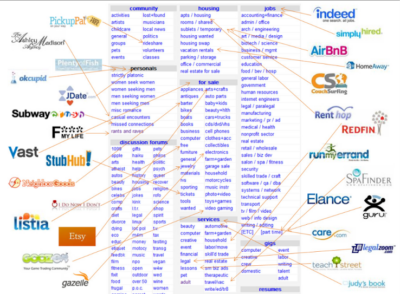
Craigslist was basically THE main platform for individual-to-individual transactions during the early stages of the web.
It will be interesting to see which other mega platforms get unbundled over time.…
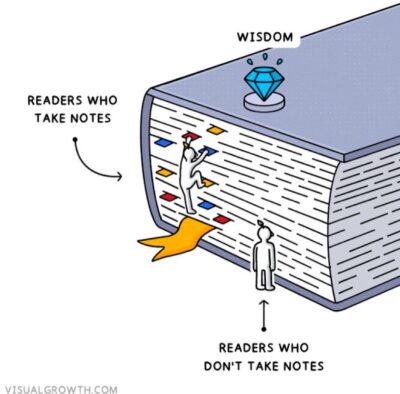
This cool graphic shows that if you take notes you can really retain the wisdom of books you read. I personally take all my notes in Apple Notes now, not …
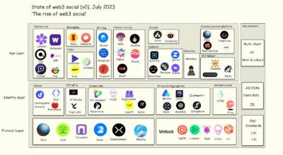
This graph categorizes different companies and where they stand in an industry-wide grand scheme of Web3.
Looking at an industry like this helps see which companies rely on others, and …
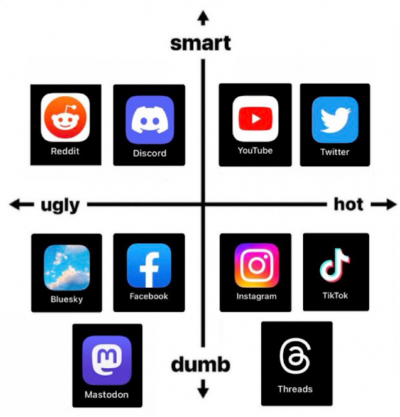
This is an awesome axis-graph which let’s you see where you are on the smart/ugly/hot/dumb scale!
This would be awesome to recreate for your industry.
P.S. I screenshotted this and …
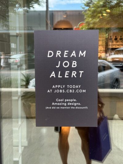
This sign at a CB2 store stepped up their copy from “Now Hiring” to “Dream Job Alert” which is far more compelling. Also checkout the 3 bullet points at the …
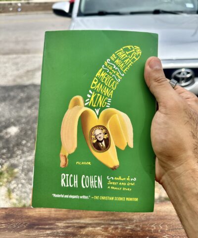
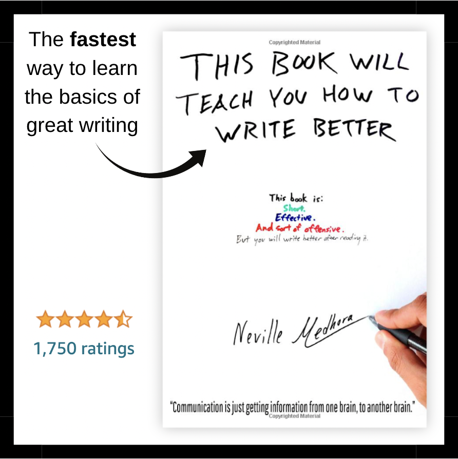
Currently reading this book….about halfway through and it’s a great read so far!
A Russian immigrant comes to America, finds out you can eat a banana even when it has …
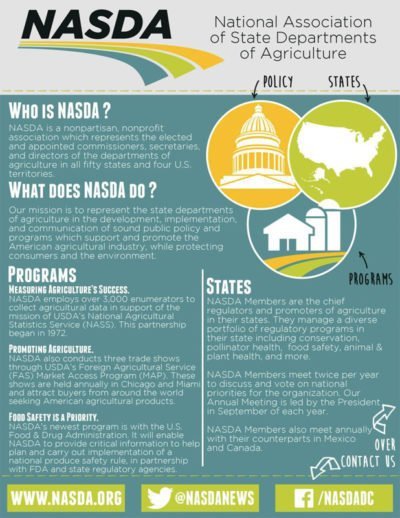
A “One Pager” is meant to be a high-level-overview on a topic, generally printed on ONE side of paper.
These are frequently used in government when an agency …
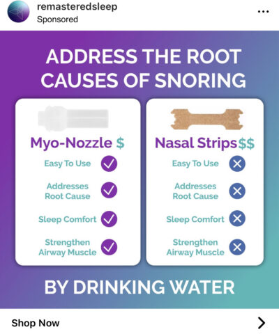
This Instagram ad for a snoring prevention device gives 4 reasons to use their product instead of the standard breathing strip. It also has a curiosity-inducing headline of “Address the …
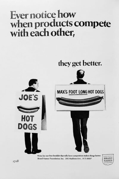
Whose hot dog would you want in your mouth?
Joe’s
-or-
Max’s?
Joe has the same hot dog, but Max is selling it better!…
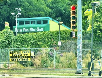
Do you think this “Reptile Expo” sign was placed here because:
1.) It’s a busy intersection.
-or-
2.) There’s a dinosaur behind it 🦖…
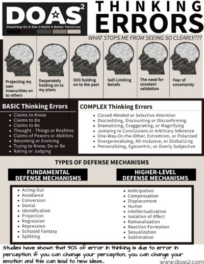
I love how much data is presented in this one-pager.…

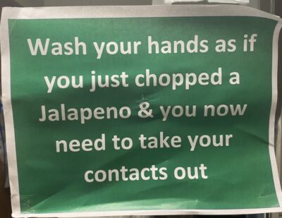
If you want people to take action, give them an analogy they can relate to. This sign pulls it off perfectly 😂…
Fiverr is one of the largest freelancer platforms out there, and if you hover over a category, it’ll essentially give you a full breakdown of all the work and gigs …
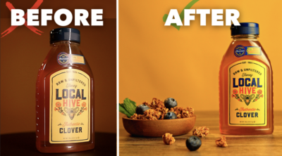
This is a very screen-shottable before/after image that helps promote a free training lead magnet for a product photography course.
I love the use of the ❌’s and ✅’s to …
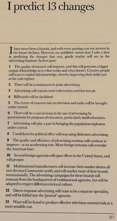
Exactly 40 years ago in 1983 David Ogilvy from the mega-popular advertising book “Ogilvy On Advertising.”
His hand was turned by the publisher to make some “predictions of the future” …
Over the course of 120 years you can see a design macro-trend happen with the Burberry logo: They go from complex design style, to simple, back to complex.…
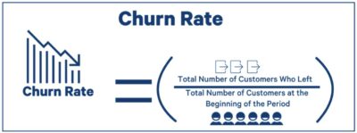
Sometimes in marketing math formulas are used, but they can sometimes be dry or boring.
Instead make them into “Visual Math Formulas” which makes them easier to understand. Here’s 4 …
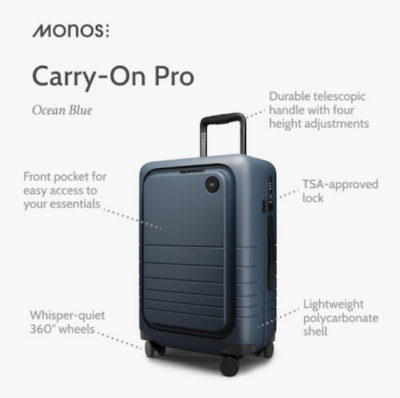
One of my favorite ways to demonstrate a product in an image is:
Picture + Callout Text
This simple Monos Travel ad explains the product super quickly.…
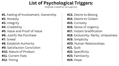
Originally listed out by Joe Sugarman in his book The AdWeek Copywriting Handbook, he identified 24 “triggers” that can cause people to purchase something. …