1912 mail order house plans
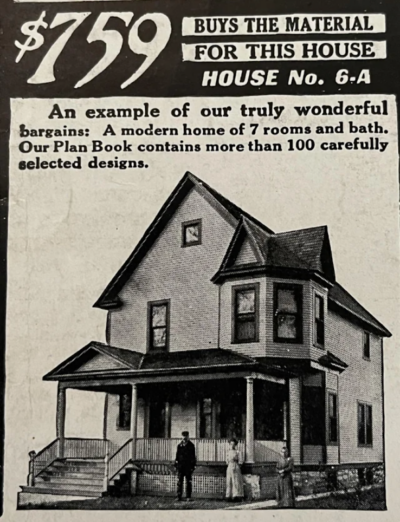
This ad is a little confusing, it sort of “implies” you can build a 7 bedroom house for $759 to get your attention. This ad is actually for a “plan …
These are examples of high converting or very grabbing headlines. A good headline can grab people to read an article, advertisement, or piece of direct mail. Use these examples to help jog your mind.
This ad is a little confusing, it sort of “implies” you can build a 7 bedroom house for $759 to get your attention. This ad is actually for a “plan …
This ad cleverly shows you how to use the product…and to use A LOT of it!
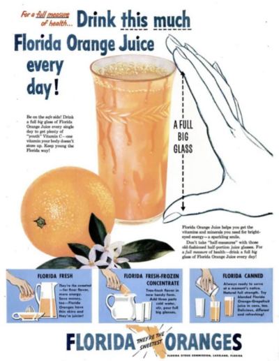
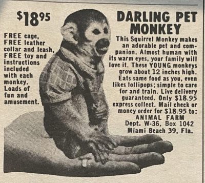
Not sure if this is considered healthy or not anymore, but the ad is …
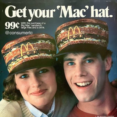
To be honest I would totally buy a Big Mac just to get this hat!!!…
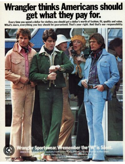
This ad for Wrangler Jeans promotes the idea of getting your money’s worth with their jeans…this copy was written in 1975 during a recession when 2.3 million American jobs were …
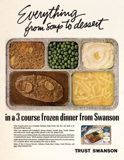
Ok…maybe in 1970’s this looked appetizing, so this image would’ve been very grabbing. However my favorite thing about this is the headline: “Everything from soup to dessert.” I thought that …
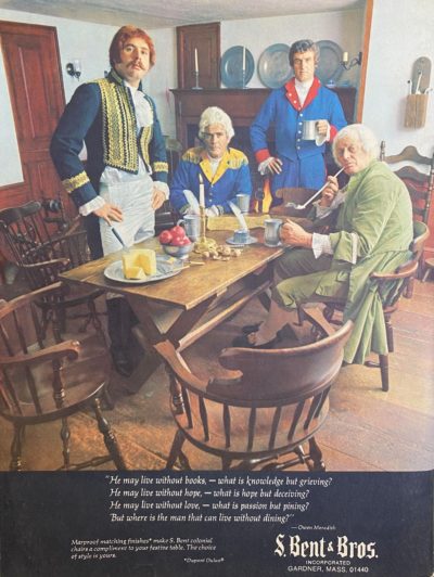
I was struck by the imagery of this ad, and it got me curious to keep reading. It goes on to some poetic copy, but it took me reading alllllll …
Sometimes using a “pattern interrupt” is great way to grab attention. A “pattern interrupt” can be something something that’s a little different than normal, and gets attention in an otherwise …
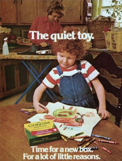
Know who your actual customer is.
For example: If someone is buying Crayons…it’s the PARENT not the child spending the money.
This 1979 Crayola ad appeals specifically to parents who …
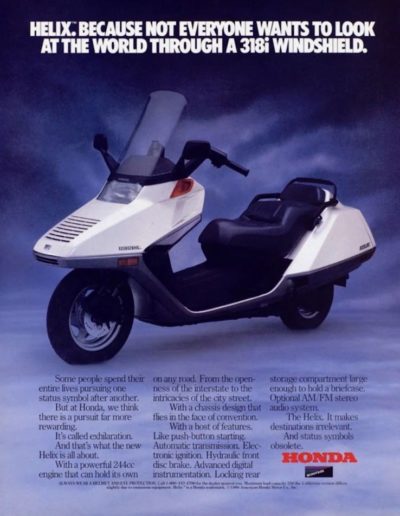
This is clearly the ugliest scooter ever made….and Honda used it’s striking appearance as the main attention grabber on this print ad.…
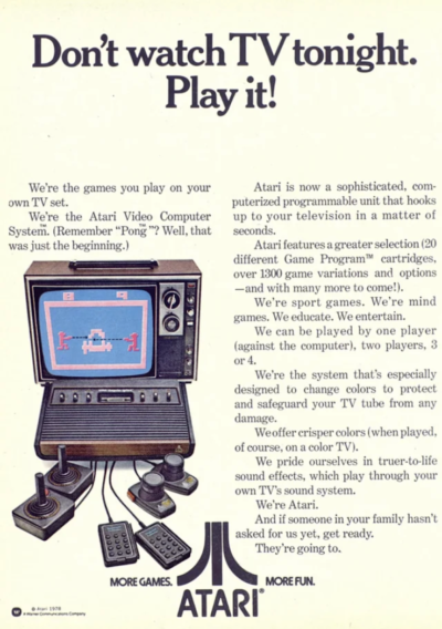
“Don’t watch TV tonight. Play it!” This was a great headline in 1978 when “Playing the TV” was a totally new and novel concept!…
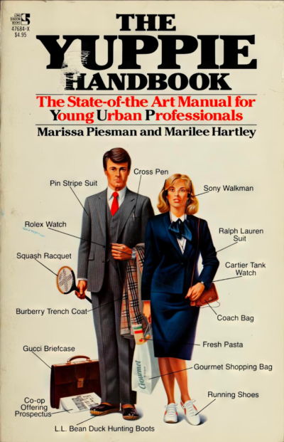
I love this great callout-image using a picture and text and arrows!…
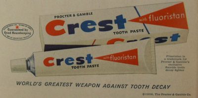
I thought this headline was great:
WORLD’S GREATEST WEAPON AGAINST TOOTH DECAY…

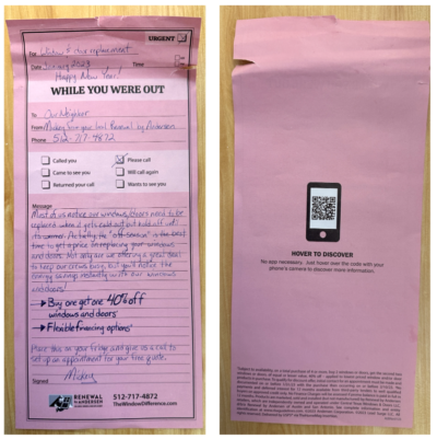
This door flyer appears to be handwritten, so it kind of catches your attention, and then goes into why replacing your windows is a good idea.…
In print advertising you had to cram a lot of information into a small space.
This 1962 ad hits all the points of a good sales message:
• Attention: Grabs …
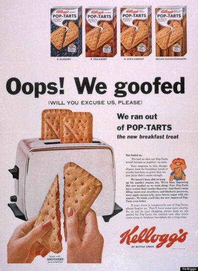
This headline really creates quite a bit of curiosity with the giant headline “Oops! We goofed”
I didn’t WANT to read the smaller print of this 1964 ad, but HAD …
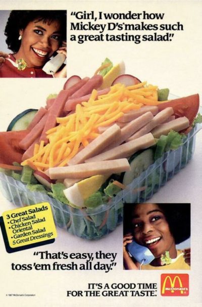
This is a great simple ad showing off McDonald’s new salads (this was the 1980’s). I wonder if the “toss em all day” was a purposeful joke or not 😂…
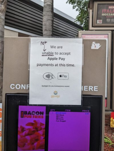
Someone made this sign easier to read by removing harder words than necessary. This sign should just say “We do not accept Apple Pay at this time”…
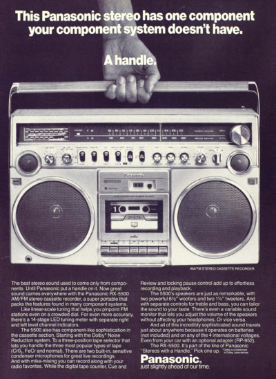
I love the simplicity and grabbiness of this ad, and how it focuses on one major feature of this stereo: A handle.
It shows that by buying this stereo “boom …
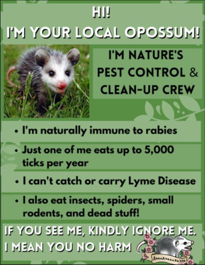
This one-pager shows people that opossum’s don’t mean humans any harm, and are helpful for their local environment. This flyer is probably needed because many people don’t like opossum’s because …
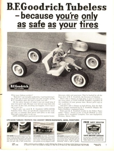
I like this ad because the headline copy and image work together to show the part of your car that actually touches the road is just your tires.…