
Advertorials are [ADVERTISEMENT] + [EDITORIAL CONTENT]. Example: A company like Purina dog food can pay BuzzFeed money to publish an article called “10 Cute Pupppies Who Love To Eat.” In some of the pictures, they might be eating Purina brand dog food. THAT is an advertorial!
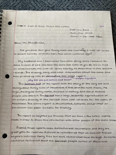
A student wanted to do CopyWork on some classic ads (hand writing other people’s work to get a feel for it), and wrote out the Gary Halbert “Coat of …
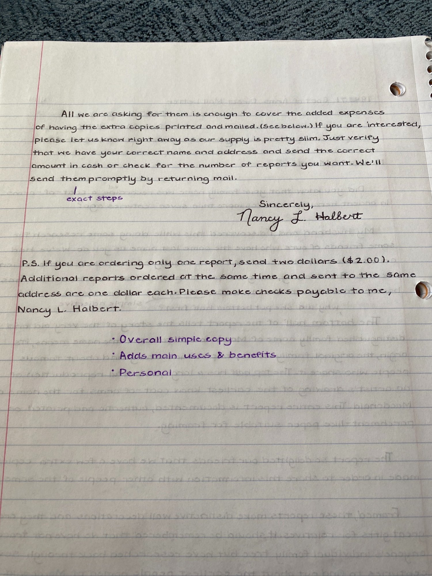
With 47 years of practice, Dr. W.R. Caldwell proves that he is an expert in medicine. He is also offering out $10,000 worth of free samples. A great way to …
This ad creates a bit of curiosity with it’s clever headline and image.…
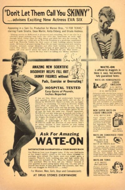
In 1963 the being skinny was out. This 1963 print ad uses a actress Eva Six to sell their weight gaining tablet.…
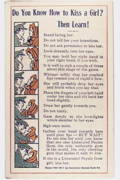
This is a crazy little advertorial that starts out like a “kissing guide” – complete with 1-2-3-style images down the left-hand side of the page – and then transitions into …
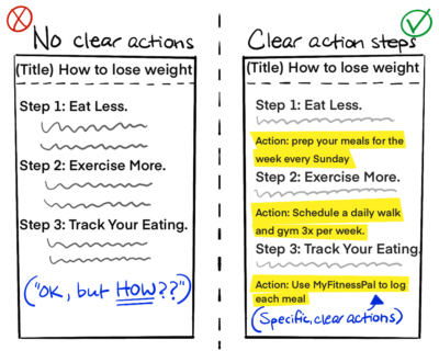
People write will often write “How To” content without giving the reader clear, practical ACTIONS to take.
Why it’s bad:
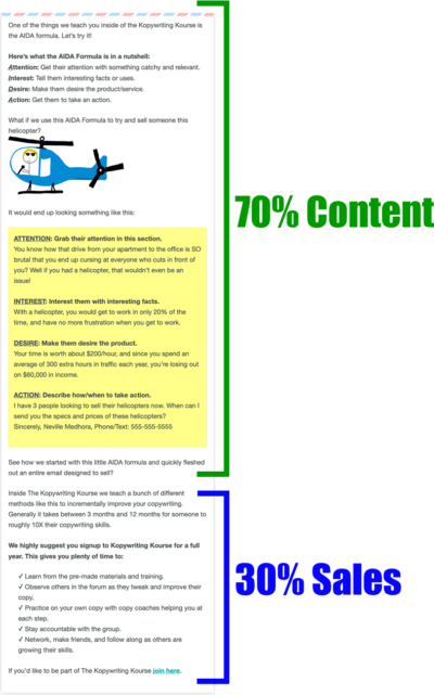
When writing content that educates as well as sells, trying making it about 70% content, and 30% sales.…
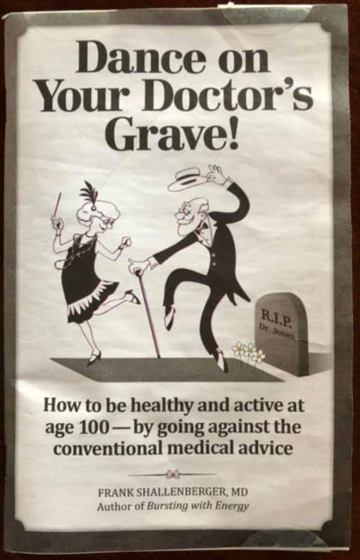
Here’s a really simple yet catchy pamphlet title and image!…
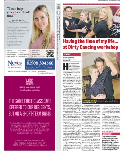
A newspaper advertorial promoting a Dirty Dancing workshop.…
Targeting teens this advertorial was featured in the magazine Seventeen…
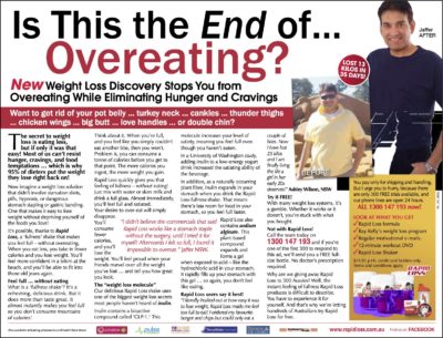
Rapid Loss sells using a common weight cause in this two-page spread advertorial.…

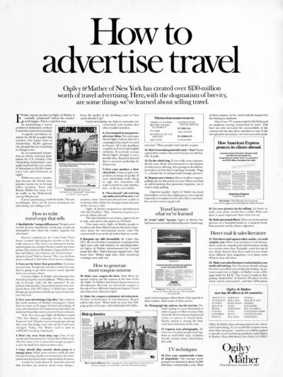
This Ogilvy print was part of the famous “How to” campaign that showcased the Ogilvy’s strategy and copywriting skills.
Red areas are most likely to attract attention, followed by …
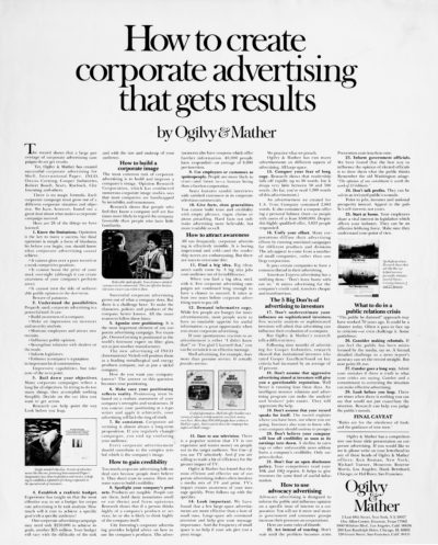
This Ogilvy print was part of the famous “How to” campaign that showcased the Ogilvy’s strategy and copywriting skills.
Red areas are most likely to attract attention, followed by …
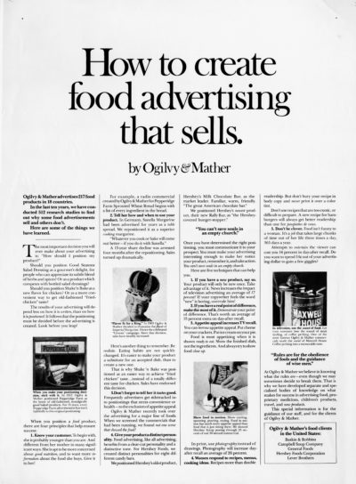
This Ogilvy print was part of the famous “How to” campaign that showcased the Ogilvy’s strategy and copywriting skills.
Red areas are most likely to attract attention, followed by …
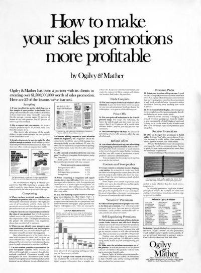
Part of Ogilvy’s famous “how to” campaign that showcases the agencies copywriting and strategy skills.
Red areas are most likely to attract attention, followed by Yellow/Orange areas, and Blue …
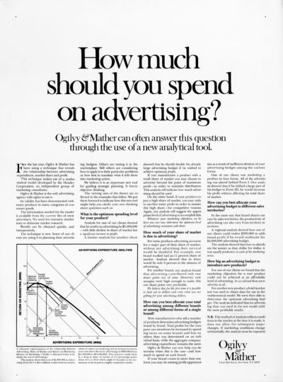
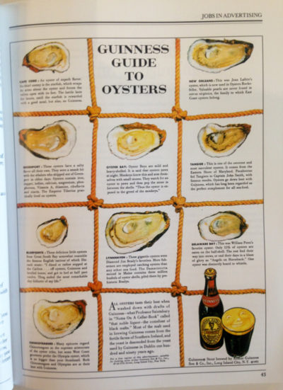
This advertorial was a great way to show companies how much they should budget for advertising.
Red areas are most likely to attract attention, followed by Yellow/Orange areas, and …
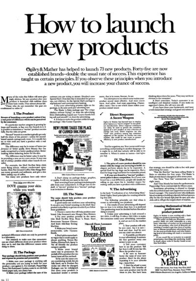
Print ad created by Ogilvy showcasing the agencies knowledge on launching new products.
Red areas are most likely to attract attention, followed by Yellow/Orange areas, and Blue areas. Areas …
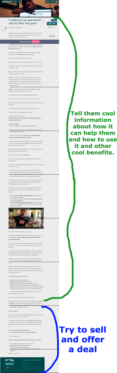
If 70% of the article would be about the benefits of the product, how to use the product, and other cool benefits you’d get by having it.
Then less than …
Not only was it an advertisement for Guinness, but people used to tear it out of the magazine and keep it. Restaurants would even display this ad for the patrons …