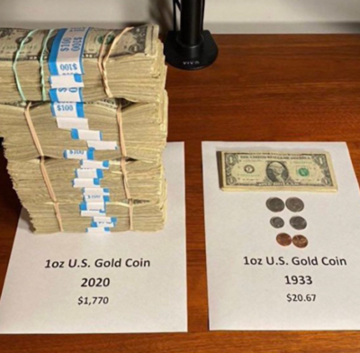
“What is inflation” cool visualization
Inflation is a hard concept to explain….but this simple picture really “shows” it perfectly!
It’s easy to see how much the buying power of the dollar has decreased in ~100 …
Inflation is a hard concept to explain….but this simple picture really “shows” it perfectly!
It’s easy to see how much the buying power of the dollar has decreased in ~100 …

This is a really high-converting email signup pop-up on Copywriting Course to get people to the weekly newsletter. It’s a pretty simple structure:
[Headline]
[Fun GIF]
[3 Bullet Points Why …
This simple product makes “YouTube Chapters” timestamps automatically, and they have a super quick and easy explainer video showcasing the whole product. …
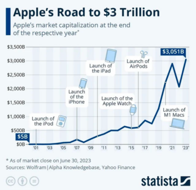
This is a cool visualization of major produce releases that helped Apple reach a $3T+ valuation. It would be cool to make a revenue chart like this with other companies, …

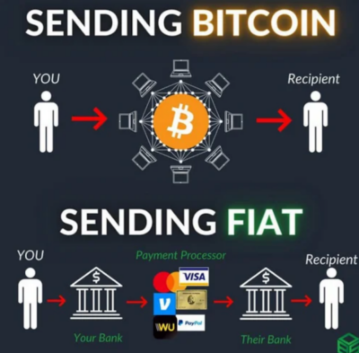
I gotta admit, the Bitcoin community has always had great memes and graphics. This one shows the difference between sending Bitcoin to someone vs a typical Dollar payment.…

This bar Lazarus Brewing offers a “free beer for life” if you buy this chalice. I believe they did it during the pandemic to raise funds.
I have a few …

A great quote from @neilhimself about collecting a “compost heap” of ideas an inspirations.
I personally call my compost heap a Swipe File and post all my ideas, inspirations, quotes, …

MasterClass has a super interesting sales sequence on their homepage which in 6 steps gets you to purchase (rather than just showing you pricing right away).
Step 1.) It gives …

This is a great home page from software company Synthesia. It has an easy headline, 3 key features and benefits, and an explainer video which demo’s the product.…
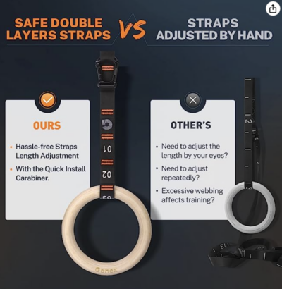
This “Ours vs Other’s” visual on Amazon shows why you should pick THIS product instead of their competitors. A simple image like this could convince someone to end their Amazon …
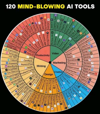
This wheel-style chart breaks down the hundreds of recent AI tools that’ve been coming out.
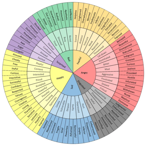
This wheel-chart looks like it was modeled after this Feelings Wheel:
 …
…

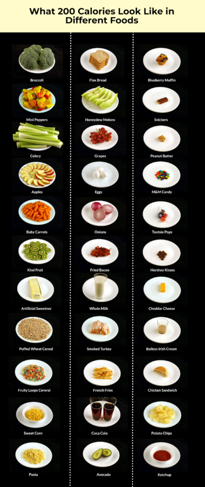
Each dish pictured here is 200 calories….but look at the volume difference of the left column vs right column!
I learned what a calorie was in 2010, and made my …
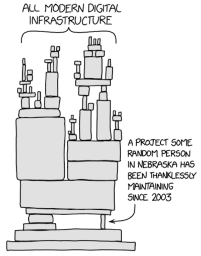
This XKCD graphic came out in 2014 after a small database of code…which happens to secure all the traffic on the internet…went out of date. It showed how dependant modern …
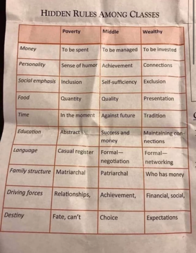
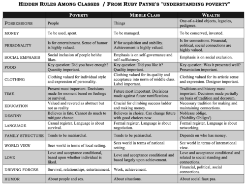
An interesting chart about hidden rules between income classes. This could be used to speak clearer to your target audience.
 …
…
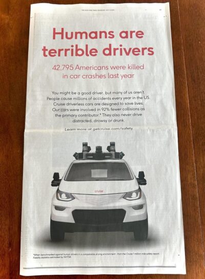
The Chevy Cruise autonomous driving project took out this full page in the New York Times to show how many lives could be saved by letting computers do all the …
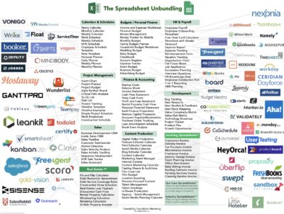
This is a cool graphic showing how the classic Excel Spreadsheet has been un-bundled by many companies. Similar to this Craigslist Unbundling graphing.…

Platforms change, but good content and interesting people always rise to the top. For example….
It used to be MySpace
It used to be Friendster
It used to be LinkedIn…

In Texas there’s this famous gas station called Buc-ee’s…and each one is absolutely gigantic, almost like a small Wal-Mart.
It’s got like 100+ gas pumps, 100+ restrooms, a gigantic carwash, …
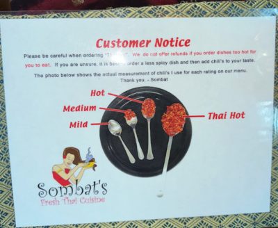
We’ve all ordered “spicy” at a Thai restaurant only to realize it’s TOO SPICY. This helpful chart shows people that even small increases in chili can be vvveerry hot.
This …